Selectors for page builder components
Selectors are system form components that enable users to select Xperience content and objects and use them in the properties of page builder components. Items available for selection include pages from a site’s content tree, media files from media libraries, unsorted page attachments attached to pages via the Attachments tab, Xperience objects, and any items in general loaded by a custom data source.
The selectors return a collection of identifiers representing the chosen items. You can use these identifiers to access objects in the logic of your page builder components. For example, when developing a widget displaying links to a set of pages, a property of the widget could use the page selector form component to enable editors to choose the pages.
In addition to using the selectors in the administration interface as standard form components (when building property dialogs of page builder components), you can also use the content selector JavaScript API utilizing the system’s modal dialog support to offer identical functionality anywhere within the code of your components.
You can examine an implementation of a sample widget using selector form components in the LearningKit project on GitHub. To set up the project, follow the instructions in the repository’s README file.
Selector form components
Selector editing components usability
The selectors described on this page are primarily intended to facilitate page builder component development. These editing components are not meant to be used on the live site or within form builder components.
One exception are the Object and General selector, which are also supported in the configuration dialogs used to edit form section properties in the form builder.
Media files selector
The media files selector form component enables users to select files from a site’s media libraries using an intuitive interface. The selector returns a collection of MediaFilesSelectorItem objects, which contain the GUID of the selected media file in the FileGuid property. The media files are in the order in which they were selected within the dialog.
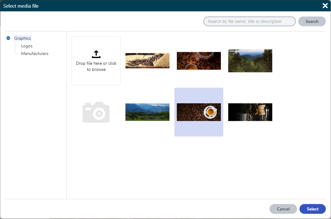
The media files selector form component has the following configurable properties:
|
Property |
Type |
Description |
|
|
LibraryName |
string |
Configures the (single) media library from which you can select files in the selector. If not specified, the selector allows selecting from all media libraries on the current site for which the user has permissions. Set the LibraryName to the code name of the media library. The media library code name is available in the Media libraries application. |
|
|
MaxFilesLimit |
int |
Configures the maximum number of files allowed to be selected:
If not specified, the default value is 1 (single file selection). |
|
|
AllowedExtensions |
string |
A semicolon-delimited string of file extensions that specify the allowed file extensions for the files to be selected. The listed extensions need to form a subset of allowed extensions specified in the Media file allowed extensions site settings key. If not specified, the selector uses the extensions from the site settings key by default. |
|
The following example shows the declaration of a property in a page builder component’s property model class that has the MediaFilesSelector form component assigned as its editing component. A URL of the selected image is then retrieved in the corresponding component’s controller.
        // Assigns a selector component to the 'Images' property
        [EditingComponent(MediaFilesSelector.IDENTIFIER)]
        // Configures the media library from which you can select files in the selector
        [EditingComponentProperty(nameof(MediaFilesSelectorProperties.LibraryName), "Graphics")]
        // Limits the maximum number of files that can be selected at once
        [EditingComponentProperty(nameof(MediaFilesSelectorProperties.MaxFilesLimit), 5)]
        // Configures the allowed file extensions for the selected files
        [EditingComponentProperty(nameof(MediaFilesSelectorProperties.AllowedExtensions), ".gif;.png;.jpg;.jpeg")]
        // Returns a list of media files selector items (objects that contain the GUIDs of selected media files)
        public IEnumerable<MediaFilesSelectorItem> Images { get; set; } = Enumerable.Empty<MediaFilesSelectorItem>();
        private readonly IMediaFileInfoProvider mediaFileInfo;
        private readonly IComponentPropertiesRetriever componentPropertiesRetriever;
        private readonly ISiteService siteService;

        public MediaFilesSelectorExample(IMediaFileInfoProvider mediaFileInfo,
                                         IComponentPropertiesRetriever componentPropertiesRetriever,
                                         ISiteService siteService)
        {
            this.mediaFileInfo = mediaFileInfo;
            this.componentPropertiesRetriever = componentPropertiesRetriever;
            this.siteService = siteService;
        }

        public ActionResult Index()
        {
            // Retrieves the GUID of the first selected media file from the 'Images' property
            Guid guid = componentPropertiesRetriever.Retrieve<CustomWidgetProperties>().Images.FirstOrDefault()?.FileGuid ?? Guid.Empty;
            // Retrieves the MediaFileInfo object that corresponds to the selected media file GUID
            MediaFileInfo mediaFile = mediaFileInfo.Get(guid, siteService.CurrentSite.SiteID);

            string url = String.Empty;
            if (mediaFile != null)
            {
                // Retrieves an URL of the selected media file
                url = MediaLibraryHelper.GetDirectUrl(mediaFile);
            }

            // Custom logic...

            return View();
        }
Configuring maximum file upload size and timeout
The media files selector also provides a media file uploader for uploading new files into media libraries as part of its functionality. By default, the uploader is limited to 200MB and times out after 120 seconds. If you wish to enable uploads of larger files or you want to set a different timeout interval, edit your MVC project’s web.config file and modify the following values:
- Modify the value of the <httpRuntime> element’s maxRequestLength and executionTimeout attributes. Enter the values in kilobytes and seconds.
- Modify the value of the <requestLimits> element’s maxAllowedContentLength attribute. Enter the value in bytes. The value of the maxAllowedContentLength attribute in kiloBytes must be greater or equal to the value of the maxRequestLengthattribute.
<!-- Scopes the maximum file size configuration to only affect files uploaded using the media files selector -->
<location path="Kentico.Uploaders">
  <system.webServer>
    <security>
      <requestFiltering>
        <requestLimits maxAllowedContentLength="MAXSIZE_IN_BYTES" />
      </requestFiltering>
    </security>
  </system.webServer>
  <system.web>
    <httpRuntime maxRequestLength="MAXSIZE_IN_KILOBYTES" executionTimeout="NUMBER_IN_SECONDS" />
  </system.web>
</location>
Page selector
The page selector form component allows users to select pages from the content tree using a dialog window. The selector returns a collection of PageSelectorItem objects, which contain the NodeGUID property with the GUID of the selected page. The pages are in the order in which they were selected within the dialog.
If you wish to select the node alias path value of pages, use the path selector component instead.
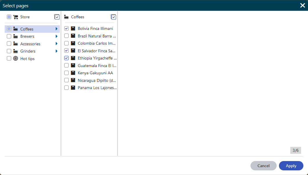
The page selector form component has the following configurable properties:
|
Property |
Type |
Description |
|
|
MaxPagesLimit |
int |
Configures the maximum number of pages allowed to be selected:
If not specified, the default value is 1 (single page selection). |
|
|
RootPath |
string |
Limits the selection of pages to a subtree rooted at a page identified by its node alias path (e.g. “/Products/Coffee-grinders”). Only the specified page and its sub-pages can be selected. If not configured, users can select from the entire content tree. |
|
The following example shows the declaration of a property in a page builder component’s property model class that has the PageSelector form component assigned as its editing component.
        // Assigns a selector component to the Pages property
        [EditingComponent(PageSelector.IDENTIFIER)]
        // Limits the selection of pages to a subtree rooted at the 'Products' page
        [EditingComponentProperty(nameof(PageSelectorProperties.RootPath), "/Products")]
        // Sets an unlimited number of selectable pages
        [EditingComponentProperty(nameof(PageSelectorProperties.MaxPagesLimit), 0)]
        // Returns a list of page selector items (node GUIDs)
        public IEnumerable<PageSelectorItem> Pages { get; set; } = Enumerable.Empty<PageSelectorItem>();
The selected pages are then retrieved in the corresponding component’s controller.
        private readonly IPageRetriever pagesRetriever;
        private readonly IComponentPropertiesRetriever componentPropertiesRetriever;

        public PageSelectorExample(IPageRetriever pagesRetriever, IComponentPropertiesRetriever componentPropertiesRetriever)
        {
            this.pagesRetriever = pagesRetriever;
            this.componentPropertiesRetriever = componentPropertiesRetriever;
        }

        public ActionResult Index()
        {
            // Retrieves the node GUIDs of the selected pages from the 'Pages' property
            List<Guid> selectedPageGuids = componentPropertiesRetriever.Retrieve<CustomWidgetProperties>().Pages
                                                                       .Select(i => i.NodeGuid)
                                                                       .ToList();

            // Retrieves the pages that correspond to the selected GUIDs
            List<TreeNode> pages = pagesRetriever.Retrieve<TreeNode>(query => query
                                                 .WhereIn("NodeGUID", selectedPageGuids))
                                                 .ToList();

            // Custom logic...

            return View();
        }
The selected pages are then retrieved in the corresponding view component.
    public class PageSelectorWidget : ViewComponent
    {
        private readonly IPageRetriever pagesRetriever;

        public PageSelectorWidget(IPageRetriever pagesRetriever)
        {
            this.pagesRetriever = pagesRetriever;
        }

        public IViewComponentResult Invoke(ComponentViewModel<CustomWidgetProperties> properties)
        {
            // Retrieves the node GUIDs of the selected pages from the 'Pages' property
            List<Guid> selectedPageGuids = properties?.Properties?.Pages?
                                                                  .Select(i => i.NodeGuid)
                                                                  .ToList();

            // Retrieves the pages that correspond to the selected GUIDs
            List<TreeNode> pages = pagesRetriever.Retrieve<TreeNode>(query => query
                                                 .WhereIn("NodeGUID", selectedPageGuids))
                                                 .ToList();

            // Custom logic...

            return View("~/Components/Widgets/PageSelectorWidget/_PageSelectorWidget.cshtml");
        }
    }
Path selector
The path selector form component allows users to select pages from the content tree using a dialog window. The path selector returns a collection of PathSelectorItem objects, which contain the NodeAliasPath property with the node alias path of the selected page. The items are in the order in which they were selected within the dialog.
If you wish to select the GUID value of pages, use the page selector component instead.

The path selector form component has the following configurable properties:
|
Property |
Type |
Description |
|
|
MaxPagesLimit |
int |
Configures the maximum number of pages allowed to be selected:
If not specified, the default value is 1 (single page selection). |
|
|
RootPath |
string |
Limits the selection of pages to a subtree rooted at a page identified by its node alias path (e.g. “/Products/Coffee-grinders”). Only the specified page and its sub-pages can be selected. If not configured, users can select from the entire content tree. |
|
The following example shows the declaration of a property in a page builder component’s model class that has the PathSelectorform component assigned as its editing component.
        // Assigns a selector component to the 'PagePaths' property
        [EditingComponent(PathSelector.IDENTIFIER)]
        // Limits the selection of pages to a subtree rooted at the 'Products' page
        [EditingComponentProperty(nameof(PathSelectorProperties.RootPath), "/Products")]
        // Sets the maximum number of selected pages to 6
        [EditingComponentProperty(nameof(PathSelectorProperties.MaxPagesLimit), 6)]
        // Returns a list of path selector items (page paths)
        public IEnumerable<PathSelectorItem> PagePaths { get; set; } = Enumerable.Empty<PathSelectorItem>();
The selected pages are then retrieved in the corresponding component’s controller.
        private readonly IPageRetriever pagesRetriever;
        private readonly IComponentPropertiesRetriever componentPropertiesRetriever;

        public PathSelectorExample(IPageRetriever pagesRetriever, IComponentPropertiesRetriever componentPropertiesRetriever)
        {
            this.pagesRetriever = pagesRetriever;
            this.componentPropertiesRetriever = componentPropertiesRetriever;
        }

        public ActionResult Index()
        {
            // Retrieves the node alias paths of the selected pages from the 'PagePaths' property
            string[] selectedPagePaths = componentPropertiesRetriever.Retrieve<CustomWidgetProperties>().PagePaths
                                                                     .Select(i => i.NodeAliasPath)
                                                                     .ToArray();

            // Retrieves the pages that correspond to the selected alias paths
            List<TreeNode> pages = pagesRetriever.Retrieve<TreeNode>(query => query
                                                 .Path(selectedPagePaths))
                                                 .ToList();

            // Custom logic...

            return View();
        }
The selected pages are then retrieved in the corresponding view component.
    public class PathSelectorWidget : ViewComponent
    {
        private readonly IPageRetriever pagesRetriever;

        public PathSelectorWidget(IPageRetriever pagesRetriever)
        {
            this.pagesRetriever = pagesRetriever;
        }

        public IViewComponentResult Invoke(ComponentViewModel<CustomWidgetProperties> properties)
        {
            // Retrieves the node alias paths of the selected pages from the 'PagePaths' property
            string[] selectedPagePaths = properties?.Properties?.PagePaths?
                                                                .Select(i => i.NodeAliasPath)
                                                                .ToArray();

            // Retrieves the pages that correspond to the selected alias paths
            List<TreeNode> pages = pagesRetriever.Retrieve<TreeNode>(query => query
                                                 .Path(selectedPagePaths))
                                                 .ToList();

            // Custom logic...

            return View("~/Components/Widgets/PathSelectorWidget/_PathSelectorWidget.cshtml");
        }
    }
Attachment selector
The attachment selector form component allows users to select unsorted page attachments using a dialog window. The selector returns a collection of AttachmentSelectorItem objects, which contain GUIDs of the selected attachments in their FileGuid property. The attachments are in the order in which they were selected within the dialog.

The attachment selector form component has the following configurable properties:
|
Property |
Type |
Description |
|
|
MaxFilesLimit |
int |
Configures the maximum number of files allowed to be selected:
If not specified, the default value is 1 (single file selection). |
|
|
AllowedExtensions |
string |
A semicolon-delimited string of file extensions that specify the allowed file extensions for the files to be selected. When no allowed extensions are specified, all extensions are displayed. |
|
The following example shows the declaration of a property in a page builder component’s property model class that has the AttachmentSelector form component assigned as its editing component. A relative URL of the selected attachment is then retrieved in the corresponding component’s controller.
        // Assigns a selector component to the 'Attachments' property
        [EditingComponent(AttachmentSelector.IDENTIFIER)]
        // Limits the maximum number of attachments that can be selected at once
        [EditingComponentProperty(nameof(AttachmentSelectorProperties.MaxFilesLimit), 3)]
        // Configures the allowed file extensions for the selected attachments
        [EditingComponentProperty(nameof(AttachmentSelectorProperties.AllowedExtensions), ".gif;.png;.jpg;.jpeg")]
        // Returns a list of attachment selector items (attachment objects)
        public IEnumerable<AttachmentSelectorItem> Attachments { get; set; } = Enumerable.Empty<AttachmentSelectorItem>();
        private readonly IComponentPropertiesRetriever propertiesRetriever;
        private readonly ISiteService siteService;
        private readonly IPageAttachmentUrlRetriever attachmentUrlRetriever;

        public AttachmentSelectorExample(IComponentPropertiesRetriever propertiesRetriever,
                                         ISiteService siteService,
                                         IPageAttachmentUrlRetriever attachmentUrlRetriever)
        {
            this.propertiesRetriever = propertiesRetriever;
            this.siteService = siteService;
            this.attachmentUrlRetriever = attachmentUrlRetriever;
        }

        public ActionResult Index()
        {
            // Retrieves the GUID of the first selected attachment from the 'Attachments' property
            Guid guid = propertiesRetriever.Retrieve<CustomWidgetProperties>().Attachments.FirstOrDefault()?.FileGuid ?? Guid.Empty;
            // Retrieves the DocumentAttachment object that corresponds to the selected attachment GUID
            DocumentAttachment attachment = DocumentHelper.GetAttachment(guid, siteService.CurrentSite.SiteID);

            string url = String.Empty;
            if (attachment != null)
            {
                // Retrieves the relative URL of the selected attachment
                url = attachmentUrlRetriever.Retrieve(attachment).RelativePath;
            }

            // Custom logic...

            return View();
        }
URL selector
The URL selector form component allows users to select one content item (pages, media library files, or unsorted page attachments) and returns its relative URL. Alternatively, a URL to an external resource may be entered directly into the text input field.
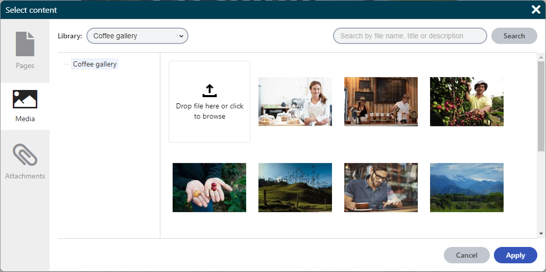
The URL selector form component has the following configurable properties:
|
Property |
Type |
Descriptions |
|
Tabs |
enum |
Specifies what tabs (and inherently what object types) will be available for selection to content editors. To select multiple tabs, use the logical OR (‘|’) operator. |
|
DefaultTab |
enum |
Specifies which tab will be opened first when the dialog is invoked. (e.g. ContentSelectorTabs.Page) |
|
PageRootPath |
string |
Limits the selection of pages to a subtree with root specified by its node alias path (e.g. ” /Products/Coffee-grinders “). Only the specified page and its sub-pages can be selected. If not specified, the whole content tree is allowed. |
|
MediaLibraryName |
string |
Code name of a (single) media library from which you can select files in the selector. If not specified, the selector allows selecting from all media libraries of the current site for which the user has permissions. The media library code name is available in the Media libraries application. |
|
MediaAllowedExtensions |
string |
A semicolon-delimited string of file extensions that specify the allowed file extensions for the files to be selected on the media tab. The listed extensions need to form a subset of allowed extensions specified in the Media file allowed extensions site settings key. When no allowed extensions are specified, all files with the extensions from the site settings key can be selected. |
|
AttachmentAllowedExtensions |
string |
A semicolon-delimited string of file extensions that specify the allowed file extensions for the files to be selected on the attachment tab. When no allowed extensions are specified, all extensions are displayed. |
The following example shows the declaration of a property in a page builder component’s property model class that has the UrlSelector form component assigned as its editing component. A relative URL of the selected content item is then stored in the component’s property.
// Assigns a selector component to the 'ImageUrl' property
[EditingComponent(UrlSelector.IDENTIFIER)]
// Configures which tabs will be available
[EditingComponentProperty(nameof(UrlSelectorProperties.Tabs), ContentSelectorTabs.Attachment | ContentSelectorTabs.Media)]
// Configures which extensions will be avalable on the media tab
[EditingComponentProperty(nameof(UrlSelectorProperties.MediaAllowedExtensions), ".gif;.png;.jpg;.jpeg")]
// Configures which extensions will be avalable on the attachment tab
[EditingComponentProperty(nameof(UrlSelectorProperties.AttachmentAllowedExtensions), ".gif;.png;.jpg;.jpeg")]
// Configures the media library from which the media files can be selected
[EditingComponentProperty(nameof(UrlSelectorProperties.MediaLibraryName), "Graphics")]
// Returns a string containing the relative URL of the selected image file
public string ImageUrl { get; set; }
Object selector
The object selector form component allows users to select Xperience objects using a drop-down menu with a search bar. Both the default object types and custom object types created under modules are supported. For custom object types, the Info, IInfoProvider and InfoProvider code must be deployed to the live site application to be available in the object selector.
The selector returns a collection of ObjectSelectorItem objects, which contain the code names or the GUIDs of selected objects.
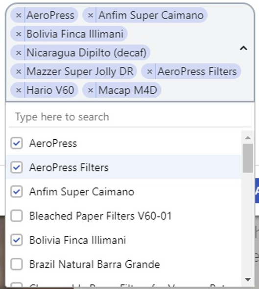
If the selection contains seven or more items, the selector automatically displays a search bar that allows users to filter displayed results.
The object selector form component has the following configurable properties:
|
Property |
Type |
Description |
|
|
ObjectType |
string |
A string property that sets the name of the object type listed in the selector. To find the name for specific object types, open the System application in the Xperience administration interface and select the Object types tab. For example, use personas.persona to list personas. Custom object types created under modules are also supported. The Info, IInfoProvider and InfoProvider code generated for the object type must be deployed to the live site application. |
|
|
IdentifyObjectByGuid |
bool |
A boolean property that indicates whether the returned object contains the GUID identifier of the selected object instead of the code name. By default, the option is disabled ( false ) and the returned object contains the object code name. We recommend identifying objects by their code names for optimal performance. |
|
|
MaxItemsLimit |
int |
Configures the maximum number of files allowed to be selected:
If not specified, the default value is 1 (single object selection). |
|
|
WhereConditionProviderType |
type |
Allows you to filter what data is available in the object selector using a custom Where condition. The specified condition class must implement the IObjectSelectorWhereConditionProvider interface and define its Get method. The Get method specifies the where condition applied to the data before the list of objects is shown to users. |
|
|
OrderBy |
string array |
An array of strings that specifies page data columns by which the items are ordered, as well as the type of ordering: ascending (ASC) or descending (DESC).
By default, the data is ordered alphabetically by the object’s display name. |
|
|
IncludeGlobalObjects |
bool |
Indicates whether global objects are included in the selection in cases where the selected object type may exist in both site and global scope. |
|
The following example shows the declaration of a property in a component’s property model class that has the ObjectSelector form component assigned as its editing component to select email feeds (newsletter.newsletter objects). The selected object is then retrieved in the corresponding component’s controller.
// Assigns a selector component to the Newsletters property
[EditingComponent(ObjectSelector.IDENTIFIER)]
// Configures the code name of the selected object type
[EditingComponentProperty(nameof(ObjectSelectorProperties.ObjectType), "newsletter.newsletter")]
// Limits the selected newsletters to exclude email campaigns
[EditingComponentProperty(nameof(ObjectSelectorProperties.WhereConditionProviderType), typeof(NewslettersWhere))]
// Orders items in the selector by their display name alphabetically from Z to A
[EditingComponentProperty(nameof(ObjectSelectorProperties.OrderBy), new string[] { "NewsletterDisplayName DESC" })]
// Returns a list of object selector items
public IEnumerable<ObjectSelectorItem> Newsletters { get; set; } = Enumerable.Empty<ObjectSelectorItem>();
public class NewslettersWhere : IObjectSelectorWhereConditionProvider
{
    // Where condition limiting the objects
    public WhereCondition Get() => new WhereCondition().WhereEquals("NewsletterType", (int)EmailCommunicationTypeEnum.Newsletter);
}
private readonly IComponentPropertiesRetriever componentPropertiesRetriever;
private readonly INewsletterInfoProvider newsletterInfoProvider;

public ObjectSelectorExample(IComponentPropertiesRetriever componentPropertiesRetriever, INewsletterInfoProvider newsletterInfoProvider)
{
    this.componentPropertiesRetriever = componentPropertiesRetriever;
    this.newsletterInfoProvider = newsletterInfoProvider;
}

public ActionResult Index()
{
    // Retrieves the code name of the selected newsletter from the properties
    string? codeName = componentPropertiesRetriever.Retrieve<CustomWidgetProperties>().Newsletters.FirstOrDefault()?.ObjectCodeName;
    // Retrieves the corresponding newsletter object
    var newsletter = newsletterInfoProvider.Get(codeName, SiteContext.CurrentSiteID);

    // Custom logic...

    return View();
}
General selector
The general selector form component allows users to select items using a drop-down menu with a search bar. The items offered by the selector can be of any type, including external data outside of Xperience. Developers need to implement a data provider that loads and prepares the items displayed in the selector.
The selector returns a collection of GeneralSelectorItem objects, which contain identifiers of the selected items.

If the selection contains seven or more items, the selector automatically displays a search bar that allows users to filter displayed results.
The general selector form component has the following configurable properties:
|
Property |
Type |
Description |
|
DataProviderType |
type |
Allows you to specify what data is available in the selector using a custom provider class. The class must implement the IGeneralSelectorDataProvider interface and define the following methods: GetItemsAsync The GetItemsAsync method provides the items available in the general selector. The method has the following parameters:
The method returns a GeneralSelectorSelectListItems object, which contains the following properties:
GetSelectedItems The GetSelectedItems method identifies which items are currently selected. Within this method, you need to transform a received collection of GeneralSelectorItem objects into GeneralSelectorSelectListItem objects, which contain the identifiers of items, as well as the text displayed in the selector interface. GetSelectedItemsAsync The GetSelectedItemsAsync method identifies which items are currently selected. Within this method, you need to transform a received collection of GeneralSelectorItem objects into GeneralSelectorSelectListItem objects, which contain the identifiers of items, as well as the text displayed in the selector interface. |
|
MaxItemsLimit |
int |
Configures the maximum number of files allowed to be selected:
If not specified, the default value is 1 (single object selection). |
The following example shows the declaration of a property in a component’s property model class that has the GeneralSelector form component assigned as its editing component to select email feeds. The selected object is then retrieved in the corresponding component’s controller.
[EditingComponent(GeneralSelector.IDENTIFIER)]
[EditingComponentProperty(nameof(GeneralSelectorProperties.DataProviderType), typeof(NewslettersDataProvider))]
public IEnumerable<GeneralSelectorItem> Newsletters { get; set; } = Enumerable.Empty<GeneralSelectorItem>();
public class NewslettersDataProvider : IGeneralSelectorDataProvider
{
    public async Task<GeneralSelectorSelectListItems> GetItemsAsync(string searchTerm, int pageIndex, CancellationToken cancellationToken)
    {
        // Defines a query that loads all email feeds on the current site
        ObjectQuery<NewsletterInfo> query = NewsletterInfo.Provider.Get().OnSite(SiteContext.CurrentSiteName);

        if (!String.IsNullOrEmpty(searchTerm))
        {
             // Applies the search term to the database query
             query.WhereContains("NewsletterDisplayName", searchTerm);
        }

        // Ensures paging of items
        query.Page(pageIndex, 50);

        // Retrieves a list of NewsletterInfo objects
        IEnumerable<NewsletterInfo> items = await query.GetEnumerableTypedResultAsync(cancellationToken: cancellationToken);

        // Formats and returns the data
        return new GeneralSelectorSelectListItems
        {
            // Transforms the data into the correct format
            Items = items.Select(GetSelectedListItem),
            // Indicates whether there is another page of incoming results
            NextPageAvailable = query.NextPageAvailable
        };
    }

    public IEnumerable<GeneralSelectorSelectListItem> GetSelectedItems(IEnumerable<GeneralSelectorItem> selectedValues)
    {
        // Creates a list containing identifiers of the selected objects
        var identifiers = selectedValues.Select(x => x.Identifier).ToList();

        // Retrieves NewsletterInfo objects based on the identifiers
        ObjectQuery<NewsletterInfo> query = NewsletterInfo.Provider.Get()
                                        .OnSite(SiteContext.CurrentSiteName)
                                        .WhereIn("NewsletterName", identifiers);
        IEnumerable<NewsletterInfo> items = query.GetEnumerableTypedResult();

        // Orders the retrieved items by their display name
        IOrderedEnumerable<NewsletterInfo> orderedItems = items.OrderBy(o => identifiers.IndexOf(o["NewsletterName"].ToString()));

        // Transforms the data into the correct format
        return orderedItems.Select(GetSelectedListItem);
    }

    // Transforms a single NewsletterInfo object into a GeneralSelectorSelectListItem object
    private GeneralSelectorSelectListItem GetSelectedListItem(NewsletterInfo newsletter)
    {
        return new GeneralSelectorSelectListItem
        {
            // Sets the string used in the selector interface
            Text = newsletter.NewsletterDisplayName,
            // Sets the identifier used to store the selected item
            // The email feed code name serves as the identifier in this case
            Value = new GeneralSelectorItem { Identifier = newsletter.NewsletterName }
        };
    }
}
public class NewslettersDataProvider : IGeneralSelectorDataProvider
{
    public async Task<GeneralSelectorSelectListItems> GetItemsAsync(string searchTerm, int pageIndex, CancellationToken cancellationToken)
    {
        // Defines a query that loads all email feeds on the current site
        ObjectQuery<NewsletterInfo> query = NewsletterInfo.Provider.Get().OnSite(SiteContext.CurrentSiteName);

        if (!String.IsNullOrEmpty(searchTerm))
        {
             // Applies the search term to the database query
             query.WhereContains("NewsletterDisplayName", searchTerm);
        }

        // Ensures paging of items
        query.Page(pageIndex, 50);

        // Retrieves a list of NewsletterInfo objects
        IEnumerable<NewsletterInfo> items = await query.GetEnumerableTypedResultAsync(cancellationToken: cancellationToken);

        // Formats and returns the data
        return new GeneralSelectorSelectListItems
        {
            // Transforms the data into the correct format
            Items = items.Select(GetSelectedListItem),
            // Indicates whether there is another page of incoming results
            NextPageAvailable = query.NextPageAvailable
        };
    }

    public async Task<IEnumerable<GeneralSelectorSelectListItem>> GetSelectedItemsAsync(IEnumerable<GeneralSelectorItem> selectedValues, CancellationToken cancellationToken)
    {
        // Creates a list containing identifiers of the selected objects
        var identifiers = selectedValues.Select(x => x.Identifier).ToList();

        // Retrieves NewsletterInfo objects based on the identifiers
        ObjectQuery<NewsletterInfo> query = NewsletterInfo.Provider.Get()
                                      .OnSite(SiteContext.CurrentSiteName)
                                      .WhereIn("NewsletterName", identifiers);
        IEnumerable<NewsletterInfo> items = await query.GetEnumerableTypedResultAsync(cancellationToken: cancellationToken);

        // Order the retrieved collection by the original selected values order.
        // This way we keep the selected items in the selector UI in the same order as is in DB.
        return items.OrderBy(o => identifiers.IndexOf(o["NewsletterName"].ToString()))
                    .Select(GetSelectedListItem);
    }

    // Transforms a single NewsletterInfo object into a GeneralSelectorSelectListItem object
    private GeneralSelectorSelectListItem GetSelectedListItem(NewsletterInfo newsletter)
    {
        return new GeneralSelectorSelectListItem
        {
            // Sets the string used in the selector interface
            Text = newsletter.NewsletterDisplayName,
            // Sets the identifier used to store the selected item
            // The email feed code name serves as the identifier in this case
            Value = new GeneralSelectorItem { Identifier = newsletter.NewsletterName }
        };
    }
}
private readonly IComponentPropertiesRetriever componentPropertiesRetriever;
private readonly INewsletterInfoProvider newsletterInfoProvider;

public GeneralSelectorExample(IComponentPropertiesRetriever componentPropertiesRetriever, INewsletterInfoProvider newsletterInfoProvider)
{
    this.componentPropertiesRetriever = componentPropertiesRetriever;
    this.newsletterInfoProvider = newsletterInfoProvider;
}

public ActionResult Index()
{
    // Retrieves the code name of the selected email feed from the properties
    string? codeName = componentPropertiesRetriever.Retrieve<CustomWidgetProperties>().Newsletters.FirstOrDefault()?.Identifier;
    // Retrieves the corresponding email feed object
    var newsletter = newsletterInfoProvider.Get(codeName, SiteContext.CurrentSiteID);

    // Custom logic...

    return View();
}