Assigning editing components to properties
When developing page builder or form builder components, you can define properties that allow content editors to adjust the component’s appearance or behavior directly in the administration interface. Such properties are edited through a configuration dialog or properties panel (in the form builder). The editing interface for each property is provided by a form component and is fully customizable.
Form components acting in this capacity are referred to as editing components in the documentation.
Editing components are used in the configuration dialogs or panels for the properties of the following builder components:
Page builder
Form builder
Assigning and configuring editing components
To expose a page or form builder component’s property for editing in the corresponding configuration interface, edit the component’s property class (properties model), and annotate the appropriate properties using the EditingComponent attribute (available in the Kentico.Forms.Web.Mvc namespace).
The EditingComponent attribute assigns a form component to provide an editing interface for the annotated property. The attribute takes the string identifier of a form component as its argument.
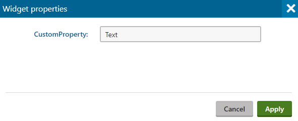
The following example shows the declaration of a property that has the TextInputComponent form component assigned as its editing component.
        // Assigns the 'TextInputComponent' as the editing component of the 'CustomProperty' property
        [EditingComponent(TextInputComponent.IDENTIFIER)]
        public string CustomProperty { get; set; }
The data type (i.e., string, decimal, etc.) of the editing component must correspond to the data type of the property being annotated.
The property now becomes visible in the component’s property configuration dialog or in the properties panel in the form builder interface (for form builder components).

Available form components
To learn about the form components that the system provides by default, see:
- Reference - System form components
- Selectors for page builder components
- Rich text editor for builder components
Identifiers of system form components are contained in the IDENTIFIER constant, available in the given form component classes.
Additionally, you can develop custom form components for any required scenarios.
Configuring editing component properties
All form components provide several system properties, which you can set to adjust the resulting property configuration interface. The EditingComponent attribute has optional constructor parameters that provide a shorthand for configuring these properties:
- Label – the label text displayed in the property’s configuration interface. Can be localized by setting the value to an expression in format: {key}. Replace “key” with the key of a resource string.
- DefaultValue – the default value of the property’s input field.
- Tooltip – text displayed for the property on mouse hover. Can be localized by setting the value to an expression in format: {key}
- ExplanationText – a short message displayed under the property’s input field. Can be localized by setting the value to an expression in format: {key}
- Order – the order in which the properties appear in the editing interface.
By default, form components designated as editing components use the initial default values of their properties.
Individual form components also have their own properties, which you can configure for editing components by adding the EditingComponentProperty attribute with the following parameters:
- PropertyName – a string matching the name of the form component property that you wish to set (you can use the nameof expression).
- PropertyValue – a value to assign to the property. For properties with text values, you can set localized values through expressions in format: {key}
The following sample code demonstrates how to set an editing component’s property:
        // Enables the 'ACustomProperty' property for editing via the properties panel and assigns 'CustomFormComponent' as its editing component
        [EditingComponent("CustomFormComponent")]
        // Sets the editing component's 'MyProperty' property to '10'
        [EditingComponentProperty("MyProperty", 10)]
        // Sets the editing component's 'CustomProperty' to a localized value using the 'customproperty.value' resource string
        [EditingComponentProperty("CustomProperty", "{$customproperty.value$}")]
        public string ACustomProperty { get; set; }
Framework data annotation attributes
You can use data attributes provided by the .NET framework in the System.ComponentModel.DataAnnotations namespace to annotate properties. For example, to set a property as required, annotate it with the Required attribute:
        // Assigns the 'IntInputComponent' as the editing component of the 'MyProperty' property and configures its system properties
        [EditingComponent(IntInputComponent.IDENTIFIER, ExplanationText = "Please enter a number", Label = "Custom property", Tooltip = "Stores a numeric value.", Order = 0)]
        [Required]
        public int MyProperty { get; set; }
Adding visibility conditions for properties
You can add dynamic visibility conditions that restrict how and when properties are displayed in the configuration dialog or panel.
For more information, see: Adding visibility conditions for builder component properties
Configuring editing component state
You can completely take over the editing component configuration logic (editing component property values, visibility conditions) via component configurators. Configurators are custom classes that give you access to an instance of the editing component and allow you to configure all of its aspects.
For more information, see: Configuring editing component state in builder configuration dialogs