
CMSMenu
The CMSMenu control allows you to display a multi-level navigation based on document data from Kentico.
Web part equivalent (portal engine): Drop-down menu
Getting started
The following is a step-by-step tutorial that shows how to display a DHTML menu containing Kentico documents using the CMSMenu control:
Create a new Web form somewhere in your web project.
Drag the CMSMenu control from the toolbox onto the form.
Set the following properties for the control:
- Layout: Horizontal
- ClassNames: CMS.MenuItem;CMS.Software
- CSSPrefix: Main;Sub
This tells the control to use a horizontal layout and which types of documents to display. In this example, the menu only displays standard pages and software product types, but you can specify any other document types as needed.
The CSSPrefix property specifies which CSS classes the menu uses to generate the main menu and sub-menus. See: Building website navigation - Using CSS prefixes
<cms:CMSMenu ID="CMSMenu1" runat="server" Layout="Horizontal" ClassNames="CMS.MenuItem;CMS.Software" CSSPrefix="Main;Sub" />
Add the following style definitions inside the page’s <head> element:
 <style type="text/css">

 /* horizontal menu - main menu */
 .MainCMSMenu { BORDER-RIGHT: 0px; TABLE-LAYOUT: fixed; BORDER-TOP: 0px; BORDER-LEFT: 0px; WIDTH: 100px; BORDER-BOTTOM: 0px; BACKGROUND-COLOR: #b8bafe }
 .MainCMSMenuItem { PADDING-RIGHT: 15px; PADDING-LEFT: 5px; FONT-SIZE: 10pt; PADDING-BOTTOM: 2px; WIDTH: 100px; COLOR: black; PADDING-TOP: 2px; FONT-FAMILY: verdana }
 .MainCMSMenuItemMouseUp { PADDING-RIGHT: 15px; PADDING-LEFT: 5px; FONT-SIZE: 10pt; PADDING-BOTTOM: 2px; WIDTH: 100px; COLOR: black; PADDING-TOP: 2px; FONT-FAMILY: verdana }
 .MainCMSMenuItemMouseOver { PADDING-RIGHT: 15px; PADDING-LEFT: 5px; FONT-SIZE: 10pt; PADDING-BOTTOM: 2px; WIDTH: 100px; CURSOR: pointer; COLOR: white; PADDING-TOP: 2px; FONT-FAMILY: verdana; BACKGROUND-COLOR: #4a3c8c }
 .MainCMSMenuItemMouseDown { PADDING-RIGHT: 15px; PADDING-LEFT: 5px; FONT-SIZE: 10pt; PADDING-BOTTOM: 2px; WIDTH: 100px; COLOR: black; PADDING-TOP: 2px; FONT-FAMILY: verdana }
 .MainCMSMenuHighlightedMenuItem { PADDING-RIGHT: 15px; PADDING-LEFT: 5px; FONT-SIZE: 10pt; PADDING-BOTTOM: 2px; WIDTH: 100px; COLOR: black; PADDING-TOP: 2px; FONT-FAMILY: verdana; BACKGROUND-COLOR: #ff7315 }
 .MainCMSMenuHighlightedMenuItemMouseUp { PADDING-RIGHT: 15px; PADDING-LEFT: 5px; FONT-SIZE: 10pt; PADDING-BOTTOM: 2px; WIDTH: 100px; CURSOR: pointer; COLOR: black; PADDING-TOP: 2px; FONT-FAMILY: verdana; BACKGROUND-COLOR: #ff7315 }
 .MainCMSMenuHighlightedMenuItemMouseOver { PADDING-RIGHT: 15px; PADDING-LEFT: 5px; FONT-SIZE: 10pt; PADDING-BOTTOM: 2px; WIDTH: 100px; CURSOR: pointer; COLOR: black; PADDING-TOP: 2px; FONT-FAMILY: verdana; BACKGROUND-COLOR: #ff7315 }
 .MainCMSMenuHighlightedMenuItemMouseDown { PADDING-RIGHT: 15px; PADDING-LEFT: 5px; FONT-SIZE: 10pt; PADDING-BOTTOM: 2px; WIDTH: 100px; CURSOR: pointer; COLOR: black; PADDING-TOP: 2px; FONT-FAMILY: verdana; BACKGROUND-COLOR: #ff7315 }

 /* horizontal menu - sub-menus */
 .SubCMSMenuItem { PADDING-RIGHT: 15px; PADDING-LEFT: 5px; FONT-SIZE: 10pt; BACKGROUND: #e7e7ff; PADDING-BOTTOM: 2px; WIDTH: 100px; COLOR: black; PADDING-TOP: 2px; FONT-FAMILY: verdana }
 .SubCMSMenuItemMouseUp { PADDING-RIGHT: 15px; PADDING-LEFT: 5px; FONT-SIZE: 10pt; PADDING-BOTTOM: 2px; WIDTH: 100px; COLOR: black; PADDING-TOP: 2px; FONT-FAMILY: verdana }
 .SubCMSMenuItemMouseOver { PADDING-RIGHT: 15px; PADDING-LEFT: 5px; FONT-SIZE: 10pt; PADDING-BOTTOM: 2px; WIDTH: 100px; CURSOR: pointer; COLOR: white; PADDING-TOP: 2px; FONT-FAMILY: verdana; BACKGROUND-COLOR: green }
 .SubCMSMenuItemMouseDown { PADDING-RIGHT: 15px; PADDING-LEFT: 5px; FONT-SIZE: 10pt; PADDING-BOTTOM: 2px; WIDTH: 100px; COLOR: black; PADDING-TOP: 2px; FONT-FAMILY: verdana }
 .SubCMSMenuHighlightedMenuItem { PADDING-RIGHT: 15px; PADDING-LEFT: 5px; FONT-SIZE: 10pt; PADDING-BOTTOM: 2px; WIDTH: 100px; COLOR: black; PADDING-TOP: 2px; FONT-FAMILY: verdana; BACKGROUND-COLOR: #ff7315 }
 .SubCMSMenuHighlightedMenuItemMouseUp { PADDING-RIGHT: 15px; PADDING-LEFT: 5px; FONT-SIZE: 10pt; PADDING-BOTTOM: 2px; WIDTH: 100px; CURSOR: pointer; COLOR: black; PADDING-TOP: 2px; FONT-FAMILY: verdana; BACKGROUND-COLOR: #ff7315 }
 .SubCMSMenuHighlightedMenuItemMouseOver { PADDING-RIGHT: 15px; PADDING-LEFT: 5px; FONT-SIZE: 10pt; PADDING-BOTTOM: 2px; WIDTH: 100px; CURSOR: pointer; COLOR: black; PADDING-TOP: 2px; FONT-FAMILY: verdana; BACKGROUND-COLOR: #ff7315 }
 .SubCMSMenuHighlightedMenuItemMouseDown { PADDING-RIGHT: 15px; PADDING-LEFT: 5px; FONT-SIZE: 10pt; PADDING-BOTTOM: 2px; WIDTH: 100px; CURSOR: pointer; COLOR: black; PADDING-TOP: 2px; FONT-FAMILY: verdana; BACKGROUND-COLOR: #ff7315 }

 </style>
These CSS styles modify the appearance of the menu. The CMSMenu control renders a menu even without any CSS classes, but it is extremely basic.
The example uses the local <head> element only for convenience. If you wish to use the control on a Kentico website, it is recommended to define the CSS classes in the website’s stylesheet in the CSS stylesheets application.
Save the web form.
Right-click the web form in the Solution explorer and select View in Browser.
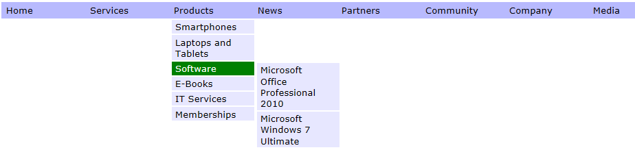
The resulting page displays the following menu:
Configuration
You can set the following properties for the CMSMenu control:
|
CMSMenu properties |
Description |
Sample value |
|
CSSPrefix |
Sets the prefixes added to the names of the control’s CSS classes. Add prefixes for individual levels of the menu separated by semicolons (;). |
“main;submenu1;submenu2” |
|
Cursor |
Determines the mouse cursor that the control displays for users controlling the menu. |
“Default” |
|
EnableMouseUpDownClass |
Indicates whether the menu renders different CSS classes for mouse-up and mouse-down events. |
|
|
EnableRTLBehaviour |
Indicates whether a right-to-left layout should be used on documents displayed in a RTL culture. Indicates whether the menu uses a right-to-left layout on documents displayed in RTL cultures. |
|
|
EncodeMenuCaption |
Indicates whether the control HTML encodes the captions of menu items. Enable if you need to display documents whose names contain HTML code. |
|
|
ExternalScriptPath |
Sets the path of the external .js file with skmMenu scripts that generate the menu. The default path is ~/cmsscripts/skmmenu.js. |
“~/myscripts/skmmenu.js” |
|
HighlightedMenuItem |
You can use this property to get the currently highlighted menu item and set its CSS classes. |
|
|
HighlightedNodePath |
Path of the menu item that the control highlights. If empty, the control automatically uses the page’s current alias path. |
“/products/PDAs” |
|
Layout |
Determines the layout of the menu — horizontal or vertical. |
“Vertical” |
|
MenuControl |
This property can be used to access the internal menu (skmMenu) control and its CSS classes and properties. |
|
|
Padding |
Sets the padding of the CMSMenu table. |
|
|
RenderImageAlt |
Indicates whether the control renders ALT attributes for images used in the menu (for XHTML compatibility). |
|
|
RenderItemName |
Indicates if the control renders the ItemName attributes of menu items in the output HTML code. |
|
|
SeparatorCssClass |
Sets the name of the CSS class applied to the separator cell (TD element) for the top menu level. |
|
|
SeparatorHeight |
Height of the separator placed between menu items of the top menu level. |
|
|
SeparatorText |
Text of the separator placed between menu items of the first menu level. |
“|” |
|
Spacing |
Sets the spacing of the CMSMenu table. |
|
Common navigation properties |
Description |
Sample value |
|
ApplyMenuDesign |
Indicates whether the control applies document menu design settings. True by default. |
|
|
Columns |
Contains the names of columns that the control loads for documents (menu items) in addition to the default columns. If you need data from other columns, type their names separated by commas. Note: To find a full list of the default navigation columns, use the SQL queries debuggingtool and inspect the query performed by your navigation control. |
“DocumentPageTitle, |
|
HideControlForZeroRows |
Indicates whether the control should be hidden when no data is loaded. Default value is False. |
|
|
HighlightAllItemsInPath |
Indicates whether the control highlights all items on the visitor’s current path. |
|
|
SubmenuIndicator |
Path to an image displayed next to every menu item that contains sub-items. |
|
|
UseAlternatingStyles |
Indicates whether the control uses alternating styles for even and odd items on the same menu level. |
|
|
UseItemImagesForHiglightedItem |
Indicates whether the control uses the item image if the highlighted image is not specified. |
|
|
WordWrap |
Indicates whether text displayed by the control uses word wrapping. If disabled, text that is too long is replaced by ‘nbsp’. |
|
|
ZeroRowsText |
Text shown when the control is hidden by the HideControlForZeroRows property. |
“No records found.” |
|
Document filtering properties |
Description |
Sample value |
|
CheckPermissions |
Indicates if the control checks the permissions of the user viewing the page. If the value is false (default value) no permissions are checked. If true, the control only loads documents for which the user viewing the page has read permissions. |
|
|
ClassNames |
Specifies which document types the control loads and displays. Identify document types through their code names, separated by semicolons (;). You can use the * wildcard as a substitute for any number of characters. For example Product.* includes the document types Product.Camera, Product.CellPhone, Product.Computer etc. If the property is left empty, the control retrieves all document types by default. In the case of menu and navigation controls, only page (CMS.MenuItem) documents are loaded by default. Note: If the control loads all document types (empty value), only the common data columns from the View_CMS_Tree_Joined view are available in the retrieved data. The specific fields of individual document types are not included. You need to keep this in mind when writing the code of transformations, WHERE conditions, ORDER BY expressions etc. |
“cms.news” |
|
CombineWithDefaultCulture |
Indicates whether the control loads documents from the website’s default culture version if the required documents are not available in the user’s selected culture. Only applies if you do not set the TreeProvider property manually. |
|
|
CultureCode |
Specifies the culture code of the documents that the control loads. If not specified, the control automatically uses the preferred culture of the user viewing the page. |
“en-us” |
|
DataSource |
Allows you to manually assign a DataSet or DataTable containing the documents that the control displays. You do not need to set this property for standard scenarios. |
|
|
FilterOutDuplicates |
Indicates if the control filters out duplicated (linked) documents from the data. |
|
|
MaxRelativeLevel |
Specifies the maximum number of content tree sub-levels from which the control displays documents. This number is relative, i.e. counted from the location of the page where the control is placed, not from the root of the website. Enter -1 to load all child documents. |
|
|
Path |
Path of the documents that the control loads. |
|
|
SelectOnlyPublished |
If enabled, the control only loads published documents. |
|
|
TreeProvider |
Gets or sets the TreeProvider object used by the control to access document data. If you do not assign a TreeProvider object, the control automatically creates a new instance. |
|
CMS Base control properties |
Description |
Sample value |
|
CacheDependencies |
List of the cache keys on which the control’s cached data depends. When the specified cache items change, the control clears its cache. Each item (dependency) must be on one line. If you leave this property empty, the control uses default dependencies. See also: Setting cache dependencies, Configuring caching |
cms.user|all |
|
CacheItemName |
Sets the name of the cache key used to store the control’s content. If you leave the value empty, the system generates a default name containing variables, such as the control ID, the selected culture and the name of the user who loaded the page. The system cache is shared by all pages in your application, so cache item names representing different data must be unique globally. If you have multiple controls that load the same data, you can share the cache keys between the controls (optimizes loading of content and avoids redundant data in the cache). If the content displayed by the control depends on variables, such as URL parameters, you can set a custom name dynamically in the page’s code behind. See also: Caching the data of page components, Configuring caching |
“CMSRepeaterNews” + |
|
CacheMinutes |
Sets the number of minutes for which the control caches content retrieved from the database.
Allows you to set up caching of content so that the control doesn’t have to retrieve content from the database on each request. The caching mechanism uses absolute expiration time. This means that cache items expire after a specified time period even if the page containing the control wasn’t requested. See also: Caching the data of page components, Configuring caching |
|
|
FilterControl |
Gets or sets the filter control used to limit the data read by the control. |
|
|
FilterName |
Gets or sets the code name of the filter control used to limit the data read by this control. |
|
|
OrderBy |
Gets or sets the ORDER BY clause of the SQL query that the control uses to load data. |
“NewsReleaseDate DESC” |
|
SelectedColumns |
Database table columns that the control loads for documents, separated by commas ( , ). If null or empty, the control loads all available columns. |
|
|
SiteName |
Specifies the code name of the Kentico website for which the control loads data. |
|
|
StopProcessing |
If true, the control stops all processing — does not load or display any data or other HTML output. |
|
|
TopN |
Specifies the maximum number of database records that the control loads. |
|
|
WhereCondition |
Gets or sets the WHERE clause of the SQL query that the control uses to loads data. |
“ProductPrice > 100” |
Appearance and styling
The appearance of the CMSMenu control is determined by its properties and CSS classes. You can use the following CSS classes to modify the design of the control:
|
CSS class name |
Applies to |
|
CMSMenu |
The main table element generated by the control. |
|
CMSMenuItem |
Standard menu items. |
|
CMSMenuItemMouseDown |
Menu items when the mouse button is clicked and held. |
|
CMSMenuItemMouseOver |
Menu item that users hover over. |
|
CMSMenuItemMouseUp |
Menu items when the mouse button is released. |
|
CMSMenuHighlightedMenuItem |
Highlighted menu items. |
|
CMSMenuHighlightedMenuItemMouseDown |
Highlighted menu items when the mouse button is clicked and held. |
|
CMSMenuHighlightedMenuItemMouseOver |
Highlighted menu items that users hover over. |
|
CMSMenuHighlightedMenuItemMouseUp |
Highlighted menu items when the mouse button is released. |
The recommended place to define these classes is in a Kentico stylesheet using the CSS stylesheets application.
You can apply stylesheets to:
- Entire websites
- Individual documents (pages) that contain the control