Developing wireframe components
All wireframe components are defined as web parts of a specific type. The system allows you to develop new web parts and modify existing ones, so you can create any custom wireframing tools that your website requires.
The following example demonstrates how to create a custom wireframe component representing a button with a resizable width. You can develop more complex components by following the same basic principles. For additional inspiration, you can inspect the code of the default wireframe web parts found in the ~/CMSWebParts/Wireframes folder of your web project.
Registering the new wireframe web part
Open the Web parts application.
Expand the Wireframe category at the bottom of the catalog tree and select the Forms sub-category.
Click New web part above the tree.
Choose Create a new web part and enter the following values:
- Display name: Resizable button
- File path: ~/CMSWebParts/Wireframe/Forms/CustomResizableButton.ascx
- Generate the code files: yes (checked)
Click Save.
On the new web part’s General tab, set the following options:
- Type: Wireframe (all web parts that you wish to use as wireframe components must use this type)
- Skip initial configuration: yes(allows users to add the web part to wireframe grids without having to configure its properties)
Click Save.
Switch to the Properties tab.
Click New field and set the following values:
- Field name: Text
- Field type: Text
- Field size: 100
- Default value: OK
- Field caption: Button caption
- Form control: Text box
The purpose of the Text property is to store the value of the button’s text caption.
Click Save.
Switch to the CSS tab and add the following class definition:
.WireframeResizableButton
{
   border: solid 3px #000;
   padding: 5px 15px 5px 15px;
   display: block;
   overflow: hidden;
   text-align: center;
   min-width: 50px;
}
The WireframeResizableButton class will be used to style the button component.
Click Save.
Implementing the component’s functionality
Open your web project in Visual Studio.
Navigate to the CMSWebParts/Wireframe/Forms folder.
- The folder contains the CustomResizableButton.ascx file and its ascx.cs code behind, which were generated by the system when you created the web part.
Edit CustomResizableButton.ascx and add the following controls into the markup:
 <cms:EditableWebPartProperty runat="server" id="txtElem" CssClass="WireframeResizableButton" PropertyName="Text" Type="TextBox" />
 <cms:WebPartResizer runat="server" id="resElem" HorizontalOnly="true" RenderEnvelope="true" />
These are two instances of server controls from the CMS.PortalControls namespace that display content and provide the wireframe editing functionality.
Control
Description
EditableWebPartProperty
Renders a text value in a way similar to a standard literal control. Users can edit the value by double-clicking the text in the wireframe.
- The **PropertyName** specifies the name of the web part property that is affected by the editing. Notice that the value matches the *Column name* of the web part's only property (Text).- Through the **Type** property, you can choose what kind of editing interface the control displays.The appearance of the control in the wireframe grid is typically defined using CSS classes, such as the *WireframeResizableButton* class in the current example.WebPartResizer
Adds a resizer that allows users to easily change the dimensions of the component directly in the wireframe.
The HorizontalOnly property is set to true in the example, so the component only supports width resizing in this case.
Other available control options:
EditableWebPartImage
Displays image content. Users can select the image through a dialog by double-clicking the current output.
EditableWebPartList
Represents a list of items formatted in a certain way, such as a menu or table. Users enter the value as text, with each item separated by a new line.
EditableWebPartColor
Displays an area in a specified color. Users can double-click the component to select the color.
Edit the code behind file. Because the file was generated specifically for a web part, the control already inherits from the appropriate base class and also contains two default regions and several basic method definitions.
Add a Text property into the Properties region, which handles the corresponding property of the web part object (defined in step 4). The overall code of the class should now match the following:
 public partial class CMSWebParts_Wireframe_Forms_CustomResizableButton : CMSAbstractWebPart
 {
      #region "Properties"

     /// <summary>
     /// Accesses the value of the web part's Text property.
     /// </summary>
      public string Text
      {
          get
          {
              return ValidationHelper.GetString(this.GetValue("Text"), "");
          }
          set
          {
              this.SetValue("Text", value);
          }
     }

     #endregion

     #region "Methods"

     /// <summary>
     /// Content loaded event handler.
     /// </summary>
     public override void OnContentLoaded()
     {
          base.OnContentLoaded();
          SetupControl();
     }

     /// <summary>
     /// Initializes the control properties.
     /// </summary>
     protected void SetupControl()
     {
          if (this.StopProcessing)
          {
              // Do not process
          }
          else
          {

          }
     }

     /// <summary>
     /// Reloads the control data.
     /// </summary>
     public override void ReloadData()
     {
          base.ReloadData();

          SetupControl();
     }

     #endregion
 }
Implement the SetupControl method:
 /// <summary>
 /// Initializes the control properties.
 /// </summary>
 protected void SetupControl()
 {
      if (StopProcessing)
      {
          // Do not process.
      }
      else
      {
          // Loads and assigns the button caption.
          txtElem.Text = Text;

          // Sets up width resizing.
          string width = WebPartWidth;
          if (!String.IsNullOrEmpty(width))
          {
              txtElem.Style += String.Format("width: {0};", width);
          }

          // Connects the button control to the resizer.
          resElem.ResizedElementID = txtElem.ClientID;
      }
 }
This method ensures that the web part displays the component correctly according to its current configuration.
- First, it checks that processing (visibility) is enabled for the web part.
- If true, the method loads the button’s caption text from the Text property and assigns it to the EditableWebPartProperty control.
- The method retrieves the width value of the button via the WebPartWidth property (inherited from the CMSAbstractWebPart parent class) and adds it to the button’s styles.
- The method binds the resizer to the button control through its ClientID.
Handling the width and height of wireframe components
In this example, the width property is not included in the configuration dialog of the web part and is handled exclusively through the resizer.
To register the width as a standard configuration option, define a property for the web part with WebPartWidth as its column name.
When creating components that also support vertical resizing, the WebPartHeight property (also inherited from the parent class) can be handled in the same way.
- Save both files.
- If your Kentico project was installed in the web application format, you must also Build the project.
The wireframe component is now fully functional and ready to be used.
Result
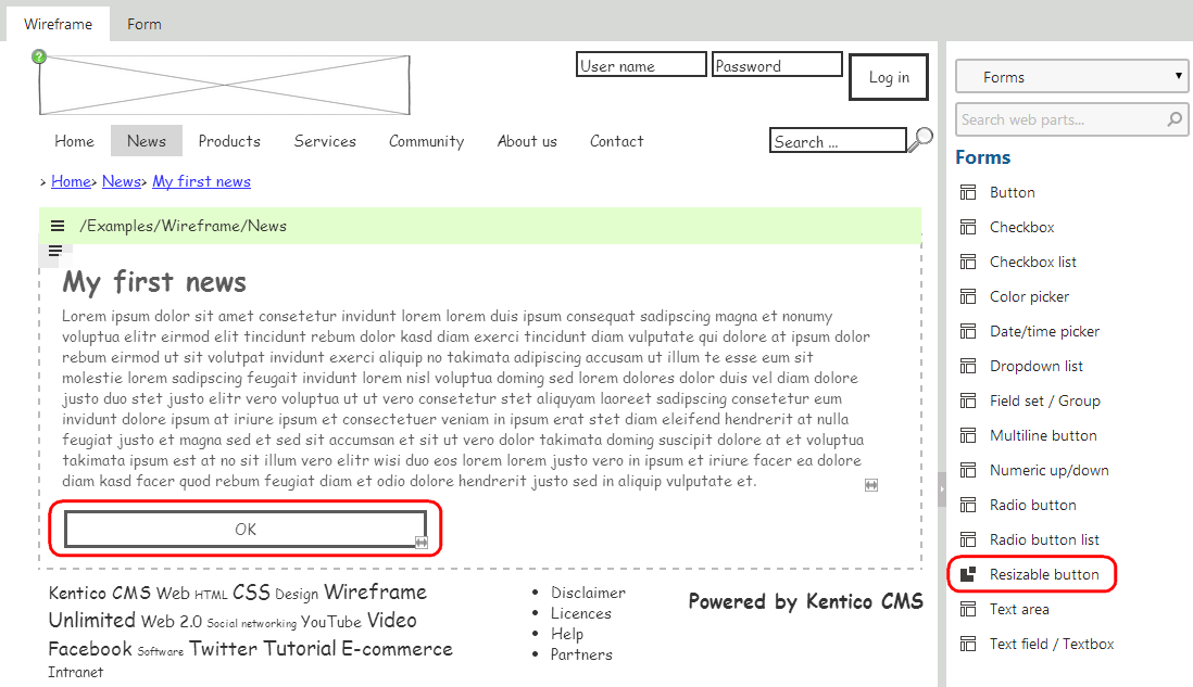
Add the Resizable button component to any wireframe on the website (for example the Examples -> Wireframe page on the sample Corporate Site). You can dynamically change the width of the button by dragging the arrow icon in its bottom right corner. Double‑clicking the button’s caption allows you to edit the text.