
Model Page Builder components for commerce
When building commerce experiences with Xperience by Kentico (XbyK), your content types determine what data you store and how you store them, while the presentation components determine how editors assemble and display that data on the website. The following sections focus on the presentation layer - Page Builder page templates, sections, and widgets – using a pet store commerce scenario with pet adoption services and a product catalog as an example.
You’ll learn how to design presentation components that let editors reference structured content from the Content hub while keeping the flexibility to override content for marketing campaigns, A/B testing, and personalization.
Companion to the commerce content modeling guide
If you haven’t designed your commerce content types yet, start with Model reusable Product SKU and Model reusable product guides to understand how reusable content works. Then go through modeling commerce page content types to define website pages and listing pages to display the content. The following sections build on those content types and focus on the presentation components editors use to display them.
Page Builder presentation overview
Xperience by Kentico’s Page Builder relies on a three-layer architecture for website content:
- Content types – represent the data structures for content items stored in the Content hub (products, pets, testimonials, articles) or in a structured format in website pages.
- Presentation components – page templates, sections, and widgets that define how content appears on the website, and allow editors to store channel-specific content.
- Page instances - specific pages where editors assemble content using presentation components.
Presentation components are the reusable building blocks that connect your content model to the pages people actually see. When they’re well designed, editors can mix and match them to create engaging pages that won’t break the website channel’s look and feel. They keep design consistent across the site, enable campaign optimization and personalization, and give teams creative freedom while staying within brand guardrails.
Every page follows a component hierarchy:
Content type (defines page data, can consist of a reusable content type with data, and a website content type with page-specific data)
└── Page Template (defines page structure and available components)
    └── Section (controls horizontal and vertical page layout)
        └── Widget (displays content from various sources)
            └── Content (data from *Content hub* or stored on page)
For a deep dive into widget theory and section design principles, see the guides on modeling Page Builder widgets and modeling Page Builder sections. The following parts focus on applying these concepts to commerce scenarios.
We recommend building every page on a page template and using Page Builder widgets to display the data. That’s why, in this material, we’ll start with widgets, then cover sections and page templates, and finish with some general recommendations.
Understand the three widget patterns
When designing widgets, your most important decision is how each widget sources its content. Xperience supports three distinct patterns, each with different trade-offs in terms of reusability and content governance.
Pattern A: Overwrite default content in widget properties
Mixed content widgets reference a content item from the Content hub and provide override properties that let editors customize specific fields without modifying the original content. This is the recommended pattern for most commerce widgets because it gives marketers the flexibility to optimize their content and messaging, campaign variations, and audience segmentation while keeping the core product or pet data intact.
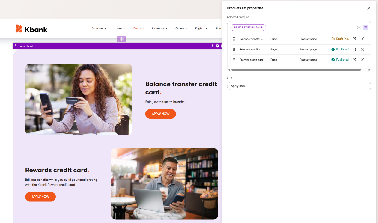
Example: A ProductCardWidget can reference a Premium Dog Food 25lb product from the Content hub. On a campaign page, the editor overrides the headline to Summer Special: Premium Dog Food and adds a 20% Off promotional badge - without changing the original product data. The following image shows the same scenario with a different product - a Car loan in the Kbank demo site.
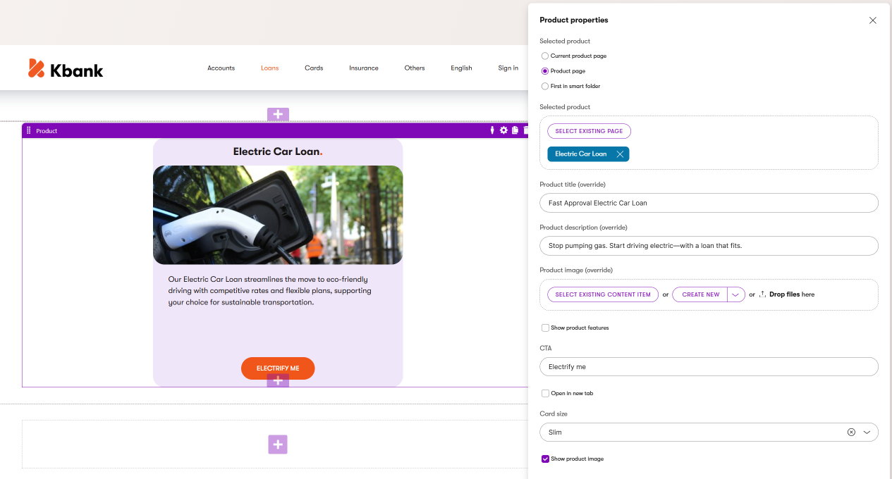
Editors use the product widget to select a product to display. They can override the default values for product title, description, and image. They can also adjust which product data is displayed in the widget, such as product features.
Pattern B: Reference content in widgets
Referenced content widgets display content exactly as it’s stored in the Content hub, with no override capabilities. Use this pattern when data integrity is the priority, and you need consistent, canonical content display.
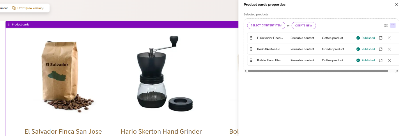
Example: An ImageWidget displays a product photograph exactly as stored, with the same aspect ratio, alt text, and caption everywhere it appears. Similarly, the Products widget on the Dancing Goat website displays only reusable product data, and editors have no way to override these default values, as you can see in the following picture.
Pattern C: Store content in widgets
Stored content widgets don’t reference Content hub data (except for images and similar assets). The data lives directly on the page within the widget configuration, which ties the content to a specific page URL and makes the content almost impossible to reuse in other channels. Use this pattern for truly one-off content that exists only on a specific page.
Example: A Rich Text Widget provides a unique introduction paragraph for a campaign landing page – content that won’t be reused anywhere else.
When to pick each pattern
|
Pattern |
Content source |
Overrides |
Best for |
|
Mixed content |
Content hub reference |
Yes - selective field overrides |
A/B testing, campaigns, promotional variations |
|
Referenced content |
Content hub reference |
No |
Canonical display, data integrity, consistent information |
|
Stored content |
Page-specific (stored in widget) |
N/A |
One-off messaging, page-specific content, visual utilities |
For more about how Xperience handles widget data storage and the implications for content reuse, see the differences between structured content and Page Builder content.
Now that you understand the three patterns, let’s explore how to design each type, starting with the most flexible widgets, which allow editors to adapt the reusable content.
Design Mixed content widgets
Mixed content widgets are the recommended pattern for most commerce widgets. They reference structured, product default (or core) content from the Content hub and provide editors with the option to override specific fields for campaigns, promotions, and optimization. The original content in the Content hub stays intact – overrides only apply to the specific page where the editor configures them.
Label override properties clearly
Make sure that editors understand that using these override properties is optional and what happens if left blank. You can use a pattern, such as: “Override [FieldName] (optional)” with a description like “If empty, displays the value from the Content hub.”
Widget examples from the pet store scenario
The following widgets are conceptual blueprints, not production-ready code. They illustrate how the three widget patterns apply to common commerce use cases within the pet store scenario introduced at the beginning of this guide - pet adoption services and a product catalog. Each example lists recommended properties grouped by category (content source, overrides, display, behavior) so you can see how the property design principles translate into practical widget designs.
Where relevant, the examples reference the Kbank demo site to show similar patterns in a real Xperience project. If you’d like to explore those implementations, start with the companion guides on modeling reusable Product SKUs and modeling commerce pages, which define the content types these widgets are built to display. Then you can explore the Training guides repository, which contains code samples of different widgets.
We provide multiple examples intentionally. Each widget faces different decisions about where the content comes from, which content editors can override, and how they can adjust content display. Reviewing them together helps you recognize recurring patterns you can adapt to your own project. If you already feel confident applying the three widget patterns to your content types, you can skip ahead to the section components section.
Pet Card widget
Displays a pet available for adoption with optional promotional overrides. You can design the widget to display data from the current page that references the pet item or another website page (that already references the pet item) in any of the channels, from the Content hub pet item, or to dynamically display an item editors added to a smart folder.
Confused about the content selection process? See how we designed the Product widget in the Kbank demo website.
Select pet
- Radio (Radio - Current pet page, Pet page, Content hub, Smart folder)
- Pet (Combined content selector/Smart folder selector - required)
Override properties:
- Override headline (Text - optional, defaults to pet name)
- Override description (Text area or Rich text - optional, defaults to pet description)
- CTA text (Text - optional, defaults to “Meet [PetName]” defined on the widget level)
- Open in new tab (Checkbox - boolean)
- Promotional badge text (Text - e.g., “Adoption Special!”)
- Promotional badge color (Dropdown - Company brand colors)
- Show adoption fee (Checkbox - boolean)
Display properties:
- Card style (Dropdown - Wide, Slim, Detailed, Featured, etc.)
- Image (Dropdown - Image variant names, or Text field - accept image variant name)
- Allow product quick view (Checkbox - Modal product preview that can trigger, e.g., on listing pages, that shows a summarized view with add-to-cart capability)
Use cases: Pet listing pages, homepage featured pets, and adoption campaign pages.
Product Card widget
Displays a product with purchase information and optional promotional overrides. It can use the same content selection mechanism as the Pet Card widget.
Select product
- Radio (Radio - Current product page, Product page, Content hub, Smart folder)
- Product (Combined content selector/Smart folder selector - required)
Override properties:
- Override headline (Text - optional, for optimization)
- Override description (Rich text or Text area - optional, for promotions)
- Override CTA text (Text - optional, defaults to “Add to Cart”)
- Promotional badge text (Text - e.g., “20% Off”)
- Promotional badge color (Dropdown - Company brand colors)
- Override price display (Text - e.g., “Starting at $19.99”)
Display properties:
- Card style (Dropdown - Wide, Slim, Detailed, Featured, etc.)
- Show rating (Checkbox - boolean)
- Show stock status (Checkbox - boolean)
- Show quick view button (Checkbox - boolean)
- Image (Dropdown - Image variant names, or Text field - accept image variant name)
Use cases: Product listing pages, related products, and upsell sections.
Testimonial widget
Displays a customer testimonial with optional excerpt customization.
Select testimonial (from Content hub)
- Testimonial (Combined content selector - required)
Override properties:
- Override quote excerpt (Text area or Rich text - can shorten for context)
- Highlight specific portion (Text - pull quote emphasis)
Display properties:
- Show customer photo (Checkbox - boolean)
- Show company/title (Checkbox - boolean)
- Show rating stars (Checkbox - boolean)
- Quote style (Dropdown - depending on the brand design, e.g., Standard, Blockquote, Card)
- Include verified badge (Checkbox - boolean)
Use cases: Product pages, landing pages, social proof sections.
Hero banner widget
The most flexible widget that can reference different content types or use fully custom content. You can follow the same content selection pattern as in the Pet Card widget. The widget’s display properties will depend on each company’s design manual, so use the following properties as ideas.
Select source content:
- Radio (Radio buttons - for indicating a decision)
- Current page (Radio)
- Pet or Product (Combined content selector - configured to allow selecting reusable Pet or Product content types or creating new content items of these types)
- Website page (Combined content selector - scoped to supported webpage content types)
- Banner (Campaign banner) (Combined content selector - reuse existing Banner from Content hub or create new)
Override/Custom properties:
- Headline (Text - required)
- Subheadline (Text)
- Description (Rich text)
- Background (Combined content selector - scoped to select assets, such as images or videos)
- CTA primary text (Text)
- CTA secondary text (Text - optional) and CTA secondary link (URL or page selector)
- CTA primary link (URL selector and Text field for external links)
Display properties:
- Height (Dropdown - Small, Medium, Large, Full width)
- Content alignment (Dropdown - Left, Center, Right)
- Overlay opacity (Number (or custom Slider component) - 0–100%)
- Text color scheme (Dropdown - Light, Dark, Auto)
- Show/Hide image (Checkbox - boolean)
- Add margin (Dropdown - Small, Medium, Large)
Use cases: Homepage hero, campaign landing pages, product launches.
For a detailed example of how a hero banner widget handles dependent properties and editor flows, see the hero banner editor flow in the widgets guide.
Call-To-Action widget
Prompts visitors to take a specific action. You can enhance CTA properties and give editors the option to select Content hub references for reusable CTAs, downloadable PDFs, and other relevant content. The decision-making pattern can follow a similar approach as the Pet Card widget.
We also recommend providing editors with a text field (or different component) they can use to add tracking IDs to call-to-action widgets. This will help them correctly track events through custom activities across different customer journeys and optimize their content.
Call-To-Action widget properties:
Select content from Content hub (optional):
- CTA content (Combined content selector - scoped to allowed content types or reusable field schemas)
CTA properties:
- Headline (Text)
- Description (Text area or Rich text editor)
- Button label (Text)
- Button link (URL or page selector)
- CTA identifier (Text - Depends on project specifications, e.g., custom_activity_name)
Display properties:
- Style (Dropdown - Depends on the brand design manual, for example, Box, Banner, Inline)
- Button style (Dropdown - Depends on the brand design manual, e.g., Primary, Secondary, Outline)
- Button size (Dropdown - Depends on the brand design manual, e.g., Small, Medium, Large)
- Icon (Combined content selector - optional, scoped to appropriate reusable content type)
- Background color (Dropdown - Depends on the brand design manual, e.g., Primary, Secondary, Highlights)
Use cases: In-content CTAs, sidebar promotions, end-of-article conversions. See also the landing page components guide for detailed CTA design considerations.
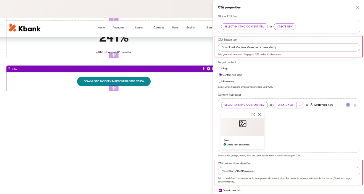
As you can see in the image above, editors can select a global Call to action content item (that represents a specific URL across all channels in the XbyK ecosystem). Or, they can create a call to action in place by adding a label and selecting a page, asset, or a specific URL directly in the widget properties. They can also assign a unique tracking ID to measure button clicks (in this case, file downloads) to visualize performance in a customer journey.
Additional Mixed content widgets to consider
Based on common commerce patterns, you may also want to design:
- BundleOffer widget - References a Product Bundle or Collection content types with overrides for name, savings callout, and CTA text. You can include a limited-time badge and display options to show included products and the savings calculation. Use for product upsells and cart recommendations.
- Promotion widget - Full-width promotional banner, for example, with a countdown timer, that allows editors to share incentive messaging and CTA. Combines Content hub reference with campaign-specific overrides.
- Category Preview widget - Visual category navigation cards that reference a product category, e.g., in Tag selector, and override the display image and teaser text for seasonal campaigns.
- Incentive Badge widget - Allow editors to share trust signals, such as showing shipping guarantees, return policies, and certification badges. You can include these properties in a custom reusable Featured content type with override capability for promotional periods.
Design Referenced content widgets
Referenced content widgets display content stored in the Content hub. Editors configure how the content looks through display properties, but they cannot change the content itself. This pattern is best for images, videos, and data-driven displays where consistency across channels matters.
Image widget
Displays an image exactly as stored in the Content hub.
Select an image from Content hub:
- Image asset (Combined content selector - required)
Display properties:
- Image size (Dropdown - Image variant names, e.g., Thumbnail, Medium, Large, Full-width),
- Image overlay (Dropdown - Depends on the brand design manual )
- Alignment (Dropdown - Left, Center, Right)
- Link URL (URL or Page selector - optional)
- Open in lightbox (Checkbox - boolean)
- Show caption (Checkbox - boolean from Image content item’s metadata)
- Enable lazy loading (Checkbox - boolean)
Use cases: Content images, product photography, decorative elements.
Video widget
Plays a video from the Content hub with configurable player settings.
Select a video from Content hub:
- Video asset (Combined content selector - required)
Display properties:
- Player controls (Dropdown - Full, Minimal, None)
- Autoplay (Checkbox - boolean)
- Muted by default (Checbox- boolean)
- Loop (Checbox- boolean)
- Aspect ratio (Dropdown - 16:9, 4:3, 1:1)
- Show transcript (Checkbox - boolean from asset metadata)
Use cases: Product demonstrations, tutorials, brand storytelling.
Feature Card widget
Displays a product or service feature from the Content hub.
Select featured content:
- Featured content (Combined content selector - required, scoped to allowed content types or reusable field schemas)
Display properties:
- Card style (Dropdown - icon-top, icon-left, minimal)
- Icon size (Dropdown - small, medium, large)
- Show learn more link (Checkbox - boolean)
Use cases: Product features, service offerings, benefit displays.
Product List widget
Displays product teasers with product name, short description, and image.
Select products
- Products (Combined content selector - Scoped against allowed content types or reusable field schemas, or from a smart folder)
Display properties
- CTA - (Text - Allow editors to provide a call to action)
- Display style - (Dropdown - Depends on the brand design manual, e.g., Stacked, Side-by-Side, Distributed)
- Number of products (Number - number of displayed products)
- Show/Hide product features (Checkbox - boolean)
See the Product list widget on the Kbank demo site.
Use cases: Product listing pages, related products, and upsell sections.
FAQ List widget
Displays a collection of FAQ items from the Content hub.
Select FAQs from Content hub:
- FAQ collection (Combined content selector - FAQ collection or a Tag selector for a category)
- OR Select multiple FAQ items (Combined content selector - multiple selection allowed, scoped against FAQ content type)
Display properties:
- Display style (Dropdown - Depends on brand design manual, e.g., Accordion, List, Cards)
- Show all expanded (Checkbox - boolean)
- Enable search (Checkbox - boolean)
- Group by category (Checkbox - boolean)
See the FAQ widget on the Kbank demo website.
Use cases: Help pages, product information, support sections. For more on FAQ widget design, see the landing page components guide.
Additional Referenced content widgets to consider
- Product Comparison widget - side-by-side comparison table referencing multiple Products. Display properties control which attributes to compare, highlight differences, and column layout. (For example, see the Product comparator widget in the Kbank demo site.)
- Pricing Table widget - references multiple Pricing Plan content items and displays them in a comparison layout. Properties include a highlighted featured plan, column layout, a show comparison toggle, and an annual/monthly pricing toggle. Use for service pricing pages and subscription offers.
- Location Map widget - references a Location content item and displays it on a map. Properties include zoom level, directions link, contact info display, and pin color. Use for store locator and contact pages.
- StoreNavigation widget - references product categories to build mega-menu or breadcrumb navigation. Display properties control navigation style, depth levels, and featured category highlights.
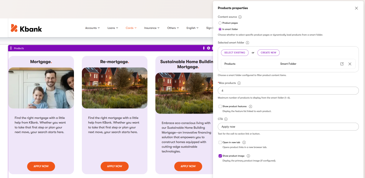
The image above shows the Products widget that you can see on the Kbank demo site. Editors can select data from a specific page or, as in this case, display products from a smart folder. They can adjust the call to action to unify the listing, and then adjust the look and feel of all the selected products section.
Design Stored content widgets
Stored content widgets hold all their data directly on the page, with no Content hub reference. Use this pattern sparingly - only for content that is truly unique to a specific page and won’t need to be reused elsewhere.
Content stored in widgets lives only on that page
Xperience stores Page Builder widget data - content and configuration - in a single database cell per page. This content cannot be queried, reused on other pages, or delivered through other channels. If there’s any chance the content will need to appear elsewhere, use a mixed content or referenced content pattern instead.
RichText widget
Editors can add free-form rich text content for page-specific messaging provided with XbyK’s out-of-the-box Rich text widget. Depending on your needs, developers can customize the rich text and provide editors with project-specific functionality.
Use cases: Page introductions, unique disclaimers, one-off announcements.
Additional Stored content widgets to consider
- Page heading - One-off headings, mostly on the landing pages. Properties: Heading text, Heading type (H2-H3), Heading visual size (Dropdown - Small, Medium, Large, Huge), Heading style (Dropdown - Depends on brand design manual). See the Page heading widget on the Kbank demo site.
- Spacer widget - Visual breathing room between content sections. Properties: Height in pixels or preset (Dropdown - Small, Medium, Large, Huge) with responsive height adjustments for mobile and tablet. (Can be replaced with dedicated section properties to add, e.g., additional margin between sections or padding to elements within the section.)
- Divider widget - Visual content separation. Properties: Divider style (Radio - Line, Dots, Dashed, Decorative), Width (Dropdown - Full, Centered-short, Centered-medium), Color, Thickness, Spacing above/below. (Can be replaced with a dedicated section property that creates a divider line.)
- Offer Countdown Timer widget - Time-limited offer countdown. Properties: End date/time (Date and time input), Expired message (Text), Timer label (Text), display format, color scheme, and size. Use for limited-time offers, event countdowns, and sales deadlines.
Design section components
Editors use sections to control the horizontal and vertical layout of a page. Sections organize space into widget zones where editors place widgets. Think of sections as the scaffolding that holds content in place. Well-designed sections provide consistent spacing, margins, and responsive behavior without requiring editors to seek developer help.
From a design perspective, the section used for commerce pages will look very similar to a generic Page Builder section. You can find detailed guidance on section modeling in a dedicated the guide on modeling Page Builder sections material that talks about Single column or Multicolumn sections. We will not discuss the generic sections here.
Additional section types to consider
Depending on your project’s complexity, you may also need:
- Product grid section - Flexible card/tile grid with configurable columns per breakpoint (Dropdown - Desktop: 2–6, Tablet: 2–4, Mobile: 1–2), row and column gaps, card style (Dropdown - Elevated, Flat, Bordered). Use for product grids, pet listings, and testimonial displays.
- Accordion section - Collapsible content panels with properties for allowing multiple panels open, default panel state, icon style (Radio - Plus/minus, Chevron, Arrow), and border style. Use for FAQs, product specifications, and shipping information.
- Tab section - tabbed content organization with tab position (Dropdown - Top, Left, Right), tab style (Radio - Pills, Underline, Boxed), default active tab, and URL anchor support for deep linking. Use for product variations, category filtering, and multi-view content.
- Carousel section - sliding content panels with visible slide count (1–5), autoplay with configurable interval, navigation arrows, pagination dots, and infinite loop option. Use for featured products, testimonials, and image galleries. (Depending on the design approach, you can also store these properties on a dedicated Carousel widget.)
Design page templates
Page templates define the page-level structure and guide the editing experience for a specific page content types.
Page templates specify available areas editors use to design a page’s layout and add content. Page templates often contain properties editors can use to adjust configurations of global elements, such as showing or hiding logo or navigation, selecting a specific style, or page color mode.
Add flexibility with Page Builder
In many commerce projects, you don’t want editors to manually craft every page from scratch or freely rearrange the layout of every element. Too much freedom leads to inconsistent product pages, different-looking listing pages, and a fragmented shopping experience.
Instead, aim for a uniform look and feel across all pages of the same type. Every product detail page should follow the same layout. Every listing page should present filters, sorting, and product cards in the same predictable structure. Consistency builds trust with shoppers and reduces the editorial effort needed to maintain large catalogs.
Xperience supports two approaches to achieve this consistency:
Preset page templates – Editors or architects design reusable preset templates with predefined sections, widgets, and layout configurations. Developers can then programmatically assign these presets when creating pages using the API, ensuring every new product or listing page starts with the correct structure.
Fixed layout templates – Developers build page templates where most content renders automatically in designated positions. Product images, descriptions, pricing, variant selectors, recommended products, and cross-sell or upsell sections all appear in consistent locations driven by the content model rather than manual editor placement.
Add editable areas even to fixed templates
Even when a page template defines a fixed layout, add Page Builder editable areas to listing pages and product detail pages. Page Builder widgets allow editors to tailor page content for specific audiences using personalization – for example, showing a loyalty discount banner to returning customers who regularly purchase a product, or adding a seasonal promotion section to a specific product category page.
Template examples from the pet store scenario
Like the widget examples above, the following templates are conceptual blueprints for the pet store scenario. They cover the most common commerce page types. Each template suggests properties and widget combinations that demonstrate how to balance structured consistency with editorial flexibility. Adapt them to match your project’s content types and design requirements.
Pet Listing template
Dynamically displays multiple pets available for adoption with filtering and grid layout options.
Template properties:
- Page title (Text - Displayed as page heading)
- Page description (Rich text - Introductory text below title)
- Filter configuration (Taxonomy selector - Pet types, age ranges, size categories)
- Grid layout (Dropdown - 2-column, 3-column, 4-column)
- Results per page (Number - Default: 12)
- Default sort order (Dropdown selector - Newest first, name A–Z, name Z–A)
Additional configuration
- Available sections: All section types.
- Recommended widgets: Pet Card widget, Image widget, Video widget, Testimonial widget, CallToAction widget, Product Card widget for recommended accessories, food, and treats, and other relevant content.
- Use case: Pages like /adopt/dogs or /adopt/cats.
Pet Detail template
Displays an individual pet profile with adoption information.
Template properties:
- Show adoption status badge (Boolean - Displays availability indicator)
- Show related pets (Boolean - Displays similar pets at the bottom)
- Application CTA style (Dropdown - Depends on the brand design manual, e.g., Primary, Secondary, Sticky)
Additional configuration:
- Available sections: SingleColumnSection, TwoColumnSection.
- Recommended widgets: HeroBannerWidget, ImageWidget, FAQListWidget, CallToActionWidget
- Use case: Pages like /adopt/dog/blackie or /adopt/cats/whiskers
Product Listing template
Displays a commerce product catalog with search, filtering, and sorting capabilities.
Template properties:
- Listing title (Text - Category or catalog heading)
- Listing description (Rich text - Category introduction)
- Product filter criteria (Taxonomy selector - Product categories, brands, price ranges)
- Grid layout (Dropdown - 2-column, 3-column, 4-column, list view)
- Enable search (Boolean - Shows search bar above results)
- Enable sorting (Boolean - Sort by price, name, popularity)
- Enable attribute filtering (Boolean - Filter by size, brand, etc.)
- Products per page (Number - 12, 24, or 48)
- Show “Add to Cart” in grid (Boolean - Enables quick add from listing)
Additional configuration:
- Available sections: All section types
- Recommended widgets: ProductCardWidget, HeroBannerWidget, CallToActionWidget
- Use case: Pages like /shop/dog-food or /shop/accessories
Product Detail template
Displays an individual product with purchase options, variant selectors, and related products.
Template properties:
- Show reviews section (Boolean - Displays customer reviews)
- Show related products (Boolean - Displays similar products)
- Related products count (Number - 4, 6, or 8)
- Enable variant selector (Boolean - For size/flavor/color variants)
- Sticky add-to-cart position (Dropdown - Top, side, bottom)
Additional configuration:
- Available sections: SingleColumnSection, TwoColumnSection
- Recommended widgets: ProductCardWidget (related products), TestimonialWidget, FAQListWidget, ImageWidget, VideoWidget
- Use case: Pages like /shop/products/premium-dog-food-25lb
Campaign Landing template
Marketing campaign pages with maximum editorial flexibility, designed for promotions and special offers. Design these templates to allow as much flexibility as possible, meaning editors will build these pages as one-offs using the Page Builder.
Template properties:
- Campaign name (Text - Internal tracking label)
- Campaign tracking code (Text - For analytics integration)
- Enable exit-intent popup (Boolean - Shows popup when visitor navigates away)
- Hero style (Dropdown - If you don’t provide a dedicated section for hero configuration, your template property might include configuration for the hero area, e.g., Image, video, Split-screen)
- Form placement (Dropdown - Top, middle, bottom, sidebar in case editors don’t use the built-in Form widget.)
Additional configuration:
- Available sections: All section types (unrestricted)
- Recommended widgets: All widgets - maximum flexibility for campaign creativity
- Use case: Pages like /promotions/summer-sale or /campaigns/new-customer-offer
Consider a Homepage template
Many pet store projects also benefit from a dedicated Homepage template with properties for featured pet spotlights, promotional banners, and quick navigation to adoption categories and product collections. Design the Homepage template with all section types available and a mix of Mixed content widgets (for promotional flexibility) and Referenced content widgets (for consistent branding).
Apply consistent property design patterns
Consistent property design across all your widgets, sections, and page templates creates a predictable editing experience. We’ll talk mostly about widget properties in this section, but the principles apply to all Page Builder component properties.
We recommend grouping widget properties into these five categories:
Content source properties - These properties define where the widget gets its data. Built-in Combined content selector form component allows you to restrict which reusable content users can link to. They also provide options for allowing single or multiple selections.
Override properties - Text overrides (choose between short text, text area, and rich text based on the content) and provide clear labeling. Use naming conventions across the whole project, for example, “Override [FieldName] (optional).” Include a description that explains the fallback behavior, for example: “If empty, displays the product name from the Content hub.”
Display/Styling properties - Layout options (grid, list, card styles), color schemes (use presets rather than custom color pickers to maintain brand consistency), spacing controls (padding, margins, gaps), and responsive behavior toggles.
Behavior properties - Interactive elements (links, buttons, hover effects), animation and transition options, and loading behaviors such as lazy loading and autoplay settings with sensible defaults.
Visibility/Conditional properties - Show/hide toggles for optional elements (dates, authors, metadata), conditional display based on whether data is present in the referenced content item, and permission-based visibility for audience-specific content.
How these categories apply across component types
Widgets use all five categories extensively, where content source and override properties are mostly relevant to Mixed content patterns.
Sections primarily use display/styling and visibility properties, with minimal content source needs (mainly widget zone configuration, background image/color, and rarely section title) and no override properties.
Templates balance content source (page-level filtering), display (global layout modes), and visibility (conditional areas) with fewer behavior properties than widgets.
Property design principles by component type
All components:
- Use clear, non-technical labels.
- Provide helpful descriptions and tooltips.
- Set sensible defaults.
- Use visibility conditions for context-specific properties
Widgets:
- Limit to 15 properties maximum; consider applying visibility conditions.
- Group logically: Content → Overrides → Display → Behavior.
- Avoid duplicating Content hub fields.
Sections:
- Limit to 10 properties.
- Focus on layout, spacing, and responsive behavior.
- Don’t include other content-specific properties than section styling.
Templates:
- Limit to 5-8 global properties.
- Affect the entire page, not individual components.
- Focus on page-level decisions and defaults.
Establish content governance for presentation components
Presentation components need governance rules that define who can create, modify, and use them. For some of the following situations, Xperience doesn’t provide built-in restrictions that automatically ensure consistency, so you need to establish the governance guidelines outside of Xperience, for example, within the editor team’s documentation.
Template governance:
- Define which roles can decide which templates are available for each website channel.
- Establish an approval process for new template requests.
- Document the purpose and intended use of each template.
Section governance:
- Decide whether all sections should be available in all templates, or restrict specific sections to specific templates for brand consistency.
- Require designer approval for custom section requests that go beyond the predefined set.
Widget governance:
- Control widget availability per template - campaign templates may offer all widgets, while product detail templates offer a curated set.
- Define override permissions: who can override referenced content with promotional messaging?
- Establish ownership for optimization and approval workflows - not every editor should be able to launch a promotional override without review.
- Create a review process for promotional badges and campaign-specific messaging.
Best practices for governance:
- Document the purpose of each component so that new team members understand the design decisions.
- Create component usage guidelines for editors with examples of when to use each widget pattern.
- Define clear rules for when to use Mixed content, Referenced content, and Stored content patterns.
- Balance flexibility with consistency - too restrictive prevents editors from responding to marketing opportunities, too permissive creates brand inconsistency.
Summary
Key takeaways
- Presentation components in XbyK follow a hierarchy: Page Template → Section → Widget → Content Item.
- Classify widgets into three patterns based on how they source content: Mixed content (Content hub reference + overrides), Referenced content (Content hub reference only), and Stored content (page-specific).
- Mixed content widgets are the recommended default for commerce scenarios - they let editors run campaigns and optimization tests without altering canonical content.
- Keep widget properties under 15 per widget, group them logically, and use conditional visibility to manage complexity.
- Establish governance rules for templates, sections, and widgets to balance editorial flexibility with brand consistency.
With your presentation components designed, you have the building blocks editors need to create commerce pages. Pair this with your commerce content types to complete the content model.