
Design website content
About this guide
This page is a part of the Content modeling guide which you should follow sequentially from beginning to end. You can also follow this series in Content modeling guide, which helps you keep track of your progress as you move through this sequential material.
Content tree hierarchy and page structure in website channels
In website channel applications, editors and marketers manage all the content they publish to their site. The content lives in a hierarchical structure called the content tree.
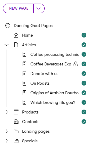
Not every item in the content tree necessarily needs to represent an actual page on the website. From a presentation perspective, we recognize three types of content stored in the content tree hierarchy:
|
Type of content |
Content from the presentation perspective |
|
Content types for pages accessible under a URL |
|
|
Content types for pages without a URL |
|
|
Folders |
|
Content tree-based routing
Depending on the website implementation, the content tree-based routing feature can generate page URLs based on their position within the content tree hierarchy. Learn more about features related to pages with URLs:
Create and organize website channel content
Xperience allows you to treat website channels as first-class citizens within your digital ecosystem. This means editors can create, manage, and design website content directly within the website channel application and they don’t need to switch between different contexts during their daily work. Editors can add or reuse content from the Content hub, craft channel-specific structured content, or create and adjust content directly within the webpage using Page Builder. Or, they can approach the website channels as one of the presentation layers that is on the same level as other digital marketing channels, and manage all their reusable content from the Content hub.
Content within a website channel can be navigable (forming part of the site’s structure and URL hierarchy) or non-navigable.
Developers can create content templates to display structured data dynamically. This ensures that the same content looks consistent across the website, but limits editorial control over design and layout. Alternatively, developers can design page templates that include Page Builder zones. Page templates provide editors with a flexible editing experience to manage page layouts, expose custom-built page template properties, and contain Page Builder widgets and sections.
Before we dive into details you’ll use in designing your content strategy, remember:
- Data in the Content hub is always reusable and can support multi-channel delivery.
- Data stored in a structured format within the website channel can be reused across the website and email channels where needed.
- Content added directly within widgets in Page Builder is page-specific and not reusable across other pages or channels.
We will discuss different options for displaying content in the website channel. For further details how to structure your digital content, see the dedicated materials on the atomic content model and the page-based model.
Design content for a website flow
You can design and present content using these Xperience features – or any combination of them:
- Predefined content templates
- Displays only structured content (that is stored through the page or )
- Define a layout for content based on the content types.
- Can be bound only to specific content types (e.g., layouts specifically for articles or blog posts, testimonials, etc.).
- Either assigned automatically or selectable by editors when creating pages.
- Created and managed by the developers.
- We recommend using content templates for content that needs to be tightly controlled.
- Page Templates
- Need to have Page Builder enabled, but don’t need to contain widgets or sections.
- Enables editors to adjust the layout of entire pages or specific sections dynamically.
- Often combined with predefined templates to allow editors to further customize options for displayed content.
- Created and enabled by developers but maintained by editors.
- This approach is suitable for most website pages.
Depending on your project’s implementation, content editors can have different options to create pages and manage their content. The most common workflows are:
- Editors use predefined templates to present structured content. Page template properties give editors limited control over the final appearance of the content they produce. Instead, the page’s overall layout is determined using MVC view files assigned to each content type. This approach ensures that all pages of a specific type (e.g., articles, event, or product pages) use a layout from a predefined set of designs.
- Editors modify the page content and its layout using Page Builder and provided components – widgets, sections, or Page Builder templates. This approach allows you to combine structured and unstructured content using dedicated Page Builder components.
- For example, using widgets that select a collection of Article pages (structured content) and enable additional formatting options such as a custom Call to action widget, the number of articles displayed per line, or personalized content, such as featuring different articles based on the visitor type (unstructured, Page Builder-specific content).
Design content using templates
Templates can combine means to display structured content with areas editable by Page Builder.
Xperience recognizes two types of templates:
- Page type templates
- A page content type can define a static display template for each page with or without options for editors to adjust it. We recommend using this type of template if you need to enforce a unified look and feel for all pages of a particular type (e.g., blog posts), without giving the editors additional freedom of customization.
- These templates do not require the Page Builder, which can simplify its production workflow – editors only fill in the necessary fields with their content, and the page is ready to go live. The type of the created page predetermines its design and layout.
- To learn more about how to set up these types of templates see Set up content tree-based routing.
Static content layout doesn’t need to span over the whole page. We recommend that even for pages, like listing, product, or article pages, developers enable editors to work with Page Builder. This will allow editors, for example, to tailor the “unified content piece” with personalized messaging. See article pages in the Kbank demo site for reference.
- Page Builder templates
- Page Builder templates allow content editors to choose from predefined page layouts when creating new pages.
- Editors can use page templates to present structured content, Page Builder content, or a combination of both, as described below.
- Developers prepare the templates and assign them to webpage content types.
- Each content type can have multiple default page templates to display content. When editors create a new page, they pick the most suitable template configuration. They can also save their custom template configurations into page Presets and use these presets for creating new pages.
Both template types may optionally include Page Builder sections to provide editors with further customization options using available Page Builder components. This type of content composition is widespread in many Xperience projects.
Recommendations – templates
We recommend basing every webpage content type on page templates with configurable page template properties and enable them for most of the pages. This gives editors additional capabilities, like save and reuse page template configuration. Pages that are not based on page templates cannot be switched to use page templates later in the development cycle.
Recommendations – page presets
To speed up content production and publishing, we recommend creating custom page presets for pages that work with Page Builder.
For example, a senior editor can create an empty page using the default page template, configure its layout with required sections and (empty) widgets, and save the configuration as a page Preset. When editors create a new page of this type, they’ll start working on a preconfigured page. This helps with content production and helps keep design consistency between pages with the same underlying content type.
Design content using Page Builder
Page Builder is a user-friendly interface where non-technical users manage the content and layout of pages using configurable components.
Editors work with Page Builder in website channels. They can build entire pages (or their sections), experiment with different layouts and page designs, and immediately see the results. Equipped with widgets and sections, editors can lay out content without asking developers for help whenever they want to build a new page or adjust the design of an existing page. Given the flexibility it provides to marketers, Page Builder is well-suited for frequently updated or campaign-focused pages.
Page Builder allows content editors to design parts or whole pages wherever developers enable it (by defining editable areas). Editors can use two types of components to format content using Page Builder: sections and widgets.
Sections specify the visual layout for widgets. They represent reusable pieces of markup that can store an arbitrary number of widget zones – areas where content editors place widgets.
Widgets are reusable components that content editors and non-technical users can quickly work with. Widgets give users more power and flexibility when adjusting page content and basic editing of text and images. By working with widgets, users decide which components are placed where on the page.
How Page Builder stores content
Developers prepare Page Builder components based on project requirements.
Page Builder stores widget content per instance, not as reusable structured data. Before choosing it to store specific content, ask whether this content will ever need to appear in more than one place, for example, in a listing, a search result, another page, or a different channel. If yes, Page Builder is the wrong storage approach. Store the content in the Content hub instead, and give editors a display widget to render this piece of content where they need. You can also provide editors with widget properties to override values retrieved from the Content hub.
If content reuse is not a requirement for a given page or section, the per-instance model is a reasonable fit.
When you are deciding how to use Page Builder in your project, also consider the following:
- Layout vs. content control. Does this content type require editors to control the layout, or only the content? For many webpage content types, especially in enterprise-size projects, layout is a developer concern and should be defined in code to ensure consistency. Introducing Page Builder widgets to store content adds flexibility that editors might not need.
- Scope of enablement. Consider webpages where editors should be able to change layout without creating formatting issues or introducing design inconsistencies. The larger the number of Page Builder pages, the harder this risk becomes to manage. One approach is to enable Page Builder only for specific page areas. This gives marketers control on-page engagement and guide visitors through the customer journey, while keeping the overall content design consistent.
- Content governance and longevity. Widget instances store content independently. The more instances that duplicate the same content, the more difficult content audits and bulk updates become.
Understand how Page Builder stores content
All content added directly to a Page Builder widget is stored in a single database field (CMS\_ContentItemCommonData → ContentItemCommonDataVisualBuilderWidgets), making it difficult to reuse. On the other hand, widgets that add design to structured content store only a reference to the linked content (using the GUID value).
Sometimes, projects require WYSIWYG editing through widgets that also store content. While specifying the project requirements, we recommend considering the implications of this design decision. Storing content directly in widgets significantly impacts content reusability or the project’s upgradeability.
See the different types of Page Builder widgets
Developers can prepare widgets to handle content in three ways:
- Widgets that present structured content
- Widgets that store and design the content at the same time
- Widgets that combine both inline editing and structured content
Widgets that present structured content
Editors add these widgets into appropriate Page Builder sections and select the content to display. Xperience can store the content itself in one of the following locations:
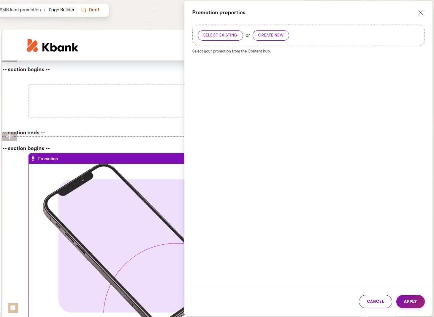
As content items in the Content hub. The widget serves only as a design container for the content stored in the Content hub. For example, a Promotion widget displays data stored in the Promotion content type. The editor either selects an existing promotion item, or creates a new one through widget properties:
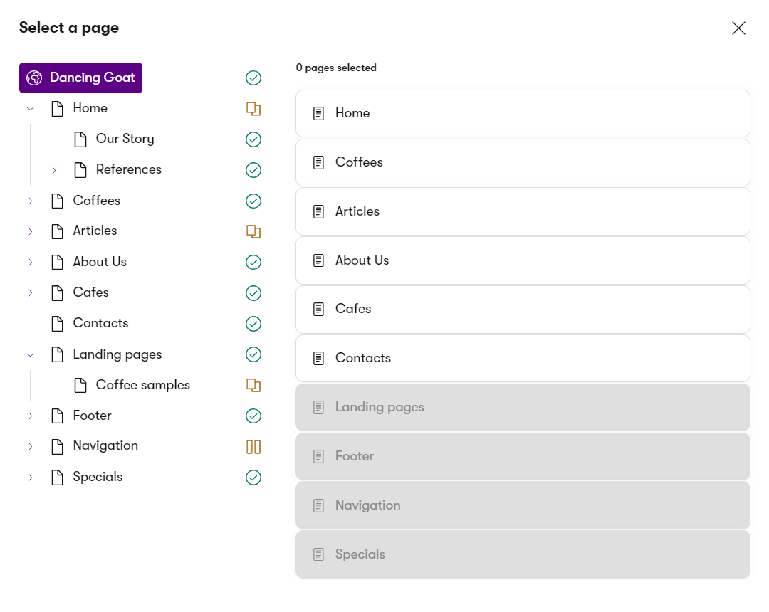
Elsewhere in Xperience website channel application. The widgets serve only as design containers for the content stored (and presented) elsewhere. For example, as shown below, editors can add a widget to a page and configure its source page using the Combined content item selector. The widget displays only several properties of the Article content type:
What does working with the reusable content look like?
For example, imagine editors are building a campaign landing page.
The page will contain a Hero element. From the design perspective, editors should select only the Hero banner content type from the Content hub to populate a Banner widget. From the editor’s perspective, adding reusable content to the page and displaying the structured data might look like the following video:
An editor adds a banner widget to the page. Instead of using the page data as source for the Banner widget, editor selects a custom hero banner content item from the Content hub.
When modeling the content storage, always consider the editor’s workflow. Help them understand what type of content they’re supposed to select.
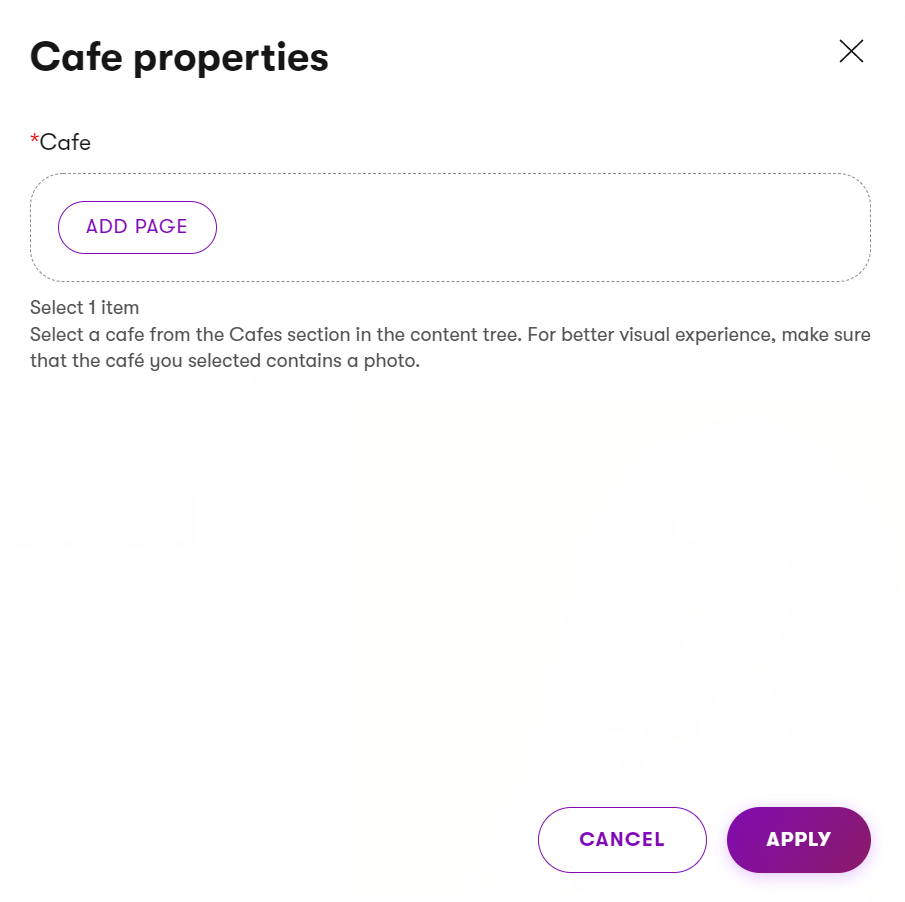
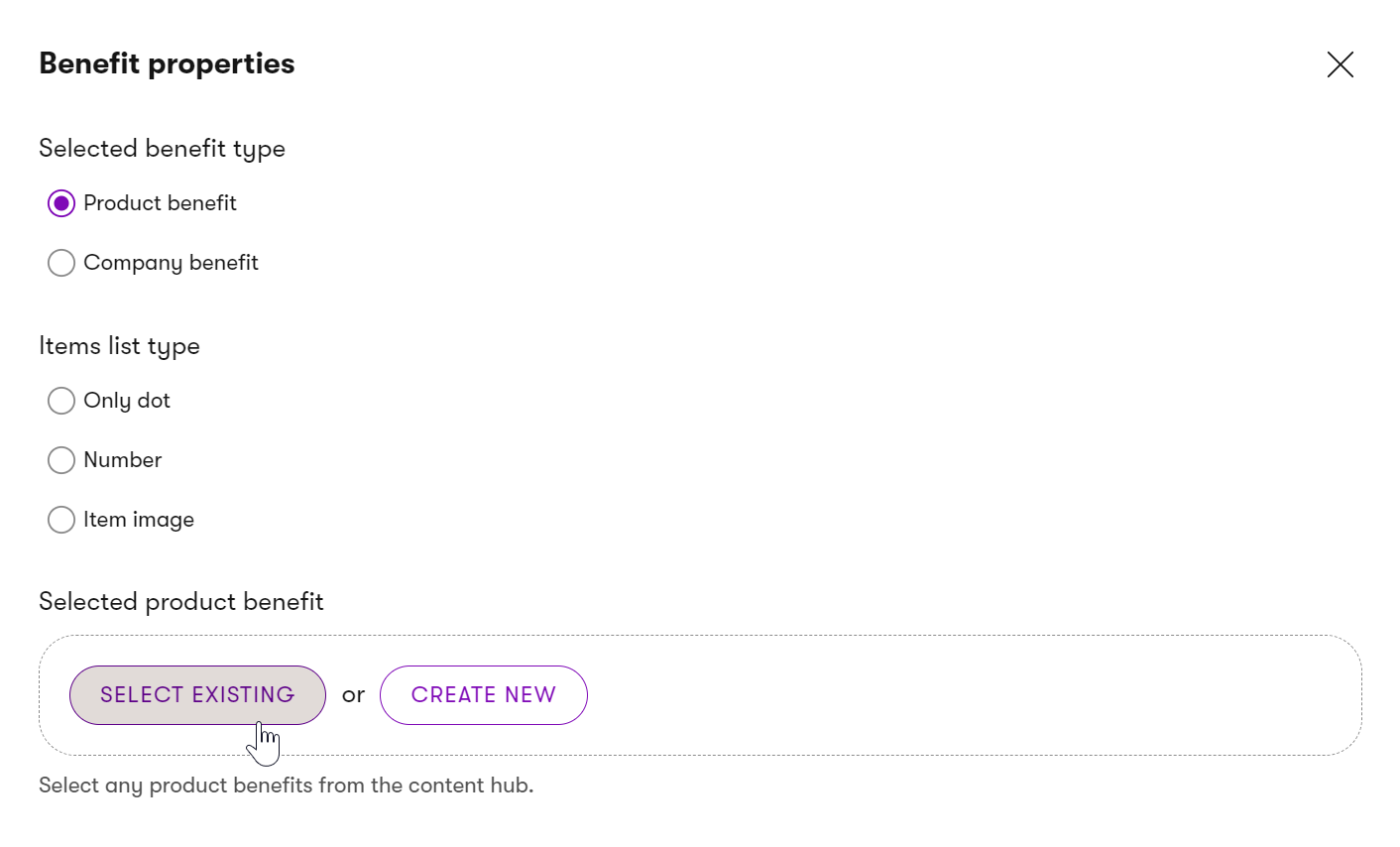
For example, you can use instructions next to the selectors in the widget properties and your project documentation to ensure editors receive enough guidance. As you can see in the image below, editor instruction explains that editor needs to select only one café from the content tree, and a note that the selected café item should include a photo for the best visual experience.
Similarly, ensure that editors will not unintentionally break the page experience by selecting content that doesn’t belong.
- Developers can restrict the selection to pages of specific webpage types that fulfill required conditions (e.g., have the URL feature enabled). See samples of the Xperience selectors in Reference - Admin UI form components. For example, the pages that editors cannot select are grayed out in the Page selector component.
- Similarly, developers define which type editors select into the widget properties, such as the Benefits widget in the Kbank demo site. First, editors use radio buttons to choose between a Product benefit or a Company benefit. Then, they decide whether benefits appear with a dot, a number, or an image. Finally, they select specific benefit content items from the Content hub.
Widgets that store and design the content at the same time
With these single-purpose content widgets, editors can manage the content in a WYSIWYG manner using inline editors, use the widget’s properties and add content through the widget’s configuration dialog, or combine both. The out-of-the-box Rich text widget is an example of a widget with advanced text styling capabilities.
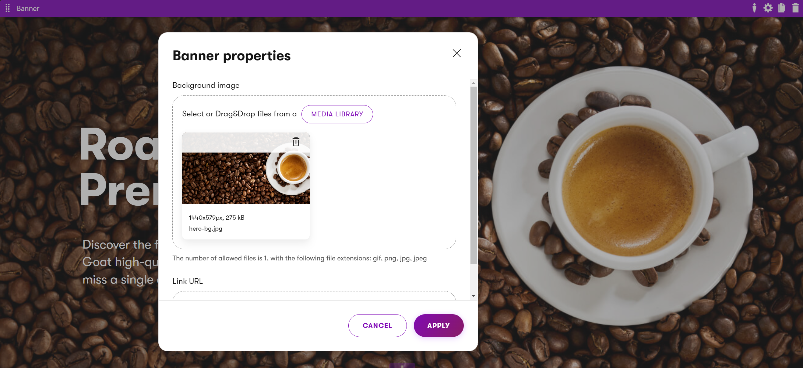
The Banner widget on the Dancing Goat sample site shows both inline editors and widget configuration properties where all the input data is stored within one database field.
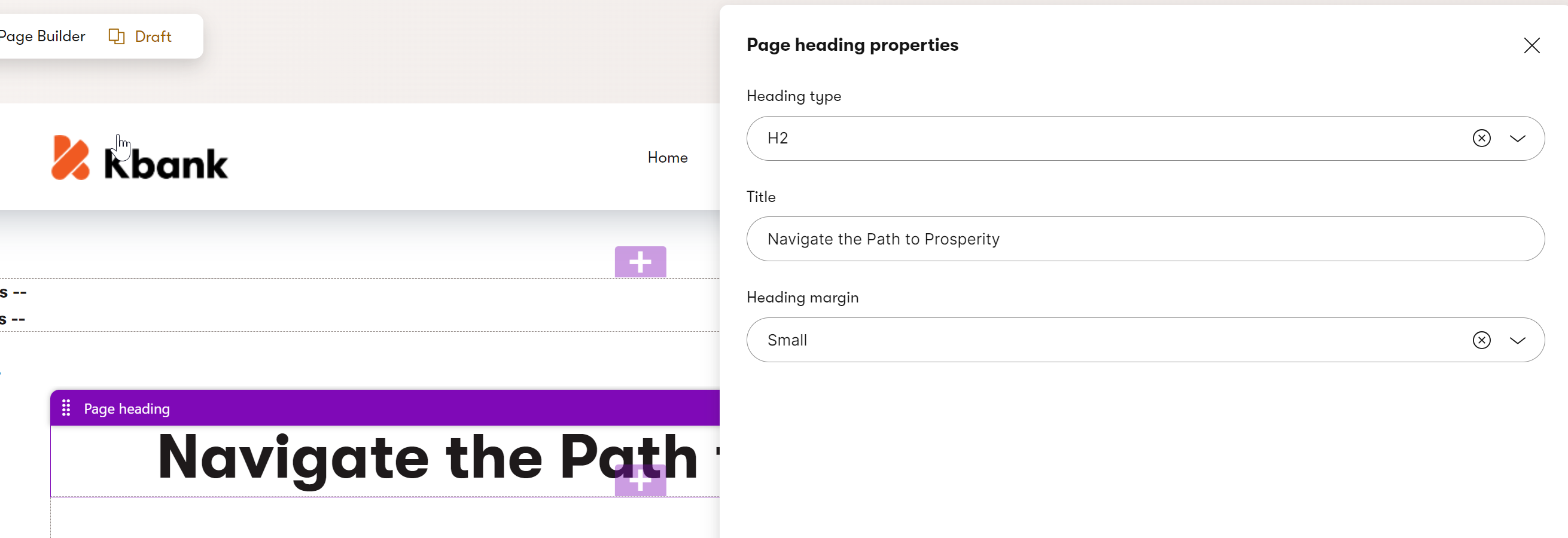
Similarly, the Page heading widget on Kbank demo site allows editors to add content, such as a title, decide on the heading type, and adjust its margin using dropdown selectors in widget properties.
Widgets that combine both inline editing and structured content
Mixed-content widgets allow editors to reuse structured content, e.g., by providing a selector to pick content from the content tree. At the same time, editors can use the widget’s editable properties to overwrite some of the content pulled from the selected page or create brand-new content. Editors can also provide additional information or behavior to their content, such as ensuring that hyperlinks to external websites open in a new tab.
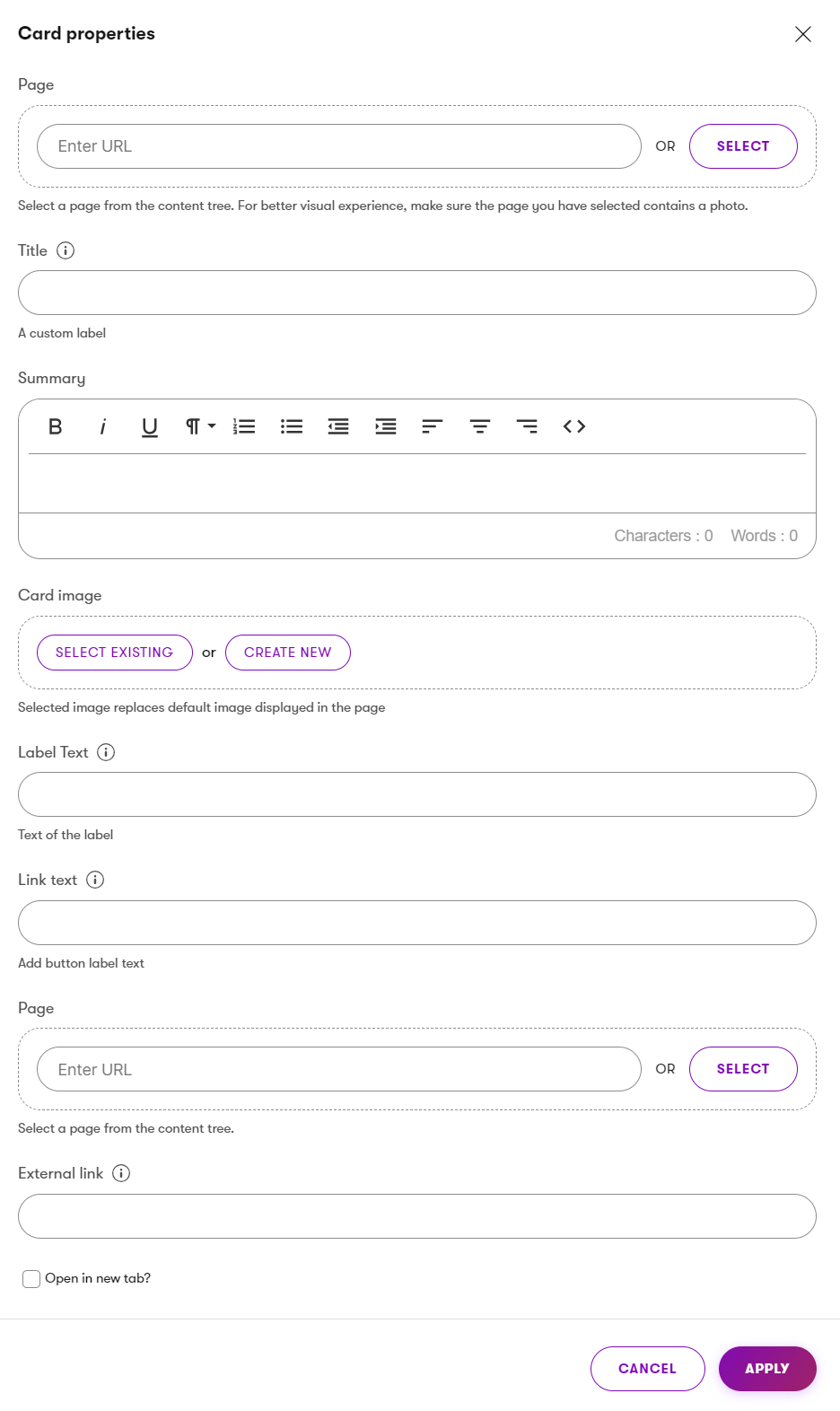
The image above shows Card widget properties where editors can customize all content and the content to which the widget links to. Editors can also:
- Link the card to a page either by entering a URL or selecting a page from the content tree, and using the target page as the source of the data for the widget, or providing custom values to override this data.
- Add a custom title and a formatted summary using a rich‑text editor.
- Assign a different card image by selecting an existing asset or creating a new one.
- Define button label text, link text for a call‑to‑action, and an optional external link, and use a checkbox that ensures the link opens in a new tab.
We recommend limiting the use of mixed-content widgets to specific pages (sections), as content stored in these widgets can be more difficult to reuse in other channels.
Drive displaying data using taxonomy
Design dedicated widgets to consume taxonomy terms as input and dynamically display content based on those terms to support taxonomy-driven content. For example, a content listing widget should allow editors to select a taxonomy tag or smart folder as a filter. The widget then queries and displays only the matching items. It should also offer options to exclude certain content, such as by listing available tags or applying an “exclude from display” tag in article itself, to give editors more control over the final output. Ideally, the widget will allow editors to wrap the listed content with additional content (e.g., text or visuals) to ensure that content remains reusable and manageable directly from the Page Builder.
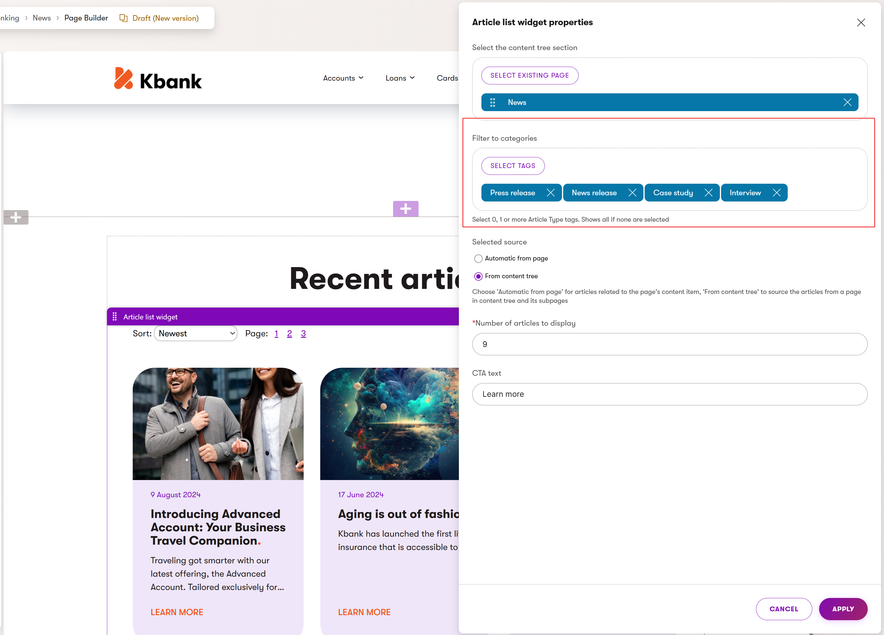
Recommendations – Page Builder
Combine structured content and widgets
To make the website’s content both reusable and future-proof, we recommend storing the content of the widgets using the structured content format. Developers should prepare widget properties that allow editors to format content using WYSIWYG editing capabilities.
Based on the project requirements, the structured content of widgets can be stored in a dedicated section in the content tree or directly in a hierarchy under the page as child items.
Limit using widgets for single-purpose content
Xperience stores the content input directly into widgets within one database field for the whole page. We recommend storing content in widgets only when the content is not going (or doesn’t have the potential) to be reused on the website. This content can work on one-off pages, such as campaign landing pages.
Create sections with designing capabilities
We recommend creating sections with properties to let editors define how the content they add via widgets displays on the website. Some examples of section properties are a field for a URL parameter (Anchor tag) for deep linking, a property to define the number of columns within the section, a property to adjust the margin or padding of widgets, and changing the color of the section, and similar properties.
Set restrictions on editable areas
Use editable area restrictions to ensure editors can add only desired widgets or sections to specific areas. This ensures page designs do not break (e.g., in different browsers) and creates boundaries for data predictability (when considering future upgrades). Find out more in Create pages with editable areas.
Create custom widgets to add markup to pages
Typically, in the early stages of a live project, editors might need to add custom HTML markup or include scripts to embed 3rd party applications. Project owners sometimes need to remember this or similar scenarios when detailing project requirements, so ensure your project gets this low-hanging fruit to make editors happy.
We recommend creating custom widgets that allow editors to add scripts or HTML markup to the page’s head or body. For example, editors might use an Anchor widget to enable linking to a section of the page or a Script widget to add JavaScript that runs a custom-built mortgage calculator.
If editors will reuse these scripts or markup on different pages, developers can prepare a custom Script content type or widget.
Add instructions to selectors in Page Builder components
When building widgets that display structured content, provide editors with clear instructions describing what content items they should select. You can use the ExplanationText widget property and provide contextual information specific to the selected widget. Providing additional guidance ensures that editors don’t break the visual experience of the website by mistake. Also, include clear instructions about how editors should use every widget on the website in your project documentation.
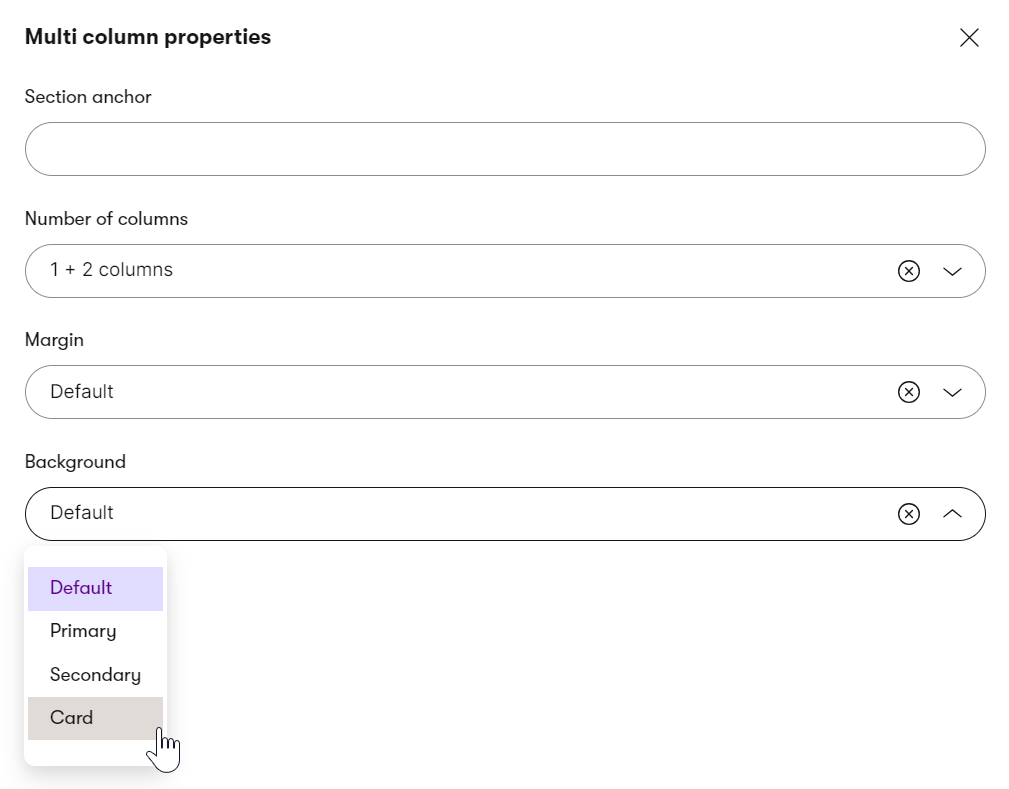
Make designing content generic
Though you might want to store design-specific information, like exact color codes or sizes, inside the channel-specific or reusable content types in the Content hub, we do not recommend doing this.
From a content longevity perspective, you want to have your design information as agnostic to the visual design as possible. When you decide to, for example, redesign your brand, it’s easier to remap the generic class name to new colors than change the specific #F05A22 brand color code in hundreds of different places. The following screenshot shows styling options in the Kbank demo site, allowing editors to only use predefined background styles, such as Default, Primary, Secodary, or Card using a dropdown selector.
In typical Xperience projects, these three approaches are combined together to create an effective content management experience that supports reusing the content as necessary. Stakeholders must decide how they’ll work with the content when defining the project requirements. However, to make your content future-friendly, we recommend storing it in a structured format.
What’s next?
You’ve learned about the different components editors can use to design Xperience pages. On the next page, you’ll learn about different approaches to storing the data using two different content models - the atomic content model that supports high-content reusability. Then, we’ll discuss the page-based content model.