Model Page Builder sections
Page Builder sections help editors define the page’s vertical and horizontal layout. Editors use them to create space on the page where they place content using Page Builder widgets. As is true for other Page Builder components, if you design sections properly, editors will be able to craft pages with varying layouts and achieve their goals without additional developer’s help.
In this article, you’ll learn:
- What Page Builder sections are and how they define a page’s layout, both vertically and horizontally.
- How to define the correct section properties that help editors in website content creation.
- About different options you can use to balance editing experience and section’s designing flexibility.
Prerequisites
You should have basic knowledge of content modeling principles.
Sections in Xperience by Kentico
Rather than coming with a prebuilt set of sections that will lock editors into a one-size-fits-all approach, Xperience comes with tools developers can use to tailor the editing experience. Why? Each business has slightly different requirements, and each editor team comes to Xperience with various skill sets and expectations.
We don’t want to prescribe every editor has to see or use this or that in the administration interface. We think that business requirements play a pivotal role in what types of sections and their associated properties your developers prepare. When you tailor sections during content modeling around specific business needs, you’ll deliver the right components that help the editor team execute their marketing strategy while aligning with the brand’s identity.
How do editors use sections?
Watch a short video that explains how sections in Xperience work.
”
Use sections to define the page’s layout and widgets to display content
Widgets allow editors to input content into various sections when designing web pages. That’s why the content personalization feature is only available for widgets.
Enhance widgets with layout and display capabilities
Xperience content personalization feature doesn’t support sections, but widgets, as you can see on the following image. It shows for which contact groups this widget contains a personalized content variant for.
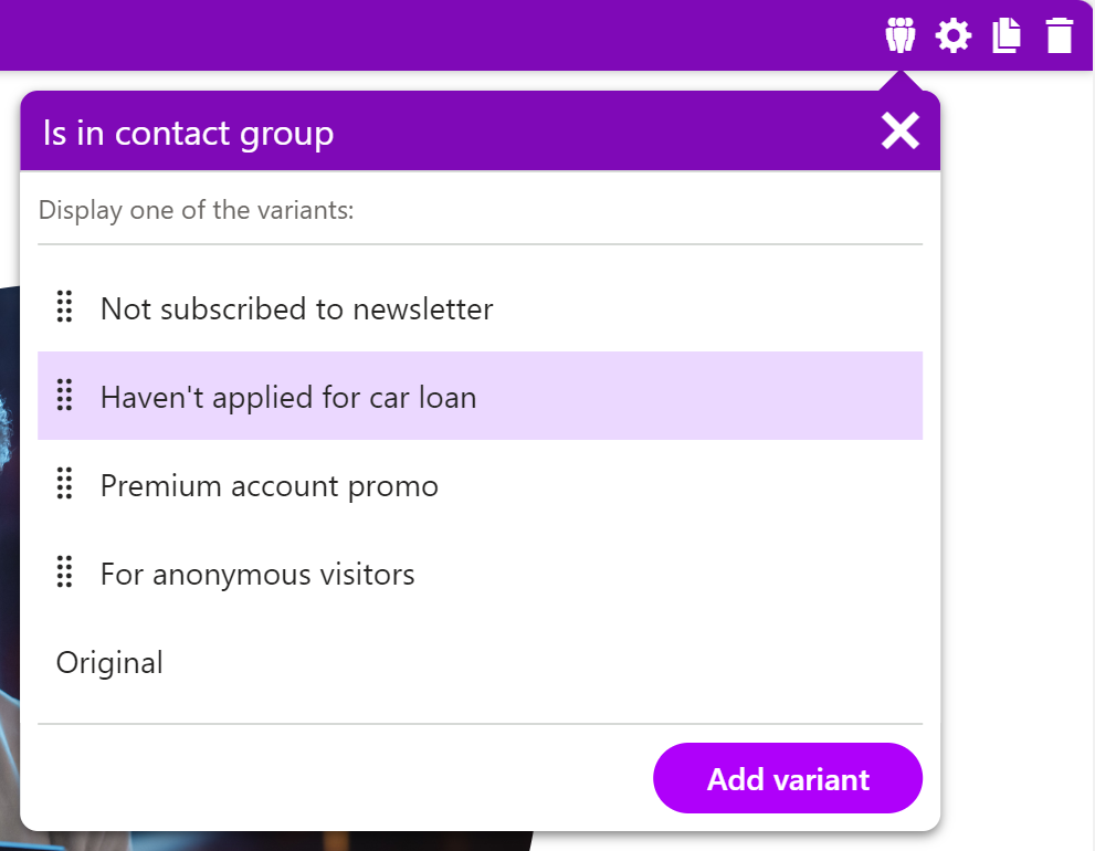
If editors aim to create personalized experiences that resonate with their audience, they should focus on adapting individual elements within those sections. They can adjust section layouts, hide specific content, or fine-tune colors and themes. To achieve this level of customization, widgets with design capabilities become indispensable. These widgets act as building blocks, enabling editors to tailor content presentation based on the customer journey.
See the Hero banner widget Example
Consider the Hero banner widget featured in the Kbank demo site. This versatile widget offers several customization options:
- Displaying/Hiding product benefits: Editors can selectively showcase or conceal specific benefits relevant to their content. The Hero banner adapts dynamically, whether it’s highlighting financial services, special offers, or unique features.
- Hiding/Displaying product image: Sometimes, a powerful image can convey more than words. With the Hero banner widget, editors can include or exclude product visuals, aligning with their storytelling strategy.
- Changing the whole color themes: The Hero banner’s color theme is adjustable. Editors can harmonize it with the overall page design or create visual contrast to draw attention. The widget is flexible, so editors can easily add a vibrant call-to-action or a calming background.
Find out more about the editing options in a guide about reusing content in the Hero banner widget.
In summary, widgets empower editors to fine-tune content elements within sections, ensuring a personalized and engaging user experience.
Use section properties to empower editors
Page Builder sections should have properties that editors will use to define the sections with widget zones, for example, their background and the number of columns where editors input widgets or adjust whitespace around individual content pieces.
Enable customization through layout and design options
Editors use Page Builder sections to craft vertical and horizontal layout web pages. To help them succeed, these sections should offer various layout options.
When editors can choose from different column configurations (such as single-column, two-column, or three-column layouts), they can tailor the page structure to their specific content needs. Whether it’s a sleek product showcase or an informative blog post, having layout flexibility ensures that editors can create visually appealing and functional pages.
Make editors self-sufficient and efficient in content creation
Empowering editors means making them self-sufficient in their content creation journey.
When you define the correct section properties, editors can confidently customize their pages without heavy reliance on developers. For instance, they can adjust the section background to set the tone for their content—a vibrant image or a subtle color gradient. Additionally, they will tweak section spacing (using properties like padding and margin) to fine-tune the alignment of elements within each section. And since the editable options come from designers, editors don’t need to worry about breaking the page design or brand messaging. Making editors independent of developers speeds up content production and inspires originality.
Typical options defined via section properties
Let’s explore some typical section properties that enhance editor empowerment:
- Layout Options: The ability to choose between single-column, multicolumn, or other custom layouts ensures flexibility.
- Section Background: Editors can select an image or a solid color as the backdrop for their content, aligning with branding guidelines.
- Section Spacing: Fine-tuning the padding (to adjust element position within the section) and margin (to control whitespace around the section) allows editors to achieve precise visual balance.
- title: A clear title for each section aids content organization and navigation. persona: architect, developer
- Heading Sizes: Providing default heading sizes and a list of allowed title styles ensures consistency across the page.
In summary, thoughtful section properties empower editors to create compelling content while maintaining design coherence. We foster a collaborative environment where developers and editors contribute to outstanding web experiences by allowing them to customize.
How many types of sections should developers build?
The number of section types developers should build depends on a delicate balance between team experience and the development’s team preferences .
Imagine your project follows a brand book that allows editors creating various sections on a page. These sections can be structured as one large column, two columns, or three columns. Additionally, the brand book specifies that the sizes of columns within the two-column setup can vary. Now, let’s see how teams’ dynamics influences this decision.
On the other hand, if you deal with a less experienced development team, favor simplicity and granularity.
What does it mean?
Developers will create more sections, each with clear and straightforward behavior. For instance, they might design five distinct sections: a single-column section, variations for two-column layouts, and a three-column section that you can see in the following image. This approach simplifies development, making it easier for less seasoned teams to manage and maintain.
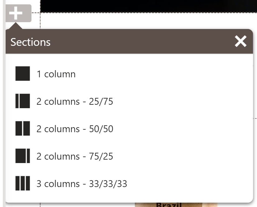
On the other hand, more seasoned teams might opt for fewer, more versatile sections, leveraging their expertise to handle complex interactions and layouts effectively. Developers might create a dedicated section to store specific content types, such as articles or forms, and then provide a universal section where editors can define the number of columns as needed, as shown in the following picture of section properties.
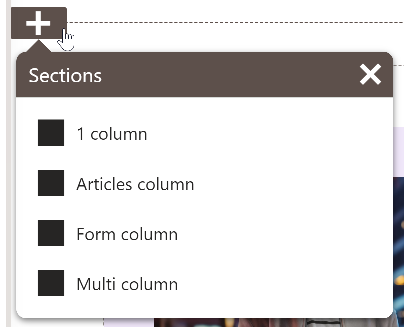
Editors pick one section and then use complex configuration options to change the number and layout of columns, e.g., two-column layout, 1 + 2 columns, or 2 + 1 columns, allowing them to split the section into even or two uneven parts.

|
Several simple sections with limited properties |
Few sections with complex properties |
|
|
Developers, simplify your work with a prebuilt set of configurable templates, sections, and widget properties.
Which option for the presentation model is the best?
As with other things in app development, it depends. But you will get all the benefits when you balance simplicity and flexibility and align your proposals with the team’s capabilities and the project’s requirements.
Add context to help marketers see what they are doing
As marketers navigate their tasks, provide them with clear context and actionable steps. Outline what to do next in the guidelines and set the stage for effective content creation. Adding editorial instructions to sections ensures they can confidently configure the page design to execute their vision. Your guidelines are not there to set limitations; they act as creative boundaries, allowing marketers to explore within defined parameters while maintaining consistency and alignment with the overall design and brand strategy.
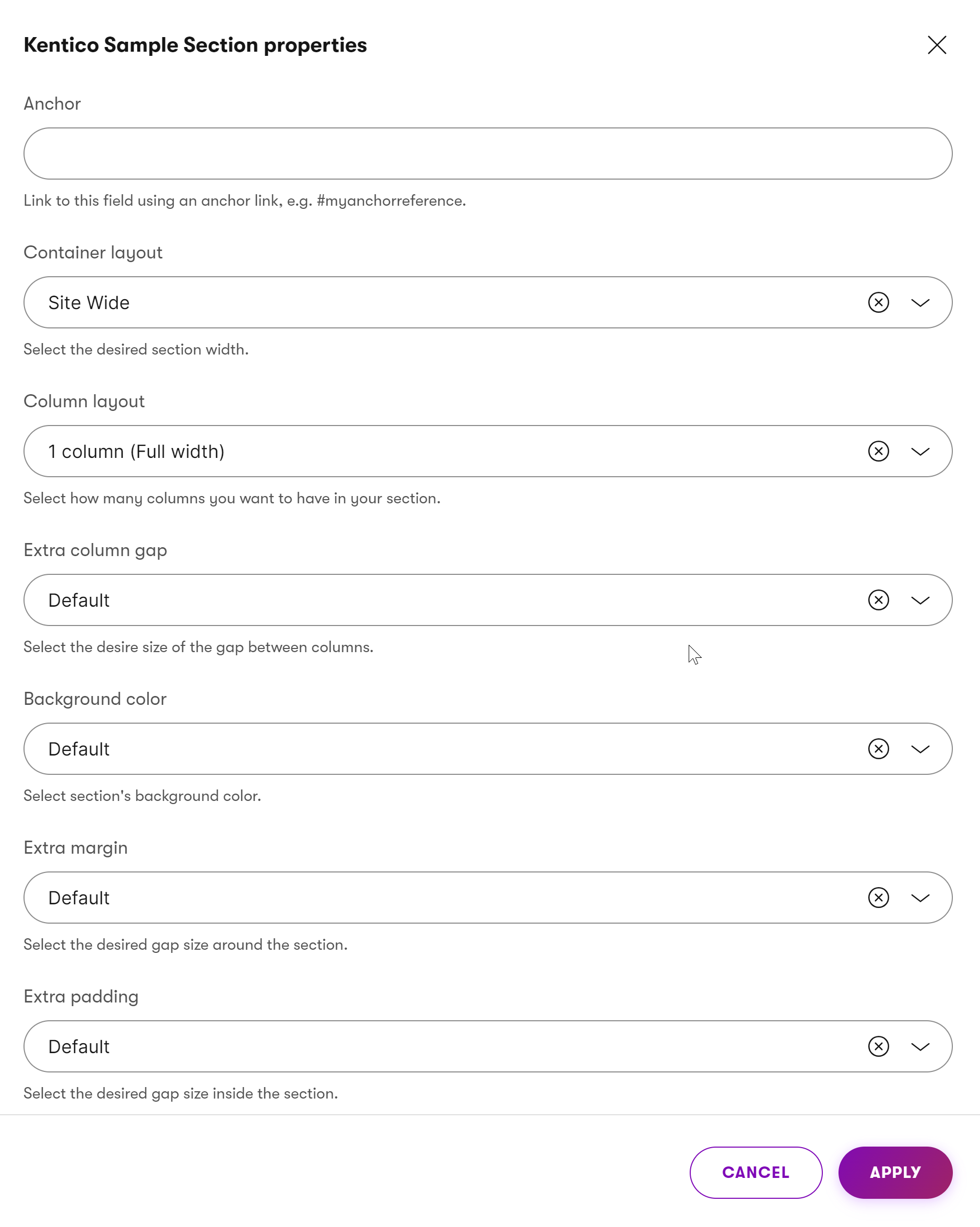
The sample section shows that each field in the section properties informs editors what they should do. The following describes options for different section properties you might want to use in your project to provide context to your editor team.
- Anchor field – Editors should use this field to create an optional anchor link for the section (e.g., #myanchorreference). This allows linking directly to this section from other parts of the page.
- Container layout field - Select how wide the section should be (e.g., Site Wide). Choose the layout that best fits the content you’re presenting.
- Column layout – Choose how many columns the section should have (e.g., 1 column – Full width). Use multiple columns to place content side by side.
- Extra column gap – Defines the spacing between columns. Use this to increase or decrease the visual separation of column content.
- Background color – Sets the background color of the entire section. Use background colors to visually distinguish different parts of the page.
- Extra margin – Adjusts the amount of spacing around the section. Choose larger margins to give the section more breathing room.
- Extra padding – Controls the spacing inside the section. Increase padding to create more space around the content within the section.
Name colors and themes properly
When naming colors and themes within a Page Builder, it’s crucial to strike the right balance between editor freedom and responsibility. While it’s great to grant editors all the flexibility to choose any color they want, it is a double-edges sword. In many cases, you don’t want editors to be too creative, as their websites must stay consistent with company brand brand book.
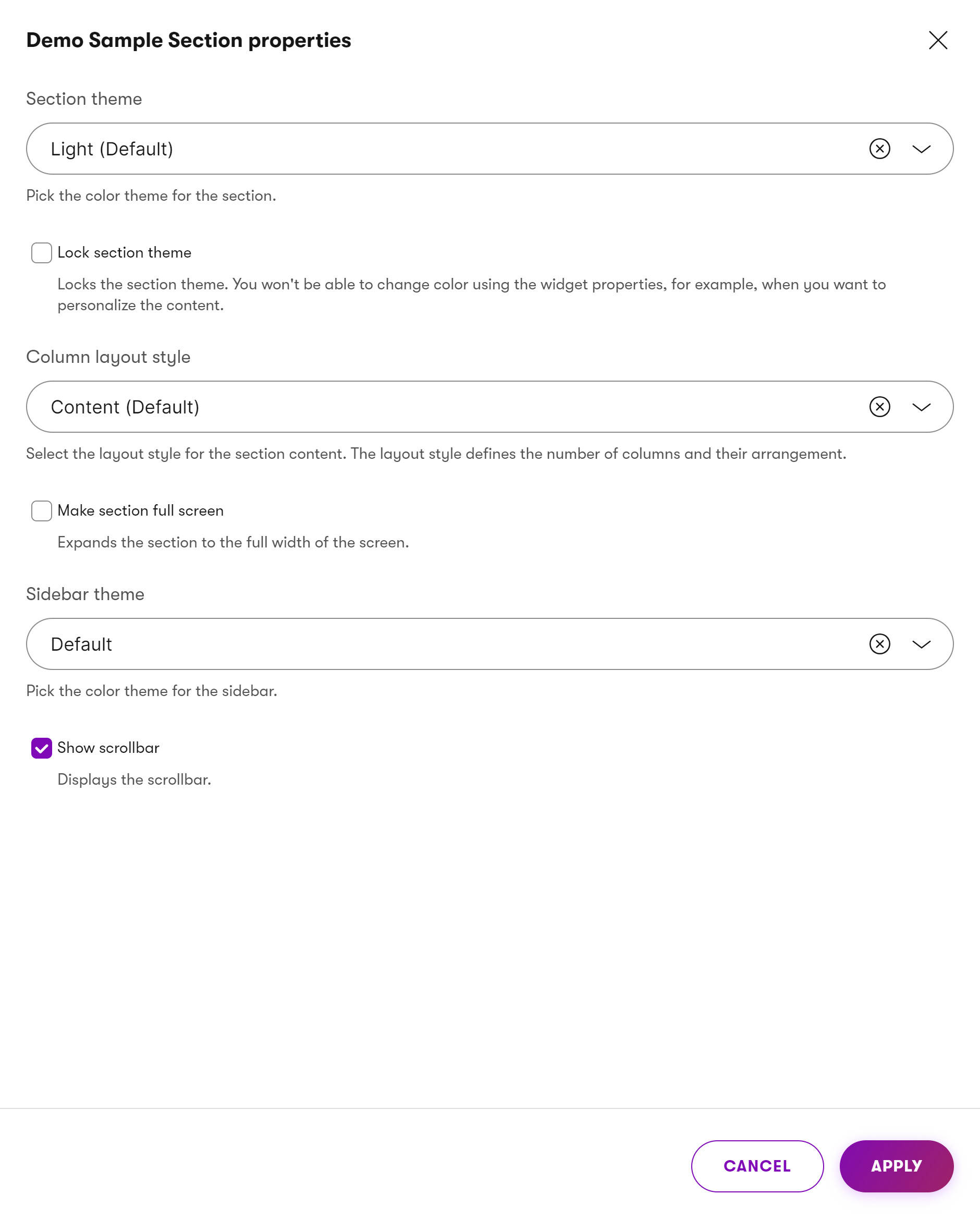
First and foremost, avoid allowing direct insertion of color codes (such as #f05a22 or rgba(240, 90, 34, 0.5)). Instead, encourage descriptive names that resonate with the marketing team’s understanding. For instance, terms like “Gray (Light)” or “Violet” provide more context than raw hex codes.
However, let’s take this recommendation a step further.
Future-proof design with meaningful names
To future-proof your Page Builder options, consider using terms like primary, secondary, or form section colors. You can also introduce brand-related naming, like Kentico vibrant or Ultramarine blue or semantically driven names, such as success color or alert color.
These personalized labels transcend specific shades and tie directly to the brand’s identity. Adopt meaningful names and ensure that the transition remains seamless even if the company decides to adjust its brand color palette or messaging. These intuitive names are user-friendly and facilitate code maintenance—making them easy to swap out when needed. In summary, thoughtful naming practices enhance usability and adaptability in the dynamic world of web design.
Balance independence and consistency
Developers face an inherent challenge when they want to ensure consistent styling between sections and widgets. Why? By design, Xperience doesn’t dynamically check how sections are configured, what widgets are input into those sections, and how these widgets are configured.
To address this, consider the experience level of your editor teams. Highly skilled teams can confidently add content while adhering to design guidelines. They understand the nuances of layout, color schemes, and typography. However, providing proper instructions becomes critical for less experienced teams. This could be exhaustive documentation or detailed guidelines for page components.
Striking the right balance between independence and consistency is essential. What can you do?
One approach is to limit editor freedom by defining strict rules and boundaries. This ensures uniformity but may stifle creativity. Alternatively, give editors the right tools and guidance. Provide them with well-documented instructions, intuitive page components, and clear naming conventions. By doing so, you promote a collaborative environment where creativity thrives within the context of brand consistency. Ultimately, the goal is to strike a harmonious balance—where skilled editors flourish, and less experienced ones feel supported.
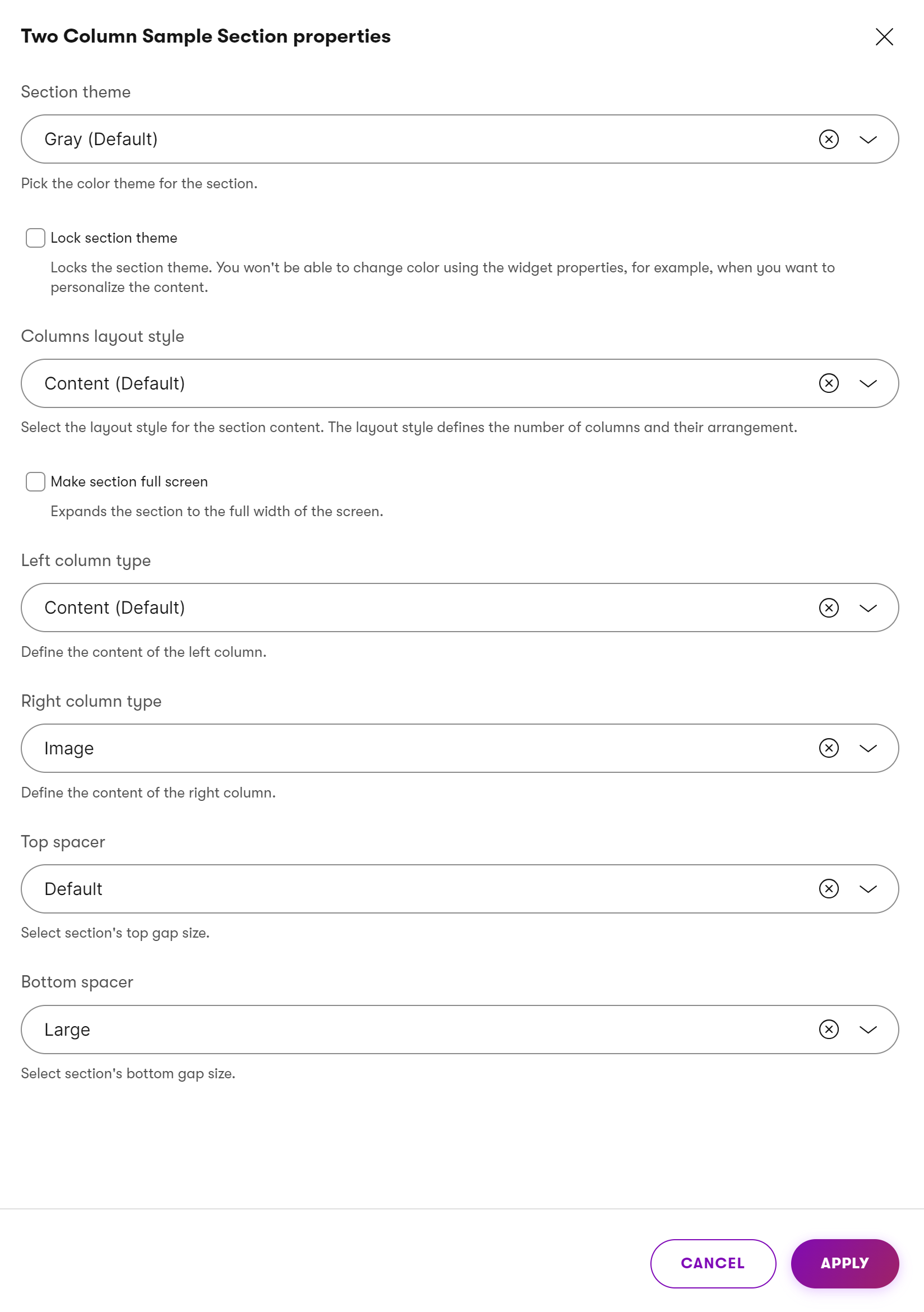
The image above shows an editor’s guidance for different section properties. Feel free to use them as inspiration for your project.
- Section theme – Pick the color theme for the section.
- Lock section theme – Locks the section theme. You won’t be able to change color using the widget properties, for example, when you want to personalize the content.
- Columns layout style – Select the layout style for the section content. The layout style defines the number of columns and their arrangement.
- Make section full screen – Expands the section to the full width of the screen.
- Left column type – Define the content of the left column.
- Right column type – Define the content of the right column.
- Top spacer – Select section’s top gap size.
- Bottom spacer – Select section’s bottom gap size.
If you don’t want editors to combine the section’s design options with options provided through widgets, simply introduce a “Lock section theme” property. The section design, such as colors or layout, will stay consistent no matter what widgets and which configurations editors introduce.
What’s next?
The following guide in this series will cover best practices for creating Page Builder widgets editors use to add their marketing content. You’ll learn about different options, where the widget content can come from, what properties developers can define, and the possibilities for content personalization through widgets.