Meet business requirements with Page Builder
Let’s examine how and when to apply Page Builder in Xperience by Kentico projects.
Consider when to apply Page Builder
Page Builder appeals to content editors because it provides flexibility. It empowers non-technical teams to design pages without pestering a developer whenever they need to tweak visual elements and audition visual changes to pages.
Page Builder also allows editors to set up content personalization through page widgets so that site visitors see different content based on their activities.
For these reasons, Page Builder is well suited to landing pages and other marketing-heavy applications. However, it can do more harm than good in cases that require strict uniformity among pages.
Appraise the available components
Once you’ve decided that Page Builder suits your requirement, it helps to understand the three main types of component.
Widgets
Page Builder widgets are the most granular Page Builder components. They are pieces of content and/or functionality that editors can move between the available zones on a page.
Widgets often have properties which can be configured to influence their appearance and the data they display. They are able to display data from virtually any location accessible through a .NET application, including:
- The widget’s own properties.
- The page the widget is on, including any linked content items.
- Any other page or content item in the site, specified through a Page selector or Content item selector.
- Any Xperience object type, specified through an Object selector or General selector.
- Any external source, for example a third-party database, GraphQL endpoint, or REST API.
The data retrieved from the external source can optionally be based on parameters configured through widget properties.
Widgets can also make POST requests to endpoints in order to handle data entry by site visitors.
Sections
Page Builder sections are configurable views that determine where widgets can be added, and the visual design of these areas. They contain Widget zones, which are like slots that widgets can fit into. Widget zones can restrict which widgets are allowed within them.
Page Builder sections can be based on view components, in order to implement complex display logic. For example, they can hide their contents if the site visitor has not accepted a certain consent agreement.
Sections and data
It is possible to include functionality similar to widgets in Page Builder sections. For example, you can use section properties to query and display data. However, we recommend using them only for the visual and structural design of the page, like providing a styled layout and including anchors in the page content.
There is no advantage to using sections instead of widgets for displaying or posting data, and blending the functionality of the two by using sections in an unintended manner might confuse business users.
Page templates
Page templates are configurable views that can display content, determine where sections can be added, or both. Templates can be general-purpose, or associated with a specific page type, in which case they can display structured data from that page type.
Page templates can contain Editable areas, which are like slots that can fit Page Builder sections. Editable areas are analogous to widget zones in sections, but they have more detailed options:
- A default section
- Restrictions on which sections are allowed inside of them
- Restrictions on which widgets are allowed inside any contained sections
- Configurations relating to caching of widget output.
Decide how to apply Page Builder
Strive for flexibility
Let’s take a look at how these components work together in a business scenario. We’ll discuss how we might leverage Page Builder components if a client presented the following mockups, with the requirement that their editors can achieve both without the help of a developer.
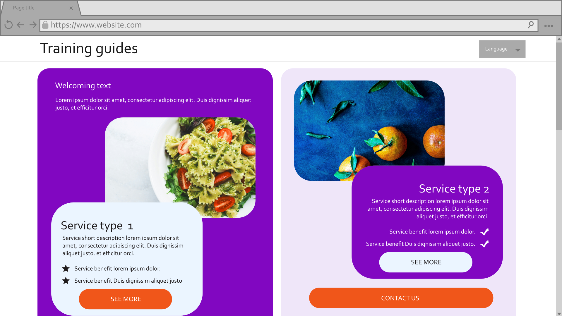
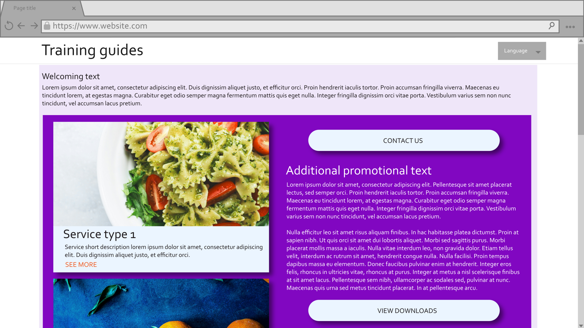
In theory, both of these results could be achieved with a single component of any kind. With enough properties and display logic to react to them, even a single template, section, or widget could be twisted into a complex monstrosity that can render both of these pages alone. However, this flawed approach would lead to hyper-specific code, little reusability, and an awful editor experience trying to configure dozens of properties in an overcrowded menu. This scenario is better achieved through the combination of all three component types.
Examine the granular pieces
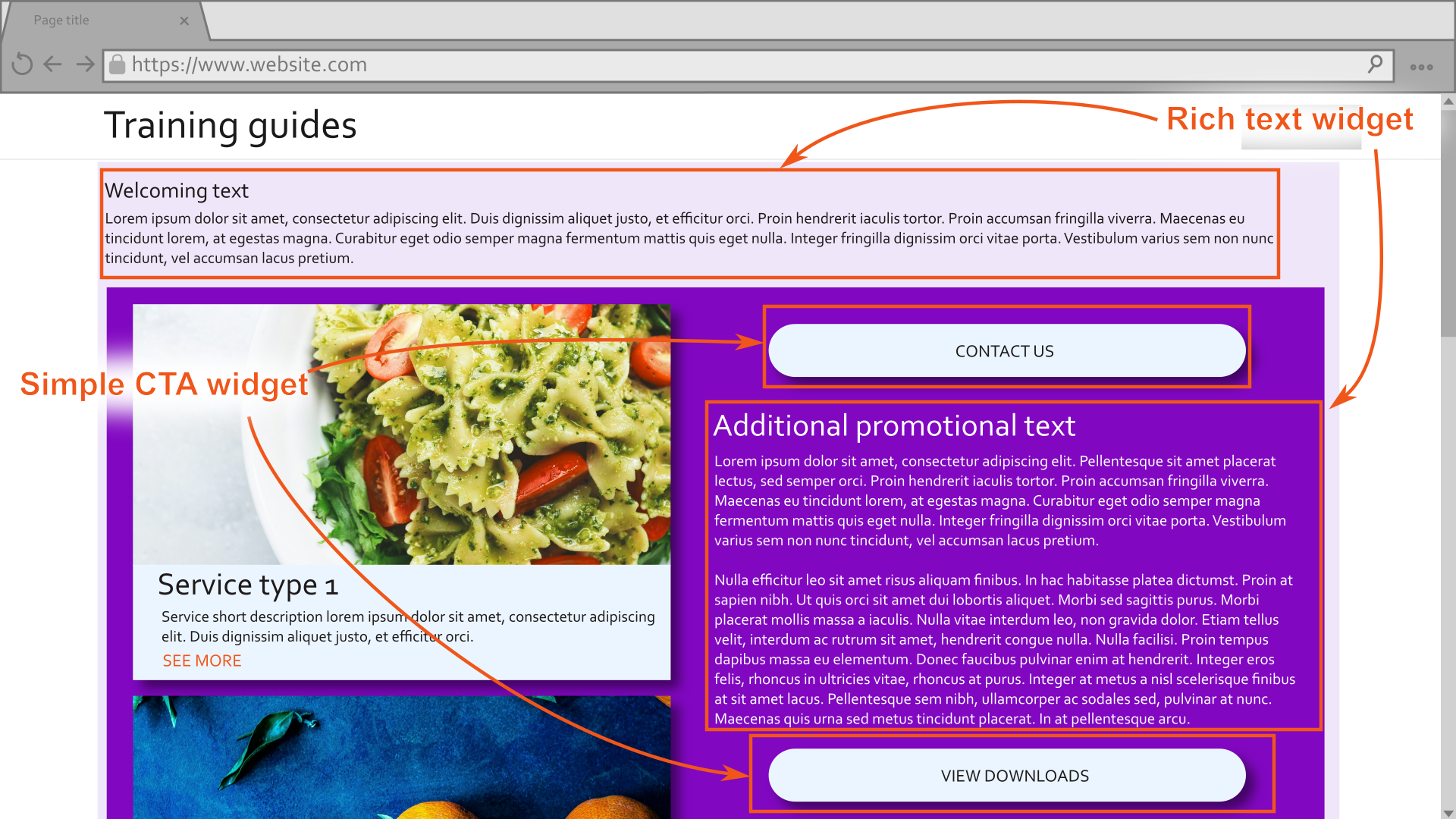
Looking over the mockups, each version of the page contains some amount of text that can be handled by the out-of-box rich text widget.
Both versions of the page also have at least one call to action (CTA) button, with multiple possibilities of text and destination, so this is a good candidate for a custom widget.
Both page versions also contain information about services, with different layouts and included data. This would also be well-suited to a custom widget. The Service widget should have properties that determine its layout and which data it displays from the selected service.
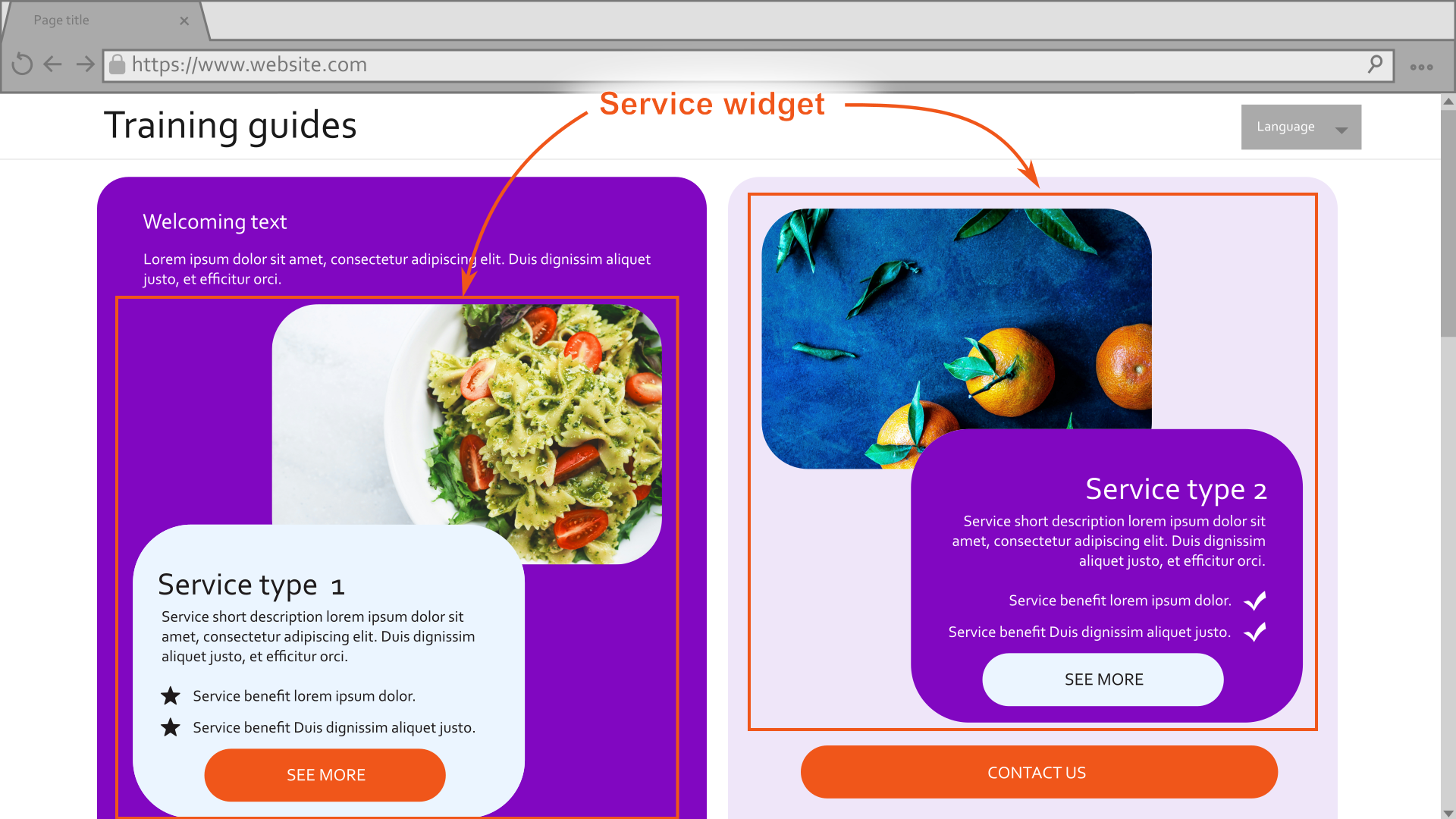
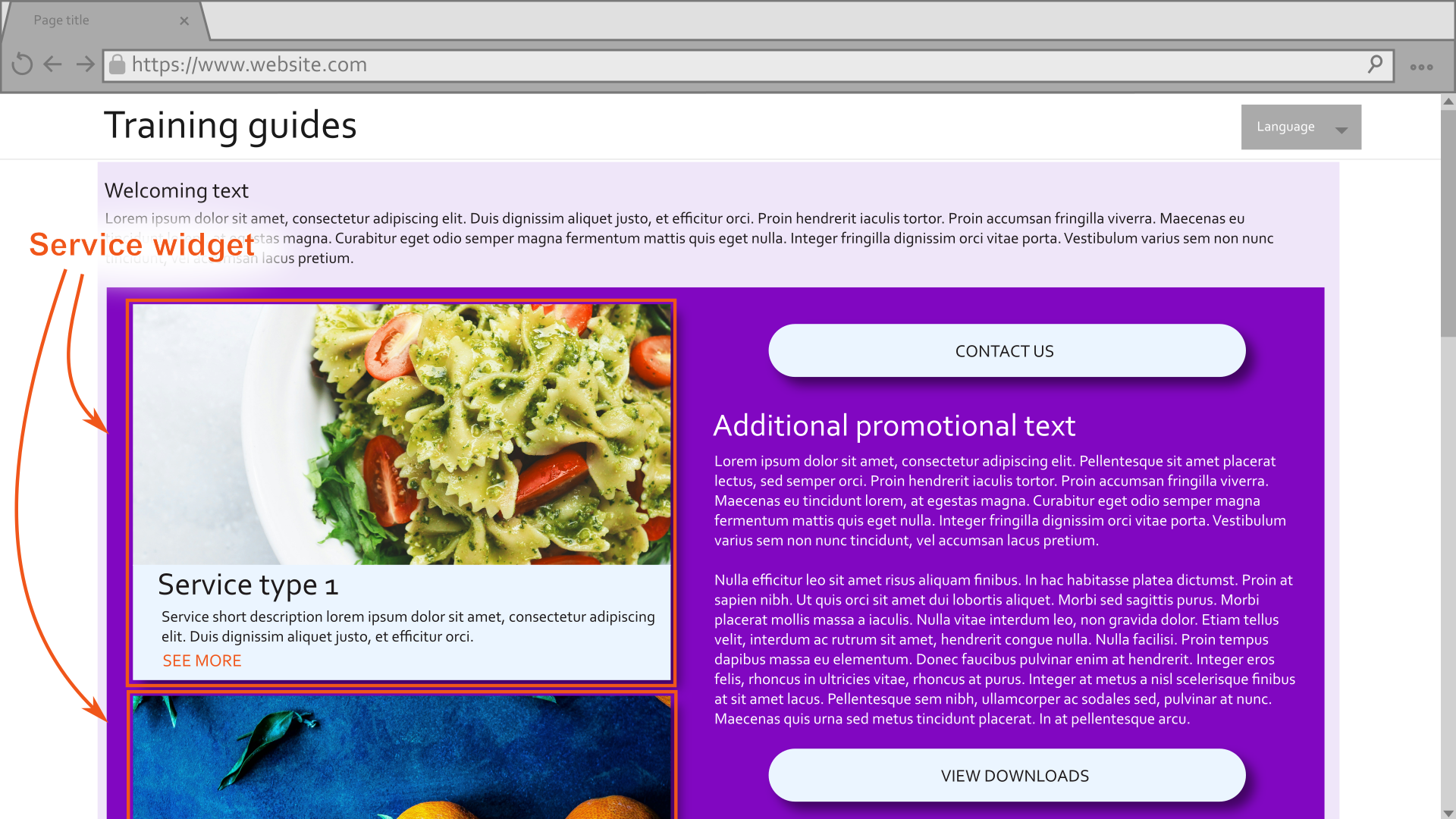
While some developers might prefer to create a listing widget that can display multiple services, rather than a widget that displays only one service per instance, a single-service widget is better for this scenario, where the services are not always in the same area of the page.
Consider the layout
If you look over the layout of the two mockups, you’ll notice that the first has two differently-colored columns, while the second contains a single column of a lighter color followed by a two-column area of a darker color.
Some would suggest having each of these configurations be a selectable option in the properties of a template or section, for example, Two column layout and Top column with two columns underneath, with properties for setting the color of each area. However, this could make the properties complicated. You would need to either figure out how many distinct parts exist in each layout to render the appropriate number of color and style selectors, or include unused color and style controls when a layout with fewer than the maximum number of parts is selected.
A better approach in this case would be to create a page template that can have a color, style, and one to three columns, and a section with the same.
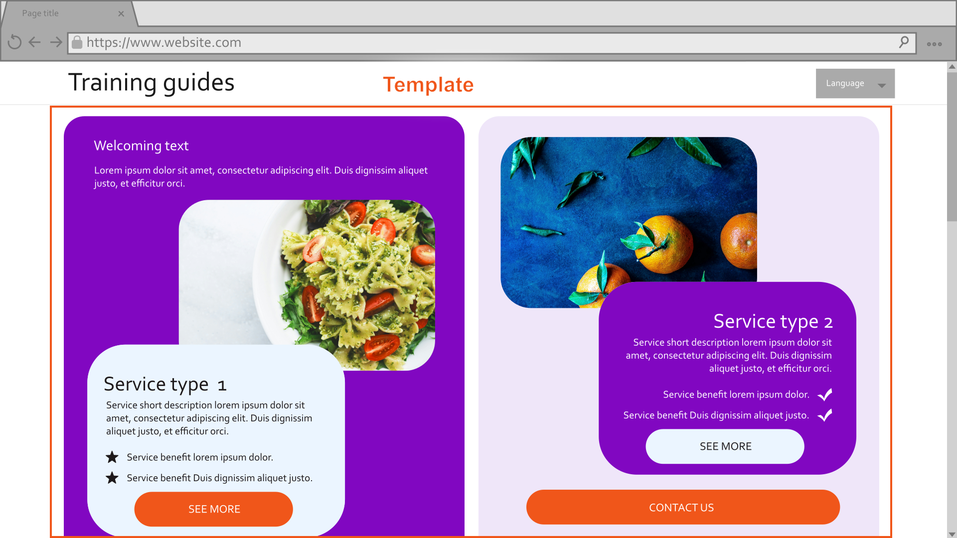
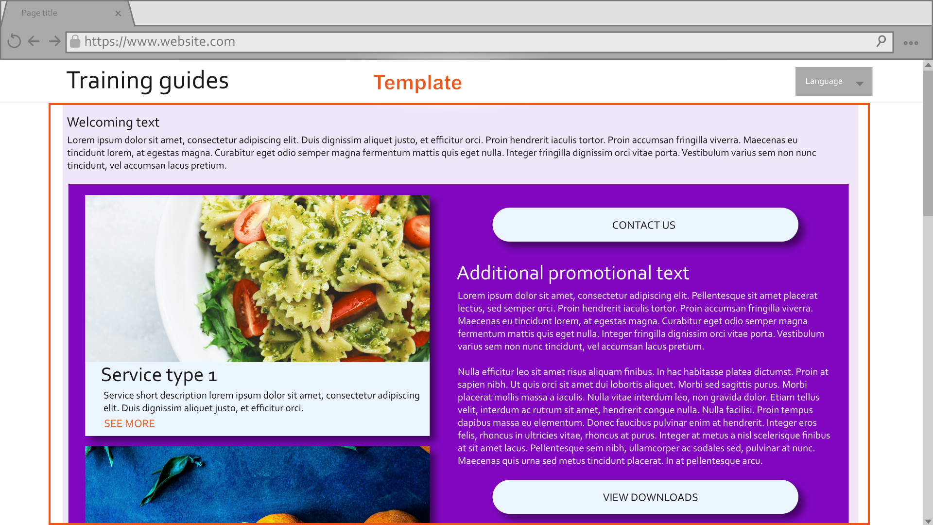
The sections can then nest within the template’s columns and create a wide variety of configurations as they stack above and below one another, each with only three properties.
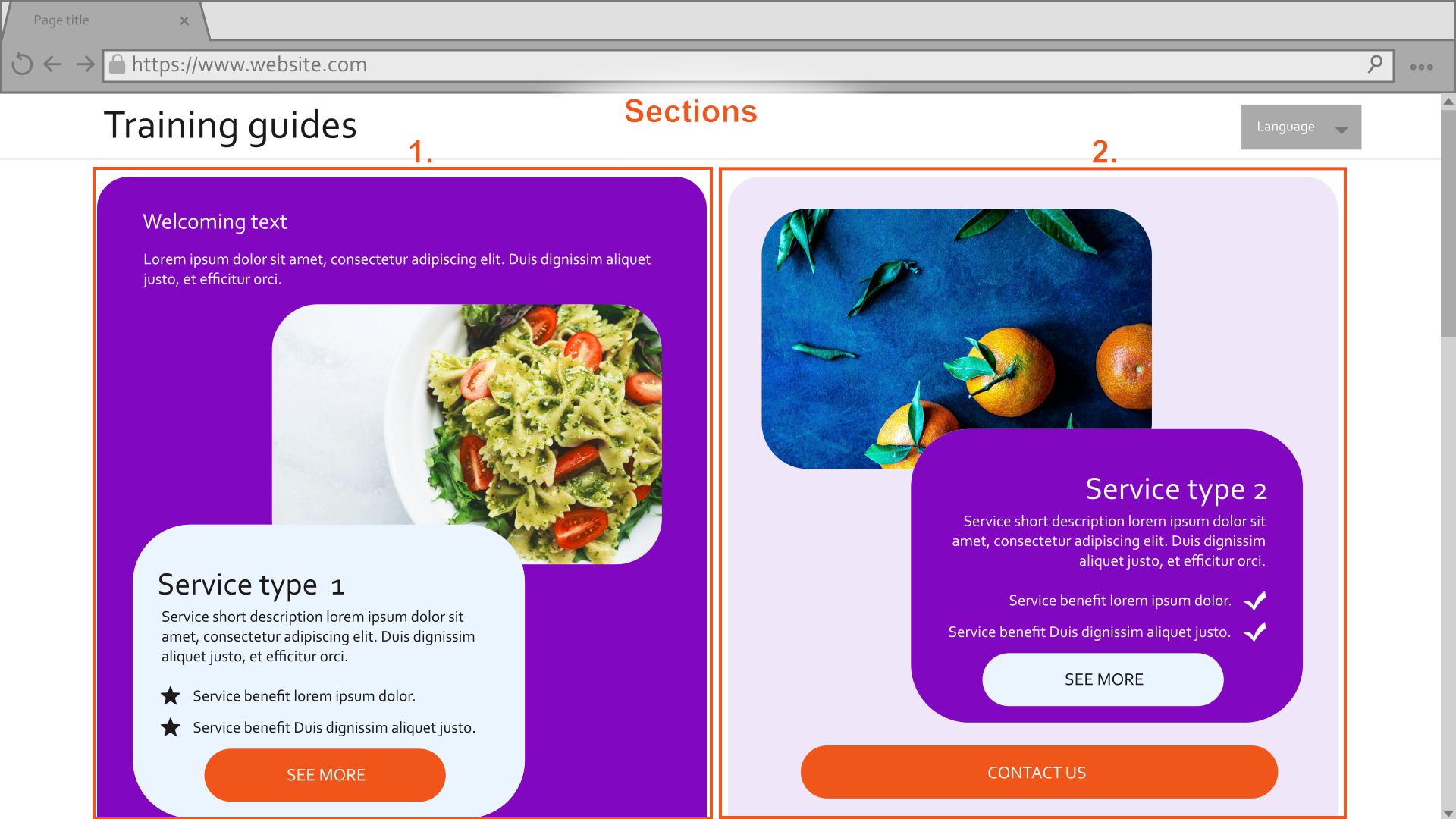
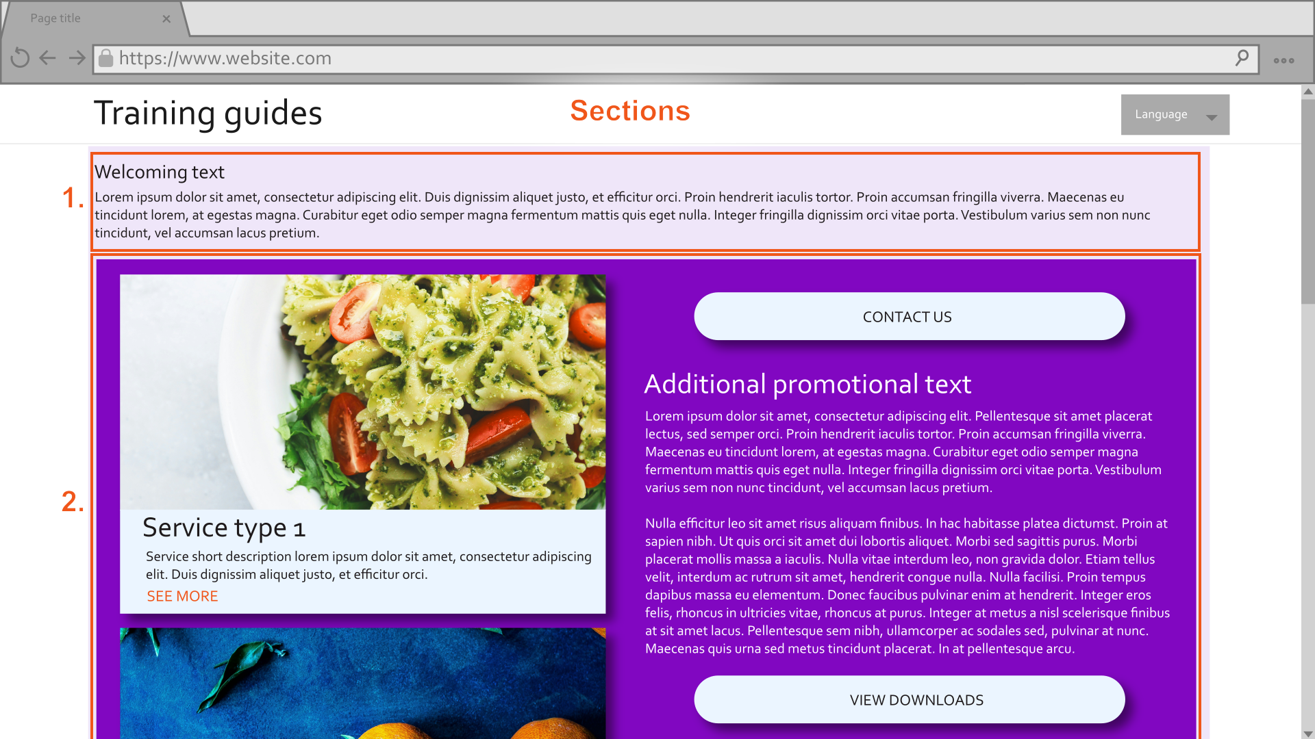
This approach misses out on some design combinations, such as a layout with four or more columns that are each a different color, but it will cover most reasonable goals.
Use Page Builder conditionally
Next, let’s explore how Page Builder might be leveraged conditionally. Imagine that a client presented a mockup like this, explaining that a service page should look like this by default, but have an option where editors can customize it more in special cases.
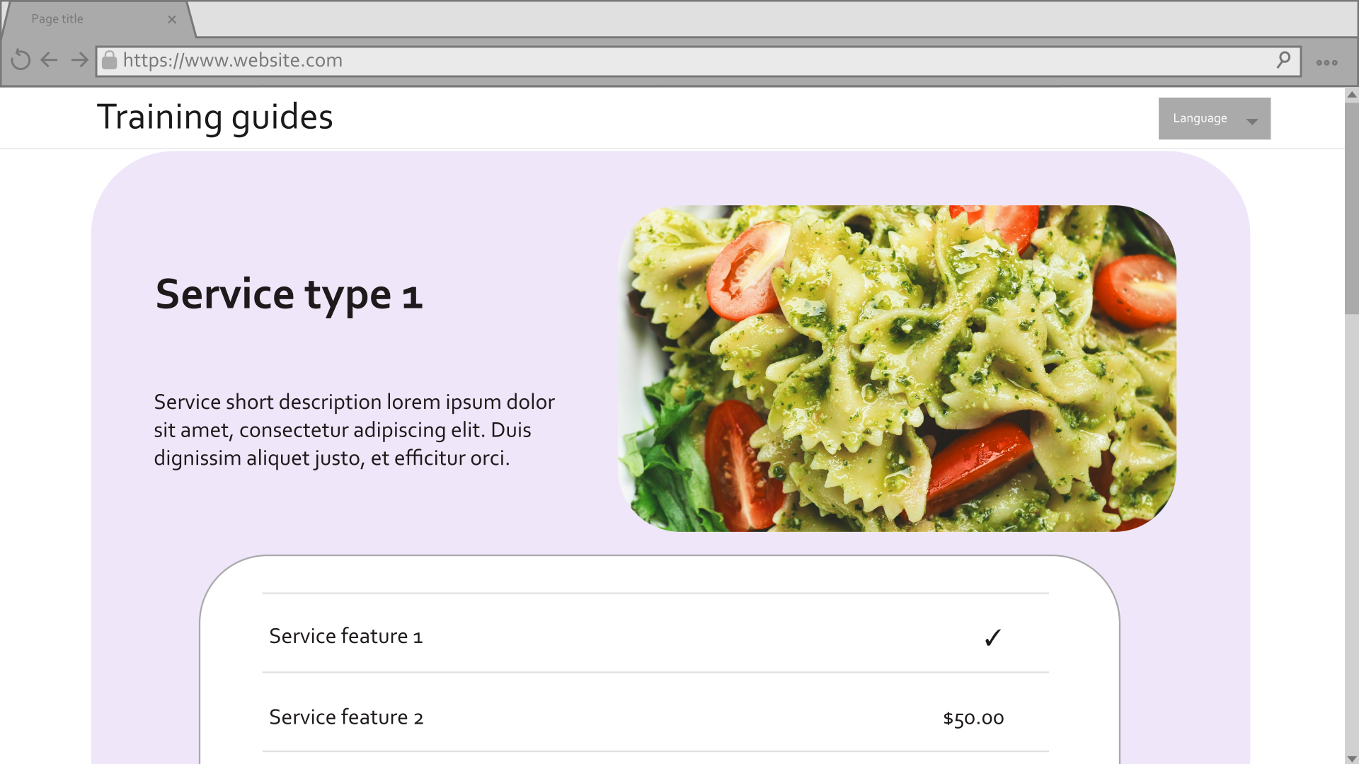
One approach to solve the problem would be to include the data shown in the mockup directly into a template associated with service pages, and add an editable area so that editors can add additional content through widgets. However, this makes the presentation of the service specific data inflexible, and also displays an enabled Page Builder area by default.
A better approach would be to use a template property to decide whether Page Builder is available at all. By default, the template can display only the data from the mockup. If Page Builder is enabled, it can become a flexible template like the one from the previous example. There, the Service widget from earlier can display pieces of the structured service data in various layouts alongside any future widgets.
What’s next
In your next Xperience project, make sure to consider the factors discussed in this article when leveraging Page Builder for your clients.
The next parts in this series cover the implementation of the templates, sections, and widgets discussed here. We will work towards achieving the look and feel of the mockup designs above, breaking the task into the following building blocks: