Model landing page components
Delivering the right content at each stage of the customer journey is crucial for engaging users and driving conversions. Editors must tailor page composition and content to meet customer needs and expectations, ensuring users receive relevant information throughout their journey.
In this guide, we’re exploring some important widgets for landing page design. This guide doesn’t cover in-depth elements discussed in other guides, such as Hero banners, Product or Article widgets, or widgets that list product benefits which were discussed in the previous article.
You’ll learn about:
- Importance of flexible components editors will use to create engaging landing pages and improve their performance.
- Typical components essential for landing page design such as images, call to action widgets, forms, page headings, FAQs or page templates.
- Role of well-defined properties to maintain a consistent experience on different website channels for editors and visitors.
Prerequisites
- You should have basic knowledge of content modeling principles.
Typical widgets for landing pages
Landing pages serve as gateways to specific products or services and provide relevant information to build trust and credibility with potential customers. The primary goal of a landing page is to drive conversions, often through form submissions or purchases, making it imperative that all other components cohesively lead users toward this desired action. Here are some typical landing page widgets editors often need to succeed.
Images
Images on landing pages serve multiple purposes. First and foremost, they’re attention-grabbers, drawing visitors in and making the page visually appealing. They convey information efficiently. Instead of reading through blocks of text, visitors can quickly grasp the essence of the offer or product through images.They help establish the brand’s identity and connect with the audience
Editors will use relatable images to help tell the story of the landing page, making it more engaging and persuasive.
Designers and solutions architects need to ensure that editors can:
- Reuse content efficiently. Editors should use what they already have in the Content hub (and media libraries). Reusing content keeps things consistent and maximizes the available resources.
- Make images stand out. Provide editors with configuration options that will help images make an impact.
- Make images easy to understand. Editors (and graphic designers especially) want to ensure that images work for everyone, no matter how they access your page. Add fields to properties for alt tags, longer descriptions, and captions to make images usable for all visitors, regardless of their abilities or assistive technologies.
- Keep images responsive. Make sure your images still look great across devices, whether someone’s using a phone, tablet, or computer. It would help if editors faced as little editing as possible to make them work.
- Add company branding. If your company uses branding elements in images, such as unique shapes, colors, or graphical overlays, ensure editors can add them to their pictures. Configuring visual design through predefined properties will reinforce brand identity and promote user recognition.
Xperience comes with two options how to store images: Content hub and Media libraries. We recommend storing the images and other similar assets in the Content hub using a custom content type, like Asset or Media. Once stored, you can reuse the asset just like any other content and take advantage of benefits, such as creating asset variants for different languages, using content workflows, or restricting access to files, for example, allowing only signed-in users to view certain assets.
Developers have complete control over the content type. They can specify which fields are needed based on your project’s requirements and customize how the type behaves.
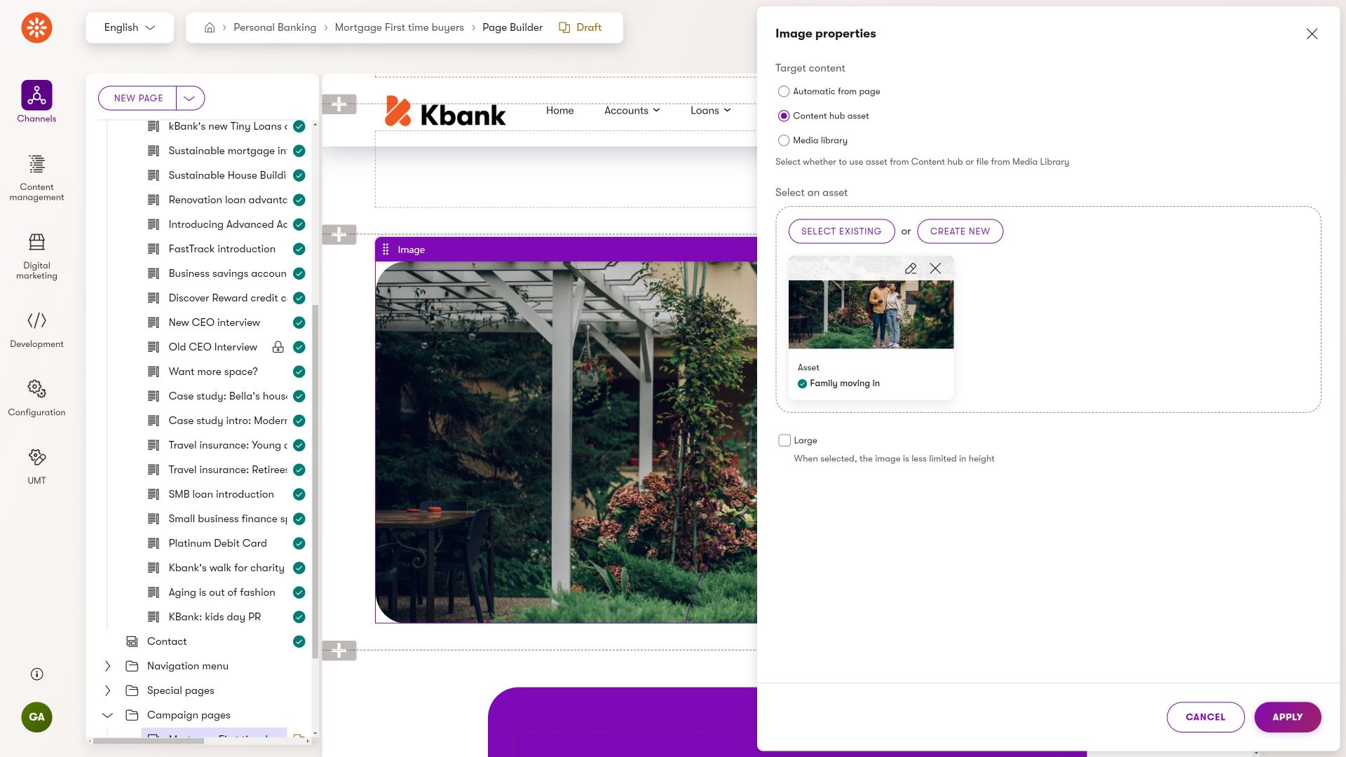
The Image widget properties tab provides configuration options for selecting and displaying an image within the page builder. First, the editor chooses the target content source from three options: automatically using the page’s teaser image, selecting an image from the Content Hub/Asset library, or pulling it from the legacy Media library.
The selected asset is displayed with its thumbnail, name, and publication status. Editors can then manually adjust the presentation and target a specific image variant rather than serving them responsively.
Call to action widget
A “call-to-action”, or CTAs for short, prompt visitors to take a specific action that aligns with the page’s goal. CTAs serve as guideposts, directing users toward the desired conversion, whether it’s purchasing a product, signing up for a service, downloading content, or contacting the company.
Marketers maximize conversion rates by creating clear, compelling, and prominently displayed CTAs. They will want to strategically place CTAs throughout the page to capture attention and encourage engagement. A CTA widget with different configurable properties will help them create the proper personalized look and feel that will lead their customers to convert.
Talking to Kentico customers, we have seen the following properties that editors like to adjust and make the CTA stand out:
- Adding different CTA labels. The main message or action verb that prompts users to take action, such as “Buy Now,” “Sign Up,” or “Learn More.”
- Content personalization support. If no other widget in your project supports content personalization, ensure that the CTA widget does. Editors will use it to tailor messaging to fit their audience segments, improving visitor experience and increasing conversions.
- Support different selector options. Editors will likely want to lead visitors to different conversions when they click the CTA, such as redirecting them to another page (in the channel or external), opening an online form, or initiating a file download. Make sure you don’t forget to include properties that editors will convert into different actions.
- Provide fields for analytics. Marketers need to make informed decisions, and landing pages usually provide a unique experience (as they often belong to a campaign, getting additional promotions via emails, PPC, and other means). Integrating with Kentico native activity tracking and analytics tools, including the performance of personalized variants, click-through rates, or conversion rates of different CTAs, will help your team measure the campaign’s effectiveness. There are other options for how you can approach integrating various tools and features. For example, the Kbank CTA widget allows data attributes and a simple tracking script to measure file downloads. There is also the Xperience Tag Manager that allows integration with different analytics services and tools.
- Nail down accessibility. Providing alternative text for images and ensuring proper focus states will make the CTA widget accessible to all users, including those who use screen readers or keyboard navigation.
From a design perspective, editors often want to configure properties such as:
- Colors. Provide properties editors can use to change the CTA button’s color to adhere to the company brand book, reinforce brand identity, and match the the aesthetic of any given page.
- Size. A size that is large enough to be easily clickable and noticeable but not so large that it overwhelms other content on the page.
- Placement. Ensure that editors can strategically place primary and secondary CTA’s in prominent locations on the page – typically above the fold or at the end of content sections – where users are more likely to see and interact with it.
- Shape. The button’s shape is often rectangular (or rectangular with rounded corners) but the design may vary depending on the design preferences and branding guidelines. Rather than giving editors all the possible “rounding” options, consider creating predefined sets of button design configurations. Editors will pick the right shape in the widget’s properties.
- Interaction effects. If your brand book allows it, give editors means to turn-off effects such as hover, transition, or other visual effects. There will be situations when editors need to turn these effects off to ensure that the call-to-action element provides an uncluttered, minimalistic experience.
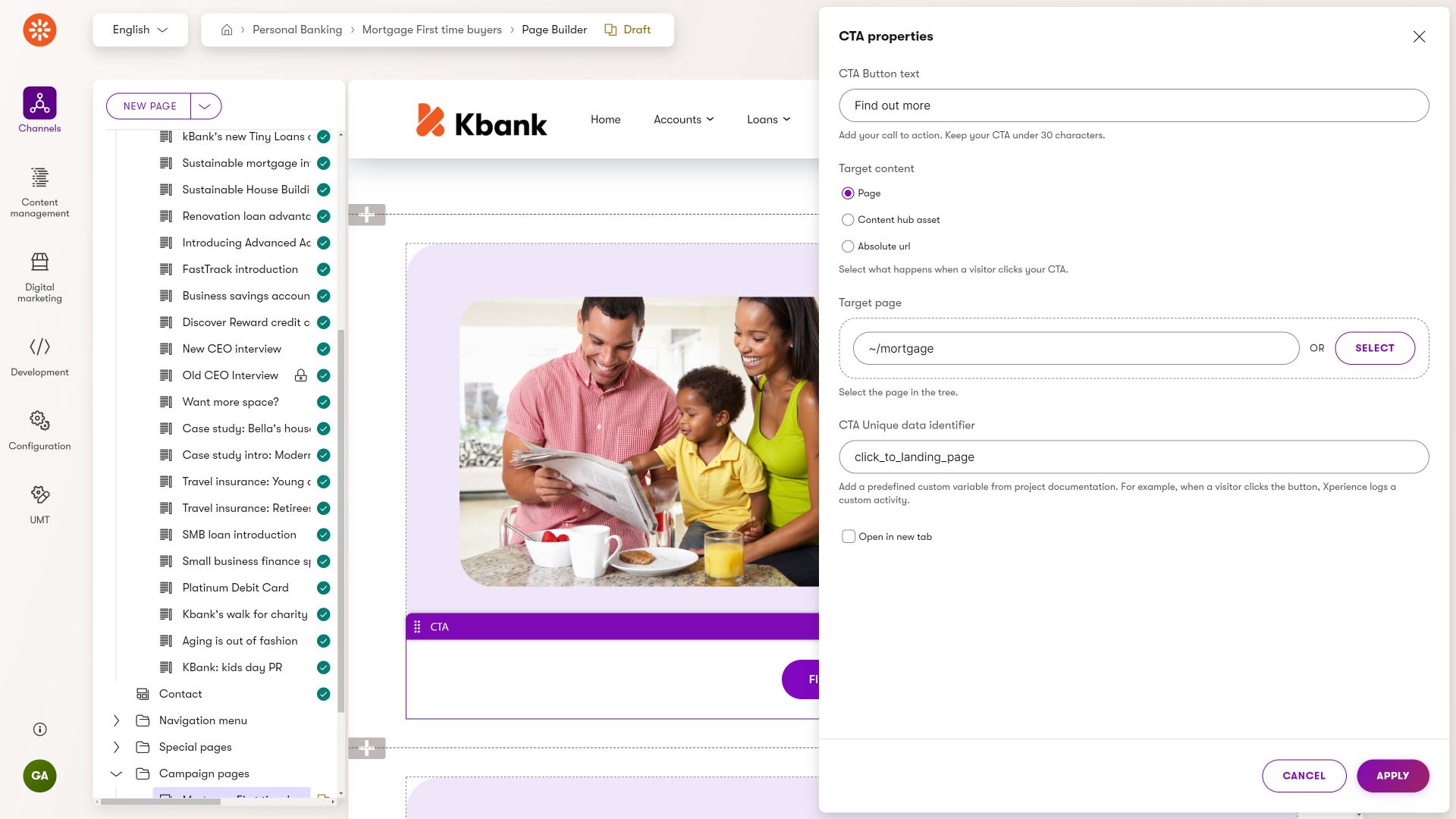
Editors can configure how a call‑to‑action button appears on a page through CTA properties.
After they enter the CTA button text, they can select target content. They can choose whether the CTA links to a page, an absolute URL, or an asset in Content hub. When linking to an internal page, the editor can either type the page path or use the Select button to browse the sitemap and pick the destination.
Further down, editors can optionally define a CTA Unique Data Identifier to enable custom click tracking. They can also configure the CTA link to open in a new tab.
You can select different after-click behaviors in the CTA widget on the Kbank demo site.
CTAs are rarely reused with the exact wording and configuration across different channels. This makes them great candidates for one-off widget content. If you need to share specific call-to-action configurations, such as button text, color, and a link to particular content, consider creating a reusable call-to-action content type. One editor creates this reusable item in the Content hub. It will be a global source of truth for linking to this specific content; everyone can reuse it whenever needed.
Form
Forms on landing pages serve as valuable tools for collecting information from visitors, such as their email addresses, names, or other relevant details. They play a crucial role in converting visitors into leads or customers by enabling them to take specific actions, such as signing up for a newsletter, requesting more information, or completing a purchase.
Designers need to ensure that editors can:
- Easily add forms to landing pages. Page Builder comes with a simple Form widget out of the box. If your company requires using a different technology, for example, due to integrations with other systems, implement a custom form widget that editors can simply add to the page and display forms from the required source.
- Style form properly. Editors need access to customizable styling options for forms. Providing styling choices allows editors to maintain visual consistency and align forms with the website’s design and branding.
- Improve form performance. This recommendation focuses on expanding the builder’s capabilities rather than just the form widget. For instance, if brand guidelines necessitate editors to divide lengthy forms into columns for better performance, your content model requirements must ensure that the components possess the necessary properties to elevate both the visual appeal and operational effectiveness of the forms. Remember to include diverse form elements such as buttons, input fields, and checkboxes which allow editors to create visually appealing and engaging forms that attract user attention.
- Lead visitors to form submissions. Editors need the flexibility to add anchor links to a form on a landing page from different page’s sections. This will help them optimize conversion opportunities and foster higher user engagement.
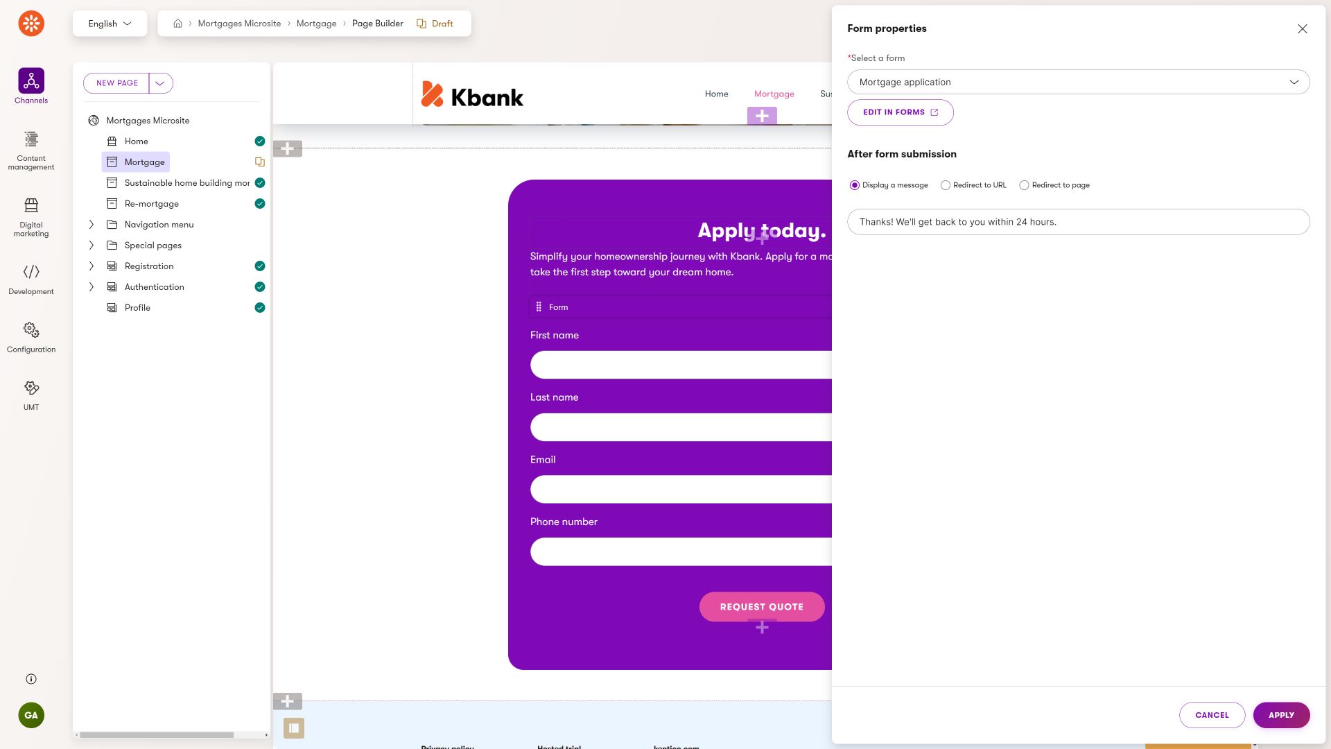
The default Form widget allows editors to select a form from the Forms application and configure what happens after a visitor submits it.
Page heading
Page headings and subheadings play a critical role in grabbing visitors’ attention. They help communicate key messages and guide visitors through the page content. Headings break down the information into smaller parts, create a visual hierarchy, and make the page easier to read. Good headings also make the page easier to find on search engines. They create a precise order, so people know what to focus on first.
Editors need to be able to:
- Use concise and descriptive headlines and subheadings to easily guide visitors through the content.
- Enhance brand recognition and consistency. For example, the Kbank demo site uses Kentico branding, and every heading 1 and heading 2 level dynamically adds a “full-stop.”
- Highlight specific headings without modifying the DOM Structure. Editors will need to ensure that particular headings stand out visually without compromising the integrity of the DOM structure. For example, the Kbank’s Page heading widget allows editors to change the size of the heading without altering the underlying HTML tag.
Featured content, Rich text
Every landing page is essentially a digital guidebook that clarifies information for its audience. These pages typically contain unique content tailored and fine-tuned for that landing page’s specific message and context. Editors often employ the Rich Text widget because it gives them enough flexibility to craft compelling narratives and convey key points effectively. However, the Rich Text widget is one of many ways editors can display data.
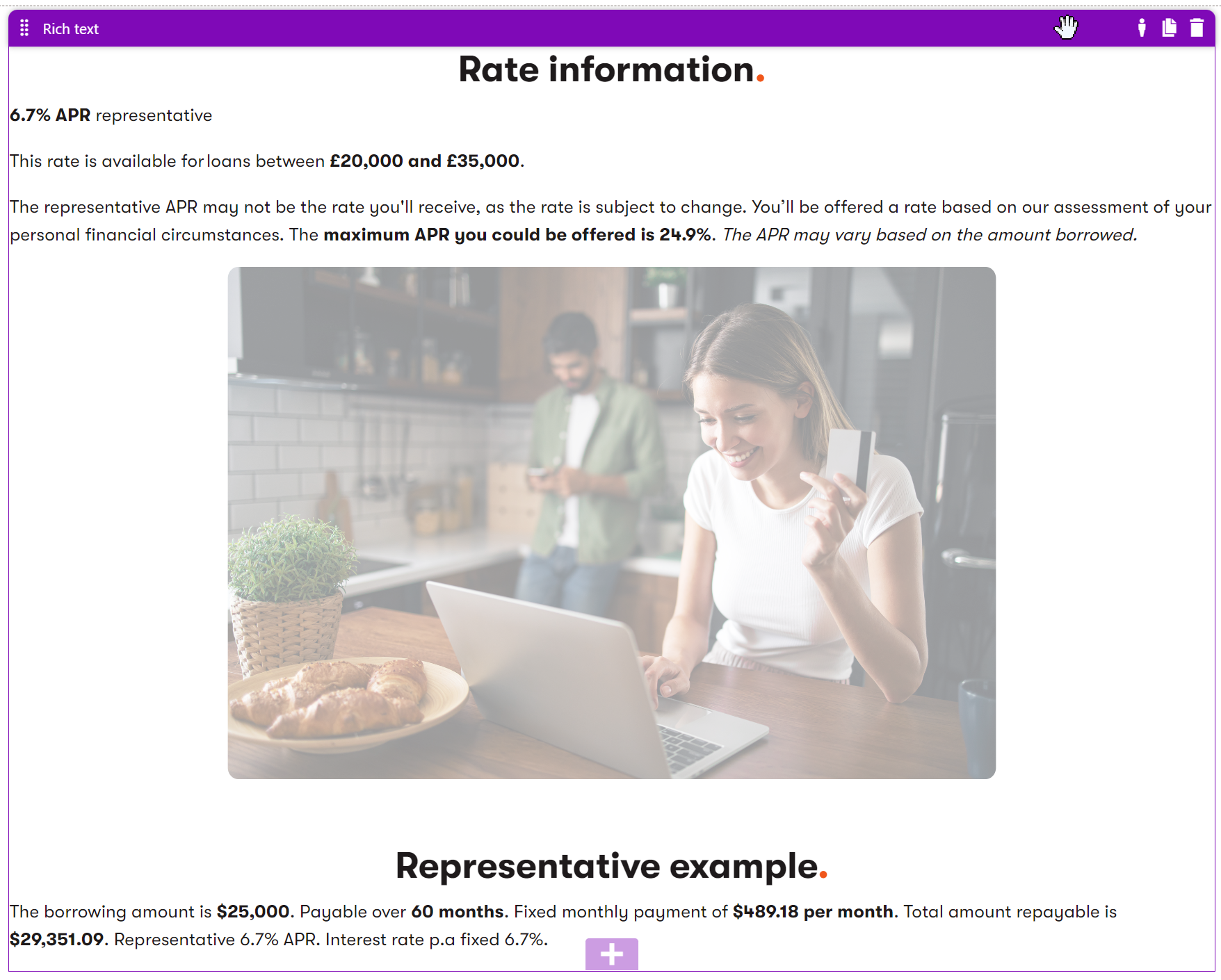
The Rich text editor provides a WYSIWYG experience. The editors can store loan rate information, highlight the representative APR, provide eligibility ranges, and include notes on how actual rates may vary.
They can place an illustrative image between the rate details and a following “Representative example” section, where they outline a sample borrowing amount, repayment term, fixed monthly payment, and total repayable amount.
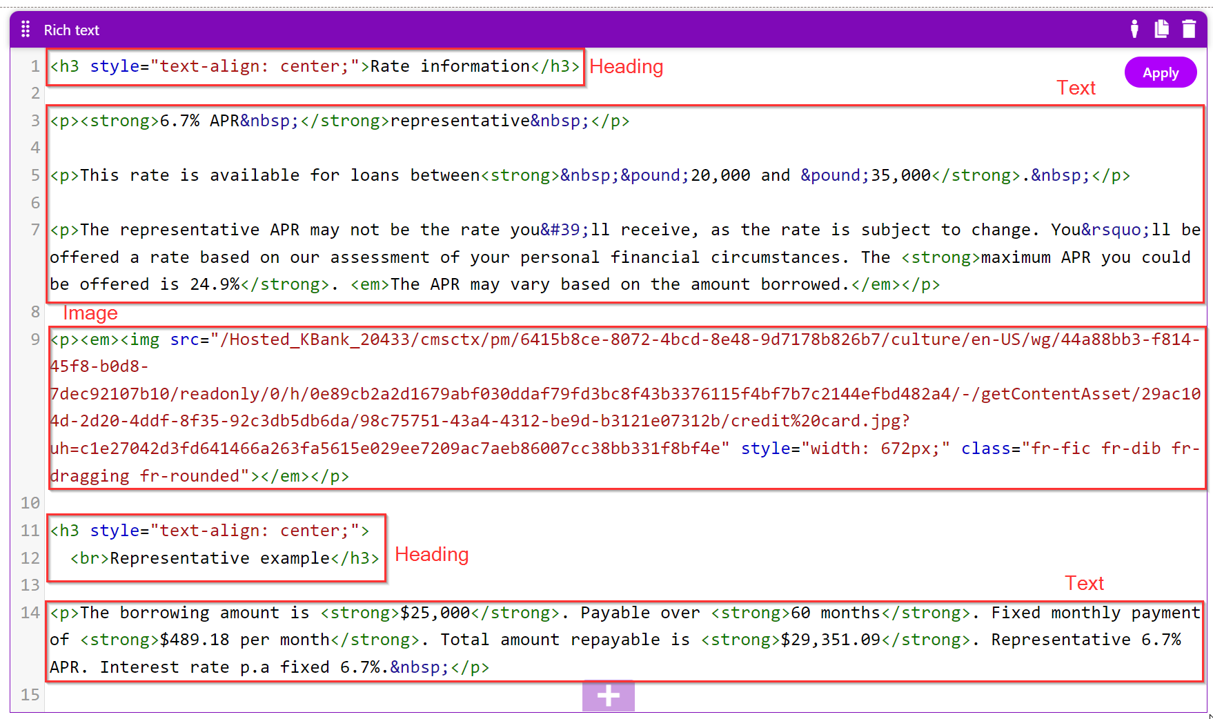
Rich text widget stores data in a single database cell as HTML. Each part of the formatted content is represented as HTML tags and inline attributes. In the database, the output appears as a block of HTML containing:
Headings stored as <h3> elements, sometimes with inline styles such as style=“text-align: center;”. Paragraphs stored as <p> elements, containing inline formatting like <strong> for bold text and HTML‑encoded characters for symbols (e.g., £ for £). An embedded image represented by an <img> tag inside a paragraph, including attributes such as the image’s src URL, inline style values for width, and CSS classes used by the editor. Structured text content in simple HTML form, including strong tags for emphasis, em tags for notes, and line‑break tags (<br>) where appropriate.
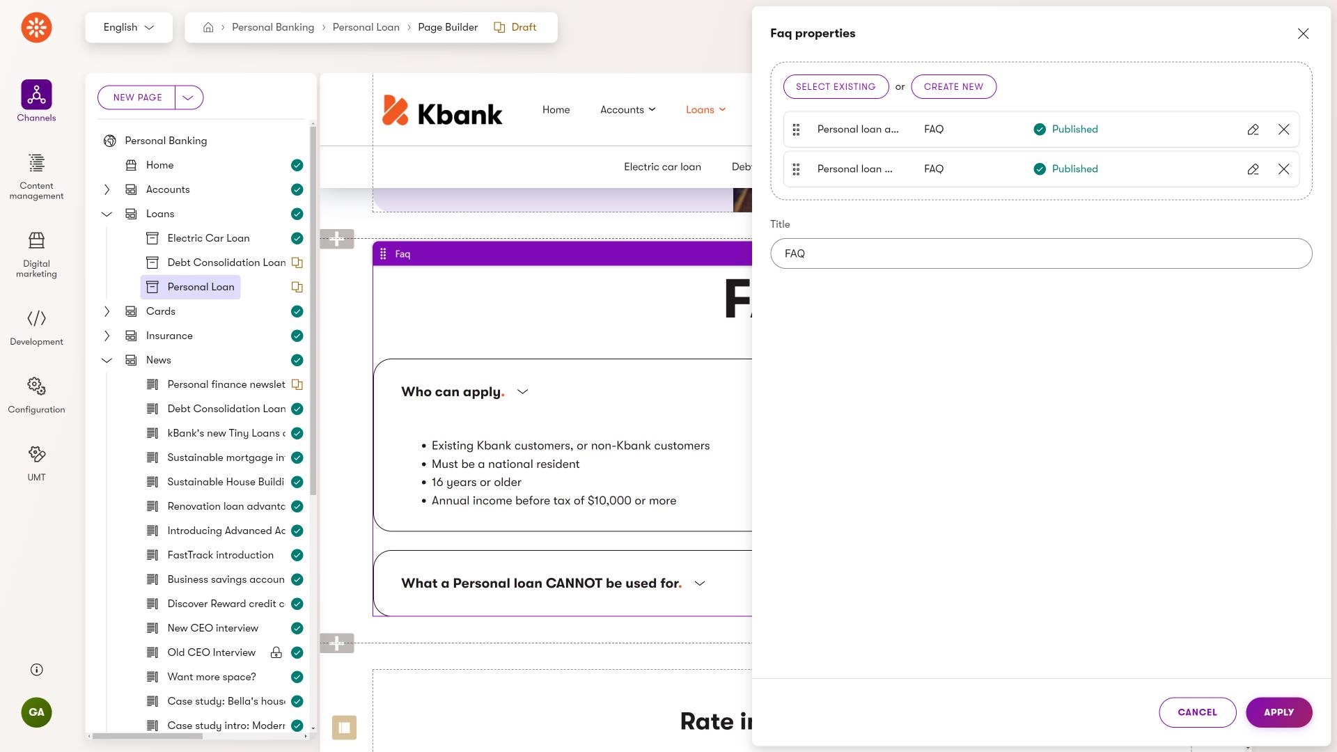
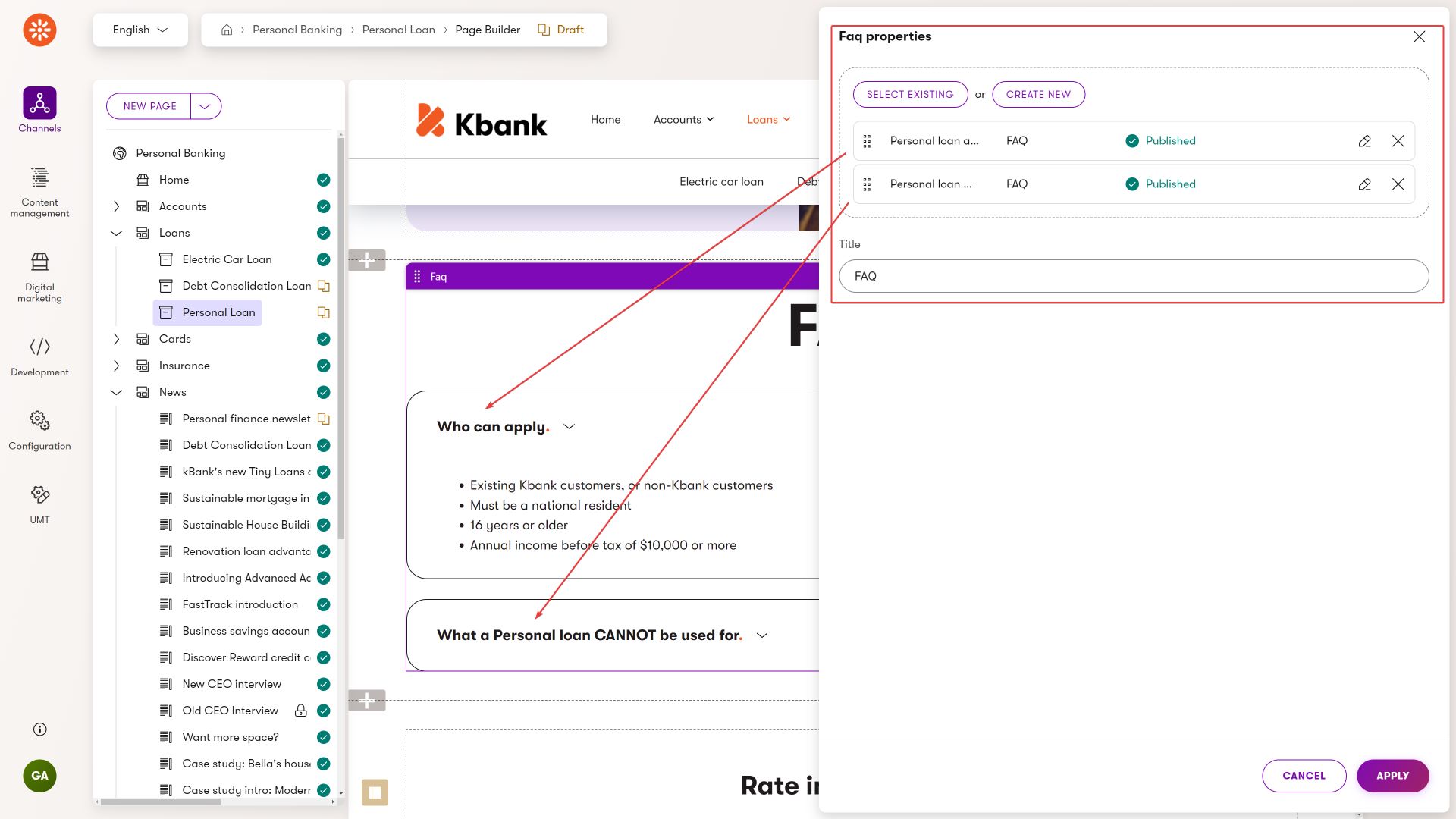
Using the FAQ widget properties, editors can configure which FAQ items appear in the widget. They can select existing FAQ content items or create new ones from within the widget, and then sort them.
When you consider editors’ workflow and content objectives, you may choose from one of the two options (or create their combination):
Leverage reusable content type
Editors often want to display text accompanied by visuals like images or videos within a website section. If your team aims for content reusability, define a content type with fields for text storage, image or video referencing, and additional optional fields like linked pages. Then, provide editors with a widget to reference this content type.
The reusable content approach is ideal for projects emphasizing multi-channel experiences and consistent campaign messaging.
Input data directly into the widget
In cases where content reusability isn’t a priority, editors can efficiently utilize the rich text widget.
However, it will help to consider the team’s and their content goals before you enable the default configuration anywhere. In many cases, it helps if developers use the rich text configuration options and customize the “tools” editors will have available. For example, hiding the Source button will prevent editors from storing presentation details in the rich text and using it only to define the structural information of their content, such as heading types, bullet point lists, or different text types.
For consistency in messaging, consider developing a custom widget that leverages structured content and fits the required scenarios.
FAQs
FAQs play an essential role on landing pages. They give answers to common questions about the offer. When marketers answer these questions and address customers’ concerns, they help people feel more confident about taking action. FAQs also show that the offer is honest and trustworthy, building brand confidence. They make it easier for people to find the information they need, making them more likely to take the next step. Plus, FAQs teach people more about the offer so they can make smarter choices and be happier with their decisions in the end.
Consider your team’s situation and how they plan to use FAQs in their content strategy. In many cases, combinations of different questions customers ask are often used in various places and marketing contexts. Rather than creating FAQ through rich text widget (making the FAQ one-off only), consider creating a dedicated content type to store the question and answer that editors will display through a dedicated widget on the website. See the following FAQ widget from the Kbank demo site.
Sections
Marketers employ various design concepts on campaign landing pages to enhance user experience, convey key messages effectively, and drive conversions.
For example, editors need to maintain consistent colors. Rather than defining complex configuration options through color, margin, and padding size properties, it’s much easier to define a Form section that contains configuration in code. Similarly, they might need to create white space around specific elements on the website page.
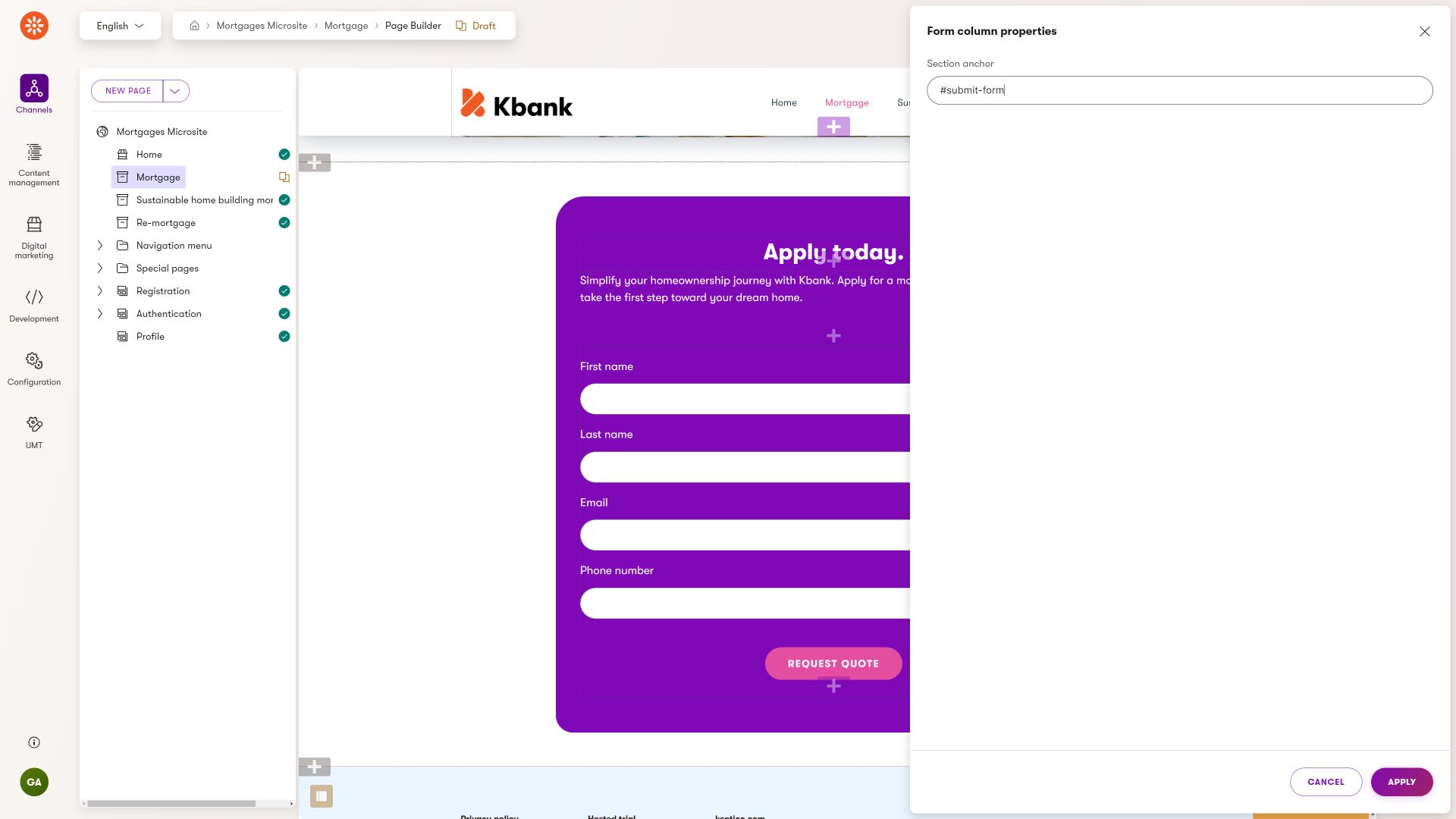
The Kbank demo site’s Form section styles the content according to the brand book in the backend. The editor can only configure the section’s anchor tag and the Form section styles properly.
Find out more about how you can approach sections in the article about modeling website sections.
Templates
To ensure editors maintain a consistent marketing experience, developers can create page templates where editors can save their preferred content or widget combinations, thus expediting content creation.
Similar to widgets, these templates offer various customizable properties, such as toggling the display of menus, breadcrumbs, or company logos, switching color schemes, and adjusting page layouts.
For instance, the Kbank demo site showcases a Content page template allowing users to adhere to specific page sections or opt for a more free-form layout.
Not every landing page needs to resemble a vibrant storefront. By defining properties at the template level, developers (and designers) can ensure that your company’s landing pages stay consistent and follow strict design requirements.
Summary
As a solution architect, you aim to define adaptable components that editors can easily add their content to and adjust quickly. These components should allow for changes without straying from the company’s brand rules. When creating landing pages becomes simpler, editors can focus more on creating great content that convinces customers to take action.
What’s next?
If you have followed this series about modeling Page Builder components, you know how to approach building editor experience for website channels. You have learned that you need to define flexible components that enable editors to swiftly add and adjust content while maintaining brand consistency. You are ready to define the Page Builder components to help editors craft compelling content that drives customer engagement and action, aligning with broader business objectives.