Define an advanced widget
Now that we’ve gone over the process of building a simple widget, let’s dive into a more complex example with many configuration options.
The code samples here are for a widget that displays financial services, with many properties to control which service data it shows and how the data are presented.
Combined with the Page templates and Page Builder section from earlier in this series, it works to achieve the page designs specified by these mockups:
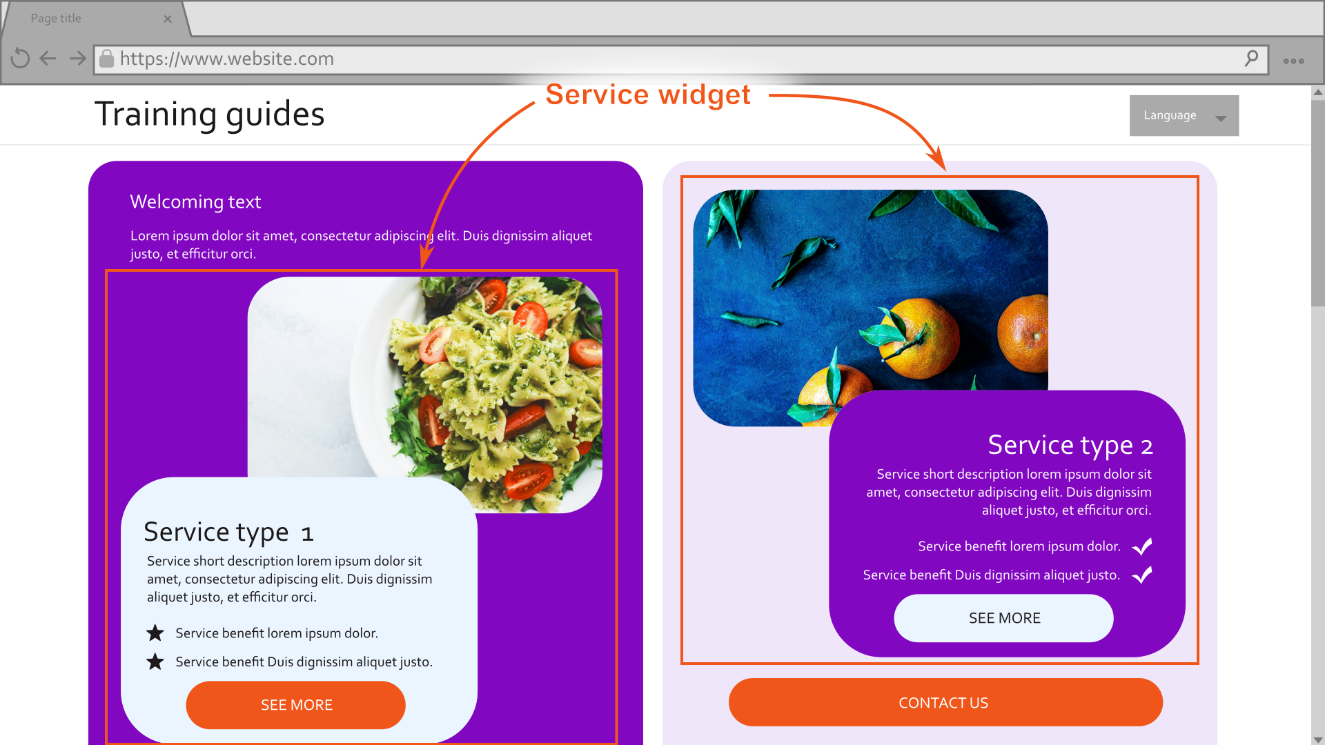
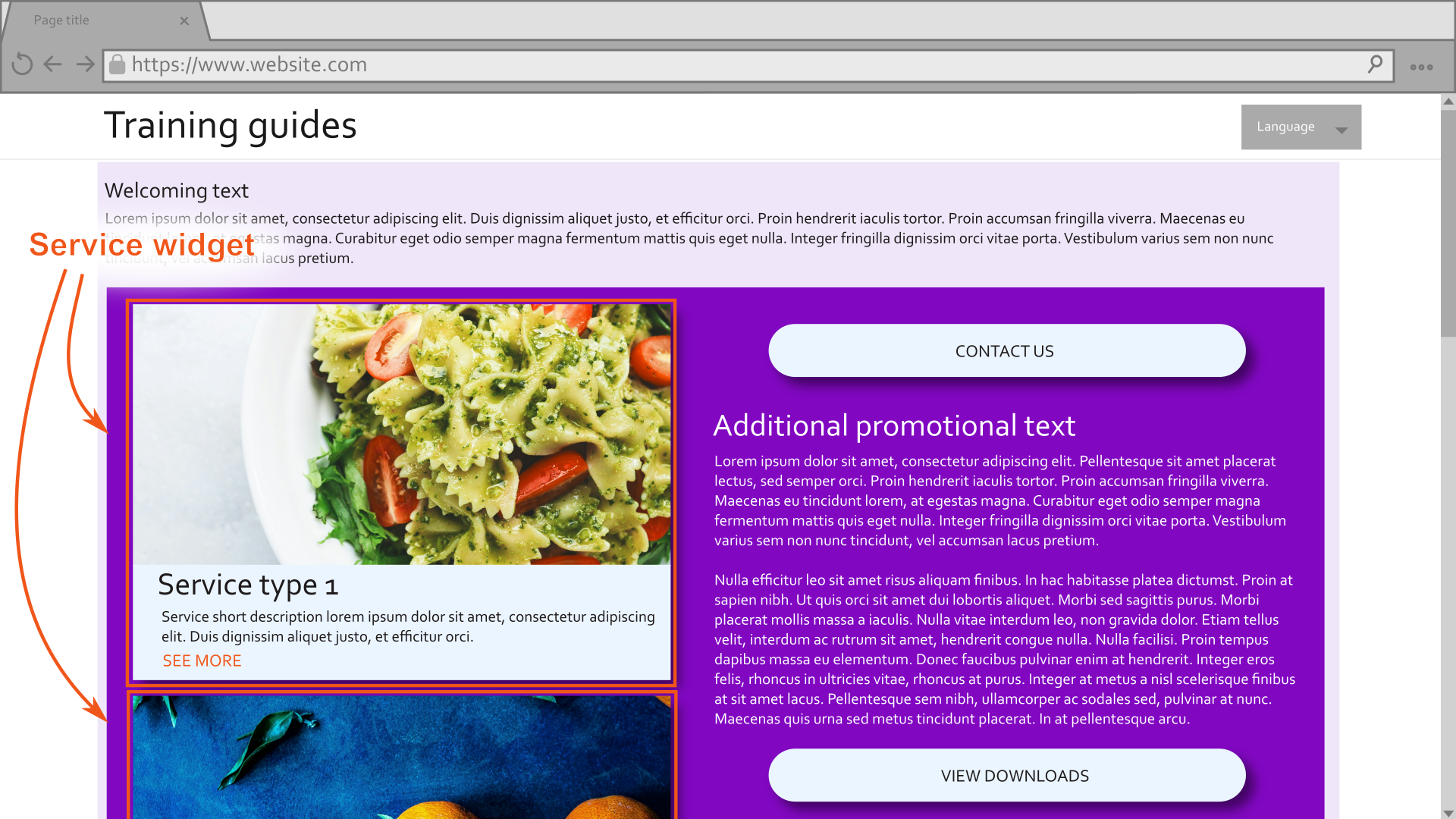
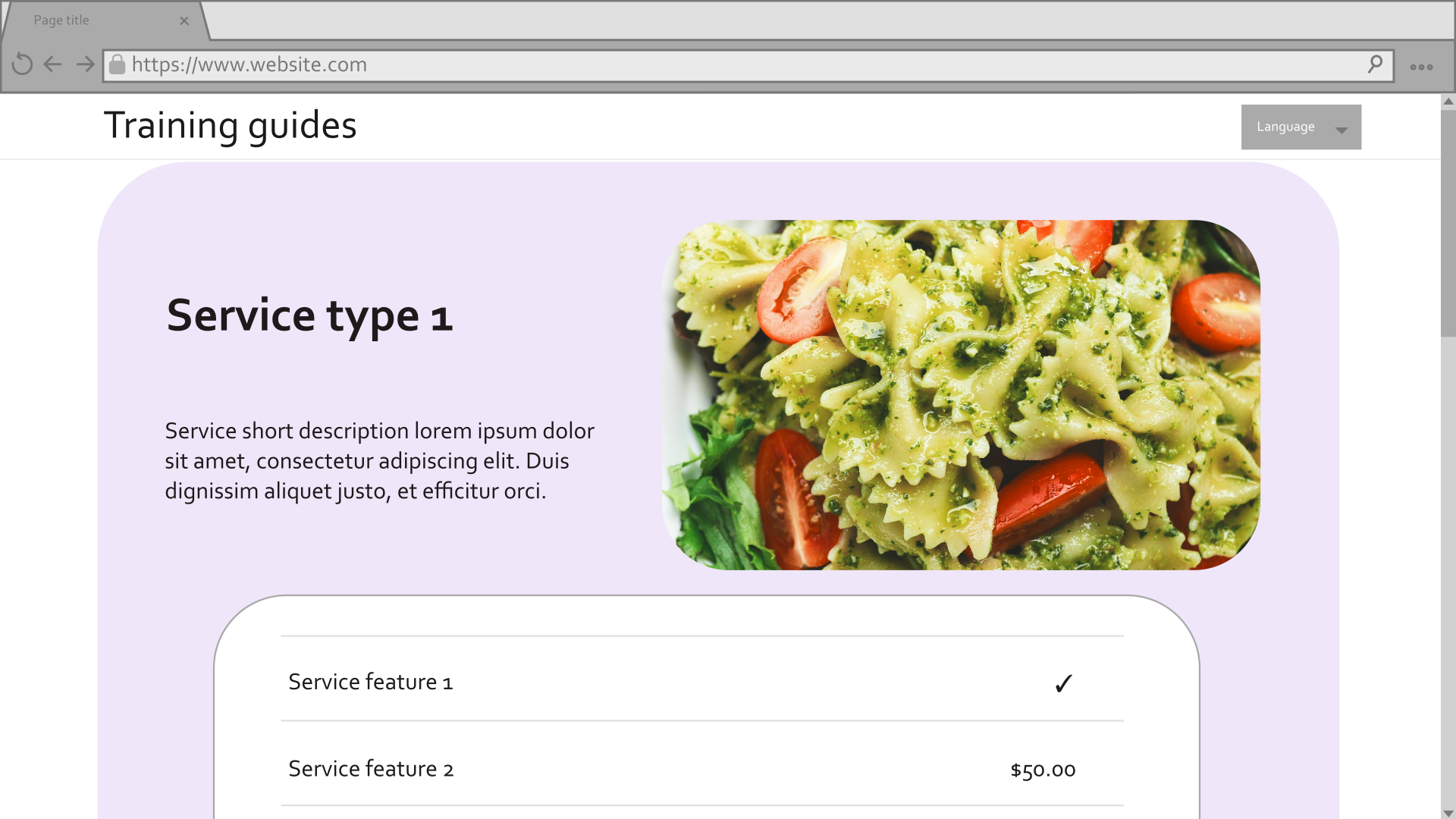
For a more detailed breakdown of how templates, sections, and widgets can be applied to achieve the mockups, check out the start of this series.
Prerequisites
This guide assumes you have:
- basic knowledge of C# and .NET framework concepts
- familiarity with the basics of Page Builder in Xperience by Kentico.
The code samples in this guide revolve around creating a Service widget, located in the ~/Features/FinancialServices/Widgets/Service folder of the TrainingGuides.Web project in the Training guides repository.
If you are working on your own project, make sure your instance of Xperience by Kentico is version 30.11.1 or higher.
If you’d like to follow along with this specific example, we recommend starting from the first guide in the Page Builder series. Many of the code samples in this guide rely on classes created in the previous guides.
If you’ve never created a widget before, but you don’t have time to follow along with the whole series, we recommend starting with the Simple CTA widget guide.
For a finished example implementation, take a look at the General section folder in the finished branch of our Training guides repository.
Create the widget view model
Begin with the widget view model, so that you have a focus on the final result the widget will render from the beginning.
Focus only on what the view needs at this point. We can gather, transform, and process the data however we like between the widget’s properties and view component.
Think of what your widget will need to display under different circumstances and decide what values will be necessary to achieve that.
Consider whether your view can reuse existing tools from your project and account for the parameters they need. For example, if we have a tag helper that renders a formatted date based on a
DateTimeobject, we can include an unprocessedDateTimevalue in the view model rather than a formatted date string.If your widget needs to show multiple possible layouts or designs, make sure to include properties that control the widget’s appearance.
If your team has an interface or abstract class for widget view models, make sure you’ve implemented all the appropriate members.
If this is your first widget, consider creating such a resource to promote consistency among widget view models where appropriate.
For example, you may include an abstract property to indicate if a widget is configured incorrectly. This invites the developers of future widgets to consider when to display an error message to business users.
Here is an example from the Training guides repository:
C#WidgetViewModel.csnamespace TrainingGuides.Web.Features.Shared.Models; public abstract class WidgetViewModel { public abstract bool IsMisconfigured { get; } }Many of the sample widgets in the finished branch of the Training guides repository inherit from the class above, such as the Hero banner and Article list.
using TrainingGuides.Web.Features.FinancialServices.Models;
using TrainingGuides.Web.Features.Shared.Models;

namespace TrainingGuides.Web.Features.FinancialServices.Widgets.Service;

public class ServiceWidgetViewModel : IWidgetViewModel
{
    public ServicePageViewModel? Service { get; set; }
    public bool ShowServiceFeatures { get; set; }
    public AssetViewModel ServiceImage { get; set; } = new();
    public bool ShowAdvanced { get; set; }
    public string ParentElementCssClasses { get; set; } = string.Empty;
    public string MainContentElementCssClasses { get; set; } = string.Empty;
    public string ImageElementCssClasses { get; set; } = string.Empty;
    public string ColorScheme { get; set; } = string.Empty;
    public string CornerStyle { get; set; } = string.Empty;
    public string CallToActionCssClasses { get; set; } = string.Empty;
    public bool IsImagePositionSide { get; set; } = false;

    public bool IsMisconfigured => Service is null;
}
Display the widget
Display messages to editors but not live site visitors
When editors work with widgets, we should help them by providing messages about how to work with the widget. Some messages make the most sense to display in the widget’s output, so that editors can see them outside of the widget properties dialog. However, we must make sure that these messages are not displayed on the live site, so visitors do not see messages that don’t concern them.
Create a tag helper or view component that displays its content only when the page is in Page Builder or Preview mode. For example:
using Kentico.Content.Web.Mvc;
using Kentico.PageBuilder.Web.Mvc;
using Kentico.Web.Mvc;
using Microsoft.AspNetCore.Razor.TagHelpers;

namespace TrainingGuides.Web.Features.Shared.Helpers.TagHelpers;

/// <summary>
/// Displays the inner content of the Tag Helper only when the page is being viewed
/// in Page Builder or Preview mode
/// </summary>
[HtmlTargetElement("tg-page-builder-content", TagStructure = TagStructure.NormalOrSelfClosing)]
public class PageBuilderContentTagHelper : TagHelper
{
    private readonly IHttpContextAccessor accessor;

    public PageBuilderContentTagHelper(IHttpContextAccessor accessor)
    {
        this.accessor = accessor;
    }

    public override void Process(TagHelperContext context, TagHelperOutput output)
    {
        var httpContext = accessor.HttpContext;

        bool isNotInPageBuilder = httpContext.Kentico().PageBuilder().GetMode() == PageBuilderMode.Off;
        bool isNotInPreview = !httpContext.Kentico().Preview().Enabled;

        if (isNotInPageBuilder && isNotInPreview)
        {
            output.SuppressOutput();
        }

        output.TagName = "";
    }
}
The PageBuilderContentTagHelper sample above can display static messages when the page is in Preview or Page Builder mode, but it can also work with dynamic content.
For example, here’s another tag helper that displays a message when the widget is not configured properly:
using Kentico.Content.Web.Mvc;
using Kentico.PageBuilder.Web.Mvc;
using Kentico.Web.Mvc;
using Microsoft.AspNetCore.Html;
using Microsoft.AspNetCore.Razor.TagHelpers;

namespace TrainingGuides.Web.Features.Shared.Helpers.TagHelpers;

/// <summary>
/// Displays a helpful message that a Widget needs to be configured when the page is viewed
/// in Page Builder or Preview mode.
/// </summary>
[HtmlTargetElement("tg-configure-widget-instructions", TagStructure = TagStructure.WithoutEndTag)]
public class ConfigureWidgetInstructionsTagHelper : TagHelper
{
    private readonly IHttpContextAccessor accessor;
    public string Message { get; set; } = string.Empty;

    private const string P_TAG = "p";
    private const string INSTRUCTIONS_EDIT_MODE = "This widget needs some setup. Click the <strong>Configure widget</strong> gear icon in the top right to configure content and design for this widget.";
    private const string INSTRUCTIONS_READONLY_MODE = "This widget needs some setup. Click <strong>Edit page</strong> and then the <strong>Configure widget</strong> gear icon in the top right to configure content and design for this widget.";
    private const string INSTRUCTIONS_PREVIEW_MODE = "This widget needs some setup. Switch to the <strong>Page Builder</strong> and <strong>Edit page</strong>.<br/>Then click the <strong>Configure widget</strong> gear icon in the top right to configure content and design for this widget.";

    public ConfigureWidgetInstructionsTagHelper(IHttpContextAccessor accessor)
    {
        this.accessor = accessor;
    }

    public override void Process(TagHelperContext context, TagHelperOutput output)
    {
        output.TagName = P_TAG;
        output.TagMode = TagMode.StartTagAndEndTag;

        var httpContext = accessor.HttpContext;
        string messageToShow = string.IsNullOrEmpty(Message)
            ? (httpContext.Kentico().PageBuilder().GetMode() switch
            {
                PageBuilderMode.Edit => INSTRUCTIONS_EDIT_MODE,
                PageBuilderMode.ReadOnly => INSTRUCTIONS_READONLY_MODE,
                PageBuilderMode.Off => INSTRUCTIONS_PREVIEW_MODE,
                _ => INSTRUCTIONS_PREVIEW_MODE
            })
            : Message;

        output.Content.SetHtmlContent(new HtmlString(messageToShow));
    }
}
Implement the widget view
Display helpful messages for editors when the widget is not configured properly.
Use tag helpers and view components to handle shared logic used in other parts of the system.
Use conditional logic to render different data and visual elements based on the values of the view model’s properties
@using System.Globalization
@using TrainingGuides.Web.Features.FinancialServices
@using TrainingGuides.Web.Features.FinancialServices.Widgets.Service
@using TrainingGuides.Web.Features.FinancialServices.Models
@using TrainingGuides.Web.Features.Shared.OptionProviders.Heading
@using TrainingGuides.Web.Features.Shared
@using TrainingGuides.Web.Features.Shared.OptionProviders.ColumnLayout
@using TrainingGuides.Web.Features.Shared.OptionProviders.ColorScheme
@using TrainingGuides.Web.Features.Shared.Services

@inject IHttpRequestService httpRequestService

@model ServiceWidgetViewModel

@{
    var baseUrl = httpRequestService.GetBaseUrl();
}

@if (Model is null || Model.IsMisconfigured)
{
    <tg-page-builder-content>
        <tg-configure-widget-instructions />
    </tg-page-builder-content>

    return;
}

<div class="@Model.ParentElementCssClasses">
    <a href="@Model.Service!.Link.LinkUrl"
        target="@(Model.Service.Link.OpenInNewTab ? "_blank": "")"
        title="@Model.Service.Link.LinkTitleText">

        @* image *@
        @if (Model.ServiceImage != null && !string.IsNullOrEmpty(Model.ServiceImage.FilePath) && !Model.IsImagePositionSide)
        {
            <tg-styled-image
                corner-style="@Model.CornerStyle"
                class="@Model.ImageElementCssClasses"
                src="@Url.Content(Model.ServiceImage.FilePath)"
                alt="@Model.ServiceImage.AltText">
            </tg-styled-image>
        }
        <tg-component-style
            color-scheme="@Model.ColorScheme"
            corner-style="@Model.CornerStyle"
            class="@Model.MainContentElementCssClasses">
            <div class="tg-row">
                <div
                    class="tg-col align-self-center m-3">
                    @* title *@
                    <h3 class="mt-2 mb-1">@Model.Service.NameHtml</h3>

                    @* short description *@
                    <p>@Model.Service.ShortDescriptionHtml</p>

                    @* benefits *@
                    @foreach (var benefit in Model.Service.Benefits)
                    {
                        <div class="tg-product_benefits c-icon-box mt-1 me-7">
                            <div class="c-icon-box_icon">
                                @if (benefit.Icon != null)
                                {
                                    <img
                                        src="@Url.Content(benefit.Icon.FilePath)"
                                        alt="@benefit.Icon.AltText" class="c-icon" />
                                }
                            </div>
                            <div class="c-icon-box_body">
                                @benefit.DescriptionHtml
                            </div>
                        </div>
                    }
                </div>
                @if (Model.ServiceImage != null && !string.IsNullOrEmpty(Model.ServiceImage.FilePath) && Model.IsImagePositionSide)
                {
                    <tg-styled-image
                        corner-style="@Model.CornerStyle"
                        class="@Model.ImageElementCssClasses"
                        src="@Url.Content(Model.ServiceImage.FilePath)"
                        alt="@Model.ServiceImage.AltText">
                    </tg-styled-image>
                }
            </div>
            @* features *@
            @if(Model.ShowServiceFeatures)
            {
                <div class="row">
                    <div class="c-pricelist">
                        <div class="col">
                            <tg-component-style color-scheme="@ColorSchemeOption.Light1" corner-style="@Model.CornerStyle" class="c-table">
                                @foreach (var feature in Model.Service.Features)
                                {
                                    <div class="c-table_row">
                                        <div class="c-table_cell"><div class="c-table_cell">@feature.LabelHtml</div></div>
                                        <div class="c-table_cell text-end">
                                            <tg-service-feature-value feature="@feature"/>
                                        </div>
                                    </div>
                                }
                            </tg-component-style>
                        </div>
                    </div>
                </div>
            }
            @* cta *@
            @if (!string.IsNullOrEmpty(Model.Service.Link.CallToAction))
            {
                <div class="mt-2">
                    <a type="submit"
                        href="@Model.Service.Link.LinkUrl"
                        class="btn text-uppercase @Model.CallToActionCssClasses"
                        target="@(Model.Service.Link.OpenInNewTab ? "_blank" : "")"
                        title="@Model.Service.Link.Name">@Model.Service.Link.CallToAction</a>
                </div>
            }
        </tg-component-style>
    </a>
</div>
Alongside the tag helpers we’ve just implemented, the sample above uses multiple tag helpers from the earlier page templates examples. You can review the details of their implementation here:
Define the widget’s properties
Widget properties are meant to gather only necessary data from editors. They do not need to include everything that the view model needs, because the data can be supplemented and transformed by the view component. Properties only require the input necessary to find everything the view model needs.
Some widgets that operate based on hard-coded values or settings stored elsewhere do not need properties at all. However, widgets meant to empower editors with flexible options rely heavily on properties.
If a flexible data source suits your scenario, create a property to determine where the widget sources its data.
For example, a widget can use data from its page by default, and pull data from a different page depending on the value of a property.If more details are required based on any of the data sources, use visibility conditions to display additional properties only when the corresponding option is selected.
If you are displaying structured data, add properties to determine what should be included or hidden.
For example, your editors may want to be able to choose whether or not a thumbnail image should appear alongside text-based content.Add properties to configure the visual display of the widget.
For example, the widget may need multiple options for layout and color scheme.If there are a lot of visual options, use visibility conditions to hide them by default. Display them only if the editor chooses to configure advanced properties with a checkbox.
Define any standard widget properties that should appear regardless of the other selections.
Consider how the properties should be ordered.
Remember that what seems logical to a developer is not necessarily intuitive for business users. If you typically focus on back-end development, it may be worth consulting a UX expert from your team.Include
ExplanationTextfor properties often, to alleviate confusion and ambiguity for your editors.Define any constants, dropdown providers, and sets of options to make maintenance easier.
C#ServiceWidgetProperties.csusing System.ComponentModel; using CMS.ContentEngine; using Kentico.PageBuilder.Web.Mvc; using Kentico.Xperience.Admin.Base.FormAnnotations; using TrainingGuides.Web.Features.Shared.OptionProviders; using TrainingGuides.Web.Features.Shared.OptionProviders.ColorScheme; using TrainingGuides.Web.Features.Shared.OptionProviders.CornerStyle; namespace TrainingGuides.Web.Features.FinancialServices.Widgets.Service; public class ServiceWidgetProperties : IWidgetProperties { // A property that determines the datasource of the widget [RadioGroupComponent( Label = "Select which Service page to display", Options = $"{ServiceWidgetModel.CURRENT_PAGE};{ServiceWidgetModel.CURRENT_PAGE_DESCRIPTION}" + $"\n{ServiceWidgetModel.SELECT_PAGE};{ServiceWidgetModel.SELECT_PAGE_DESCRIPTION}", Order = 10)] public string Mode { get; set; } = ServiceWidgetModel.CURRENT_PAGE; // A conditional property based on the selected data source [VisibleIfEqualTo(nameof(Mode), ServiceWidgetModel.CURRENT_PAGE, StringComparison.OrdinalIgnoreCase)] [TextInputComponent( Label = "Service page anchor", ExplanationText = "If displaying current page, optionally set what page anchor to navigate to when visitor clicks the widget or its call to action link.", Order = 20)] public string PageAnchor { get; set; } = string.Empty; // A conditional property based on the selected data source [VisibleIfEqualTo(nameof(Mode), ServiceWidgetModel.SELECT_PAGE, StringComparison.OrdinalIgnoreCase)] [ContentItemSelectorComponent( ServicePage.CONTENT_TYPE_NAME, Label = "Select service page", ExplanationText = "Choose the service page to be displayed in the widget.", MaximumItems = 1, Order = 30)] public IEnumerable<ContentItemReference> SelectedServicePage { get; set; } = []; // Properties that determine if specific data should be displayed or hidden [CheckBoxComponent( Label = "Display service image", Order = 40)] public bool ShowServiceImage { get; set; } = true; [CheckBoxComponent( Label = "Display service benefits", Order = 50)] public bool ShowServiceBenefits { get; set; } = true; [CheckBoxComponent( Label = "Display service features", Order = 60)] public bool ShowServiceFeatures { get; set; } = false; // Standard widget properties that do not depend on other selections [TextInputComponent( Label = "Call to action (CTA) text", ExplanationText = "Add a call to action text, e.g., \"Read more\".", Order = 70)] public string CallToAction { get; set; } = string.Empty; [CheckBoxComponent( Label = "Open in new tab", ExplanationText = "Opens Service page in new tab when visitor clicks the widget or CTA", Order = 80)] public bool OpenInNewTab { get; set; } = true; // Property to determine if advanced styling configuration should be shown [CheckBoxComponent( Label = "Show advanced options", Order = 90)] public bool ShowAdvanced { get; set; } = false; // Advanced styling properties, hidden if the ShowAdvanced checkbox is not enabled. [VisibleIfTrue(nameof(ShowAdvanced))] [DropDownComponent( Label = "Color scheme", ExplanationText = "Select widget color scheme.", DataProviderType = typeof(DropdownEnumOptionProvider<ColorSchemeOption>), Order = 100)] public string ColorScheme { get; set; } = nameof(ColorSchemeOption.Dark1); [VisibleIfTrue(nameof(ShowAdvanced))] [DropDownComponent( Label = "Corner style", DataProviderType = typeof(DropdownEnumOptionProvider<CornerStyleOption>), Order = 110)] public string CornerStyle { get; set; } = nameof(CornerStyleOption.Sharp); [VisibleIfTrue(nameof(ShowAdvanced))] [CheckBoxComponent( Label = "Drop shadow", Order = 120)] public bool DropShadow { get; set; } = false; [VisibleIfTrue(nameof(ShowAdvanced))] [VisibleIfTrue(nameof(ShowServiceImage))] [DropDownComponent( Label = "Image position", ExplanationText = "Select the image position with respect to text.", DataProviderType = typeof(DropdownEnumOptionProvider<ImagePositionOption>), Order = 130)] public string ImagePosition { get; set; } = nameof(ImagePositionOption.FullWidth); [VisibleIfTrue(nameof(ShowAdvanced))] [DropDownComponent( Label = "Text alignment", DataProviderType = typeof(DropdownEnumOptionProvider<ContentAlignmentOption>), Order = 140)] public string TextAlignment { get; set; } = nameof(ContentAlignmentOption.Left); [VisibleIfTrue(nameof(ShowAdvanced))] [VisibleIfNotEmpty(nameof(CallToAction))] [DropDownComponent( Label = "CTA button style", DataProviderType = typeof(DropdownEnumOptionProvider<LinkStyleOption>), Order = 150)] public string CallToActionStyle { get; set; } = nameof(LinkStyleOption.Medium); } // Add options for the position of the image in the widget public enum ImagePositionOption { [Description("Full width")] FullWidth, [Description("Left side")] Left, [Description("Right side")] Right, [Description("Ascending shape")] Ascending, [Description("Descending shape")] Descending } // Add options for how the content of the widget is aligned public enum ContentAlignmentOption { Left, Center, Right } // Add constants for names and descriptions public static class ServiceWidgetModel { public const string CURRENT_PAGE = "currentServicePage"; public const string CURRENT_PAGE_DESCRIPTION = "Use the current service page. (If this widget is placed on existing Service page, automatically displays the correspongind Service data.)"; public const string SELECT_PAGE = "servicePage"; public const string SELECT_PAGE_DESCRIPTION = "Select a service page."; }In some cases you may find it beneficial to move option enumerations into their own dedicated files.C#LinkStyleOption.csusing System.ComponentModel; namespace TrainingGuides.Web.Features.Shared.OptionProviders.ColorScheme; // Change description of color scheme enumeration options to apply to links/CTA buttons public enum LinkStyleOption { [Description("Button, dark")] Dark = ColorSchemeOption.Dark1, [Description("Button, medium")] Medium = ColorSchemeOption.Dark2, [Description("Button, light 1")] Light1 = ColorSchemeOption.Light1, [Description("Button, light 2")] Light2 = ColorSchemeOption.Light2, [Description("Button, light 3")] Light3 = ColorSchemeOption.Light3, [Description("Plain link, dark")] TransparentDark = ColorSchemeOption.TransparentDark, [Description("Plain link, medium")] TransparentMedium = ColorSchemeOption.TransparentMedium, [Description("Plain link, light")] TransparentLight = ColorSchemeOption.TransparentLight }For information about creatingIDropdownOptionProviderimplementations such as theDropdownEnumOptionProviderin this sample, see the custom dropdown example from earlier.
Build the widget view component
A widget’s view component is often the core of its functionality.
The view component contains the business logic that supplies all the values for the view model, usually by interacting with the Xperience API, or some external endpoint. It often uses widget properties to parameterize API interactions based on input from the editors.
Use an identifier constant to register the widget.
If you have any properties that are meant to change the data source of the widget, add conditional code that reacts to them accordingly.
If you have properties meant to affect how the widget interacts with APIs, make sure to take them into account.
For example, you may have a property to narrow the results of a query.Appraise your existing tools, such as services and extensions, to share code across your project and avoid redundancy.
If your application does not have any reusable resources that apply, and the widget shares functionality with other parts of your application, consider making new shared code.Pass along display-related properties that are handled in the view, while processing display-related properties that are not handled by the view.
using CMS.Helpers;
using Kentico.PageBuilder.Web.Mvc;
using Microsoft.AspNetCore.Mvc;
using Microsoft.AspNetCore.Mvc.ViewComponents;
using TrainingGuides.Web.Features.FinancialServices.Models;
using TrainingGuides.Web.Features.FinancialServices.Services;
using TrainingGuides.Web.Features.FinancialServices.Widgets.Service;
using TrainingGuides.Web.Features.Shared.Models;
using TrainingGuides.Web.Features.Shared.OptionProviders.CornerStyle;
using TrainingGuides.Web.Features.Shared.Services;

[assembly: RegisterWidget(
    identifier: ServiceWidgetViewComponent.IDENTIFIER,
    viewComponentType: typeof(ServiceWidgetViewComponent),
    name: "Service",
    propertiesType: typeof(ServiceWidgetProperties),
    Description = "Displays selected service.",
    IconClass = "icon-ribbon")]

namespace TrainingGuides.Web.Features.FinancialServices.Widgets.Service;

public class ServiceWidgetViewComponent(IContentItemRetrieverService contentItemRetrieverService,
        IComponentStyleEnumService componentStyleEnumService,
        IServicePageService servicePageService,
        IContentTypeService contentTypeService) : ViewComponent
{
    public const string IDENTIFIER = "TrainingGuides.ServiceWidget";
    private const string BS_DROP_SHADOW_CLASS = "shadow";
    private const string BS_MARGIN_CLASS = "m-3";
    private const string BS_PADDING_CLASS_3 = "p-3";
    private const string BS_PADDING_CLASS_5 = "p-5";

    public async Task<ViewViewComponentResult> InvokeAsync(ServiceWidgetProperties properties)
    {
        var model = await GetServiceWidgetViewModel(properties);

        if (model.Service?.Price is decimal price)
        {
            model.Service?.Features.Add(
                new ServiceFeatureViewModel
                {
                    Key = "price-from-service-content-item",
                    Name = "Price",
                    LabelHtml = new("Price"),
                    Price = price,
                    ValueHtml = new(string.Empty),
                    FeatureIncluded = false,
                    ValueType = ServiceFeatureValueType.Number,
                    ShowInComparator = true,
                });
        }

        return View("~/Features/FinancialServices/Widgets/Service/ServiceWidget.cshtml", model);
    }

    private async Task<ServiceWidgetViewModel> GetServiceWidgetViewModel(ServiceWidgetProperties properties)
    {
        if (properties == null)
            return new ServiceWidgetViewModel();

        var servicePageViewModel = await GetServicePageViewModel(properties);

        return new ServiceWidgetViewModel()
        {
            Service = servicePageViewModel,
            ShowServiceFeatures = properties.ShowServiceFeatures,
            ServiceImage = properties.ShowServiceImage
                ? servicePageViewModel?.Media.FirstOrDefault() ?? new AssetViewModel()
                : new AssetViewModel(),
            ShowAdvanced = properties.ShowAdvanced,
            ColorScheme = properties.ColorScheme,
            CornerStyle = properties.CornerStyle,
            ParentElementCssClasses = GetParentElementCssClasses(properties).Join(" "),
            MainContentElementCssClasses = GetMainContentElementCssClasses(properties).Join(" "),
            ImageElementCssClasses = properties.ShowServiceImage ? GetImageElementCssClasses(properties).Join(" ") : string.Empty,
            IsImagePositionSide = IsImagePositionSide(properties.ImagePosition),
            CallToActionCssClasses = componentStyleEnumService
                .GetColorSchemeClasses(componentStyleEnumService.GetLinkStyle(properties.CallToActionStyle ?? string.Empty))
                .Join(" ")
        };
    }

    private async Task<ServicePage?> GetServicePage(ServiceWidgetProperties properties)
    {
        ServicePage? servicePage;

        if (properties.Mode.Equals(ServiceWidgetModel.CURRENT_PAGE))
        {
            servicePage = await contentItemRetrieverService.RetrieveCurrentPage<ServicePage>(3);
        }
        else
        {
            var guid = properties.SelectedServicePage?.Select(webPage => webPage.Identifier).FirstOrDefault();

            servicePage = guid.HasValue && guid != Guid.Empty
                ? await contentItemRetrieverService.RetrieveWebPageByContentItemGuid<ServicePage>(
                    (Guid)guid,
                    4)
                : null;
        }

        int? serviceContentTypeId = contentTypeService.GetContentTypeId(ServicePage.CONTENT_TYPE_NAME);

        return servicePage?.SystemFields.ContentItemContentTypeID == serviceContentTypeId
            ? servicePage
            : null;
    }

    private async Task<ServicePageViewModel?> GetServicePageViewModel(ServiceWidgetProperties properties)
    {
        var servicePage = await GetServicePage(properties);

        if (!string.IsNullOrWhiteSpace(properties.PageAnchor))
        {
            properties.PageAnchor = properties.PageAnchor!.StartsWith('#')
                ? properties.PageAnchor
                : $"#{properties.PageAnchor}";
        }

        return servicePage != null
            ? await servicePageService.GetServicePageViewModel(
                servicePage: servicePage,
                getMedia: properties.ShowServiceImage,
                getFeatures: properties.ShowServiceFeatures,
                getBenefits: properties.ShowServiceBenefits,
                callToAction: properties.CallToAction,
                callToActionLink: properties.PageAnchor,
                openInNewTab: properties.OpenInNewTab,
                getPrice: properties.ShowServiceFeatures)
            : null;
    }

    private List<string> GetParentElementCssClasses(ServiceWidgetProperties properties)
    {
        const string PARENT_ELEMENT_BASE_CLASS = "tg-product";
        const string LAYOUT_FULL_WIDTH_CLASS = "tg-layout-full-width";
        const string LAYOUT_IMAGE_LEFT_CLASS = "tg-layout-image-left";
        const string LAYOUT_IMAGE_RIGHT_CLASS = "tg-layout-image-right";
        const string LAYOUT_ASCENDING_CLASS = "tg-layout-ascending";
        const string LAYOUT_DESCENDING_CLASS = "tg-layout-descending";

        List<string> cssClasses = [PARENT_ELEMENT_BASE_CLASS];

        if (properties.ShowServiceImage)
        {
            string imagePositionCssClass = properties.ImagePosition switch
            {
                nameof(ImagePositionOption.Left) => LAYOUT_IMAGE_LEFT_CLASS,
                nameof(ImagePositionOption.Right) => LAYOUT_IMAGE_RIGHT_CLASS,
                nameof(ImagePositionOption.Ascending) => LAYOUT_ASCENDING_CLASS,
                nameof(ImagePositionOption.Descending) => LAYOUT_DESCENDING_CLASS,
                nameof(ImagePositionOption.FullWidth) => LAYOUT_FULL_WIDTH_CLASS,
                _ => LAYOUT_FULL_WIDTH_CLASS
            };
            cssClasses.Add(imagePositionCssClass);

            if (IsImagePositionFullSize(properties.ImagePosition))
            {
                cssClasses.Add(BS_MARGIN_CLASS);

                cssClasses.AddRange(
                    componentStyleEnumService.GetCornerStyleClasses(
                        componentStyleEnumService.GetCornerStyle(properties.CornerStyle!)));

                if (properties.DropShadow)
                    cssClasses.Add(BS_DROP_SHADOW_CLASS);
            }
        }

        return cssClasses;
    }

    private List<string> GetMainContentElementCssClasses(ServiceWidgetProperties properties)
    {
        const string MAIN_CONTENT_BASE_CSS_CLASS = "tg-product_main";
        const string ROUND_CORNERS_BOTTOM_ONLY_CLASS = "bottom-only";
        const string TEXT_ALIGN_LEFT_CLASS = "align-left";
        const string TEXT_ALIGN_CENTER_CLASS = "align-center";
        const string TEXT_ALIGN_RIGHT_CLASS = "align-right";

        List<string> cssClasses = [MAIN_CONTENT_BASE_CSS_CLASS];

        cssClasses.AddRange(GetChildElementCssClasses(properties));

        if (properties.ShowServiceImage)
        {
            if (IsImagePositionSide(properties.ImagePosition))
                cssClasses.Add(BS_PADDING_CLASS_5);
            else
                cssClasses.Add(BS_PADDING_CLASS_3);

            if (IsImagePositionFullSize(properties.ImagePosition)
                && HasRoundCorners(properties.CornerStyle))
            {
                cssClasses.Add(ROUND_CORNERS_BOTTOM_ONLY_CLASS);
            }
        }

        string textAlignmentClass = properties.TextAlignment switch
        {
            nameof(ContentAlignmentOption.Left) => TEXT_ALIGN_LEFT_CLASS,
            nameof(ContentAlignmentOption.Center) => TEXT_ALIGN_CENTER_CLASS,
            nameof(ContentAlignmentOption.Right) => TEXT_ALIGN_RIGHT_CLASS,
            _ => TEXT_ALIGN_LEFT_CLASS
        };

        cssClasses.Add(textAlignmentClass);
        return cssClasses;
    }

    private List<string> GetImageElementCssClasses(ServiceWidgetProperties properties)
    {
        const string IMAGE_BASE_CSS_CLASS = "tg-product_img";
        const string ROUND_CORNERS_TOP_ONLY_CLASS = "top-only";
        List<string> imageLeftRightClasses = ["tg-col", "c-product-img", "object-fit-cover"];

        List<string> cssClasses = [IMAGE_BASE_CSS_CLASS];

        cssClasses.AddRange(GetChildElementCssClasses(properties));

        if (IsImagePositionSide(properties.ImagePosition))
        {
            cssClasses.AddRange(imageLeftRightClasses);
        }

        if (IsImagePositionFullSize(properties.ImagePosition)
        && HasRoundCorners(properties.CornerStyle))
        {
            cssClasses.Add(ROUND_CORNERS_TOP_ONLY_CLASS);
        }

        return cssClasses;
    }

    private List<string> GetChildElementCssClasses(ServiceWidgetProperties properties)
    {
        List<string> cssClasses = [];

        if (!IsImagePositionFullSize(properties.ImagePosition))
        {
            if (properties.DropShadow)
                cssClasses.Add(BS_DROP_SHADOW_CLASS);

            cssClasses.Add(BS_MARGIN_CLASS);
        }
        return cssClasses;
    }

    private bool IsImagePositionFullSize(string imagePosition) =>
        Equals(imagePosition, nameof(ImagePositionOption.FullWidth));

    private bool IsImagePositionSide(string imagePosition) =>
        Equals(imagePosition, nameof(ImagePositionOption.Left)) || Equals(imagePosition, nameof(ImagePositionOption.Right));

    private bool HasRoundCorners(string cornerStyle) =>
        Equals(cornerStyle, nameof(CornerStyleOption.Round)) || Equals(cornerStyle, nameof(CornerStyleOption.VeryRound));
}
If your project has a dedicated class for component identifiers, add the identifier for your widget.
    ...
    public static class ComponentIdentifiers
    {
        public static class Sections
        {
            ...
        }

        public static class Widgets
        {
            ...
            //Include the widget in the component identifiers list
            public const string SERVICE = ServiceWidgetViewComponent.IDENTIFIER;
            ...
        }
    }
Document your widget
When you develop a new widget, make sure you train your editors about how to use it, and create documentation for it. Things that seem self-explanatory to development teams may not be so clear to non-technical users, so it’s important to give editors and other business users instructions on how to use what you make for them.
See the results
Now your editors can place service details on pages, alongside other content and functionality.
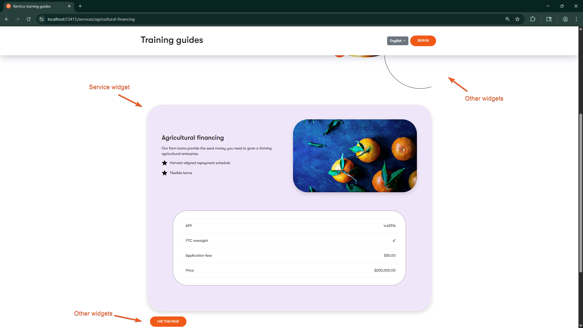
If you’ve followed along with this series about Page Builder, you can now use the General template, General section, Simple CTA widget, and Service widget to recreate the pages depicted in the mockups.
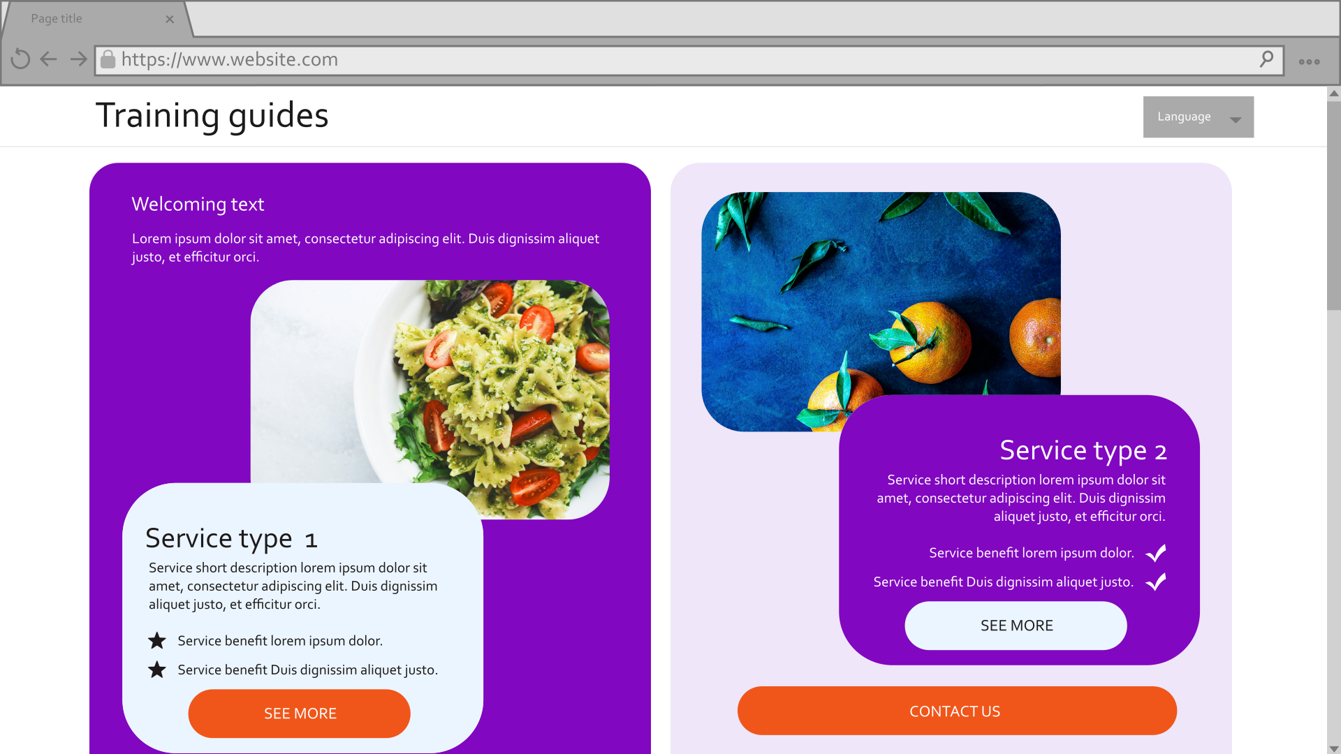
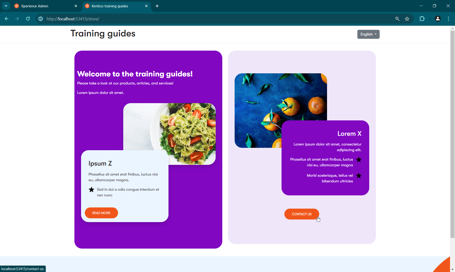
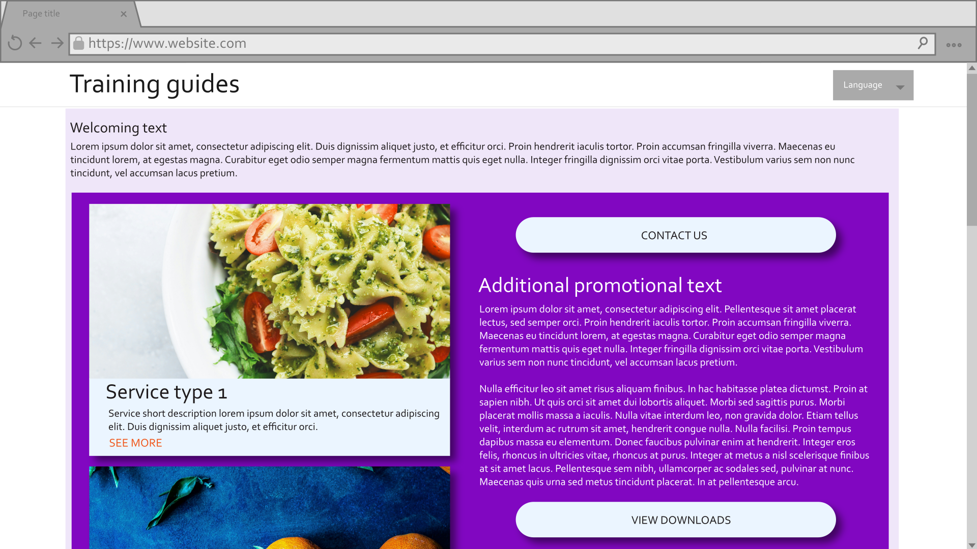
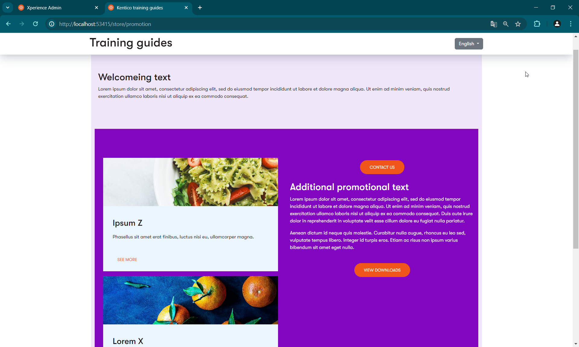

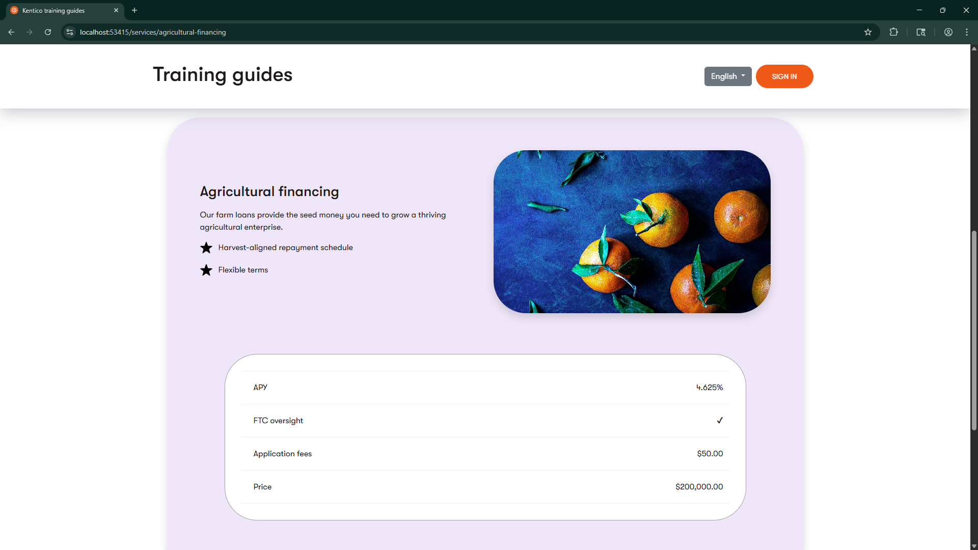
You’re welcome to tweak the styling to get the pages to appear even closer to the mockups. You can also apply your knowledge to add additional configurations to the template, section, and widgets.
Additionally, the finished branch of our Training guides repository has several additional widgets that you can look over and modify for your own purposes.
Localize the widget (optional)
If you are localizing your Admin UI into other languages, you can localize the widget’s name, description, and property labels so editors see them in their preferred language.
The localization process has two parts: first, you’ll replace hardcoded strings in your code with localization expressions. Then, you’ll define the actual translations in resource (.resx) files and register them with Xperience, as described in the Admin UI localization documentation.
For a complete example of a localized widget, see the CallToAction sample widget in the finished branch of the Training guides repository.
Localize widget properties
To localize the widget’s configuration interface, update widget property annotations to use localization expressions in the format {$ resource.key $}.
Here’s an example showing how to localize the Label and ExplanationText for one property in the Service widget:
using ...

namespace TrainingGuides.Web.Features.FinancialServices.Widgets.Service;

public class ServiceWidgetProperties : IWidgetProperties
{
    ...
    [ContentItemSelectorComponent(
        ServicePage.CONTENT_TYPE_NAME,
        Label = "{$TrainingGuides.ServiceWidget.SelectedServicePage.Label$}",
        ExplanationText = "{$TrainingGuides.ServiceWidget.SelectedServicePage.ExplanationText$}",
        MaximumItems = 1,
        Order = 30)]
    public IEnumerable<ContentItemReference> SelectedServicePage { get; set; } = [];
    ...
}
You’ll need to apply this pattern to all properties in the class that have user-facing strings.
Localize widget registration
Next, localize how the widget appears in the Page Builder widget selector. Use localization expressions in the widget registration attribute for the widget’s name and description:
using ...

[assembly: RegisterWidget(
    identifier: ServiceWidgetViewComponent.IDENTIFIER,
    viewComponentType: typeof(ServiceWidgetViewComponent),
    name: "Service",
    propertiesType: typeof(ServiceWidgetProperties),
    Description = "{$TrainingGuides.ServiceWidget.Description$}",
    IconClass = "icon-ribbon")]

namespace TrainingGuides.Web.Features.FinancialServices.Widgets.Service;

public class ServiceWidgetViewComponent(IContentItemRetrieverService contentItemRetrieverService,
        IComponentStyleEnumService componentStyleEnumService,
        IServicePageService servicePageService,
        IContentTypeService contentTypeService) : ViewComponent
{
    ...
Define resource strings
After adding localization expressions to your code, create the corresponding resource strings in .resx files. For example:
...
<data name="TrainingGuides.ServiceWidget.Name">
  <value>Service</value>
</data>
<data name="TrainingGuides.ServiceWidget.SelectedServicePage.Label">
  <value>Select service page</value>
</data>
...
Use AI agents to accelerate localization
AI assistants like GitHub Copilot can significantly speed up the localization process. For example:
- Manually write the localization expression for the first property, then let Copilot infer the pattern for the remaining properties.
- Use a prompt like the following to generate both the localized code and resource file entries:
For this widget properties class, perform two tasks:

1) Replace all hardcoded Label, ExplanationText, and Options strings with localization expressions in the format {$TrainingGuides.ServiceWidget.{PropertyName}.{ParameterType}$} (e.g., {$TrainingGuides.ServiceWidget.SelectedServicePage.Label$}).

2) Generate a .resx file with XML entries for each replaced string, using the original hardcoded values. Include entries from [RadioGroupComponent], [ContentItemSelectorComponent], [CheckBoxComponent], [DropDownComponent], and [TextInputComponent] attributes.

Provide both the updated C# code and the complete .resx XML content.
This approach reduces repetitive work while maintaining consistency across your localized content.
Note that this is just an example prompt. Adjust it to match your project’s naming conventions and specific needs, and provide the AI agent with the relevant code context.
We recommend using the Xperience by Kentico Documentation MCP server to help AI agents better understand Xperience widgets and localization patterns.