Model website navigation
Website navigation arranges links and menus to help users efficiently browse and access information on a website.
This guide will show you the recommended practices for defining and organizing content types and their properties that your editors will use to create your navigation menus in any website channel managed in Xperience by Kentico.
Prerequisites
You should have basic knowledge of content modeling principles.
Start from your marketing team’s needs
A thorough examination of your existing content, its lifecycle, editing workflows, and discussions with content editors, strategists, or information architects help build the groundwork for your content model.
Let’s see how to approach building website navigation options in Xperience using the following scenario:
Your marketing team manages several websites across different languages, including two main website channels and several smaller, campaign-focused microchannels. Each microchannel will have around 15 URLs, including several “thank you” pages that appear after users submit forms. The team wants to organize navigation menus independently on each channel.
On the main websites, they want to:
- Group navigation items at various levels – primary, secondary, or tertiary – to fit each site’s structure.
- Link from the navigation menu to pages that might reside within the same website, on another Xperience channel, or even on an external, third-party site.
On the microsite, they want to:
- Build only a primary-level navigation menu on the microchannel website.
- Link from the navigation menu to pages that reside on another Xperience channel and on external, third-party websites.
Analyze your team’s requirements for working with navigation
During the content audit and project shaping to deliver the scenario above, your team identified the following criteria:
The navigation will differ per website channel and will be multilingual.
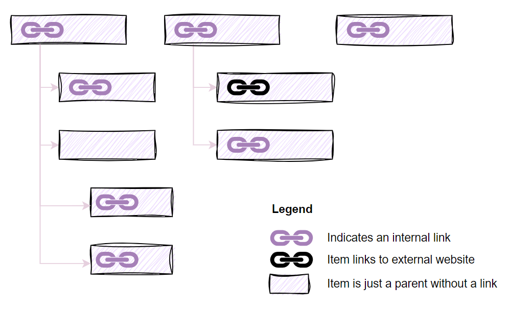
The primary navigation will have two levels, for example:

Side menus can nest up to three levels.
Some of the parent navigation items will contain a hyperlink.
The microchannel navigation will be single level and contain maximally five pages.
- Editors need to be able to dynamically add or remove pages from the menu and reorder individual pages in the navigation depending on the running campaigns.
Editors will need to adjust the navigation content on their own; creating navigation should be simple and follow the same pattern across different website channels.
Editors will need to create different menu items in different groups depending on the website channel. For example, microsites will have navigation without nested elements.
Designers expect to introduce mega menus for some of the website channels.
Define the content types and their properties to build the navigation menu
Based on your team’s requirements, you can define a Navigation content type editors will use to create different navigation menus.
Considering your team’s conventions, you’ve defined the following properties of the Navigation item:
- Navigation
- Caption
- Icon
- Item description
- Link to page
- Link to external website
- Open in a new tab
- Navigation menu type
- Header navigation
- Footer navigation
- Mega menu
- Side navigation
As designers consider building mega menus with icons and images, you will reuse the existing Asset content type to store mega menu visuals.
- Asset
- Description
- Alt text caption
- The media file
Three approaches to modeling navigation in Xperience by Kentico
In Xperience by Kentico, you can structure your navigation menus using one of three main approaches, each suited to different project needs. All approaches leverage the Combined Content Selector feature and allow editors to decide if they want to link to a page in the website channel, or use a dedicated reusable content type within one simple selector.
Define navigation in the content tree
With the content tree-based approach, editors build navigation menus by arranging pages directly within the content tree. Here, they can define parent-child relationships to create complex, multi-level menus.
Website microchannels limit the number of content tree items to 20. Learn more about the differences between standard and microchannels.
Advantages of defining navigation in the content tree
- Intuitive Structure: Editors grasp this approach easily, as the navigation in the content tree mirrors the actual navigation structure on the live site. Each item in the navigation section in the content tree represents a visible item in the menu or part of its structure. Editors can set up the hierarchy without any issues.
- Access Control: Using the page permissions in the content tree ACLs, you can control which editorial roles can access specific navigation sections within the content tree.
Challenges of defining navigation in the content tree
- Limiting item’s reusability: Content items used for navigation are defined as “Pages” and thus are inaccessible in the Content Hub for broader reuse across channels. If your navigation item contains a link to an external site, you cannot reuse this “link” in email or headless channel, and you have to create a different “reusable-only” link representation in the Content hub.
- Overloading the content tree: Adding navigation items to the content tree introduces “visual clutter,” as these items are non-navigable URLs. Editors can feel confused since these items don’t align with the rest of the content tree where each page represents a navigable URL. It also limits the number of navigable pages that editors can create in a microchannel.
Define navigation in the Content Hub
A recommended approach for most projects is to keep navigation separate from the content tree. Instead, editors store the navigation menu items within the Content Hub. They can put them into a dedicated Navigation menus folder per each website channel and ensure the navigation doesn’t mix with other content. (In the upcoming releases, editors will be able to assign these folders to a channel-specific workspace. The workspace will ensure that only roles allowed to work with the navigation for that specific channel will be able to edit the channel’s navigation menus.)
The following example from the Developer kickstart shows a simple implementation of a navigation menu using a dedicated content type.
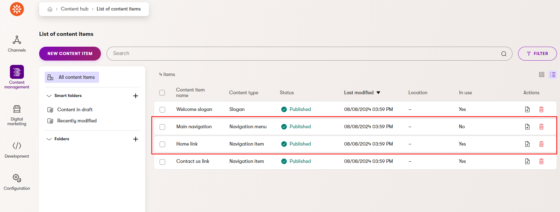
You can see three published content items that represent Main navigation, Home link, and Contact us link. These content items contain indicators which show whether each of these items is actively used in the website.
Advantages of defining navigation in the Content Hub
- Improving consistent behavior: Because navigation elements aren’t navigable, they remain distinct from the main content tree items that visitors access through URLs, keeping the content tree clean and reducing visual overload.
- Allows for flexible updates: Editors of large website projects often need to update the navigation structure completely, especially when part of their content strategy changes. Using navigation in the Content hub, they can create the new navigation layout without disturbing the existing content tree setup and block small navigation menu updates in the meantime.
- Simplifying the updates using Smart Folders: Smart folders are saved views in the Content hub that support dynamic delivery. By placing the navigation structure in a dedicated smart folder, you can easily display the navigation through a smart folder selector or update the navigation directly from the Content hub.
Challenges of defining navigation in the Content hub
- Too much reusability: Navigation items stored in the Content Hub become reusable across different channels, especially if you don’t store them in a dedicated folder or restrict access by adding them to a dedicated workspace in the future. As navigation is often unique to each website channel and making menu items can confuse editors. They might accidentally use a navigation menu from one channel in another and create navigation inconsistencies.
- Editor Confusion: Depending on the project configuration, editors in Xperience can create and launch their website channels by themselves without developers assistance. If approaches to modeling microchannel and standard channel navigation menus differ (see below), editors might not know where to define or edit the navigation. Using different methods for defining the same thing, such as a navigation menu, in projects with multiple channels where smaller channels are managed by teams with lower content management maturity can be confusing. If your project requires different approaches for building navigation menus, help everyone on your team succeed. For example, website administrators will use the upcoming workspace feature and make sure that editors only see navigation items they need to work with. Remember also to provide suitable documentation that explains the different approaches (and reasoning why they differ) to the editor teams.
Define microchannel navigation
In smaller or single-purpose website microchannels, navigation menus are simple with only a few items. The navigation typically consists of a primary menu, usually built from the main pages in the channel. It doesn’t make sense to create navigation structure of this size in the content tree as it makes the simple content tree unnecessarily complex. We recommend consulting with the team to understand their requirements for microchannels and determine which pages they want included in the navigation.
Dynamically list all navigation items
The simplest option developers can implement is to automatically include existing pages in the content tree into the navigation menu. Editors will need to follow the project documentation to ensure that the menu contains only the pages they intended to include.
There are many different options for how to approach building the navigation menu dynamically, for example:
- Developers can programmatically display only the content-tree’s top-level pages in the navigation. If the editors want to add, for example, thank you pages to their microsite, they need to add them as child pages to ensure navigation menu contains only intended items.
- The navigation menu will contain only pages of a specific content type, for example, a landing page built for a specific persona.
Allow editors to select navigation items
In many cases, editors want to define the microchannel navigation themselves and only include specific pages into the navigation menu. There are different ways how to implement the solution.
The recommended approach is to create a dedicated content type for Microchannel settings that editors add to the content tree. Editors can use it to override the global settings for each of their website microchannels.
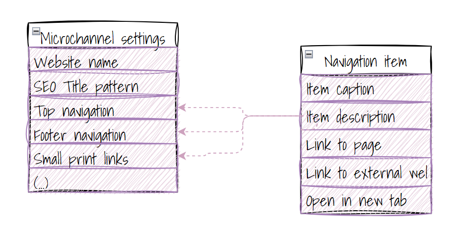
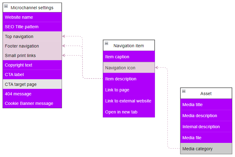
You can see a conceptual diagram showing how Microchannel settings connect to individual Navigation item content objects.
The Microchannel settings conent type contains fields, such as website name, SEO title pattern, top navigation, footer navigation, and small‑print links.
The Navigation item content type defines the structure for each link, including item caption, description, internal page link, external URL link, and an option to open the link in a new tab.
Using the dedicated selector in this Microchannel settings content type, editors can directly select the pages from the tree and order them as needed. In case they need to refer to external pages from their microchannel navigation, they can use a custom Navigation item content type or a reusable Global Call to action content type to store the target URL of an external website.
In large projects heavily built on reusable content scenarios, editors can display content of one content item in different places on the website or different even external website channels. They can use custom reusable Global Call to action content type to pair the reusable content item with it’s default navigable representation. We will cover different aspects of using the reusable Global Call to action content type in another guide.
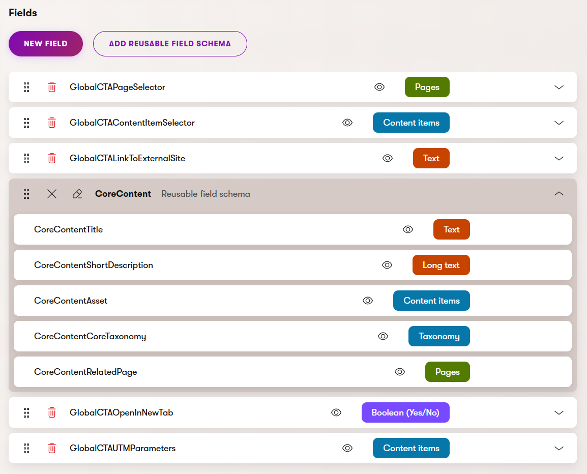
One of the convenient options is to create a custom Microchannel website page content type containing a custom Display in the menu checkbox property that editors select when creating the page. Developers will display all respective pages in the navigation using their order in the content tree. We don’t recommend using this approach for standard website channels with multi-layer navigation menus as they make their organization less transparent and tend to complicate building navigation menus when projects grow large.
Other options that provide less flexibility to editors include:
- Editors select pages they want to include into the navigation using the Page selector in a dedicated content type’s field.
- Editors leverage “Use in navigation” custom property that developers define for every webpage content type.
See our Developer kickstart for code samples about building navigation using dedicated Navigation menu content type instead of complex Website settings page content type.
Define how editors will create different navigation menus
Your model for the navigation menu is shaping up nicely. You know about the different options editors can use to define the navigation menus in Xperience. You’ve also identified the basic properties your team needs.
To sum up, we recommend storing navigation menus in the Content hub for most projects. For large websites with complex multi-level navigation, using the content tree’s visual hierarchy can simplify organization. However, for microchannels, remember that the content tree is limited to 20 items – using it for navigation reduces the number of actual pages you can create. Check the public roadmap for upcoming navigation-related features.
Let’s continue with the scenario.
Main website channel navigation
The team has decided build the navigation menus for the larger site in the content tree. This will highlight the navigation hierarchy, provide an easy way to add new items and offer editors drag-and-drop capabilities if they need to reorder the menu.
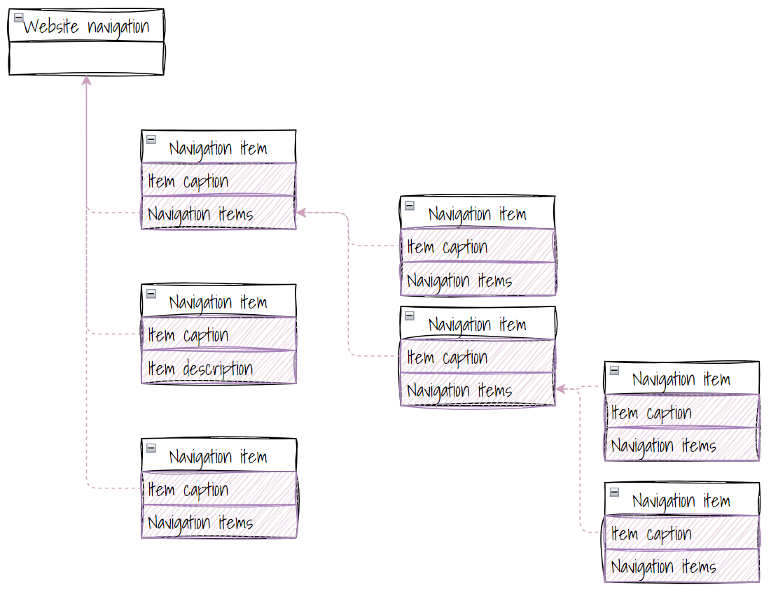
The multi‑level website navigation structure uses Navigation item content type that are children to a single Website navigation object, or the root of the menu.
The Navigation item objects branch downwards, each containing an item caption and an optional collection of nested navigation items. These items continue to branch into deeper levels, showing how navigation elements can contain sub‑items, and those sub‑items can contain further child items, forming a hierarchical tree. Some items also include additional fields like an item description, allowing editors to include optional metadata.
Microchannel navigation
For microchannel websites, the team agreed to use a dedicated content type to manually select items for the navigation menu. They also want to introduce additional properties that apply only to this microchannel that are not related to the navigation menu, and the custom Microchannel settings content type was a convenient solution.
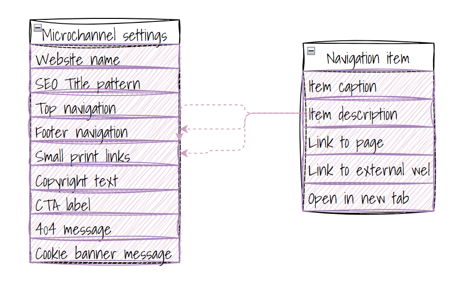
The Microchannel settings content type uses reusable Navigation item content items to define key website‑level configuration.
The Microchannel settings content type contains high‑level fields such as website name, SEO title pattern, top and footer navigation, small‑print links, copyright text, CTA label, 404 message, and the cookie‑banner message.
Each Navigation item defines the structure of an individual link, including item caption, description, an internal page link, an external URL option, and a toggle for opening links in a new tab.
You can create a dedicated content type to define channel-specific properties. To manage your website channel settings, you can also create global solutions such as a dedicated custom module. If you use custom modules, we still recommend creating navigation menus using the Content hub, rather than defining the navigation structure in the custom module.
Draft a simple navigation content type
When the team agrees on suggested approaches for building navigation, you can create a rough sketch of the content types for creating navigation menus, as you can see in the following image.
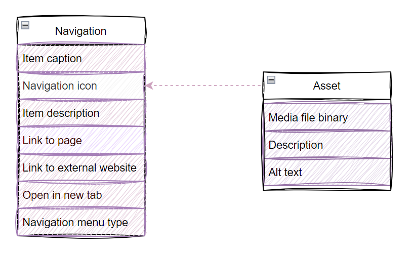
The fields inlcude:
- Item caption
- Navigation icon (reference to Asset content type)
- Item description
- Link to page
- Link to external website
- Open in a new tab (checkbox)
- Navigation menu type (top, footer, mega menu, etc.)
To simplify workflows for editors and developers, you’ve decided to build the navigation for standard website channel using one content type. As editors need to reorder items, they will make the navigation per website channel using a dedicated section in the content tree.
Add tips and hints for editors to your Navigation content type
Depending on your team’s experience, we recommend that you create sufficient instructions and document every content type field. Tips and hints help remove confusion and speed up your team’s content creation and curation process. Your instructions (and the whole content type) might look like the following:

For example, you can use Tooltip text and Text below input properties to provide guidance, as you can see in the image above.
Editors need to know how to correctly fill out each of the navigation item’s fields. The Text below input column provides helper messages that appear directly under fields in the editing interface, giving practical instructions like choosing a page from the site tree, when to select a page from the content tree, keeping labels short, adding full external links with parameters and description how to enter the URL, or selecting the navigation type.
The tooltips can provide additional context, such as the purpose of the field, additional guidance on style for labeling menu items, or what happens when editors enable the open in new tab option.
Verify Navigation content type with stakeholders
After completing the previous exercise, you and your team should know what content types editors need to store information for Navigation.
To help your team understand how editors will create the navigation in the hierarchy, you might want to create a simplified diagram like the following:
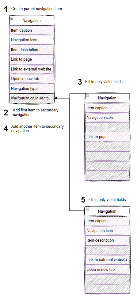
First, the editor creates a parent navigation item. Then they add a first child item to introduce the secondary navigation layer and fill in the available fields. They then repeat the process for each navigation item and each level of their navigation menu hierarchy.
Create the content type in Xperience
To verify that the editors can easily create different navigation menus for multiple website channels that satisfy their needs, create the Navigation content type in Xperience using the Content types application.
Xperience provides an dropdown component you can use to define lists of options. See a short, voice-less demonstration how you can help editors to define different navigation menu types or locations.
A navigation item added by an editor may look like the following:
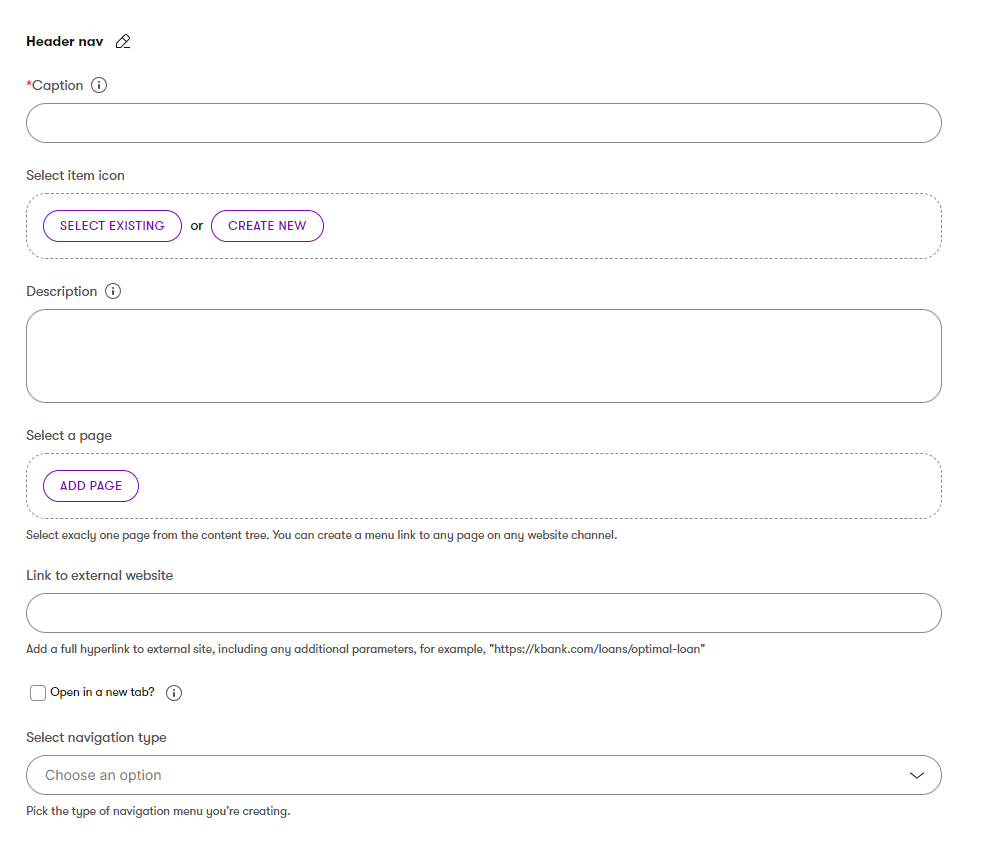
You can see a UI form of a content type used to build navigation items as structured data. Editors first add required Caption field that translates into a label that will appear in the menu. This field can serve both to create a link (if a page is selected), or to create a non-clickable element that builds a “section” within the navigation menu.
Other fields are optional. Editors can add an item icon that references asset content type, and a description for optional helper text that can appear in certain navigation layouts. Then, they can select a page from the site’s content tree, or instead provide a link to an external website by entering a full URL. A checkbox lets the editor choose whether that external link should open in a new tab.
Finally, the editor can specify in a dropdown selector what kind of navigation item they are creating, with guidance text explaining the purpose of the selection.
Have editors create a simple navigation structure
Representatives from the content editor team should participate in the website modeling process. It always helps to get a buy-in from the system users. Have your editors create several items in the content tree to get their feedback on how you’ve modeled the navigation content type and the whole navigation process.
During the hands-on testing, users raise questions and might bring out friction points they see when they use the content type. Listen to their feedback. They are the customers; they will use your designs daily, and you still have time to address their concerns.
For example, in our demo scenario, editors agreed that they like creating a navigation menu for their microsite using a dedicated settings page, as you can see in the Kbank demo site example.
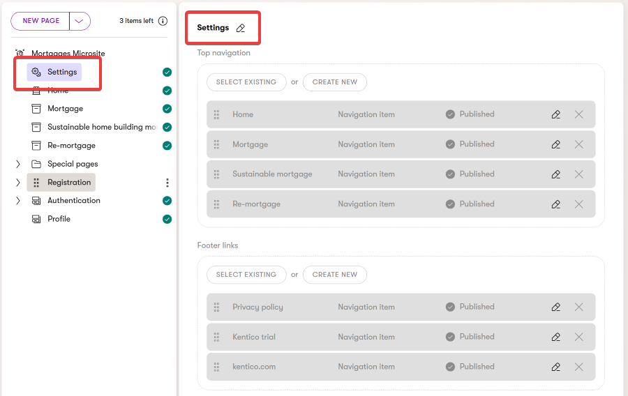
The Settings content item contains two Combined content selector fields where editors select reusable Navigation items. The top field serves to define the Top navigation, the bottom field is used for Footer links.
At the same time, they found it hard to understand that they create a navigation menu group and individual menu items with just one content type. They might also let you know that the visual experience where every item in the hierarchy was represented by the same icon of the content tree felt confusing.
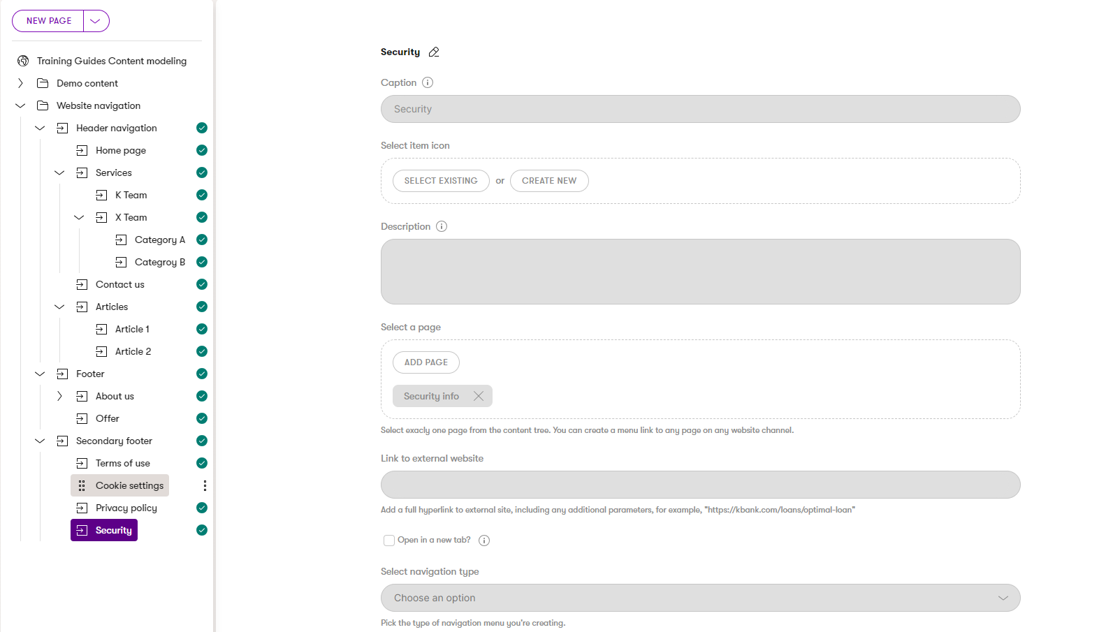
This time, editors create a new item in the content tree using the already-mentioned Navigation item. Instead of reusable content types, they use Page selector component to create links directly within the content tree. The navigation item provides all the additional options for customizing the navigation item, such as a caption or option to open in a new tab.
Redefine the editor flow into two Navigation content types
Talking to Kentico customers, we found that users with less technical background sometimes felt confused about how one item can reference another item of the same type or even become a parent to other items of the same type (and create a hierarchy). As your license in Xperience by Kentico does not limit you to a specific number of content types, you can create another content type to improve the editing experience.
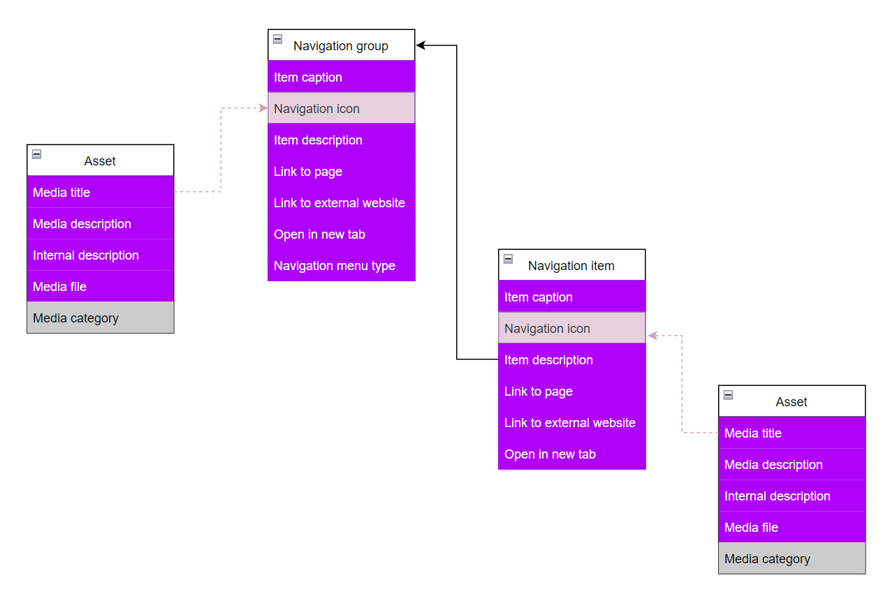
Adjust the editing experience and create an additional Navigation group content type that editors will use to define sets of links. The new Navigation group will serve as a parent item for the links within the navigation menus. At the same time, editors can create a link from the Navigation group, should they need it.
Your final types for creating navigation menus might look like the following hierarchies.
Finalize your content type and get a write-off
Adjust both Navigation group and Navigation item content types, add instructions for editors to the new type, add anything missing during the testing, and resolve conflicts in data types and field order.

Once your content types for creating website navigation menus are done, hand over the definition to your team.
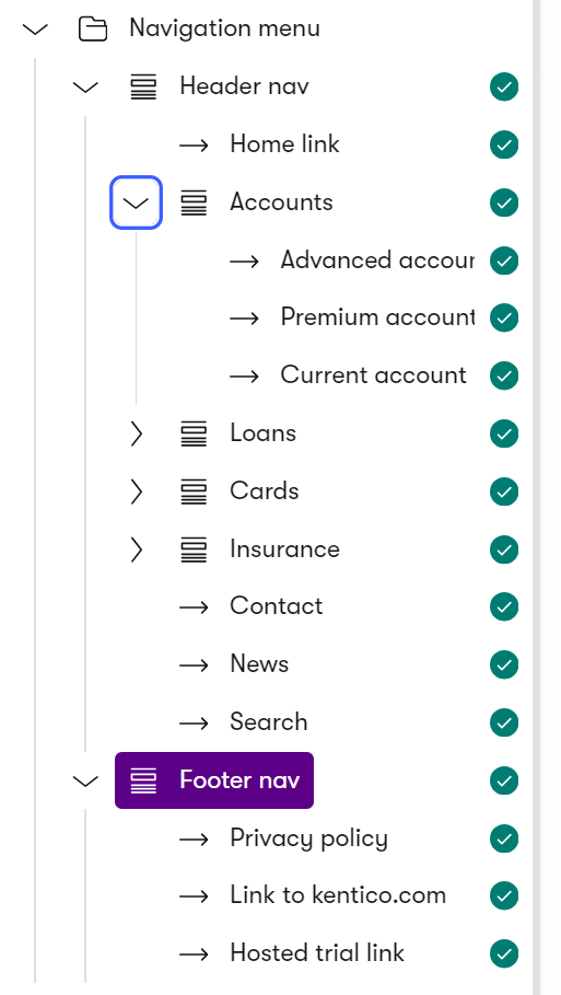
If you’ve followed the example in this guide, your editors can create different navigation menus in any website channel using the visual hierarchy of the content tree. Here’s an example of a demo of the Kbank Personal site’s navigation menu in the content tree, and a selected Fotter nav parent item with Privacy policy, Link to kentico.com, and Hosted trial link child items.
