Create versatile page templates, part 1
In this guide, we’ll walk through the process of creating a page template to match this service detail mockup:
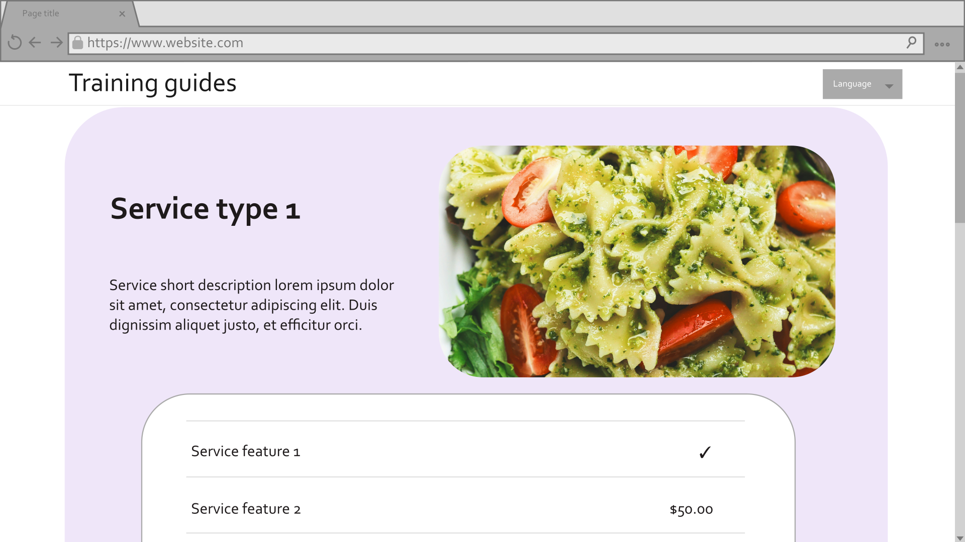
See the first guide in this series for an overview of the mockup, and a breakdown of how to meet business requirements with Page Builder.
Prerequisites
This guide uses the main branch of the Training guides repository as a starting point.
It relies on the dropdown provider from the previous guide.
If you’re following along while working in a different environment, make sure:
- Your instance of Xperience by Kentico is version 31.3.3 or higher.
Some features covered in the training guides may not work in older versions.
- Your site has Service, ServicePage, ServiceFeature, and Benefit content types that match the structure of those in the repository.
- Page Builder is enabled for the Service page content type during the application’s startup sequence.
This guide will take place in the TrainingGuides.Web project of the repository, so assume any folder paths start from the root of this project.
Show structured data
The data in the mockup comes from the Service content type, which is served in the web channel through the Service page content type.
In order to implement a page that matches the mockup without any extra steps for editors, we need to access that data and display it directly in the template.
Let’s start by setting up view models to work with the data.
Set up the view models
Create supporting view models
First, let’s set up the view model for the service page.
If you look at the Service content type in Xperience, you’ll notice that Service items reference collections of Benefit and Service feature content items. Start by making view models for these content types, so we can work with them in views and .NET services later on.
- In the ~/Features/FinancialServices/Models folder, add a file called ServiceFeatureViewModel.cs.
- Create properties corresponding to the content type’s fields.
C#ServiceFeatureViewModel.cs
using Microsoft.AspNetCore.Html; namespace TrainingGuides.Web.Features.FinancialServices.Models; public class ServiceFeatureViewModel { public string Key { get; set; } = string.Empty; public string Name { get; set; } = string.Empty; public HtmlString LabelHtml { get; set; } = HtmlString.Empty; public decimal Price { get; set; } public HtmlString ValueHtml { get; set; } = HtmlString.Empty; public bool FeatureIncluded { get; set; } public ServiceFeatureValueType ValueType { get; set; } public bool ShowInComparator { get; set; } } - Include a
ServiceFeatureValueTypeenumeration to represent the value of theValueTypefield at the bottom of the file.C#ServiceFeatureViewModel.cs... //(After the end of the ServiceFeatureViewModel class's scope) public enum ServiceFeatureValueType { //These integers correspond to the data source in the Service feature content type, defined in the Xperience admin interface. Text = 0, Number = 1, Boolean = 2 } - Add a method to the
ServiceFeatureViewModelclass to get the corresponding enum value from an integer.C#ServiceFeatureViewModel.cs... private static ServiceFeatureValueType GetValueType(string value) { if (string.IsNullOrEmpty(value)) return ServiceFeatureValueType.Text; if (int.TryParse(value, out int id)) return (ServiceFeatureValueType)id; return ServiceFeatureValueType.Text; } ... - Add a static
GetViewModelmethod to create and populate aServiceFeatureViewModelbased on aServiceFeatureobject.ServiceFeatureis a generated class, created by the Xperience code generation tool.C#ServiceFeatureViewModel.cs... public static ServiceFeatureViewModel GetViewModel(ServiceFeature feature) => new() { Key = feature.ServiceFeatureKey, Name = feature.SystemFields.ContentItemName, LabelHtml = new(feature.ServiceFeatureLabel), Price = feature.ServiceFeaturePrice, ValueHtml = new(feature.ServiceFeatureValue), FeatureIncluded = feature.ServiceFeatureIncluded, ValueType = GetValueType(feature.ServiceFeatureValueType), ShowInComparator = feature.ServiceFeatureShowInComparator == "1" }; ...
That takes care of Service feature, so let’s move on to the Benefit content type.
- Create a new class called
BenefitViewModelin the ~/Features/Shared/Models folder. - Add properties that correspond to the Benefit content type’s fields, utilizing the existing
AssetViewModelclass for the asset.C#BenefitViewModel.csusing Microsoft.AspNetCore.Html; namespace TrainingGuides.Web.Features.Shared.Models; public class BenefitViewModel { public HtmlString DescriptionHtml { get; set; } = HtmlString.Empty; public AssetViewModel Icon { get; set; } = new(); } - Add a static
GetViewModelmethod to retrieve aBenefitViewModelfrom an object of the generatedBenefitclass.C#BenefitViewModel.cs... public static BenefitViewModel GetViewModel(Benefit benefit) => new() { DescriptionHtml = new(benefit.BenefitDescription), Icon = benefit.BenefitIcon?.FirstOrDefault() != null ? AssetViewModel.GetViewModel(benefit.BenefitIcon.FirstOrDefault()) : new(), };
using Microsoft.AspNetCore.Html;

namespace TrainingGuides.Web.Features.FinancialServices.Models;

public class ServiceFeatureViewModel
{
    public string Key { get; set; } = string.Empty;
    public string Name { get; set; } = string.Empty;
    public HtmlString LabelHtml { get; set; } = HtmlString.Empty;
    public decimal Price { get; set; }
    public HtmlString ValueHtml { get; set; } = HtmlString.Empty;
    public bool FeatureIncluded { get; set; }
    public ServiceFeatureValueType ValueType { get; set; }
    public bool ShowInComparator { get; set; }

    public static ServiceFeatureViewModel GetViewModel(ServiceFeature feature) => new()
    {
        Key = feature.ServiceFeatureKey,
        Name = feature.SystemFields.ContentItemName,
        LabelHtml = new(feature.ServiceFeatureLabel),
        Price = feature.ServiceFeaturePrice,
        ValueHtml = new(feature.ServiceFeatureValue),
        FeatureIncluded = feature.ServiceFeatureIncluded,
        ValueType = GetValueType(feature.ServiceFeatureValueType),
        ShowInComparator = feature.ServiceFeatureShowInComparator == "1"
    };

    private static ServiceFeatureValueType GetValueType(string value)
    {
        if (string.IsNullOrEmpty(value))
            return ServiceFeatureValueType.Text;

        if (int.TryParse(value, out int id))
            return (ServiceFeatureValueType)id;

        return ServiceFeatureValueType.Text;
    }
}

public enum ServiceFeatureValueType
{
    Text = 0,
    Number = 1,
    Boolean = 2
}
using Microsoft.AspNetCore.Html;

namespace TrainingGuides.Web.Features.Shared.Models;

public class BenefitViewModel
{
    public HtmlString DescriptionHtml { get; set; } = HtmlString.Empty;
    public AssetViewModel Icon { get; set; } = new();

    public static BenefitViewModel GetViewModel(Benefit benefit) => new()
    {
        DescriptionHtml = new(benefit.BenefitDescription),
        Icon = benefit.BenefitIcon?.FirstOrDefault() != null
            ? AssetViewModel.GetViewModel(benefit.BenefitIcon.FirstOrDefault())
            : new(),
    };
}
Implement the Service page view model
With these in place, let’s move on to the ServicePageViewModel.
- Create a
ServicePageViewModelclass in the ~/Features/FinancialServices/Models folder. - Inherit from the
PageViewModelclass.C#ServicePageViewModel.csnamespace TrainingGuides.Web.Features.FinancialServices.Models; public class ServicePageViewModel : PageViewModel { }Notice theLinkproperty of thePageViewModelclass, which can be re-used by other page types in the future. - Add properties that mirror the fields of the Service content type, with collections of
ServiceFeatureViewModelandBenefitViewModelobjects where appropriate.C#ServicePageViewModel.csusing Microsoft.AspNetCore.Html; using TrainingGuides.Web.Features.Shared.Models; namespace TrainingGuides.Web.Features.FinancialServices.Models; public class ServicePageViewModel : PageViewModel { public HtmlString NameHtml { get; set; } = HtmlString.Empty; public HtmlString ShortDescriptionHtml { get; set; } = HtmlString.Empty; public HtmlString DescriptionHtml { get; set; } = HtmlString.Empty; public List<AssetViewModel> Media { get; set; } = []; public decimal Price { get; set; } public List<ServiceFeatureViewModel> Features { get; set; } = []; public List<BenefitViewModel> Benefits { get; set; } = []; }
Add a new .NET service
You might notice that ServicePageViewModel doesn’t have a GetViewModel method like ServiceFeatureViewModel and BenefitViewModel. This is because it needs Dependency injection to get the page’s URL, so we’re going to move it to a service instead.
Make sure that any methods you include in your view model classes are simple, with only basic data transformation at most.
Add an interface called
IServicePageServiceto ~/Features/FinancialServices/Services.Include a method signature
GetServicePageViewModelwith the following parameters:- The
ServicePageobject to base the view model on. - Optional boolean values to indicate which values to include.
- Optional settings for the call to action link
C#IServicePageService.cs
 using TrainingGuides.Web.Features.FinancialServices.Models;

 namespace TrainingGuides.Web.Features.FinancialServices.Services;

 public interface IServicePageService
 {
     Task<ServicePageViewModel> GetServicePageViewModel(
         ServicePage? servicePage,
         bool getMedia = true,
         bool getFeatures = true,
         bool getBenefits = true,
         string callToAction = "",
         string callToActionLink = "",
         bool openInNewTab = true,
         bool getPrice = true);
 }
- The
Add a
ServicePageServiceclass that implements this interface.C#ServicePageService.cs... public class ServicePageService : IServicePageService ...Use primary constructor injection in the class’s definition to acquire an
IWebPageUrlRetrieverobject.C#ServicePageService.cs... public class ServicePageService( IWebPageUrlRetriever webPageUrlRetriever) : IServicePageService ...The code samples in this guide rely on a decorated version of
If you do not plan to use a similar customization, make sure to handle errors that theIWebPageUrlRetrieverthat includes exception handling.Retrievemethod may throw when it cannot find a page.Implement the
GetServicePageViewModelmethod.C#ServicePageService.csusing TrainingGuides.Web.Features.FinancialServices.Models; using TrainingGuides.Web.Features.Shared.Models; namespace TrainingGuides.Web.Features.FinancialServices.Services; public class ServicePageService(IWebPageUrlRetriever webPageUrlRetriever) : IServicePageService { /// <summary> /// Creates a new instance of <see cref="ServicePageViewModel"/>, setting the properties using ServicePage given as a parameter. /// </summary> /// <param name="servicePage">Corresponding Service page object.</param> /// <returns>New instance of ServicePageViewModel.</returns> public async Task<ServicePageViewModel> GetServicePageViewModel( ServicePage? servicePage, bool getMedia = true, bool getFeatures = true, bool getBenefits = true, string callToActionText = "", string callToActionLink = "", bool openInNewTab = true, bool getPrice = true) { //Return an empty view model if the provided ServicePage is null. if (servicePage == null) { return new ServicePageViewModel(); } //Use the IWebPageUrlRetriever to get the URL of the service page. string url = string.IsNullOrWhiteSpace(callToActionLink) ? (await webPageUrlRetriever.Retrieve(servicePage)).RelativePath : callToActionLink; //Make sure to account for the boolean parameters as you construct the view model. return new ServicePageViewModel { NameHtml = new(servicePage.ServicePageService.FirstOrDefault()?.ServiceName), ShortDescriptionHtml = new(servicePage.ServicePageService.FirstOrDefault()?.ServiceShortDescription), DescriptionHtml = new(servicePage.ServicePageService.FirstOrDefault()?.ServiceDescription), Media = getMedia ? servicePage.ServicePageService.FirstOrDefault()?.ServiceMedia.Select(AssetViewModel.GetViewModel)?.ToList() ?? [] : [], Link = new LinkViewModel() { Name = servicePage.ServicePageService.FirstOrDefault()?.ServiceName ?? string.Empty, LinkUrl = url, CallToAction = callToActionText, OpenInNewTab = openInNewTab }, Features = getFeatures ? servicePage.ServicePageService.FirstOrDefault()?.ServiceFeatures .Select(ServiceFeatureViewModel.GetViewModel) .ToList() ?? [] : [], Benefits = getBenefits ? servicePage.ServicePageService.FirstOrDefault()?.ServiceBenefits .Select(BenefitViewModel.GetViewModel) .ToList() ?? [] : [], Price = getPrice ? servicePage.ServicePageService.FirstOrDefault()?.ServicePrice ?? 0 : 0, }; } }Register the
ServicePageServicewith the dependency injection container in TrainingGuides.Web/ServiceCollectionExtensions.cs:C#ServiceCollectionExtensions.cs... public static void AddTrainingGuidesServices(this IServiceCollection services) { ... services.AddSingleton<IServicePageService, ServicePageService>(); ... } ...
Define page template properties
Now that we have view models to determine the service template’s data, let’s add properties, so that editors can configure its appearance.
The properties will utilize dropdowns fed by the dropdown provider we created earlier in this series, so start by defining enumerations for different color scheme and corner style options.
Decorate options with the Description attribute to provide user-friendly names.
In the ~/Features/Shared/OptionProviders/ColorScheme directory:
C#ColorSchemeOption.csusing System.ComponentModel; namespace TrainingGuides.Web.Features.Shared.OptionProviders.ColorScheme; public enum ColorSchemeOption { [Description("Light background, dark text")] Light1 = 1, [Description("Light background, dark text 2")] Light2 = 2, [Description("Light background, dark text 3")] Light3 = 3, [Description("Transparent background, dark text")] TransparentDark = 4, [Description("Transparent background, medium text")] TransparentMedium = 5, [Description("Transparent background, light text")] TransparentLight = 6, [Description("Dark background, light text")] Dark1 = 7, [Description("Dark background, light text 2")] Dark2 = 8 }In the ~/Features/Shared/OptionProviders/CornerStyle directory:
C#CornerStyleOption.csusing System.ComponentModel; namespace TrainingGuides.Web.Features.Shared.OptionProviders.CornerStyle; public enum CornerStyleOption { [Description("Sharp corners")] Sharp = 0, [Description("Round corners")] Round = 1, [Description("Very round corners")] VeryRound = 2, }
Next, create a properties class for the ServicePage content type that utilizes these dropdowns in the ~/Features/FinancialServices folder.
    using Kentico.PageBuilder.Web.Mvc.PageTemplates;
    using Kentico.Xperience.Admin.Base.FormAnnotations;
    using TrainingGuides.Web.Features.Shared.OptionProviders;
    using TrainingGuides.Web.Features.Shared.OptionProviders.CornerStyle;
    using TrainingGuides.Web.Features.Shared.OptionProviders.ColorScheme;

    namespace TrainingGuides.Web.Features.FinancialServices;

    public class ServicePagePageTemplateProperties : IPageTemplateProperties
    {
        [DropDownComponent(
            Label = "Color scheme",
            ExplanationText = "Select the color scheme of the template.",
            DataProviderType = typeof(DropdownEnumOptionProvider<ColorSchemeOption>),
            Order = 20)]
        public string ColorScheme { get; set; } = nameof(ColorSchemeOption.TransparentDark);

        [DropDownComponent(
            Label = "Corner style",
            ExplanationText = "Select the corner type of the template.",
            DataProviderType = typeof(DropdownEnumOptionProvider<CornerStyleOption>),
            Order = 30)]
        public string CornerStyle { get; set; } = nameof(CornerStyleOption.Round);
    }
Set up the template
With the view models and service in place, we can create the page template, register it, and serve it from a controller.
Find more details here
This section briefly goes over processes covered in Build a page template step of our Kickstart series. Please refer to it if you’d like more detailed steps and information in the context of a different example.
Note these sections in particular:
Define the view
With the view model and properties in place, you can create a view under ~/Features/FinancialServices.
Use the GetTemplateModel method to retrieve structured data and display it in a view. We’ll expand on this in the future. For now, let’s keep it simple.
    @using TrainingGuides.Web.Features.FinancialServices.Models
    @using TrainingGuides.Web.Features.FinancialServices

    @model TemplateViewModel<ServicePagePageTemplateProperties>

    @{
        var templateModel = Model.GetTemplateModel<ServicePageViewModel>();
    }

    <div>
        <div>
            <h3>@templateModel.NameHtml</h3>
            <p>@templateModel.ShortDescriptionHtml</p>
        </div>

        <div>
            <img src="@templateModel.Media.FirstOrDefault()?.FilePath" alt="@templateModel.Media.FirstOrDefault()?.Description"/>
        </div>
    </div>
Register the template
Create a new file called ServicePagePageTemplate.cs in the ~/Features/FinancialServices folder, and use it to house the registration attribute for the page template.
    using Kentico.PageBuilder.Web.Mvc.PageTemplates;
    using TrainingGuides;
    using TrainingGuides.Web.Features.FinancialServices;

    [assembly: RegisterPageTemplate(
        identifier: ServicePagePageTemplate.IDENTIFIER,
        name: "Service page template",
        propertiesType: typeof(ServicePagePageTemplateProperties),
        customViewName: "~/Features/FinancialServices/ServicePagePageTemplate.cshtml",
        ContentTypeNames = [ServicePage.CONTENT_TYPE_NAME],
        IconClass = "xp-box")]

    namespace TrainingGuides.Web.Features.FinancialServices;

    public static class ServicePagePageTemplate
    {
        public const string IDENTIFIER = "TrainingGuides.ServicePageTemplate";
    }
Create the controller
- In the ~/Features/FinancialServices folder, add a file called ServicePageController.
- Use an
IContentItemRetrieverServiceto get the service data from Xperience. - Use an instance of the
IServicePageServicewe defined earlier to convert theServicePageto aServicePageViewModel. - Add a new
ServiceFeatureViewModelcontaining the service’s price, so that it appears in the table.
using Kentico.Content.Web.Mvc.Routing;
using Kentico.PageBuilder.Web.Mvc.PageTemplates;
using Microsoft.AspNetCore.Mvc;
using TrainingGuides;
using TrainingGuides.Web.Features.FinancialServices.Models;
using TrainingGuides.Web.Features.FinancialServices.Services;
using TrainingGuides.Web.Features.Shared.Services;

[assembly: RegisterWebPageRoute(
    contentTypeName: ServicePage.CONTENT_TYPE_NAME,
    controllerType: typeof(TrainingGuides.Web.Features.FinancialServices.ServicePageController))]

namespace TrainingGuides.Web.Features.FinancialServices;

public class ServicePageController(
    IContentItemRetrieverService contentItemRetriever,
    IServicePageService servicePageService) : Controller
{
    public async Task<IActionResult> Index()
    {
        var servicePage = await contentItemRetriever.RetrieveCurrentPage<ServicePage>(3);

        var model = await servicePageService.GetServicePageViewModel(servicePage);
        model.Features.Add(
                new ServiceFeatureViewModel
                {
                    Key = "price-from-service-content-item",
                    Name = "Price",
                    LabelHtml = new("Price"),
                    Price = model.Price,
                    ValueHtml = new(string.Empty),
                    FeatureIncluded = false,
                    ValueType = ServiceFeatureValueType.Number,
                    ShowInComparator = true,
                });

        return new TemplateResult(model);
    }
}
Check your progress
We’ve been focused on code for a while, so let’s double-check that everything is working on the site.
- Sign in to the Xperience admin and open the Training guides pages channel.
- Choose one of the Service page pages under the Services page in the tree, and edit the page on the Page Builder tab.
- Click the page icon in the bottom left corner of the Page Builder frame to configure the Page Builder properties.
- Choose the Service page template, and see how the data from the service page is now displayed according to your templates.
If you’re not seeing any output, make sure the service page type is included in the UsePageBuilder call during the application’s startup sequence, try putting breakpoints in the controller and view. If one or both of them is not being hit, it could indicate an issue in one of the registration attributes for the controller or page template.
Style the template based on properties
You probably noticed in the last section that the template is not very pretty yet. You’ll also find that the dropdowns for color scheme and corner style in the template properties don’t change anything.
Let’s create a service that maps the options from the dropdown to CSS classes, and a tag helper that uses it to style a div element.
Create a service to retrieve styles
- Define an
IComponentStyleEnumServiceinterface in the ~/Features/Shared/Services folder. - Include method signatures to retrieve CSS classes based on a
ColorSchemeOptionandCornerStyleOptionrespectively.C#IComponentStyleEnumService.csusing TrainingGuides.Web.Features.Shared.OptionProviders.ColorScheme; using TrainingGuides.Web.Features.Shared.OptionProviders.CornerStyle; namespace TrainingGuides.Web.Features.Shared.Services; public interface IComponentStyleEnumService { IEnumerable<string> GetColorSchemeClasses(ColorSchemeOption colorScheme); IEnumerable<string> GetCornerStyleClasses(CornerStyleOption cornerStyle); ... - Add method signatures to convert the string representation of a selected option to its corresponding enum value, and to retrieve the style for links.
C#IComponentStyleEnumService.cs
... CornerStyleOption GetCornerStyle(string cornerStyleString); ColorSchemeOption GetColorScheme(string colorSchemeString); ColorSchemeOption GetLinkStyle(string linkStyleString); } - Implement the interface, mapping the selected options to sets of CSS classes. Use the
Parsemethod from theEnumStringServicewe defined earlier in the series for the string conversion methods.C#ComponentStyleEnumService.csusing TrainingGuides.Web.Features.Shared.OptionProviders; using TrainingGuides.Web.Features.Shared.OptionProviders.ColorScheme; using TrainingGuides.Web.Features.Shared.OptionProviders.CornerStyle; namespace TrainingGuides.Web.Features.Shared.Services; public class ComponentStyleEnumService(IEnumStringService enumStringService) : IComponentStyleEnumService { public IEnumerable<string> GetColorSchemeClasses(ColorSchemeOption colorScheme) => colorScheme switch { ColorSchemeOption.Light1 => ["tg-bg-light-1", "tg-txt-dark"], ColorSchemeOption.Light2 => ["tg-bg-light-2", "tg-txt-dark"], ColorSchemeOption.Light3 => ["tg-bg-light-3", "tg-txt-dark"], ColorSchemeOption.Dark1 => ["tg-bg-primary", "tg-txt-light"], ColorSchemeOption.Dark2 => ["tg-bg-secondary", "tg-txt-light"], ColorSchemeOption.TransparentLight => ["tg-bg-none", "tg-txt-light"], ColorSchemeOption.TransparentMedium => ["tg-bg-none", "tg-txt-medium"], ColorSchemeOption.TransparentDark => ["tg-bg-none", "tg-txt-dark"], _ => [string.Empty], }; public IEnumerable<string> GetCornerStyleClasses(CornerStyleOption cornerStyle) => cornerStyle switch { CornerStyleOption.Round => ["tg-corner-rnd"], CornerStyleOption.VeryRound => ["tg-corner-v-rnd"], CornerStyleOption.Sharp => ["tg-corner-shrp"], _ => [string.Empty], }; public CornerStyleOption GetCornerStyle(string cornerStyleString) => enumStringService.Parse(cornerStyleString, CornerStyleOption.Round); public ColorSchemeOption GetColorScheme(string colorSchemeString) => enumStringService.Parse(colorSchemeString, ColorSchemeOption.TransparentDark); public ColorSchemeOption GetLinkStyle(string linkStyleString) { var colorScheme = enumStringService.Parse(linkStyleString, LinkStyleOption.TransparentDark); return (ColorSchemeOption)colorScheme; } }Each of the classes in this example are small, usually only setting one css property to minimize collisions across classes.
Defining the styles themselves is outside the scope of this series, but you can find their definitions in the ~/scss directory, where .scss styles are defined and later compiled to css.
If you are using the main branch of the Training guides repository to follow along, the classes should already exist. - Remember to register the service with the dependency injection container in the TrainingGuides.Web/ServiceCollectionExtensions.cs file:
C#ServiceCollectionExtensions.cs
 ...
 public static void AddTrainingGuidesServices(this IServiceCollection services)
 {
     ...
     services.AddSingleton<IComponentStyleEnumService, ComponentStyleEnumService>();
     ...
 }
 ...
Apply the styles with a tag helper
- Add a new class called
ComponentStyleTagHelperto the ~/Features/Shared/Helpers/TagHelpers folder. - Inherit from the .NET
TagHelperclass, and decorate it with theHtmlTargetElementattribute to set its element name totg-component-style. Acquire anIComponentStyleEnumServiceobject through dependency injection.C#ComponentStyleTagHelper.cs... [HtmlTargetElement("tg-component-style")] public class ComponentStyleTagHelper( IComponentStyleEnumService componentStyleEnumService) : TagHelper ... - Give the tag helper string properties called
ColorSchemeandCornerStyle, so that objects that store selections as strings, such as page template properties, can use them directly.C#ComponentStyleTagHelper.cs... public string ColorScheme { get; set; } = string.Empty; public string CornerStyle { get; set; } = string.Empty; ... - Use a constant to hold the type of tag, in case we need to add more complex logic for determining the tag name in the future.
C#ComponentStyleTagHelper.cs
... private const string DIV_TAG = "div"; ... - In the
Processmethod, use the service to retrieve styles for the output tag.C#ComponentStyleTagHelper.cs... public override void Process(TagHelperContext context, TagHelperOutput output) { output.TagName = DIV_TAG; List<string> cssClasses = []; var colorScheme = componentStyleEnumService.GetColorScheme(ColorScheme); cssClasses.AddRange(componentStyleEnumService.GetColorSchemeClasses(colorScheme)); var cornerStyle = componentStyleEnumService.GetCornerStyle(CornerStyle); cssClasses.AddRange(componentStyleEnumService.GetCornerStyleClasses(cornerStyle)); if (cssClasses.Count > 0) { foreach (string cssClass in cssClasses) { output.AddClass(cssClass, HtmlEncoder.Default); } } } ...
using System.Text.Encodings.Web;
using Microsoft.AspNetCore.Mvc.TagHelpers;
using Microsoft.AspNetCore.Razor.TagHelpers;
using TrainingGuides.Web.Features.Shared.Services;

namespace TrainingGuides.Web.Features.Shared.Helpers.TagHelpers;

[HtmlTargetElement("tg-component-style")]
public class ComponentStyleTagHelper(
    IComponentStyleEnumService componentStyleEnumService) : TagHelper
{
    public string ColorScheme { get; set; } = string.Empty;
    public string CornerStyle { get; set; } = string.Empty;

    private const string DIV_TAG = "div";

    public override void Process(TagHelperContext context, TagHelperOutput output)
    {
        output.TagName = DIV_TAG;

        List<string> cssClasses = [];

        var colorScheme = componentStyleEnumService.GetColorScheme(ColorScheme);
        cssClasses.AddRange(componentStyleEnumService.GetColorSchemeClasses(colorScheme));

        var cornerStyle = componentStyleEnumService.GetCornerStyle(CornerStyle);
        cssClasses.AddRange(componentStyleEnumService.GetCornerStyleClasses(cornerStyle));

        if (cssClasses.Count > 0)
        {
            foreach (string cssClass in cssClasses)
            {
                output.AddClass(cssClass, HtmlEncoder.Default);
            }
        }
    }
}
Put the tag helper to use
The tag helper is now ready to be added to the view. If you return to ServicePagePageTemplate.cshtml you can wrap all of the existing markup with the new tag helper tag, and pass along the color scheme and corner style properties from the page template’s configuration.
    @using TrainingGuides.Web.Features.FinancialServices.Models
    @using TrainingGuides.Web.Features.FinancialServices

    @model TemplateViewModel<ServicePagePageTemplateProperties>

    @{
        var templateModel = Model.GetTemplateModel<ServicePageViewModel>();
    }

    <tg-component-style color-scheme="@Model.Properties.ColorScheme" corner-style="@Model.Properties.CornerStyle">
        <div>
            <div>
                <h3>@templateModel.NameHtml</h3>
                <p>@templateModel.ShortDescriptionHtml</p>
            </div>

            <div>
                <img src="@templateModel.Media.FirstOrDefault()?.FilePath" alt="@templateModel.Media.FirstOrDefault()?.Description"/>
            </div>
        </div>
    </tg-component-style>
If you sign in to the Xperience administration interface, you’ll notice that you can now adjust the appearance of the box containing the service’s data by clicking the gear icon in the bottom left of the Page Builder pane.
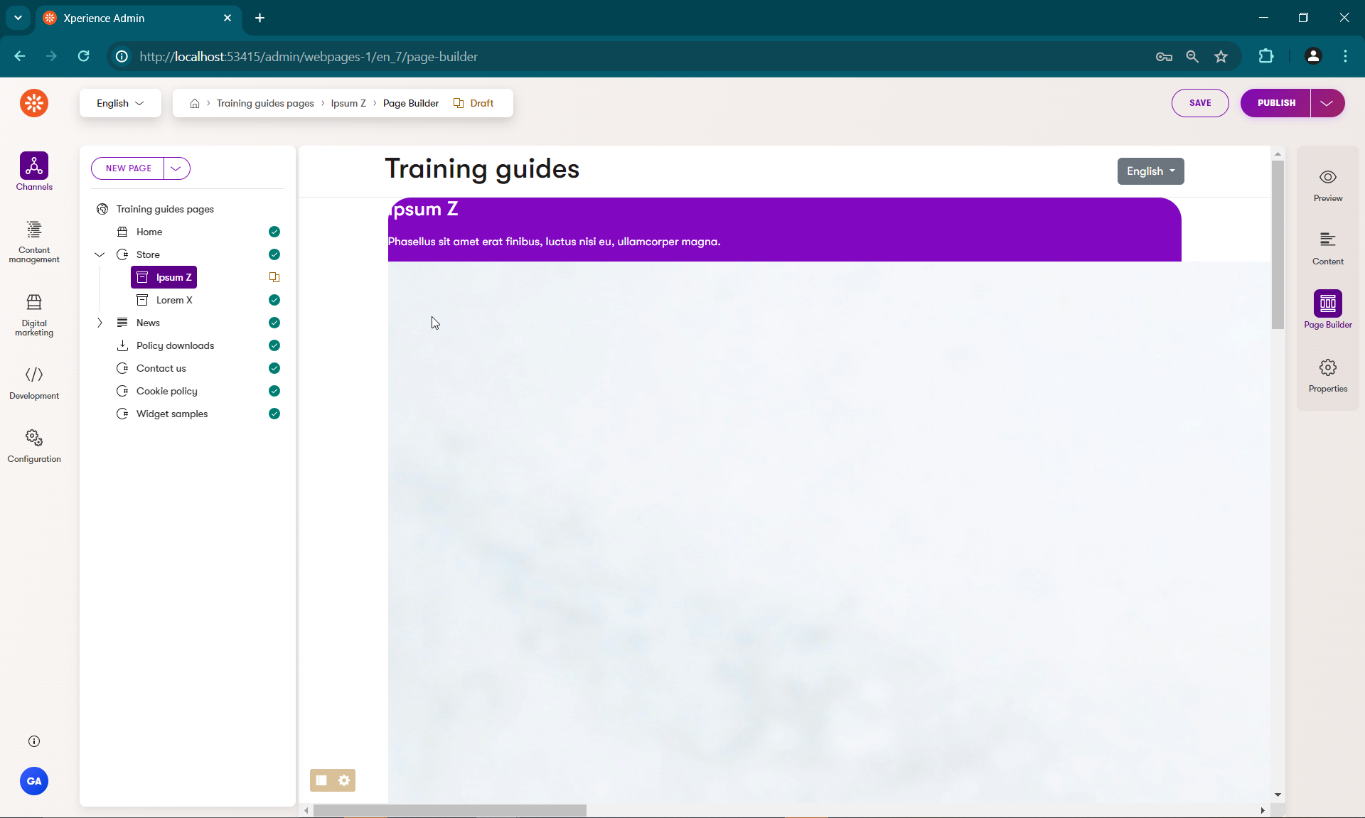
However, if you set the template to use rounded corners and a colored background, you’ll see that the corners of the image do not change to match the style of the parent div. The image may also be an unreasonable size, depending on the file.
Create an image tag helper
- In the ~/Features/Shared/Helpers/TagHelpers folder, add a new self-closing TagHelper called
StyledImageTagHelperwith the tag nametg-styled-image. Inject anIComponentStyleEnumServiceinstance.C#StyledImageTagHelper.cs... namespace TrainingGuides.Web.Features.Shared.Helpers.TagHelpers; [HtmlTargetElement("tg-styled-image", TagStructure = TagStructure.WithoutEndTag)] public class StyledImageTagHelper( IComponentStyleEnumService componentStyleEnumService) : TagHelper ... - Set up properties in the same manner as the
ComponentStyleTagHelper, leaving out theColorSchemeproperty this time.C#StyledImageTagHelper.cs... public string CornerStyle { get; set; } = string.Empty; private const string IMG_TAG = "img"; ... - In the
Processmethod, set theTagModeof the rendered HTML tag toTagMode.SelfClosingand style the image according to the classes returned by the service.C#StyledImageTagHelper.cs... public override void Process(TagHelperContext context, TagHelperOutput output) { output.TagName = IMG_TAG; output.TagMode = TagMode.SelfClosing; List<string> cssClasses = []; var cornerStyle = componentStyleEnumService .GetCornerStyle(CornerStyle ?? string.Empty); cssClasses.AddRange(componentStyleEnumService .GetCornerStyleClasses(cornerStyle)); if (cssClasses.Count > 0) { foreach (string cssClass in cssClasses) { output.AddClass(cssClass, HtmlEncoder.Default); } } } ...
using System.Text.Encodings.Web;
using Microsoft.AspNetCore.Mvc.TagHelpers;
using Microsoft.AspNetCore.Razor.TagHelpers;
using TrainingGuides.Web.Features.Shared.Services;

namespace TrainingGuides.Web.Features.Shared.Helpers.TagHelpers;

[HtmlTargetElement("tg-styled-image", TagStructure = TagStructure.WithoutEndTag)]
public class StyledImageTagHelper(
    IComponentStyleEnumService componentStyleEnumService) : TagHelper
{
    public string CornerStyle { get; set; } = string.Empty;

    private const string IMG_TAG = "img";

    public override void Process(TagHelperContext context, TagHelperOutput output)
    {
        output.TagName = IMG_TAG;
        output.TagMode = TagMode.SelfClosing;

        List<string> cssClasses = [];

        var cornerStyle = componentStyleEnumService.GetCornerStyle(CornerStyle ?? string.Empty);
        cssClasses.AddRange(componentStyleEnumService.GetCornerStyleClasses(cornerStyle));

        if (cssClasses.Count > 0)
        {
            foreach (string cssClass in cssClasses)
            {
                output.AddClass(cssClass, HtmlEncoder.Default);
            }
        }
    }
}
The tag helper can be used in the view like this:
@foreach (var asset in templateModel.Media)
{
    <tg-styled-image src="@asset.FilePath"
        alt="@asset.Description"
        corner-style="@Model.Properties.CornerStyle"
        class="c-product-img object-fit-cover" />
}
Complete the template
Comparing the current template to the mockup from the start of this series, you’ll notice that the Service features table is missing.

Its data is already in the template model, so it should be fairly straightforward to render to the page.
However, if you inspect the ServiceFeature content type, you may notice that its value can come from multiple different places depending on the selected ServiceFeatureValueType.
Let’s make one last tag helper, so that we don’t need to clutter the view with conditionals.
Add a service feature value tag helper
Since this one is specifically related to Service features, and not general styling, we can put it in the ~/Features/FinancialServices/TagHelpers folder.
- Create a new self-closing tag helper called
ServiceFeatureValueTagHelper, with the tag nametg-service-feature-value. - Add a
ServiceFeatureViewModelproperty and a constant for thespantag. - In the
Processmethod, determine the formated value depending on the providedServiceFeatureValueTypefrom the view model and render it.
using Microsoft.AspNetCore.Html;
using Microsoft.AspNetCore.Razor.TagHelpers;

using TrainingGuides.Web.Features.FinancialServices.Models;

namespace TrainingGuides.Web.Features.FinancialServices.TagHelpers;

/// <summary>
/// Formats Service feature value based on its type.
/// </summary>
//This TagStructure allows the helper to be called with a single self-closing tag in razor views.
[HtmlTargetElement("tg-service-feature-value", TagStructure = TagStructure.WithoutEndTag)]
public class ServiceFeatureValueTagHelper : TagHelper
{
    public ServiceFeatureViewModel? Feature { get; set; }

    private const string SPAN_TAG = "span";

    public override void Process(TagHelperContext context, TagHelperOutput output)
    {
        output.TagName = SPAN_TAG;
        // Make sure to set the output's  TagMode to StartTagAndEndTag.
        // This ensures that even though the tag helper is called with a single tag,
        // the rendered output closes the `span` tag that wraps the value.
        output.TagMode = TagMode.StartTagAndEndTag;

        string? formattedValue = Feature?.ValueType switch
        {
            ServiceFeatureValueType.Text => Feature.ValueHtml.Value,
            ServiceFeatureValueType.Number => "$" + Feature.Price.ToString("n2"),
            ServiceFeatureValueType.Boolean => Feature.FeatureIncluded ? "✔" : "-",
            _ => string.Empty
        };

        output.Content.SetHtmlContent(new HtmlString(formattedValue));
    }
}
Add the service features list to the template view
- In the ~/Features/FinancialServices/ServicePagePageTemplate.cshtml folder, add a
foreachloop to cycle through the service features. - Retrieve each feature’s
LabelHtmldirectly, and use the new tag helper to display its value - Wrap the whole thing in the
tg-component-styletag helper, settingcolor-schemedirectly andcorner-stylebased on the template properties.
...
<tg-component-style color-scheme="@ColorSchemeOption.Light1" corner-style="@Model.Properties.CornerStyle"  class="c-table">
    @foreach (var feature in templateModel.Features)
    {
        <div>
            <div>@feature.LabelHtml</div>
            <div>
                <tg-service-feature-value feature="@feature"/>
            </div>
        </div>
    }
</tg-component-style>
...
Finish styling the template.
Now if you run the site, you’ll see all the data, but it’s still not formatted in a way that matches the mockup.
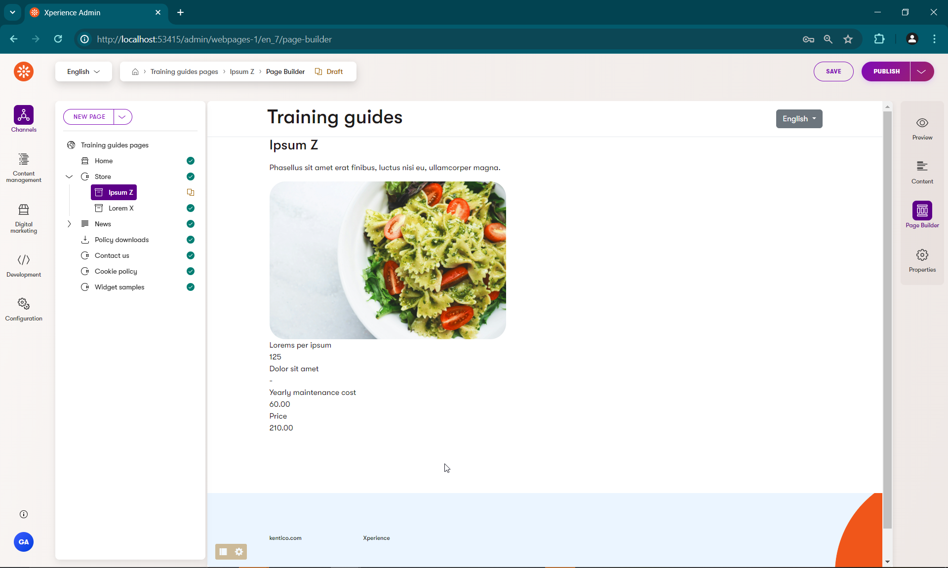
Add CSS styles and any necessary elements to make the template more visually appealing.
@using TrainingGuides.Web.Features.FinancialServices.Models
@using TrainingGuides.Web.Features.FinancialServices
@using TrainingGuides.Web.Features.Shared.OptionProviders.ColorScheme

@model TemplateViewModel<ServicePagePageTemplateProperties>

@{
    var templateModel = Model.GetTemplateModel<ServicePageViewModel>();
}

<tg-component-style color-scheme="@Model.Properties.ColorScheme" corner-style="@Model.Properties.CornerStyle">
    <div>
        <div>
            <h3>@templateModel.NameHtml</h3>
            <p>@templateModel.ShortDescriptionHtml</p>
        </div>

        @foreach (var asset in templateModel.Media)
        {
            <tg-styled-image src="@asset.FilePath"
                alt="@asset.Description"
                corner-style="@Model.Properties.CornerStyle"
                class="c-product-img object-fit-cover" />
        }

        <tg-component-style color-scheme="@ColorSchemeOption.Light1" corner-style="@Model.Properties.CornerStyle"  class="c-table">
            @foreach (var feature in templateModel.Features)
            {
                <div>
                    <div>@feature.LabelHtml</div>
                    <div>
                        <tg-service-feature-value feature="@feature"/>
                    </div>
                </div>
            }
        </tg-component-style>
    </div>
</tg-component-style>
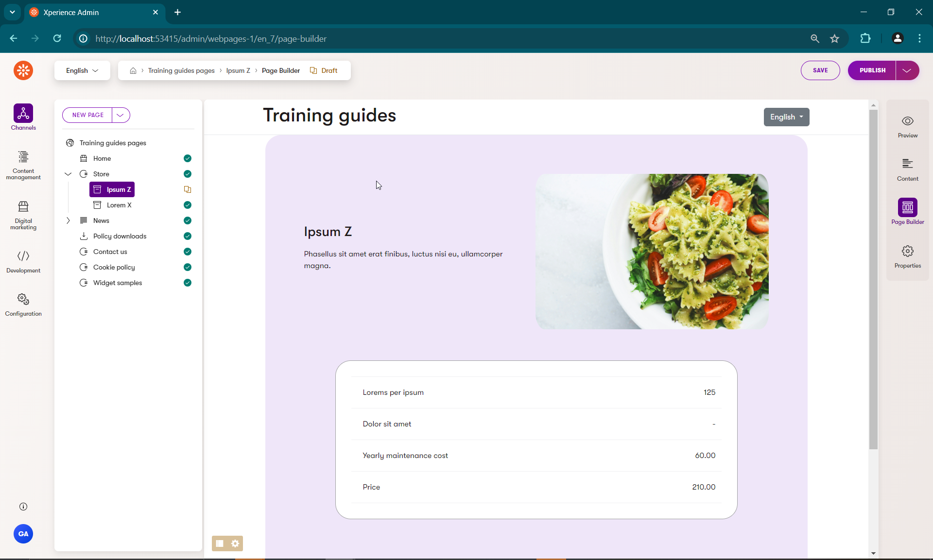
At the end of it all, you should be able to achieve this by configuring your template.
What’s next?
Part 2 of the Create versatile templates guide covers the process of adding toggleable Page Builder functionality to this template, so that your editors can customize its content in special cases.
If you started in this guide, we recommend circling back to check out these guides form earlier in the series:
- Meet business requirements with Page Builder, a guide that analyzes how and when to apply Page Builder to business scenarios
- Add a custom dropdown provider for administration components, a guide that demonstrates the process of creating custom providers that provide options to dropdown menus in Page Builder component properties.