
Build a flexible Email Builder template
Email Builder in Xperience by Kentico empowers marketers to create visually engaging emails using a drag-and-drop interface. Let’s create a flexible, reusable template that supports a variety of layouts and color schemes.
We’ll walk through the process of building a general-purpose template and section for Email Builder, supporting a range of visual customization options for your marketers.
Before you start
This guide uses resources from the Email Builder Starter Kit
If you haven’t already integrated the Email Builder Starter Kit into your project, you can see a step-by-step example in this guide.
This guide requires the following:
- Familiarity with C#, .NET Core, Dependency injection, and the MVC pattern.
- Familiarity with builders in Xperience by Kentico, especially Email Builder
- Familiarity with ASP.NET Razor components, Blazor development best practices, and MJML markup.
- A running instance of Xperience by Kentico, preferably 31.3.3 or higher.
Some features covered in the training guides may not work in older versions.
Code samples
You can find a project with completed, working versions of code samples from this guide and others in the finished branch of the Training guides repository.
The main branch of the repository provides a starting point to code along with the guides.
The code samples in this guide have only been tested in .NET 8.
They come from a project that uses implicit using directives. You may need to add additional using directives to your code if your project does not use this feature.
Prepare styling options
Create an enumeration dropdown provider
To support flexible layouts and color schemes, start by creating dropdown providers for enumerations. This allows you to manage the options marketers can specify for column layout, corner style, and color scheme.
You may be familiar with a DropdownEnumOptionProvider class from our dropdown provider guide. If your project does not have the class, you add it by following the steps in that guide or copy the completed code from the finished branch of the Training guides repository..
Define a service for parsing enum values
Next, create and register a service for parsing enum values from strings, using the Enums.NET NuGet package. It should take a default value to fall back to when the provided string does not contain an enum value.
We also outline this in the dropdown provider guide mentioned earlier, which creates the following files:
- ~/Features/Shared/OptionProviders/IEnumStringService.cs
- ~/Features/Shared/OptionProviders/EnumStringService.cs
- ~/ServiceCollectionExtensions.cs
Include enumerations for styling
With a dropdown provider and a class for parsing enumeration values in place, we can move on to the enumerations themselves.
If you haven’t completed our Page Builder module or guides, add these files to your project:
- ~/Features/Shared/OptionProviders/ColorScheme/ColorSchemeOption.cs
- ~/Features/Shared/OptionProviders/ColumnLayout/ColumnLayoutOption.cs
- ~/Features/Shared/OptionProviders/CornerStyle/CornerStyleOption.cs
Add styles corresponding to the enums
Now we have the framework for allowing editors to specify styling options, but we don’t have any actual styles to apply based on their selections.
Let’s define CSS classes to style your Email Builder components according to the selected options.
...
.tg-tiny-margin {
    margin: 1px;
}

.tg-corner-shrp {
    border-radius: 0;
}

.tg-corner-rnd {
    border-radius: 32px;
}

.tg-corner-v-rnd {
    border-radius: 64px;
}

.tg-bg-primary {
    background: #8107c1;
}

.tg-bg-secondary {
    background: #f0561a;
}

.tg-bg-none {
    background: none;
}

.tg-bg-light-1 {
    background: white;
}

.tg-bg-light-2 {
    background: #efe6f9;
}

.tg-bg-light-3 {
    background: #ebf5ff;
}

.tg-txt-light {
    color: white;
}

.tg-txt-light a {
    color: #f0561a;
}

.tg-txt-medium {
    color: #f0561a;
}

.tg-txt-medium a {
    color: white;
}
.tg-txt-dark {
    color: #1e1a1b;
}

.tg-txt-dark a {
    color: #f0561a;
}
Link these styles to their enums with a service
Now, all that’s left is to build a service that retrieves a collection of CSS styles based on a provided enumeration value.
The column layout will change the markup of an email, so we’ll handle that logic in the specific Razor component. For this service, focus on retrieving classes for color scheme and corner style, which are controlled by CSS classes.
Add the following files:
- ~/Features/Shared/Services/IComponentStyleEnumService.cs
- ~/Features/Shared/Services/ComponentStyleEnumService.cs
- ~/ServiceCollectionExtensions.cs
You can find more implementation details for the style service in the versatile page templates guide.
Craft a reusable columns component
Now, let’s create a Razor component analogous to the Page Builder columns view component from the page builder module.
In this case, we’ll render only widget zones. Allowing the component to conditionally render both editable areas and widget zones, like we did in the Page Builder component, would cause problems with the hierarchy of MJML components.
Alternately, you can modify the component to render editable areas instead. This will require you to take a different approach regarding which level of the Email Builder hierarchy you can use certain MJML elements (templates vs sections vs widgets).
Define the models
Add a new folder, ~/Features/Shared/EmailBuilder/RazorComponents/, and create models to represent email layout columns.
Start with a model for the individual columns. Each widget zone will need an identifier, and the option to control which widgets are allowed.
Then, the mj-column component that wraps each widget zone will need a width and CSS classes.
namespace TrainingGuides.Web.Features.Shared.EmailBuilder.RazorComponents;

public class EmailBuilderColumnModel
{
    public int Width { get; set; } = 0;
    public string Identifier { get; set; } = string.Empty;
    public IEnumerable<string> CssClasses { get; set; } = [];
    public IEnumerable<string> AllowedWidgets { get; set; } = [];
    // If you want to apply this approach to Editable Areas rather than Widget Zones, you can also include this:
    // public IEnumerable<string> AllowedSections { get; set; } = [];
}
Moving on to the collection of columns, for now let’s just include one property to hold multiple column models.
You can expand this with additional properties in the future, or simply eliminate this class and include the collection of columns directly in the Razor component, depending on your project’s conventions.
namespace TrainingGuides.Web.Features.Shared.EmailBuilder.RazorComponents;

public class EmailBuilderColumnsModel
{
    public IEnumerable<EmailBuilderColumnModel> Columns { get; set; } = [];
}
Build the component
The component’s code-behind needs the following elements:
- Constants that it can use for its widget zone identifiers.
- We’ll follow the zone naming conventions from the Email Builder Starter Kit.
- A private
EmailBuilderColumnsModelproperty, to hold information about the columns it needs to render - (Optional) A dictionary of attributes and properties, to dynamically configure certain properties of its Widget zone
- Properties to configure the component’s corner style, column layout, column colors, and allowed widgets
- Methods to assemble the columns and populate their properties based on the selected options
- Let’s specify the width of each column as a percentage, leaving some extra space to compensate for padding.
- Calls to the
ComponentStyleEnumServiceto retrieve CSS classes corresponding to each selected color scheme
using Microsoft.AspNetCore.Components;
using TrainingGuides.Web.Features.Shared.OptionProviders.ColorScheme;
using TrainingGuides.Web.Features.Shared.OptionProviders.ColumnLayout;
using TrainingGuides.Web.Features.Shared.OptionProviders.CornerStyle;
using TrainingGuides.Web.Features.Shared.Services;

namespace TrainingGuides.Web.Features.Shared.EmailBuilder.RazorComponents;

public partial class EmailBuilderColumns : ComponentBase
{
    // If you want to apply this approach to Editable Areas rather than Widget Zones, we recommend changing these constants with more accurate names.
    private const string ZONE_MAIN = "Widget_Zone_0";
    private const string ZONE_SECONDARY = "Widget_Zone_1";
    private const string ZONE_TERTIARY = "Widget_Zone_2";

    private EmailBuilderColumnsModel Model { get; set; } = new();

    private Dictionary<string, object> AreaAttributes { get; set; } = [];

    private int NumberOfColumns => ColumnLayout switch
    {
        ColumnLayoutOption.TwoColumnEven or
        ColumnLayoutOption.TwoColumnLgSm or
        ColumnLayoutOption.TwoColumnSmLg
        => 2,
        ColumnLayoutOption.ThreeColumnEven or
        ColumnLayoutOption.ThreeColumnSmLgSm
        => 3,
        ColumnLayoutOption.OneColumn or
        _
        => 1
    };

    [Inject]
    private IComponentStyleEnumService ComponentStyleEnumService { get; set; } = default!;

    [Parameter]
    public ColumnLayoutOption ColumnLayout { get; set; } = ColumnLayoutOption.OneColumn;

    [Parameter]
    public CornerStyleOption CornerStyle { get; set; } = CornerStyleOption.Round;

    [Parameter]
    public ColorSchemeOption Column1ColorScheme { get; set; } = ColorSchemeOption.Light1;

    [Parameter]
    public ColorSchemeOption Column2ColorScheme { get; set; } = ColorSchemeOption.Light1;

    [Parameter]
    public ColorSchemeOption Column3ColorScheme { get; set; } = ColorSchemeOption.Light1;

    [Parameter]
    public IEnumerable<string> AllowedWidgets { get; set; } = [];

    // If you want to apply this approach to Editable Areas rather than Widget Zones, you can also include this:
    // [Parameter]
    // public IEnumerable<string> AllowedSections { get; set; } = [];

    protected override void OnInitialized()
    {
        if (AllowedWidgets.Where(str => !string.IsNullOrWhiteSpace(str)).Any())
            AreaAttributes.Add(nameof(AllowedWidgets), AllowedWidgets);
        // If you want to apply this approach to Editable Areas rather than Widget Zones, you can also include this:
        // if (AllowedSections.Where(str => !string.IsNullOrWhiteSpace(str)).Any())
        //     AreaAttributes.Add(nameof(AllowedSections), AllowedSections);

        Model = new EmailBuilderColumnsModel
        {
            Columns = GetColumns(),
        };
    }

    private IEnumerable<EmailBuilderColumnModel> GetColumns()
    {
        var columns = new List<EmailBuilderColumnModel>();

        int numberOfColumns = NumberOfColumns;
        for (int i = 0; i < numberOfColumns; i++)
        {
            columns.Add(GetColumn(i));
        }

        return columns;
    }

    private EmailBuilderColumnModel GetColumn(int columnIndex)
    {
        string columnIdentifier;
        int width;
        var cssClasses = GetColumnCssClasses(columnIndex).ToList();
        cssClasses.AddRange(ComponentStyleEnumService.GetCornerStyleClasses(CornerStyle));
        cssClasses.Add("tg-tiny-margin");

        switch (ColumnLayout)
        {
            case ColumnLayoutOption.TwoColumnEven:
                //first column is main
                width = 45;
                columnIdentifier = columnIndex == 0
                    ? ZONE_MAIN
                    : ZONE_SECONDARY;
                break;
            case ColumnLayoutOption.TwoColumnLgSm:
                //first column is main
                if (columnIndex == 0)
                {
                    width = 60;
                    columnIdentifier = ZONE_MAIN;
                }
                else
                {
                    width = 30;
                    columnIdentifier = ZONE_SECONDARY;
                }
                break;
            case ColumnLayoutOption.TwoColumnSmLg:
                //second column is main
                if (columnIndex == 0)
                {
                    width = 30;
                    columnIdentifier = ZONE_SECONDARY;
                }
                else
                {
                    width = 60;
                    columnIdentifier = ZONE_MAIN;
                }
                break;
            case ColumnLayoutOption.ThreeColumnEven:
                //middle column is main
                width = 30;
                columnIdentifier = columnIndex == 1
                    ? ZONE_MAIN
                    : columnIndex == 0
                        ? ZONE_SECONDARY
                        : ZONE_TERTIARY;
                break;
            case ColumnLayoutOption.ThreeColumnSmLgSm:
                if (columnIndex == 1)
                {
                    width = 40;
                    columnIdentifier = ZONE_MAIN;
                }
                else
                {
                    width = 25;
                    columnIdentifier = columnIndex == 0
                        ? ZONE_SECONDARY
                        : ZONE_TERTIARY;
                }
                break;
            case ColumnLayoutOption.OneColumn:
            default:
                //sole column is main
                width = 90;
                columnIdentifier = ZONE_MAIN;
                break;
        }

        return new EmailBuilderColumnModel
        {
            Width = width,
            CssClasses = cssClasses,
            Identifier = columnIdentifier,
            AllowedWidgets = AllowedWidgets,
            // If you want to apply this approach to Editable Areas rather than Widget Zones, you can also include this:
            // AllowedSections = AllowedSections
        };
    }

    private IEnumerable<string> GetColumnCssClasses(int columnIndex) => columnIndex switch
    {
        0 => ComponentStyleEnumService.GetColorSchemeClasses(Column1ColorScheme),
        1 => ComponentStyleEnumService.GetColorSchemeClasses(Column2ColorScheme),
        2 => ComponentStyleEnumService.GetColorSchemeClasses(Column3ColorScheme),
        _ => []
    };
}
Moving on to the component itself, it can be fairly simple thanks to the work we did in the code-behind.
Display the columns using a foreach loop.
EmailBuilderColumns.razor
@using Kentico.VisualBuilderComponents.Rcl.Components

@foreach(var column in Model.Columns)
{
    <mj-column width="@($"{column.Width}%")" css-class="@(string.Join(" ", column.CssClasses))" padding="8px">
        <WidgetZone ZoneName="@(column.Identifier)" @attributes="AreaAttributes" />
    </mj-column>
}
Build a general section
With the Razor component in place, let’s create a section that utilizes our email builder columns component. Create the ~/Features/Shared/EmailBuilder/Sections folder.
Define section properties.
To feed the parameters of our columns component, we need properties that allow editors to choose different layout and styling options.
Add properties for the corner style of the section, and the color scheme of each potential column. Depending on the selected layout, the component will not render certain columns. Let’s use visibility conditions and a configurator to conditionally hide columns in each scenario.
Section properties
using Kentico.EmailBuilder.Web.Mvc;
using Kentico.Xperience.Admin.Base.FormAnnotations;
using TrainingGuides.Web.Features.Shared.OptionProviders;
using TrainingGuides.Web.Features.Shared.OptionProviders.ColorScheme;
using TrainingGuides.Web.Features.Shared.OptionProviders.ColumnLayout;
using TrainingGuides.Web.Features.Shared.OptionProviders.CornerStyle;

namespace TrainingGuides.Web.Features.Shared.EmailBuilder.Sections;

public class GeneralEmailSectionProperties : IEmailSectionProperties
{
    [DropDownComponent(
        Label = "Column layout",
        ExplanationText = "Select the layout of the editable areas in the template.",
        DataProviderType = typeof(DropdownEnumOptionProvider<ColumnLayoutOption>),
        Order = 10)]
    public string ColumnLayout { get; set; } = nameof(ColumnLayoutOption.OneColumn);

    [DropDownComponent(
        Label = "Corner type",
        ExplanationText = "Select the corner type of the template.",
        DataProviderType = typeof(DropdownEnumOptionProvider<CornerStyleOption>),
        Order = 20)]
    public string CornerStyle { get; set; } = nameof(CornerStyleOption.Round);

    [DropDownComponent(
        Label = "Column 1 color scheme",
        ExplanationText = "Select the color scheme for the first column.",
        DataProviderType = typeof(DropdownEnumOptionProvider<ColorSchemeOption>),
        Order = 30)]
    public string Column1ColorScheme { get; set; } = nameof(ColorSchemeOption.Light1);

    [DropDownComponent(
        Label = "Column 2 color scheme",
        ExplanationText = "Select the color scheme for the second column.",
        DataProviderType = typeof(DropdownEnumOptionProvider<ColorSchemeOption>),
        Order = 40)]
    // This property is only visible if the layout is not single-column
    [VisibleIfNotEqualTo(nameof(ColumnLayout), nameof(ColumnLayoutOption.OneColumn))]
    public string Column2ColorScheme { get; set; } = nameof(ColorSchemeOption.Light1);

    [DropDownComponent(
        Label = "Column 3 color scheme",
        ExplanationText = "Select the color scheme for the third column.",
        DataProviderType = typeof(DropdownEnumOptionProvider<ColorSchemeOption>),
        Order = 50)]
    // This property is visible if the layout is any of multiple three-column options
    [FormComponentConfiguration(typeof(GeneralEmailSectionColumn3Configurator), [nameof(ColumnLayout)])]
    public string Column3ColorScheme { get; set; } = nameof(ColorSchemeOption.Light1);

}
Configurator
using Kentico.Xperience.Admin.Base.Forms;
using TrainingGuides.Web.Features.Shared.OptionProviders;
using TrainingGuides.Web.Features.Shared.OptionProviders.ColumnLayout;
using TrainingGuides.Web.Features.Shared.VisibilityConditions;

namespace TrainingGuides.Web.Features.Shared.EmailBuilder.Sections;

public class GeneralEmailSectionColumn3Configurator : FormComponentConfigurator<DropDownComponent>
{
    private readonly IEnumStringService enumStringService;

    public GeneralEmailSectionColumn3Configurator(IEnumStringService enumStringService)
    {
        this.enumStringService = enumStringService;
    }

    public override async Task Configure(DropDownComponent formComponent, IFormFieldValueProvider formFieldValueProvider, CancellationToken cancellationToken)
    {
        if (!GetShowColumn3(formFieldValueProvider))
        {
            HideField(formComponent);
        }
    }

    private bool GetShowColumn3(IFormFieldValueProvider formFieldValueProvider)
    {
        if (formFieldValueProvider.TryGet(nameof(GeneralEmailSectionProperties.ColumnLayout), out string columnLayout))
        {
            var layout = enumStringService.Parse(columnLayout, ColumnLayoutOption.OneColumn);
            return layout is ColumnLayoutOption.ThreeColumnEven or ColumnLayoutOption.ThreeColumnSmLgSm;
        }
        return true;
    }

    private void HideField(DropDownComponent formComponent) =>
        formComponent.VisibilityConditions.Add(new Invisible());
}
Custom visibility condition for configurator
using Kentico.Xperience.Admin.Base.Forms;

namespace TrainingGuides.Web.Features.Shared.VisibilityConditions;

// Custom visibility condition that is always false, used to dynamically hide fields in configurators
public class Invisible : VisibilityCondition
{
    public override bool Evaluate(IFormFieldValueProvider formFieldValueProvider) => false;
}
Define the section’s Razor component
Thanks to the EmailBuilderColumns component we built earlier, the section component can be fairly simple.
In the code-behind, register the component and include a GeneralEmailSectionProperties parameter to access marketers’ configurations. Then utilize the IEnumStringService to parse enumeration values from the properties.
using Kentico.EmailBuilder.Web.Mvc;
using TrainingGuides.Web.Features.Shared.EmailBuilder.Sections;

using Microsoft.AspNetCore.Components;
using TrainingGuides.Web.Features.Shared.OptionProviders.ColumnLayout;
using TrainingGuides.Web.Features.Shared.OptionProviders.CornerStyle;
using TrainingGuides.Web.Features.Shared.OptionProviders.ColorScheme;
using TrainingGuides.Web.Features.Shared.OptionProviders;

[assembly: RegisterEmailSection(
    identifier: GeneralEmailSection.IDENTIFIER,
    name: "General email template section",
    componentType: typeof(GeneralEmailSection),
    PropertiesType = typeof(GeneralEmailSectionProperties),
    Description = "Section for the General email template.",
    IconClass = "icon-l-cols-3")]

namespace TrainingGuides.Web.Features.Shared.EmailBuilder.Sections;

public partial class GeneralEmailSection : ComponentBase
{
    public const string IDENTIFIER = "TrainingGuides.GeneralEmailSection";

    [Inject]
    private IEnumStringService EnumStringService { get; set; } = default!;

    private ColumnLayoutOption ColumnLayout => EnumStringService.Parse(Properties.ColumnLayout, ColumnLayoutOption.OneColumn);
    private CornerStyleOption CornerStyle => EnumStringService.Parse(Properties.CornerStyle, CornerStyleOption.Round);
    private ColorSchemeOption Column1ColorScheme =>
        EnumStringService.Parse(Properties.Column1ColorScheme, ColorSchemeOption.Light1);
    private ColorSchemeOption Column2ColorScheme =>
        EnumStringService.Parse(Properties.Column2ColorScheme, ColorSchemeOption.Light1);
    private ColorSchemeOption Column3ColorScheme =>
        EnumStringService.Parse(Properties.Column3ColorScheme, ColorSchemeOption.Light1);

    [Parameter]
    public GeneralEmailSectionProperties Properties { get; set; } = new();
}
In the template’s Razor file, wrap the columns component in a mj-section component, for consistency with the sections from the Email Builder Starter Kit.
Depending on the conventions of your project, you may use different MJML components at different levels. Keep in mind that MJML has strict guidelines for which components are allowed where. For example, mj-section cannot nest inside of other mj-section components, or in lower-level components like mj-column.
@using Kentico.VisualBuilderComponents.Rcl.Components
@using TrainingGuides.Web.Features.Shared.EmailBuilder.RazorComponents

<mj-section width="600px" padding="8px">
    <EmailBuilderColumns ColumnLayout="@ColumnLayout"
        CornerStyle="@CornerStyle"
        Column1ColorScheme="@Column1ColorScheme"
        Column2ColorScheme="@Column2ColorScheme"
        Column3ColorScheme="@Column3ColorScheme" />
</mj-section>
Save the component identifier
If you use a shared component identifiers file in your project, like we do in the “https://github.com/Kentico/xperience-by-kentico-training-guides/tree/finished” linkText=“Training guides repository” %}, you can add the general section’s identifier.
...
using TrainingGuides.Web.Features.Shared.EmailBuilder.Sections;
...
public static class ComponentIdentifiers
{
    ...
    public static class EmailBuilderSections
    {
        public const string GENERAL = GeneralEmailSection.IDENTIFIER;

        // Kentico.Xperience.Mjml.StarterKit.Rcl sections
        public const string FULL_WIDTH = FullWidthEmailSection.IDENTIFIER;
        public const string TWO_COLUMN = TwoColumnEmailSection.IDENTIFIER;
    }
}
Create a general template
With the section in place, we can tie everything together with an Email Builder template.
Create the ~/Features/Shared/Emailbuilder/Templates folder to hold files related to the general email template.
Define email template properties
Specify the template properties. We’ll include properties for the background color and corner shape, and allow multiple, vertically-stacked editable areas.
It’s possible to add rows to a single editable area by adding multiple sections to it.
Using multiple editable areas provides you the option to add contrasting styles for template rows, compared to sections within a single editable area, such as a larger space between. Additionally, it will make it more difficult for marketers to accidentally delete entire rows on templates that are meant to have a minimum number.
You can exclude this functionality if it does not meet your requirements.
using Kentico.EmailBuilder.Web.Mvc;
using Kentico.Xperience.Admin.Base.FormAnnotations;
using TrainingGuides.Web.Features.Shared.OptionProviders;
using TrainingGuides.Web.Features.Shared.OptionProviders.ColorScheme;
using TrainingGuides.Web.Features.Shared.OptionProviders.CornerStyle;

namespace TrainingGuides.Web.Features.Shared.EmailBuilder.Templates;

public class GeneralEmailTemplateProperties : IEmailTemplateProperties
{
    [NumberInputComponent(
        Label = "Number of rows",
        ExplanationText = "The number of rows in the template. (maximum of 5)",
        Order = 10)]
    public int NumberOfRows { get; set; } = 1;

    [DropDownComponent(
        Label = "Corner type",
        ExplanationText = "Select the corner type of the template.",
        DataProviderType = typeof(DropdownEnumOptionProvider<CornerStyleOption>),
        Order = 20)]
    public string CornerStyle { get; set; } = nameof(CornerStyleOption.Round);

    [DropDownComponent(
        Label = "Color scheme",
        ExplanationText = "Select the color scheme of the template.",
        DataProviderType = typeof(DropdownEnumOptionProvider<ColorSchemeOption>),
        Order = 30)]
    public string MainColorScheme { get; set; } = nameof(ColorSchemeOption.Light2);
}
Now we can move on to the Razor component for the template. The approach for the template’s layout is much simpler than dealing with columns, so there’s no need to break it out into a separate component.
Aside from the layout, we also need to account for information in the header of the email, like styles and metadata, and the unsubscribe link.
If you haven’t been following along, make sure you have the email data mapper from earlier in this series.
using CMS.EmailMarketing;
using Kentico.Xperience.Mjml.StarterKit.Rcl;
using Kentico.Xperience.Mjml.StarterKit.Rcl.Contracts;
using Kentico.Xperience.Mjml.StarterKit.Rcl.Mapping;
using Microsoft.AspNetCore.Components;
using TrainingGuides.Web.Features.Shared.OptionProviders;
using TrainingGuides.Web.Features.Shared.OptionProviders.ColorScheme;
using TrainingGuides.Web.Features.Shared.OptionProviders.CornerStyle;
using TrainingGuides.Web.Features.Shared.Services;

namespace TrainingGuides.Web.Features.Shared.EmailBuilder.Templates;

public partial class GeneralEmailTemplate : ComponentBase
{
    public const string IDENTIFIER = "TrainingGuides.GeneralEmailTemplate";

    public const string AREA_MAIN = "MainContent";

    private IEmailData emailData = new EmailData(string.Empty, string.Empty);
    private CornerStyleOption CornerStyle => EnumStringService.Parse(Properties.CornerStyle, CornerStyleOption.Round);
    private ColorSchemeOption MainColorScheme => EnumStringService.Parse(Properties.MainColorScheme, ColorSchemeOption.Light2);
    private List<string> RowIdentifiers { get; set; } = [];
    private List<string> MainCssClasses { get; set; } = [];

    private string? cssContent;
    protected string CssContent
    {
        get => cssContent ?? string.Empty;
        set => cssContent = value;
    }

    private EmailRecipientContext? recipient;

    protected EmailRecipientContext Recipient => recipient ??= RecipientContextAccessor.GetContext();

    [Parameter]
    public GeneralEmailTemplateProperties Properties { get; set; } = new();

    [Inject]
    private IEmailRecipientContextAccessor RecipientContextAccessor { get; set; } = default!;

    [Inject]
    private IEmailDataMapper EmailDataMapper { get; set; } = default!;

    [Inject]
    private CssLoaderService CssLoaderService { get; set; } = default!;

    [Inject]
    private IComponentStyleEnumService ComponentStyleEnumService { get; set; } = default!;

    [Inject]
    private IEnumStringService EnumStringService { get; set; } = default!;

    protected override async Task OnInitializedAsync()
    {
        emailData = await EmailDataMapper.Map();
        CssContent = await CssLoaderService.GetCssAsync();

        var cornerCssClasses = ComponentStyleEnumService.GetCornerStyleClasses(CornerStyle);

        MainCssClasses.AddRange(ComponentStyleEnumService.GetColorSchemeClasses(MainColorScheme));
        MainCssClasses.AddRange(cornerCssClasses);

        int numberOfRows = Math.Clamp(Properties.NumberOfRows, 1, 5);
        for (int index = 0; index < numberOfRows; index++)
        {
            string rowIdentifier = index == 0 ? AREA_MAIN : $"Area_{index}";
            RowIdentifiers.Add(rowIdentifier);
        }

    }
}
@using Kentico.VisualBuilderComponents.Rcl.Components
@using TrainingGuides.Web
@using TrainingGuides.Web.Features.Shared.EmailBuilder.RazorComponents;
@using TrainingGuides.Web.Features.Shared.OptionProviders.ColumnLayout

<mjml>
  <mj-head>
    <mj-title>@emailData.EmailSubject</mj-title>
    <mj-attributes>
      <mj-all color="inherit" />
    </mj-attributes>
    <mj-preview>
      @emailData.EmailPreviewText
    </mj-preview>
    <mj-style>
      @((MarkupString)CssContent)
    </mj-style>
    <EmailBuilderStyles />
  </mj-head>
  <mj-body>
    <mj-wrapper css-class="@(string.Join(" ", MainCssClasses))" >
      @foreach (var rowIdentifier in RowIdentifiers)
      {
        <EditableArea AreaIdentifier="@rowIdentifier" DefaultSectionIdentifier="@ComponentIdentifiers.EmailBuilderSections.GENERAL" AllowedSections="[ComponentIdentifiers.EmailBuilderSections.GENERAL]" />
      }
      <mj-text align="center">
        <a href="@Recipient.UnsubscriptionUrl" data-click-tracking="false">Unsubscribe</a>
      </mj-text>
    </mj-wrapper>
    <EmailBuilderScripts />
  </mj-body>
</mjml>
Register the template
We recommend registering the template in a separate file, in case you want to move the template and section into a more portable RCL or NuGet package.
That way, you can locate the registration attribute outside of the separate project, in a location with access to your solution’s content types.
using Kentico.EmailBuilder.Web.Mvc;
using TrainingGuides;
using TrainingGuides.Web.Features.Shared.EmailBuilder.Templates;

[assembly: RegisterEmailTemplate(
    identifier: GeneralEmailTemplate.IDENTIFIER,
    name: "General email template",
    componentType: typeof(GeneralEmailTemplate),
    PropertiesType = typeof(GeneralEmailTemplateProperties),
    IconClass = "xp-l-rows-3",
    ContentTypeNames = [BasicEmail.CONTENT_TYPE_NAME])]
See the results
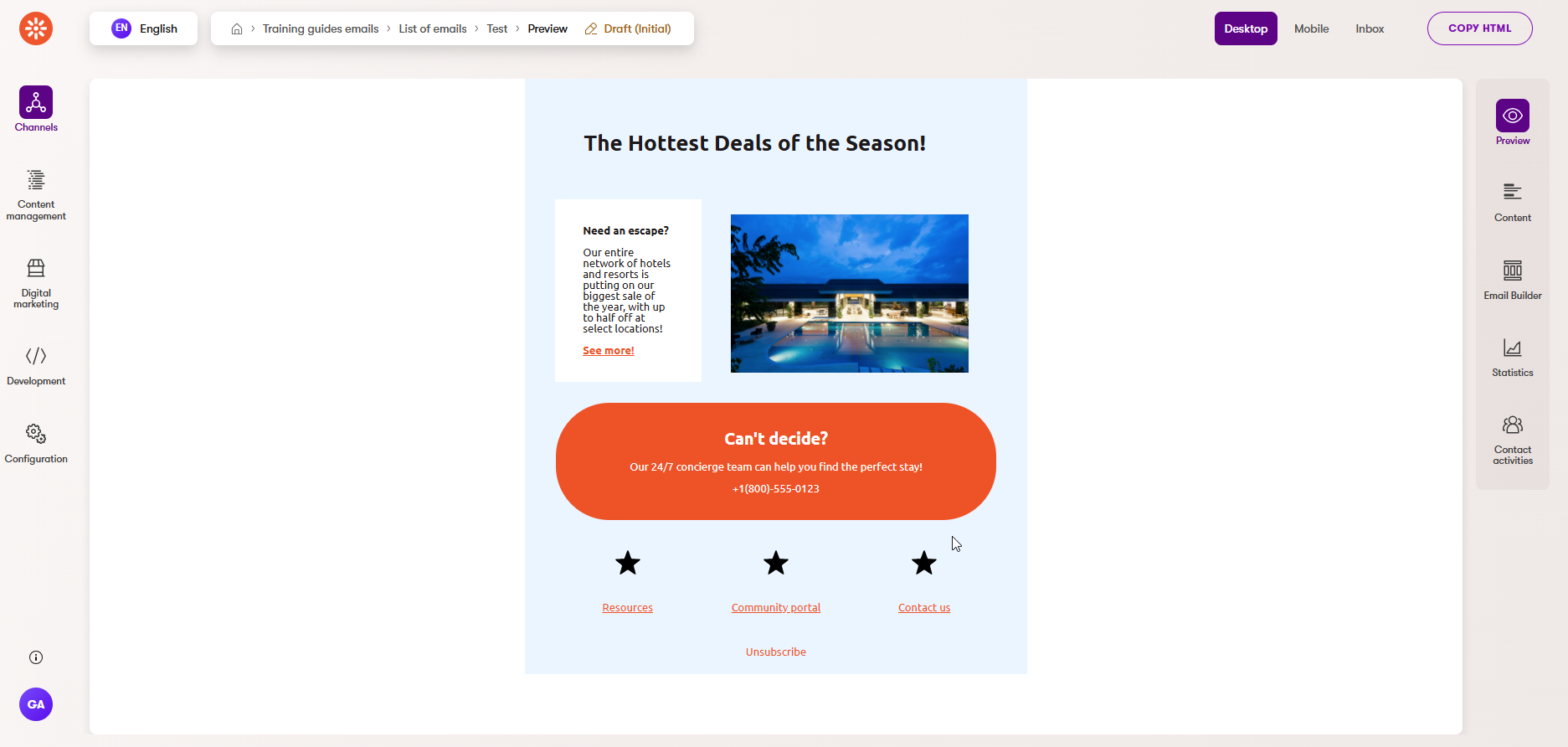
Now your new Email Builder components are in working order!
Create a new email using the General email template to test it out!
You can use these components along with widgets from the Email Builder Starter Kit to create an email like this:
Due to current system limitations at the time this guide was authored, the text color on the Email Builder tab may not match the color specified in a template or section. The correct color will appear on the Preview tab and in the sent email.
Your marketers should consider the Preview tab as the source of truth.