
Develop Email Builder components
The Email Builder framework consists of components, which are implemented using ASP.NET Blazor as Razor components.
Email Builder components fit together in the following hierarchy to form an email:
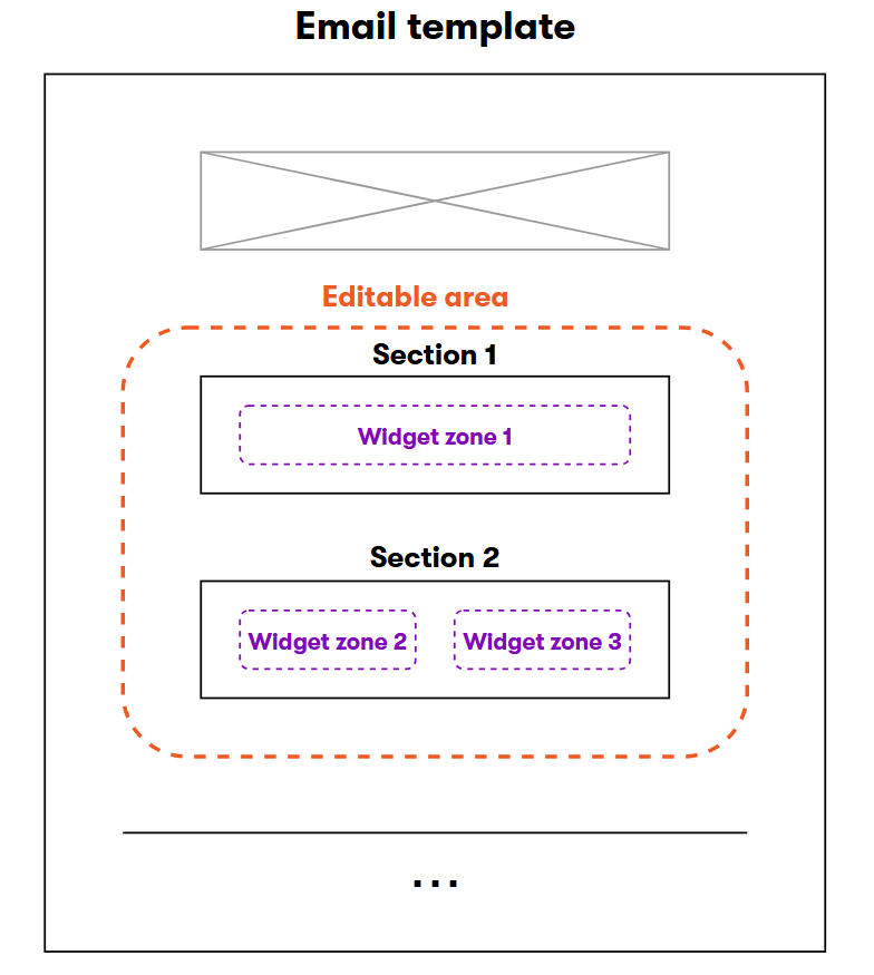
- Email templates – the top-level component that sets the email’s overall design, as well as any fixed content, such as a header and footer. Templates contain one or more editable areas.
- Editable areas – parts of templates that are empty by default, but can be edited using the Email Builder visual interface.
- Sections – blocks of markup that specify a layout for email content, typically containing one or more columns. Can store an arbitrary number of widget zones – areas where content creators place widgets. Sections are fully customizable, and as a developer, you have absolute freedom in the way you set each section’s layout.
- Widget zones – allow content editors to insert widgets. Each zone can contain any number of widgets (depending on the design limitations of the parent template and section).
- Widgets – reusable components that represent individual pieces of email content, such as text, images, CTA links, etc. Widgets can be easily manipulated by content editors and other non-technical users.
Email Builder Starter Kit
We recommend using the Email Builder Starter kit to speed up the development of your components. The Starter Kit provides a basic set of components, which allow users to create the most common types of email content. You can adjust the components according to specific project requirements or use them as examples when implementing your own custom components. The Starter Kit components use MJML markup.
The Starter Kit is available in the Xperience by Kentico Email Builder Starter Kit GitHub repository. See the repository’s README file for detailed information and instructions.
Manage multiple email channels
If you’re working with multiple email channels, see Manage multiple email channels for recommended file structure, naming conventions, and guidance on managing your Email Builder components.
MJML markup
Email Builder components support two different types of markup:
- MJML markup language – a framework that makes it easier to create responsive emails, and can speed up your email development time. Its semantic syntax is easy to learn and straightforward.
- HTML – you can use standard HTML markup if you are not comfortable switching to another markup language, or wish to reuse existing code.
Combining HTML and MJML Email Builder components is not supported
When planning to use Email Builder for a project, you need to decide whether to use HTML or MJML components. You cannot combine both types within a single project. Once you enable MJML support, HTML components will no longer work.
To enable MJML support for Email Builder components:
- Install the Kentico.Xperience.Mjml NuGet package into your project.
- Call
AddMjmlForEmailsin your application’s startup code (Program.cs). - Replace the default section (which contains HTML markup) with an MJML section:
- Assign the identifier of a suitable MJML section into
EmailBuilderOptions.DefaultSectionIdentifier. - Set
EmailBuilderOptions.RegisterDefaultSectiontofalse.
- Assign the identifier of a suitable MJML section into
using Kentico.Web.Mvc;
using Kentico.EmailBuilder.Web.Mvc;
using Kentico.Xperience.Mjml;

// ...

builder.Services.AddKentico(features =>
{
    // Enables Email Builder
    features.UseEmailBuilder();

    // ...
});

builder.Services.Configure<EmailBuilderOptions>(options =>
{
    // Allows Email Builder for the 'Acme.Email' content type
    options.AllowedEmailContentTypeNames = ["Acme.Email"];
    // Replaces the default Email Builder section
    options.DefaultSectionIdentifier = "Acme.DefaultMjmlSection";
    options.RegisterDefaultSection = false;
});

// Enables MJML markup processing for Email Builder components
builder.Services.AddMjmlForEmails();

// ...
Configure MJML includes
When using <mj-include>, you can configure how included files are resolved in your application’s appsettings.json file:
RootPath– sets the root location for included files. The value can be a full path or a relative path. The default value is"~/".AllowedFileExtensions– a list of allowed file extensions for included files. The default value is".mjml", ".html", ".htm", ".css".
The system resolves include paths relative to RootPath and allows only files that match AllowedFileExtensions. If an include path points outside of the configured root, or uses a file extension that is not allowed, the include is blocked and the component returns an error.
For security and maintainability, we recommend storing reusable include chunks in a dedicated folder (for example ~/EmailComponents) instead of the application root.
"MjmlInclude": {
    "RootPath": "~/EmailComponents",
    "AllowedFileExtensions": [".css", ".mjml"]
}
MJML limitations
- The <mj-raw> MJML tag is only supported in the markup of email templates, and may result in errors or work incorrectly in other components (sections or widgets).
- Using certain MJML tags to apply custom styling, for example <mj-html-attributes> or <mj-font>, may lead to inconsistent appearance of the resulting component. Such components may be displayed slightly differently in Email Builder mode than in the final email content. To get an accurate reference for how recipients will see an email, use the Preview mode.
Blazor development best practices
All Email Builder components must be developed as ASP.NET Razor components (Blazor). If you are new to Blazor development, start by familiarizing yourself with at least the following .NET documentation:
- ASP.NET Core Blazor – a general overview of Blazor development
- ASP.NET Core Razor components – the basics of Razor component development
- ASP.NET Core Razor component lifecycle – explains the component lifecycle and how to use lifecycle events
Additionally, follow these practices when developing Email Builder components:
- Use Dependency injection to access instances of Xperience API services in the markup or code of your components.
- Consider splitting components into two files – HTML/MJML and Razor markup in a Razor file (
.razor) and C# code in a code-behind file defined as a partial class (.razor.cs).- For simple components that mostly consist of markup, you can keep everything within the
.razorfile. But components with any significant code logic are easier to develop and maintain with a separate code-behind file. - See Partial class support to learn more about splitting Razor components into multiple files.
- Note: The component code-behind must belong in the same namespace as the Razor file code, which uses an automatic namespace in format
<assembly name>.<folder structure>by default. If you use a complicated folder structure to store components, you can override the Razor file’s namespace explicitly using the @namespace directive.
- For simple components that mostly consist of markup, you can keep everything within the
- If you wish to share reusable content between Email Builder components, prepare separate Razor components and nest them within the Razor markup.
- For MJML components, you can create MJML files with reusable content and add them using <mj-include>.
- If a nested Razor component loads data from the Xperience database, you need to ensure safe database access using
ContextUtils.PropagateCurrent.
- If you plan to create a large number of Email Builder components, consider placing them into a dedicated Razor class library (RCL).
- Install the Kentico.Xperience.WebApp NuGet package into the RCL project.
- The RCL must have class discovery enabled – add the
[assembly: CMS.AssemblyDiscoverable]attribute to a class within the project, for example Properties/AssemblyInfo.cs. - Add a project reference from your main Xperience web project to the RCL.
Global import of using statements
To set up your Razor component folder for Email Builder development, you can create an _Imports.razor file in the root, and add a @using Kentico.VisualBuilderComponents.Rcl.Components statement. The namespace allows you access Email Builder components, such as editable areas and widget zones, within your Email Builder Razor components. You can also add using statements for any other frequently used namespaces.
Alternatively, you can add using statements for the Kentico.VisualBuilderComponents.Rcl.Components namespace directly into the code of individual components.
Ensure safe database access in nested components
Email Builder renders components asynchronously. If you develop reusable Razor components that you nest within Email Builder widgets, sections, or templates, and these child components load data from the Xperience database (e.g., using content retriever, content item query, or ObjectQuery), you may encounter database connection errors like: “The connection does not support MultipleActiveResultSets.”
The system stores database connection state as ambient context that flows through async operations. When multiple components run within the same async flow, they can inadvertently share a single database connection, which leads to the errors above.
The main Email Builder components (templates, sections, widgets) automatically isolate their database connection. For nested Razor components, you need to ensure isolation explicitly using ContextUtils.PropagateCurrent. This method copies the parent’s system context while giving the nested component a fresh, independent database connection scope. We recommend using the following approach:
- Override the SetParametersAsync method in your Razor component.
- Wrap the base call into
ContextUtils.PropagateCurrent(available in theCMS.Basenamespace). - Perform your database retrieval operations, for example, in
OnInitializedAsync.
using CMS.Base;

using Microsoft.AspNetCore.Components;

public partial class CustomReusableComponent : ComponentBase
{
    // Sets parameters supplied by the component's parent
    public override Task SetParametersAsync(ParameterView parameters)
    {
        // Copies the parent's system context and ensures an isolated database connection
        return ContextUtils.PropagateCurrent(async () =>
        {
            await base.SetParametersAsync(parameters);
        })();
    }

    protected override async Task OnInitializedAsync()
    {
        // Database operations are now safe to execute (e.g., via IContentRetriever)
    }
}
For more details about the ContextUtils class and thread context sharing, see Database connection issues when scheduling parallel or asynchronous work.
Styles, images and assets for Email Builder components
Your emails may often require custom CSS, images and other assets to achieve their desired appearance. When composing emails from Email Builder components, styling will need to be part of the component definitions.
Use one of the following options to include CSS styles:
- The most recommended option for styling emails is to use inline CSS code for your HTML or MJML elements.
- If you prefer to embed CSS, you can place style definitions into the <head> tag of your templates (for MJML templates, use the <mj-head> → <mj-style> MJML components).
- For MJML components, you can include CSS from external files using <mj-include> components.
To include font definitions, prepare and include @font-face declarations or import web fonts. For MJML components, you can include .css files with font declarations using <mj-font> component’s the <head> tag of your templates.
Carefully consider how to store images and other files assets for Email Builder components:
- For local development and testing, you can store images or other assets in the Xperience project’s wwwroot/Content/Images folder.
- For production environments that send emails to real recipients, images and other file assets must be linked from a publicly available storage, such as a CDN.
Images in MJML components
For components with MJML markup, include images using the appropriate MJML components, such as <mj-image> or <mj-hero>.
Templates
Templates are the top-level component that sets the email’s overall design, as well as any fixed content, such as a header and footer. The template content is defined through HTML or MJML markup. Templates also define areas that can be edited using the Email Builder visual interface.
Develop templates as ASP.NET Razor components and follow our Blazor development best practices.
Template types
Two types of Email Builder templates are available:
- Default email templates are defined by your code. The Email Builder content of an email is empty when a default template is initially assigned.
- Preset email templates are saved from an email that was created using another Email Builder template. If the email contains Email Builder content, such as widgets and sections, the preset template will contain a snapshot of this content on top of the layout defined in the default email template.
Developers define the email layout in the form of default email templates. Content creators then create an email from a default email template, or define preset email templates that inherit the layout from the default email templates.
Email Builder scripts and styles
Templates must load scripts and styles required for the Email Builder UI. Add the following components into the template markup:
<EmailBuilderStyles />– renders links for required stylesheet files. Call within the <head> tag of the email markup (within the the <mj-head> component for MJML templates).<EmailBuilderScripts />– renders required script tags and script file links. Call before the closing </body> tag of the page code (at the end of the <mj-body> component for MJML templates).
These components ensure that the scripts and styles are loaded when the email is being edited in the Email Builder visual interface.
@using Kentico.VisualBuilderComponents.Rcl.Components
<html>
<head>
    ...
    <EmailBuilderStyles />
</head>
<body>
    ...
    <EmailBuilderScripts />
</body>
</html>
@using Kentico.VisualBuilderComponents.Rcl.Components
<mjml>
  <mj-head>
    ...
    <EmailBuilderStyles />
  </mj-head>
  <mj-body>
    ...
    <EmailBuilderScripts />
  </mj-body>
</mjml>
Email preview text support
When editing emails on the Content tab, users in Xperience can enter a Preview text – a brief text that recipients see in their inbox after the email sender information and the subject line.
To support the preview text, you need include it in a suitable location within your email templates. Retrieve the value from the EmailPreviewText field via the EmailContext API.
For templates with MJML markup, add the preview text value into an <mj-preview> component in the template’s <mj-head> section.
<mjml>
  <mj-head>
    ...
    <mj-preview>
      @Email?.EmailPreviewText
    </mj-preview>
  </mj-head>
  <mj-body>
    ...
  </mj-body>
</mjml>

@code {
    private EmailContext _emailContext;

    protected EmailContext EmailContext => _emailContext ??= EmailContextAccessor.GetContext();
    protected Generated.Models.Email Email;

    [Inject]
    public IEmailContextAccessor EmailContextAccessor { get; set; }

    protected override async Task OnInitializedAsync()
    {
        Email = await EmailContext.GetEmail<Generated.Models.Email>();
    }
}
For HTML templates, insert the preview text value after the template’s opening <body> tag. Most email clients display a content preview, showing the starting characters of the email’s body. Enclose the preview text in a hidden element, so that you do not affect the visible email content and design.
<body>
    <div style="display: none; font-size: 1px; color: #ffffff; line-height: 1px; max-height: 0px; max-width: 0px; opacity: 0; overflow: hidden;">
      @Email?.EmailPreviewText
    </div>
    ...
</body>

@code {
    private EmailContext _emailContext;

    protected EmailContext EmailContext => _emailContext ??= EmailContextAccessor.GetContext();
    protected Generated.Models.Email Email;

    [Inject]
    public IEmailContextAccessor EmailContextAccessor { get; set; }

    protected override async Task OnInitializedAsync()
    {
        Email = await EmailContext.GetEmail<Generated.Models.Email>();
    }
}
Editable areas
Editable areas mark the locations in your emails where you want users to edit content by adding sections and widgets. To place editable areas, add EditableArea components within the template’s body:
<EditableArea AreaIdentifier="MainContent" DefaultSectionIdentifier="Acme.ExampleEmailSection" />
The AreaIdentifier property of each editable area must be a string without whitespace characters that is unique within the context of the given template.
The DefaultSectionIdentifier property allows you to set the section which is automatically added into the area for new emails and in cases where an editor removes the last section from the area. If not specified, the area uses the global default section set for the Email Builder feature.
See Limit allowed sections and widgets to learn how to limit which sections and widgets are allowed in your areas.
Template properties
When developing Email Builder templates, you can define properties that allow content editors to adjust the appearance or behavior of the template directly through the administration interface. Content editors can set the template properties via a configuration dialog.
A template can be shared by any number of emails and each email has its own separate configuration of the available template properties.
Use the following process to develop properties for a template:
Create a model class implementing the
IEmailTemplatePropertiesinterface.- We recommend storing the properties model class within the same folder and namespace as the related template’s Razor component files.
Define each property by adding a corresponding C# property in the model class.
- You can set default values for the properties.
Assign editing components to define the visual interface for properties that you want to make editable in the template’s configuration dialog.
C#Example - Template property modelusing Kentico.EmailBuilder.Web.Mvc; using Kentico.Xperience.Admin.Base.FormAnnotations; public class TemplateColorProperties : IEmailTemplateProperties { // Property providing a text input for configuring the color of the template's header and footer [TextInputComponent(Label = "Background color", Order = 1)] public string Color { get; set; } = "#f0f0f0"; }Custom editing components with links to content items and pages
If you decorate any template property with a custom form component that allows users to add links to content items and pages (other than the default combined content selector, page selector and rich text editor), you need to create a custom reference extractor in order to enable usage tracking in the property.Advanced property options
You can add dynamic visibility conditions and validation that restricts how and when properties are displayed in the template configuration dialog.Render or otherwise handle the properties in the template’s code.
- The template Razor component code must contain a property that:
- is named Properties
- has a type matching the template’s property model class
- is designated as a razor component property via the
Parameterattribute
- Note: Always consider the type of content that you are rendering in the template markup. For example, properties using the RichTextEditorComponent editing component return raw HTML values, which you need to render as a MarkupString.
C#Example - Handling template properties<mjml> <mj-head> <EmailBuilderStyles /> </mj-head> <mj-body> <mj-section background-color="@Properties?.Color" > ... </mj-section> <EditableArea AreaIdentifier="MainContent" DefaultSectionIdentifier="Acme.ExampleEmailSection" /> <mj-section background-color="@Properties?.Color"> ... </mj-section> <EmailBuilderScripts /> </mj-body> </mjml> @code { [Parameter] public TemplateColorProperties Properties { get; set; } }- The template Razor component code must contain a property that:
Set the
PropertiesTypeproperty of theRegisterEmailTemplateattribute to the type of the property model class when registering the template.
Users can now click the Configure template () icon when working with the template in the Email Builder UI. This opens the template properties dialog, and the configured property values affect the appearance and behavior of the template in the resulting email. Every email using the template has its own separate configuration of the template’s properties.
Register templates
Templates must be registered using the RegisterEmailTemplate assembly attribute. You can add the attribute to the start of the template’s Razor component code-behind class (if you have created one), or use a central class to register all of your Email Builder components, e.g., ComponentRegister.cs.
Specify the following parameters for the attribute:
identifier– a unique identifier for the template. We recommend using a unique prefix in your identifiers to prevent conflicts with other templates, for example matching your company’s name.name– the name used to identify the template when creating emails in the administration interface.componentType– theSystem.Typeof the template’s Razor component class.
You also need to specify the email content types for which the template will be available via the attribute’s ContentTypeNames property. Set the value to an array of email content type code names.
For templates with properties, you also need to specify the type of the template’s property model class in the PropertiesType property of the RegisterEmailTemplate attribute.
You can also set the following optional properties:
Description– additional description text displayed as a tooltip in the Email Builder template selector.IconClass– the icon displayed in the Email Builder template selector. Use icons from the set of icons starting with the xp- prefix, referenced by the constants in theKentico.Xperience.Admin.Base.Iconsclass.
using Kentico.EmailBuilder.Web.Mvc;

[assembly: RegisterEmailTemplate(
    identifier: "Acme.ExampleEmailTemplate",
    name: "Example template",
    componentType: typeof(ExampleEmailTemplate),
    ContentTypeNames = ["Acme.Email"],
    PropertiesType = typeof(TemplateColorProperties))]
Once your templates are registered, they appear in the template selector when creating new emails of the specified content types in an email channel.
Template notes and limitations
- For templates with MJML markup, you can use MJML’s <mj-section> components, but only for fixed hard-coded content. Do not place editable areas inside
<mj-section>tags. For content that is managed in editable areas, add the<mj-section>tags into Email Builder sections. - Deleting a template or its registration code will break any emails that use the template.
- When developing templates for regular emails, you need to provide a link that allows recipients to unsubscribe. See Regular email unsubscription links.
Sections
Sections are blocks of markup that specify a layout for email content, typically containing one or more columns. Section content is defined through HTML or MJML markup. Sections contain one or more zones where editors can add widgets using the Email Builder visual interface.
Develop sections as ASP.NET Razor components and follow our Blazor development best practices.
Sections with MJML markup
When using MJML markup for Email Builder components, define the section’s layout using <mj-section> and <mj-column> components.
The options for column width are restricted to the following predefined values:
- Percent values:
- 1%, 2%, 3%, 5%, 10%, 15%, … , 95%, 100% (multiples of 5% between 5 and 100)
- 33.33333333333333% and 66.66666666666666%
(the value must be copied with the exact number of digits) - The sum of all column widths must be 100%.
- Length values in px: 1, 2, 3, 5, 10, 20, …, 590, 600px (multiples of 10px between 10 and 600)
Note: All section content must be placed within an <mj-section> component. Anything outside may not be rendered correctly.
Widget zones
Widget zones allow content editors to insert widgets. Each zone can contain any number of widgets, depending on the design limitations of the parent template and section. Every section must contain at least one widget zone – sections without widget zones are not supported.
To place widget zones into section markup, add WidgetZone components. The ZoneName property of each zone component must be a string without whitespace characters that is unique within the given section.
See Limit allowed sections and widgets to learn how to limit which widgets are allowed in your widget zones.
@using Kentico.VisualBuilderComponents.Rcl.Components

<mj-section>
    <mj-column width="33.33333333333333%">
        <WidgetZone ZoneName="ZoneA" />
    </mj-column>

    <mj-column width="33.33333333333333%">
        <WidgetZone ZoneName="ZoneB" />
    </mj-column>

    <mj-column width="33.33333333333333%">
        <mj-spacer height="55px" width="50%"></mj-spacer>
        <mj-image src="..." href="..."></mj-image>
        <mj-spacer height="155px"></mj-spacer>
    </mj-column>
</mj-section>

@code {
    // ...
}
Ensure transfer of widgets between section types
Users in the Email Builder UI can replace an existing section with a different section. Any widgets within the original section are automatically moved to the new section’s zones. The system attempts to match widget zones according to their ZoneName. If a matching zone isn’t found in the new section, widgets from the given zone are placed into the first zone within the section’s code.
For example:
|
Original section |
New section |
|
ZoneA: Widget 1, Widget 2 |
ZoneA: Widget 1, Widget 2, Widget 4 |
We recommend setting matching ZoneName values for corresponding widget zones across all of your Email Builder sections.
Section properties
When developing Email Builder sections, you can define properties that allow content editors to adjust the appearance or behavior of the section directly in the administration interface. Users interact with section properties through the section configuration dialog.
Use the following process to develop properties for a section:
Create a model class implementing the
IEmailSectionPropertiesinterface.- We recommend storing the properties model class within the same folder and namespace as the related section’s Razor component files.
Define each property by adding a corresponding C# property in the model class.
- You can set default values for the properties.
Assign editing components to define the visual interface for properties that you want to make editable in the section’s configuration dialog.
C#Example - Section property modelusing Kentico.EmailBuilder.Web.Mvc; using Kentico.Xperience.Admin.Base.FormAnnotations; public class SectionColorProperties : IEmailSectionProperties { // Property providing a text input for configuring the section's color [TextInputComponent(Label = "Background color", Order = 1)] public string Color { get; set; } = "#FFF"; }Custom editing components with links to content items and pages
If you decorate any section property with a custom form component that allows users to add links to content items and pages (other than the default combined content selector, page selector and rich text editor), you need to create a custom reference extractor in order to enable usage tracking in the property.Advanced property options
You can add dynamic visibility conditions and validation that restricts how and when properties are displayed in the section configuration dialog.Render or otherwise handle the properties in the section’s code.
- The section Razor component code must contain a property that:
- is named Properties
- has a type matching the section’s property model class
- is designated as a razor component property via the
Parameterattribute
- Note: Always consider the type of content that you are rendering in the section markup. For example, properties using the RichTextEditorComponent editing component return raw HTML values, which you need to render as a MarkupString.
C#Example - Handling section properties<mj-section background-color="@Properties?.Color"> ... </mj-section> @code { [Parameter] public SectionColorProperties Properties { get; set; } }- The section Razor component code must contain a property that:
Set the
PropertiesTypeproperty of theRegisterEmailSectionattribute to the type of the property model class when registering the section.
Users can now click the Configure section () icon when working with the section in the Email Builder UI. This opens the section properties dialog, and the configured property values affect the appearance and behavior of the section in the resulting email.
Register sections
Sections must be registered using the RegisterEmailSection assembly attribute. You can add the attribute to the start of the section’s Razor component code-behind class (if you have created one), or use a central class to register all of your Email Builder components, e.g., ComponentRegister.cs.
Specify the following parameters for the attribute:
identifier– a unique identifier for the section. We recommend using a unique prefix in your identifiers to prevent conflicts with other sections, for example matching your company’s name.name– the name displayed in the section selection dialog within the Email Builder UI.componentType– theSystem.Typeof the section’s Razor component class.
For sections with properties, you also need to specify the type of the section’s property model class in the PropertiesType property of the RegisterEmailSection attribute.
You can also set the following optional properties:
Description– additional description text displayed as a tooltip in the Email Builder section selection dialog.IconClass– the icon displayed in the section selection dialog. The value must be a font icon class from the set of icons starting with the icon- prefix. Alternatively, you can pick the icon from the pre-packaged, annotated list of icons that’s part of the KentiCopilot initiative.
using Kentico.EmailBuilder.Web.Mvc;

[assembly: RegisterEmailSection(
    identifier: "Acme.ExampleEmailSection",
    name: "Example section",
    componentType: typeof(ExampleEmailSection),
    PropertiesType = typeof(SectionColorProperties),
    IconClass = "icon-rectangle-a")]
Once your sections are registered, they appear in the selection dialog displayed when adding sections in editable areas in the Email Builder UI.
Assign a default section
Editable areas in Email Builder have a default section, which is automatically added when the area is empty. This includes new areas where content editors have not yet placed any other section, and scenarios where an editor removes the last section from an area.
The system provides a built-in Default section for this purpose. This Default section uses HTML markup, and contains a single widget zone without any layout or formatting.
You can replace the default section globally for the Email Builder to ensure that your editable areas have output code that exactly matches your email design requirements. Replacing the default section is required if you wish to use MJML markup for Email Builder components.
- Adjust the configuration of
EmailOptionsin your application’s startup code (Program.cs). - Assign the identifier of your preferred default section into the
DefaultSectionIdentifierproperty. - To disable the system’s built-in Default section, also set the
RegisterDefaultSectionproperty tofalse.
Warning: If your email channels already have existing emails that use Email Builder, replace all occurrences of the Default section in email content before you disable it. Otherwise, an error will occur when viewing or sending the given emails.
builder.Services.Configure<EmailBuilderOptions>(options =>
{
    // Allows Email Builder for the 'Acme.Email' content type
    options.AllowedEmailContentTypeNames = ["Acme.Email"];
    // Sets the default Email Builder section
    options.DefaultSectionIdentifier = "Acme.DefaultSection";
    // Disables the system's default Email Builder section
    options.RegisterDefaultSection = false;
});
Empty editable areas now use the new default section. The change does NOT modify the sections within existing Email Builder content.
You can also override the global default section for individual editable areas – specify the section identifier in the DefaultSectionIdentifier property of EditableArea components.
Widgets
Widgets are reusable components that represent individual pieces of email content, such as text, images, CTA links, etc. Content editors can easily add, configure and move widgets within widget zones in the Email Builder visual interface.
Develop widgets as ASP.NET Razor components and follow our Blazor development best practices.
Widgets with MJML markup
When using MJML markup for Email Builder components, do not include <mj-column> components in widget content. Columns must be defined in the layout of the parent sections.
Widget properties
When developing Email Builder widgets, you can define properties that allow content editors to adjust the widget content or behavior directly in the administration interface. Users interact with widget properties through the widget configuration dialog or in the main Email Builder interface through inline editors. You can combine the configuration dialog and inline editors for a single widget property.
Widget personalization
When editing emails, users can create multiple personalization variants of Email Builder widgets. Personalization enables sending of different email content based on the contact groups to which individual recipients belong. Each widget variant has its own property configuration and/or inline editor content.
To learn more, see Personalize widgets.
Use the following process to develop properties for a widget:
Create a model class implementing the
IEmailWidgetPropertiesinterface.- We recommend storing the properties model class within the same folder and namespace as the related widget’s Razor component files.
Define each widget property by adding a corresponding C# property in the model class.
- You can set default values for the properties.
Assign editing components to define the visual interface for properties that you want to make editable in the widget’s configuration dialog.
C#Example - Widget property modelusing Kentico.EmailBuilder.Web.Mvc; using Kentico.Xperience.Admin.Base.FormAnnotations; public class CTAWithTextWidgetProperties : IEmailWidgetProperties { // Property providing a text input for the main CTA caption [TextInputComponent(Label = "CTA caption", Order = 1)] public string Caption { get; set; } // Property providing a text input for the CTA link URL [TextInputComponent(Label = "CTA URL", Order = 2)] public string Url { get; set; } // Property providing a rich text editor for an intro text block [RichTextEditorComponent(Label = "CTA intro text", Order = 3)] public string RichTextIntro { get; set; } }Custom editing components with links to content items and pages
If you decorate any widget property with a custom form component that allows users to add links to content items and pages (other than the default combined content selector, page selector and rich text editor), you need to create a custom reference extractor in order to enable usage tracking in the widget property.Advanced property options
You can add dynamic visibility conditions and validation that restricts how and when properties are displayed in the widget configuration dialog.Render or otherwise handle the properties in the widget’s code.
- The widget’s Razor component code must contain a property that:
- is named Properties
- has a type matching the widget’s property model class
- is designated as a razor component property via the
Parameterattribute
- Note: Always consider the type of content that you are rendering in the widget markup. For example, properties using the RichTextEditorComponent editing component return raw HTML values, which you need to render as a MarkupString.
C#Example - Handling widget properties<mj-button href="@Properties?.Url" background-color="#f45e43" color="white"> @Properties?.Caption </mj-button> <mj-text> @((MarkupString)Properties?.RichTextIntro) </mj-text> @code { [Parameter] public CTAWithTextWidgetProperties Properties { get; set; } }- The widget’s Razor component code must contain a property that:
Set the
PropertiesTypeproperty of theRegisterEmailWidgetattribute to the type of the property model class when registering the widget.
Users can now click the Configure widget () icon when working with widgets in the Email Builder UI. This opens the widget properties dialog, and the configured property values affect the content of the widget in the resulting email.
Register widgets
Widgets must be registered using the RegisterEmailWidget assembly attribute. You can add the attribute to the start of the widget’s Razor component code-behind class (if you have created one), or use a central class to register all of your Email Builder components, e.g., ComponentRegister.cs.
Specify the following parameters for the attribute:
identifier– a unique identifier for the widget. We recommend using a unique prefix in your identifiers to prevent conflicts with other widgets, for example matching your company’s name.name– the name displayed in the widget selection dialog within the Email Builder UI.componentType– theSystem.Typeof the widget’s Razor component class.
For widgets with properties, you also need to specify the type of the widget’s property model class in the PropertiesType property of the RegisterEmailWidget attribute.
You can also set the following optional properties:
Description– additional description text displayed as a tooltip in the Email Builder widget selection dialog.IconClass– the icon displayed when viewing the widgets in the widget list. The value must be a font icon class from the set of icons starting with the icon- prefix. Alternatively, you can pick the icon from the pre-packaged, annotated list of icons that’s part of the KentiCopilot initiative.
using Kentico.EmailBuilder.Web.Mvc;

[assembly: RegisterEmailWidget(
    identifier: "Acme.CTAWithTextWidget",
    name: "CTA with text",
    componentType: typeof(CTAWithTextWidget),
    PropertiesType = typeof(CTAWithTextWidgetProperties),
    IconClass = "icon-light-bulb")]
Once your widgets are registered, they appear in the selection dialog displayed when adding widgets in the Email Builder UI.
Limit allowed sections and widgets
You can define restrictions for editable areas and the sections within them, enabling you to configure which components (widgets or sections) can be added to them.
The allowed components properties work as an allowlist – you list the components that you want to allow in your editable area or section, and all others are automatically excluded. You can also set the properties to the following special values (found in the Kentico.EmailBuilder.Web.Mvc namespace):
AllowedComponents.ALL– all components are allowed.AllowedComponents.NONE– no components are allowed (equivalent to an empty list of identifiers).
Editable area restrictions of widgets are combined with any widget restrictions set for individual widget zones. Both sets of restrictions apply to create the final list of allowed widgets for a given zone.
Tip: Prepare the identifiers of allowed components as a string array, and then assign the array to the appropriate property.
@using Kentico.EmailBuilder.Web.Mvc

@{
    var MyAllowedWidgets = new[] { DancingGoatButtonWidget.IDENTIFIER,
                                   DancingGoatTextWidget.IDENTIFIER
                                 };
    var MyAllowedSections = AllowedComponents.All;
}

<EditableArea AreaIdentifier="MainContent" AllowedWidgets="MyAllowedWidgets" AllowedSections="MyAllowedSections" />
The AllowedSections property allows you to define a list of sections which can be added to an editable area. The items in the list are the string identifiers of the given sections. If not specified, all registered sections are allowed.
The AllowedWidgets property allows you to define a list of widgets which can be added to an editable area or widget zone. The items in the list are the string identifiers of the given widgets. If not specified, all registered widgets are allowed.
When adding a new widget or section to a limited editable area, editors can now only choose from the set of allowed components. When dragging widgets or sections between areas, the interface visually distinguishes between areas where you can and cannot drop the components.
The component limiting feature is intended as a way to set guidelines for content editors, not as a security measure. When you limit an area, existing instances of widgets and sections placed in the area are not validated or removed.
Access contextual information in components
In some cases, you may need to adjust the content or functionality of your components according to the context in which they are used.
- Email Builder mode
- Email preview mode
- Email fields
- Email metadata
- Recipient context
- Regular email unsubscription links
- Commerce order context
Email Builder mode
The Email Builder mode allow you to check the stage of the email lifecycle where a component is being used. For example, a component can be displayed to content editors in the Email Builder’s editing mode, or processed by the system when putting together the final email content sent to recipients.
Obtain an instance of the IEmailContextAccessor service (using dependency injection), call the GetContext method to retrieve an EmailContext object, and access the BuilderMode property. The property has a value from the EmailBuilderMode enum with the following possible states:
Off– the email’s output is being rendered before being sent to recipients. Also used when displaying emails in Preview mode.Edit– the email is being edited in Email Builder.ReadOnly– the email is being viewed in Email Builder, but editing is disabled (e.g., for sent or scheduled emails, or for users without the Update permission for the email channel).
@using Kentico.EmailBuilder.Web.Mvc

@inject IEmailContextAccessor emailContextAccessor

@if (emailContextAccessor.GetContext().BuilderMode == EmailBuilderMode.Edit)
{
    @* Content rendered only in Email Builder edit mode *@
}
using Kentico.EmailBuilder.Web.Mvc;

// Stores an instance of the IEmailContextAccessor service (e.g., obtained using dependency injection)
private readonly IEmailContextAccessor emailContextAccessor;

// Executes the following block only in Email Builder edit mode
if (emailContextAccessor.GetContext().BuilderMode == EmailBuilderMode.Edit)
{
    // Targeted custom logic
}
Email preview mode
The Email Builder API allows you to check if an Email Builder component is being viewed in preview mode or processed by the system when putting together the final email content sent to recipients. This can be useful when working with contexts that are not available in preview modes (for example Commerce order context), or if you wish to populate a component with sample data for previews.
Obtain an instance of the IEmailContextAccessor service (using dependency injection), call the GetContext method to retrieve an EmailContext object, and access the IsPreview property. The property’s value is:
truewhen the email is being viewed in Preview or Email Builder mode in the administration UI or being sent as a draft.falsewhen the email is being sent to real recipients.
@using Kentico.EmailBuilder.Web.Mvc

@inject IEmailContextAccessor emailContextAccessor

@if (emailContextAccessor.GetContext().IsPreview)
{
    @* Content rendered only in preview modes *@
}
using Kentico.EmailBuilder.Web.Mvc;

// Stores an instance of the IEmailContextAccessor service (e.g., obtained using dependency injection)
private readonly IEmailContextAccessor emailContextAccessor;

// Executes the following block only in preview modes
if (emailContextAccessor.GetContext().IsPreview)
{
    // Targeted custom logic
}
Email fields
Every email is based on a content type, which defines a set of fields for storing content. All email content types have the EmailSubject and EmailPreviewText system fields, and can have any number of other fields, such as rich text inputs or content item asset selectors. Users edit the fields for specific emails in the Content view in email channel applications.
You can use content from email fields within your Email Builder components.
Generate model classes for email content types
Start by generating model classes for the email content types that you use with Email Builder.
cd my/Xperience/app/root
dotnet run --no-build -- --kxp-codegen --type "EmailContentTypes"
The generated classes provide easy-to-use representations of email content types, with strongly-typed properties for all fields.
Storing generated email classes
For smaller projects, you can store both your Email Builder components and generated email model classes directly within the main Xperience project.
However, in many cases Email Builder components may be placed in a dedicated Razor class library (RCL). Your generated content type models need to be accessible in both the Email Builder component RCL and your main Xperience project.
We recommend creating another separate Class library project for storing all generated model classes, and then referencing this project from all of your RCLs and projects. The model class project must have class discovery enabled – add the [assembly: CMS.AssemblyDiscoverable] attribute to a class, for example Properties/AssemblyInfo.cs.
Get email field values
- In the code of your Email Builder component, obtain an instance of the
IEmailContextAccessorservice (using dependency injection). - Call
IEmailContextAccessor.GetContextto obtain anEmailContextobject. - Override the component’s OnInitializedAsync method, and call
EmailContext.GetEmail<T>. Replace the generic parameter with the type of the generated class representing the appropriate email content type.- To identify the content type of the current email, access the
EmailContext.ContentTypeNameproperty, which returns the content type’s code name.
- To identify the content type of the current email, access the
- Get the values of the email’s fields from the properties of the returned generated class.
- When using any object populated in
OnInitializedAsync(e.g., the email object returned byGetEmail<T>) within the component’s markup, always include the?.null-conditional operator. Otherwise you will encounter errors, as components are asynchronously rendered for the first time before the initialization is complete. - Consider the type of content that you are rendering. For example, fields with the Rich text (HTML) data type return a string containing raw HTML values, which you need to render as a MarkupString.
- When using any object populated in
@using Kentico.EmailBuilder.Web.Mvc

@* Renders the rich text content from the email's 'Content' field *@
<mj-text>
    @((MarkupString)Email?.Content)
</mj-text>

@* Renders an image based on an asset linked in the 'BannerLogo' field *@
<mj-image src="@BannerLogo?.ImageFile.Url" alt="@BannerLogo?.ImageShortDescription" width="@BannerLogo?.ImageFile.Metadata.Width">
</mj-image>

@code {
    private EmailContext _emailContext;

    // Property storing the EmailContext object
    protected EmailContext EmailContext => _emailContext ??= EmailContextAccessor.GetContext();

    // Properties storing instances of model classes representing the email and linked content items
    protected Generated.Models.Email Email;
    protected Generated.Models.Image BannerLogo;

    [Inject]
    public IEmailContextAccessor EmailContextAccessor { get; set; }

    protected override async Task OnInitializedAsync()
    {
        // Gets an instance of a generated model class representing the current email
        Email = await EmailContext.GetEmail<Generated.Models.Email>();
        // Gets the content item linked in the email's 'BannerLogo' field
        BannerLogo = Email.BannerLogo.FirstOrDefault();
    }
}
Email metadata
To get the metadata of the specific email where a component is being used, obtain an instance of the IEmailContextAccessor service (using dependency injection) and call its GetContext method. This returns an EmailContext object, with properties holding the data of the current email:
LanguageName– the language of the email containing the widget.EmailChannelId– the ID of the email channel.ContentTypeName– the code name of the content type used for the email containing the widget.
Recipient context
You can perform basic personalization of emails by adding the email recipient’s attributes (First name, Last name or Email) into component content.
Obtain an instance of the IEmailRecipientContextAccessor service (using dependency injection) and call its GetContext method. This returns an EmailRecipientContext object with properties holding the current email recipient’s attributes, as well as the ContactGuid identifier of the related contact.
@using CMS.EmailMarketing

<mj-text>
    @* Inserts the recipient's first name into the component's content *@
    Hello @Recipient.FirstName,
</mj-text>

@code {
    private EmailRecipientContext _recipient;

    // Property storing the EmailRecipientContext object
    protected EmailRecipientContext Recipient => _recipient ??= RecipientContextAccessor.GetContext();

    [Inject]
    public IEmailRecipientContextAccessor RecipientContextAccessor { get; set; }
}
Recipient context in the Email Builder and Preview modes
When editing or viewing emails in the Xperience administration in Email Builder or Preview modes, recipient context values are resolved for a fake recipient named John Doe.
Regular email unsubscription links
When developing Email Builder templates for regular emails, you need to provide a link that allows recipients to unsubscribe. Typically, such links are placed into the email footer, which is a fixed part of the email template’s content.
To get the unsubscription URL for the email’s recipient, obtain an instance of the IEmailRecipientContextAccessor service (using dependency injection), call its GetContext method, and access the UnsubscriptionUrl property of the returned EmailRecipientContext object. The provided unsubscription URL is based on the unsubscribe settings of the recipient list to which the resulting emails are sent.
To ensure that tracking of clicked link email statistics is disabled for the unsubscription link, you need to manually add the data-click-tracking="false" attribute to the link’s <a> tag.
@using CMS.EmailMarketing

<mj-text>
    If you'd rather not receive future emails, <a href="@Recipient.UnsubscriptionUrl" data-click-tracking="false">unsubscribe here</a>.
</mj-text>

@code {
    private EmailRecipientContext _recipient;

    [Inject]
    private IEmailRecipientContextAccessor RecipientContextAccessor { get; set; }

    protected EmailRecipientContext Recipient => _recipient ??= RecipientContextAccessor.GetContext();
}
Commerce order context
When developing Email Builder components for customer order notification emails, you need to access data from the order for which the notification is being sent.
- Obtain an instance of the
IEmailBuilderOrderContextAccessorservice (using dependency injection). - Get the ID of the related order the via the
Context.OrderIdproperty of the accessor service. - Use the order ID and the Xperience Info and provider API to retrieve the order’s data, for example
OrderInfofor the order and its properties, andOrderItemInfofor the purchased items. - Populate a model with the required order data and display it within the component’s markup.
Handle order context in preview modes
The Email Builder order context is only available when sending notification emails for a real order to actual customers. When the email is viewed in various preview modes, IEmailBuilderOrderContextAccessor.Context returns a null value. This includes Preview and Email Builder mode in the administration UI, and draft emails.
To avoid errors in preview modes, add conditions around all order context logic using the Email preview mode API.
using System.Collections.Generic;
using System.Threading.Tasks;

using CMS.Commerce;
using Kentico.EmailBuilder.Web.Mvc;

[Inject]
private IEmailContextAccessor EmailContextAccessor { get; set; } = default!;

[Inject]
private IEmailBuilderOrderContextAccessor OrderContextAccessor { get; set; } = default!;

[Inject]
private IInfoProvider<OrderInfo> OrderInfoProvider { get; set; } = default!;

[Inject]
private IInfoProvider<OrderItemInfo> OrderItemInfoProvider { get; set; } = default!;


protected override async Task OnInitializedAsync()
{
    // Only accesses the order context for actual emails
    // Note that the order context is null in preview modes
    if (!EmailContextAccessor.GetContext().IsPreview)
    {
        // Gets the ID of the related order from the order context
        int orderId = OrderContextAccessor.Context.OrderId;

        // Gets the OrderInfo object holding the order data
        OrderInfo order = await OrderInfoProvider.GetAsync(orderId);

        // Gets values from the order's properties, for example the grand total
        decimal? orderGrandTotal = order?.OrderGrandTotal;

        // Gets a collection of order items (purchased products)
        IEnumerable<OrderItemInfo> orderItems = await OrderItemInfoProvider.Get()
                    .WhereEquals(nameof(OrderItemInfo.OrderItemOrderID), orderId)
                    .GetEnumerableTypedResultAsync();

        // Populate a model for the component containing the required order data
        // ...
    }
    else
    {
        // We recommend populating a model for the component with sample order data for preview modes
        // ...
    }
}