BasicDataList
The BasicDataList control displays items from a data source in a list based on specified templates. Allows you to display data in several columns.
You can use the BasicDataList with any bindable data source – not only Kentico data and objects.
Derived from: ASP.NET DataList
Web part equivalent (portal engine): Basic datalist
Tip: If you want to display pages from Kentico , you can use the CMSDataList control, which has built-in support for loading Kentico pages.
Getting started
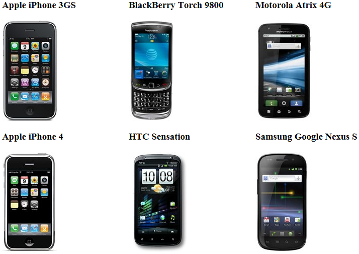
The following is a step-by-step tutorial that shows how to use the BasicDataList control to display a list of smartphones (CMS.Smartphone pages) from the sample Corporate Site:
Create a new Web form in your web project.
Drag the BasicDataList control from the toolbox onto the form.
Set the control’s RepeatColumns property to 3.
- Determines the number of columns that the control uses to display items.
Add the following code marked by the BasicDataList templates comments between the <cms:BasicDataList> tags. The overall code of the BasicDataList control should look like this:
 <cms:BasicDataList ID="BasicDataList1" runat="server" RepeatColumns="3">

     <%-- BasicDataList template --------------------------------------------------------- --%>

     <itemtemplate>
         <div style="width: 250px">
             <h3>
                 <%# Eval("DocumentSKUName") %>
             </h3>
             <img src="<%# CMS.Ecommerce.Web.UI.EcommerceTransformationFunctions.GetSKUImageUrl(Eval("SKUImagePath"), 0, 0, 200, Eval("SKUSiteID")) %>" alt="<%# Eval("DocumentSKUName") %>" />
         </div>
     </itemtemplate>

     <%-- BasicDataList template --------------------------------------------------------- --%>

 </cms:BasicDataList>
This defines the template used by the BasicDataList to display items. The control uses inline code to insert the values of items into the template. This process is repeated for all records in the data source.
Switch to the web form’s code behind and add the following references:
 using System.Data;

 using CMS.DocumentEngine;
Add the following code to the Page_Load method:
 // Retrieves all CMS.Smartphone pages from the Kentico database as a DataSet
 DataSet ds = DocumentHelper.GetDocuments("CMS.Smartphone").Path("/", PathTypeEnum.Children).OrderBy("DocumentSKUName");

 // Assigns the DataSet as the data source of the BasicDataList control
 BasicDataList1.DataSource = ds;
 BasicDataList1.DataBind();
Save the changes to the web form and its code behind file.
Right-click the web form in the Solution explorer and select View in Browser.
The resulting page displays a list similar to the following:

Configuration
You can set the following properties for the BasicDataList control:
|
Property name |
Description |
Sample value |
|
DataBindByDefault |
Indicates whether the control automatically performs data binding during the Init event. |
|
|
HideControlForZeroRows |
Indicates whether the control should be hidden when no data is loaded. The default value is False. |
|
|
PagerDataItem |
Gets or sets the pager data item object. |
|
|
PagerForceNumberOfResults |
If set, the pager does not modify the DataSet containing paged items, but the pager itself behaves as if the amount of paged items were identical to this value. The value must be set to -1 for the property to be disabled. |
|
|
RelatedData |
Custom data connected to the object. |
|
|
ZeroRowsText |
Text shown if no records are found. This text is not visible when the control is hidden by the HideControlForZeroRows property. |
“No records found.” |
Note: The BasicDataList inherits from the ASP.NET DataList control, so you can also set any of the base properties.
Appearance and styling
You can modify the appearance of the BasicDataList control by setting the standard properties inherited from the ASP.NET DataList control.
The design of the listed items is determined by the code of the templates defined within the tags of the BasicDataList control. The following templates are available:
|
Template name |
Description |
|
AlternatingItemTemplate |
Template applied to alternating items. |
|
EditItemTemplate |
Template applied to the item selected for editing. |
|
FooterTemplate |
Template used for the footer of the list. |
|
HeaderTemplate |
Template used for the header of the list. |
|
ItemTemplate |
Template applied to standard items. |
|
SelectedItemTemplate |
Template applied to the selected item. |
|
SeparatorTemplate |
Template used for separating the listed items. |