
Form component properties
Alongside their front-end logic, form components contain a set of properties that can be exposed to users via the configuration dialog. Using the provided interface, users can parameterize a component by providing a different label, tooltip, set a field’s required status, etc.
The configuration dialog lists all editable properties belonging to the currently selected form component. The editing interface for each property is provided by UI form components (a different type of components usable exclusively in the Xperience administration UI) and is fully customizable. UI form components acting in this capacity are referred to as editing components in the documentation.
Defining properties for custom form components
You can define custom properties for each component in its corresponding properties class. See Example - Define a ‘Character size’ property.
To expose these properties for editing, use the editing component attribute. For more information, refer to Editing components.
// Assigns the 'TextInputComponent' as the editing component of the 'CustomProperty' property
[TextInputComponent(Label = "Enter text")]
public string CustomProperty { get; set; }
Properties without the an assigned editing component are not displayed in the properties dialog, but can be managed through the component’s code.
System properties of components
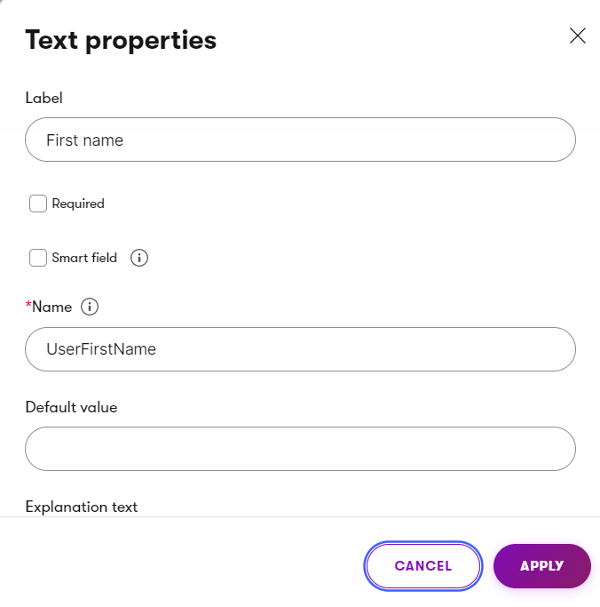
Each form component inherits basic system properties from the FormComponentProperties base class:
|
Property |
Description |
Additional information |
|
Label |
The label text displayed in the properties dialog. |
Can be localized by setting the value to an expression in format |
|
Required |
When true, the form can only be submitted if the field has a value specified. |
|
|
SmartField |
Indicates whether the field behaves as a smart field. |
Fields marked as smart are displayed only on repeated views of a form, as a replacement for other fields that were already filled in by the given visitor. |
|
DefaultValue |
The default value of the property’s input field. |
|
|
Name |
The unique identifier of fields within the given form. |
If a user adds multiple fields based on the same component to a form, the system automatically appends a number to the default name. |
|
Size |
Sets the size of the underlying database column. |
When configured, it overrides the size set in the form component’s properties class constructor. If configured for an editing component (e.g., in a widget configuration dialog), sets the maximum number of characters the property can contain. |
|
Precision |
The number of digits floating point numbers stored in the database can contain. |
When configured, it overrides the precision set in the form component’s properties class constructor. |
|
ExplanationText |
A short message usually displayed under the input field. |
Can be localized by setting the value to an expression in format |
|
Tooltip |
The tooltip of the property displayed on hover. |
Can be localized by setting the value to an expression in format |
|
Placeholder |
Sets a placeholder text for the input field of the component. |
Overriding the editing components of system properties
All system properties use system UI form components as their editing components. If you wish to assign a different editing component for these properties:
- Override the system property in the properties class used by your form component.
- Designate a different editing component using the UI form component’s attribute (e.g.,
NumberInputComponentfor integers).
The following example overrides the base implementation of the Tooltip and Label properties, assigns them custom editing components, and configures some of their system properties using optional constructor parameters of the editing component attributes:
// Overrides the Label property and sets its editing component to 'TextInputComponent'
[TextInputComponent(Label = "Label")]
public override string Label { get; set; }

// Overrides the Tooltip property and sets its editing component to 'TextInputComponent'
[TextInputComponent(Label = "Tooltip")]
public override string Tooltip { get; set; }
Hiding system properties
If you wish to hide a system property of a form component in the properties dialog, override the property and omit the editing component attribute. Users will no longer be able to configure the property in the Form Builder interface.
Example - Define a ‘Character size’ property
The following example demonstrates how to declare and configure a property that sets a field’s width to exactly fit the specified number of characters:
Open your project in Visual Studio.
Declare a new property in a component properties class and assign an editing component attribute:
C#Properties classusing Kentico.Forms.Web.Mvc; using Kentico.Xperience.Admin.Base.FormAnnotations; public class CharacterSizeProperties : FormComponentProperties<string> { // Gets or sets the default value of the form component and the underlying field [TextInputComponent(Label = "Default value", Order = EditingComponentOrder.DEFAULT_VALUE)] public override string DefaultValue { get; set; } // Defines a custom property and its editing component [NumberInputComponent(Label = "Size", Tooltip = "Enter the number of characters the field's width should be set to.", ExplanationText = "Sets the field's width to exactly fit the specified number of characters", Order = -95)] public int CharacterSize { get; set; } // Initializes a new instance of the properties class and configures the underlying database field public CharacterSizeProperties() : base(FieldDataType.Text, 500) { } }In the view templates of form components utilizing the extended properties class, set the
sizeattribute of the<input>element to the value of the custom property.cshtmlView template@using Kentico.Forms.Web.Mvc @model LearningKit.FormBuilder.FormComponents.CustomPropertyComponent @{ @* Gets a collection of system HTML attributes necessary for the correct functionality of the form component inputs *@ var htmlAttributes = ViewData.Kentico().GetEditorHtmlAttributes(); @* Specifies additional HTML attributes for the form component *@ htmlAttributes["size"] = Model.Properties.CharacterSize; } @* Renders the input element for the 'Value' property of the form component *@ @Html.TextBoxFor(m => m.Value, htmlAttributes)Save the changes and Build your project.
The custom property can now be edited on the properties dialog of form components using the modified properties class. When editors configure the property, the width of the input field is set to exactly fit the specified number of characters.