
Admin UI customization model overview
This page covers two topics:
- an overview of the extension and customization points available in the admin UI.
- the development process for admin UI extensions.
Extensions and customization points
You can customize the following parts of the Xperience administration:
UI pages
Pages in the client application are defined via UI pages. The URL of each page derives from its ancestors – pages specify their parent during registration. You can add new pages to existing applications or create entirely new page structures for custom applications.
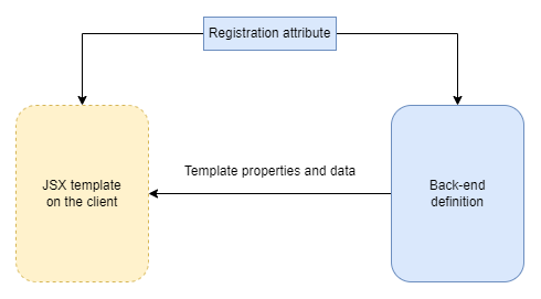
A single UI page consists of the following components:
- Back-end definition – a class in the Xperience .NET application. Retrieves the data displayed on the client and defines command handlers for user interactions with the page.
- Client template – a React component that describes the layout and appearance of the UI page (written in JSX). Displays data received from the back end and invokes commands in response to user interaction.
- Registration attribute – ties the back-end definition and a corresponding client template together.
The following diagram illustrates the basic structure of UI pages:
The system provides support for creating most types of pages found in a default installation of Xperience (listing pages, info object editing pages, pages with forms). For more information about developing UI pages, see UI pages.
UI application pages
Every application in the admin UI is contained within an application page that serves as the app’s entry point and the root for its UI page subtree. The following diagram illustrates a sample application structure:
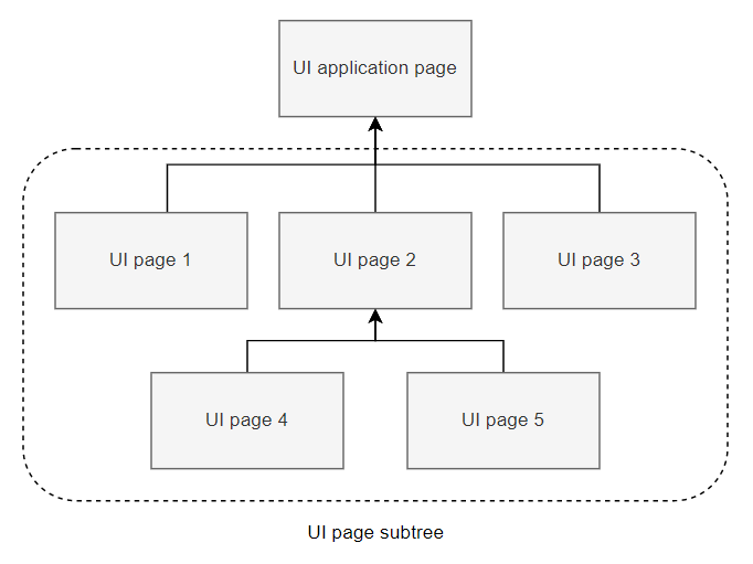
For more information, see UI application pages.
UI page commands
Page commands enable the execution of arbitrary code on the server back end from within the client-side application. Typical use cases for commands are CRUD operations on database objects (creating or deleting new users, for example). However, you can use commands to execute any custom logic on the back end.
Commands belong to individual UI pages. They can also be inherited from other classes (e.g., base classes that provide common logic for multiple UI pages).
The following diagram illustrates the basic lifecycle of a command:
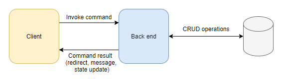
In the diagram:
- A command is invoked from the client-side administration interface (e.g., via a button click or a similar user interaction).
- The React application sends a request to the back end with contextual information about the invoked command (name, source page, and any other required data).
- Based on the provided information, the back end executes the command (a method annotated with a specific attribute) and returns a result back to the client.
- The client receives the result and reacts accordingly (e.g., displays a message, reloads the page to display new data, redirects the user)
See UI pages and UI page commands for more information about developing UI pages and page commands.
UI page extenders
Page extenders allow you to modify the back-end definition of existing UI pages without directly editing their source code. You can use extenders to add new commands or change the configuration of pages. For example, you can add additional columns to an object listing (e.g., to display additional properties of registered users) or specify new actions (e.g., perform a specific operation with selected objects).
Additionally, page extenders contain Before and After events tied to command execution. The events enable you to register handlers that execute before or after a specific command handler method is invoked.

For more information about developing UI pages and commands, see UI page extenders.
UI form component framework
UI form components define the editing interface for fields that comprise forms used to edit or configure objects and pages in the admin UI.
Each form field is assigned a single form component, which manages the field’s editing interface by providing, for example, a text box, a group of radio buttons, or a drop-down selector input for the underlying value. Well-designed forms can make working with the admin UI much simpler for business users and administrators alike.
UI form components are different from form components used in Form Builder. UI form components integrate into the React-based client application. For this reason, their front end must be written as a React component (not as an MVC View file used in Form Builder components).
To learn how to write custom UI form components, see UI form components.
Validation rules and visibility conditions
For better user experience, you can constrain component input using
- validation rules that allow users to submit only data that fulfills specified conditions, and
- visibility conditions that hide designated fields until set criteria are met.
See UI form component validation rules and UI form component visibility conditions for a reference of input constraint elements available in default Xperience installations and guides to implement additional elements that fit your requirements.
Admin UI development process
This section introduces concepts and best practices related to the development of admin UI customizations. Any customization you choose to implement will, in the majority of cases, fall into one of two categories:
Use existing client components to extend parts of the UI with back-end code.
- In this case, you’re reusing available React components to build the UI, so only changes to the back end are necessary.
-
- In this case, you need to develop modules that export new React components for consumption by the client application. The modules must be embedded in an assembly and registered using back-end code (same as other components).
The admin UI doesn’t rely on location conventions to detect customizations – the structure of your custom code is therefore entirely up to you. However, there are certain deployment scenarios that benefit from specific setups. See Custom code location for more information.
Back-end development
When developing the admin UI using only back-end code, you’re reusing React UI components available in the system by default. Most commonly, this will be the case when adding new UI pages or applications, or writing extenders for existing pages.
The following steps summarize the general process:
- Create a new assembly dedicated to admin-related code.
- We recommend separating admin UI custom code into a dedicated class library project. Using separate assemblies keeps the code intended for the admin UI separate from custom code and your site implementation. It also provides a convenient place to embed compiled JS modules with client code and simplifies certain advanced deployment scenarios.
- To access all admin UI-related APIs, install the Kentico.Xperience.Admin NuGet package to the project.
- Write the required customizations.
Client application development
In this case, you’re developing modules that export new React components for consumption by the client application. The module must be embedded in an assembly and registered using back-end code (same as other components).
The following steps summarize the general process:
- Prepare your environment for client development.
- Develop required client components.
- You can make use of existing Xperience components provided by the base system modules.
- Use the components when writing the corresponding back-end code.
Client application JavaScript modules
Xperience client components and configuration is available in the following modules:
- @kentico/xperience-admin-base
- Core components and functionality, such as navigation, forms, commands, hooks, and notifications.
- @kentico/xperience-admin-components
- React UI components used to build out the client application.
- @kentico/xperience-webpack-config
- Webpack config files for bundling client modules.
Custom code location
We recommend separating admin UI custom code into a dedicated class library project. Using separate assemblies keeps the code intended for the admin UI separate from custom code and your site implementation. It also provides a convenient place to embed compiled JS modules with client code and simplifies certain advanced deployment scenarios.
Back-end files
For custom code that only requires changes on the back end (reuses default client components and functionality) create a custom assembly and reference it from the main .NET application.
All customizations are registered into the system via assembly attributes collected during application initialization, meaning there are no location conventions for admin UI code. Regardless, keeping a clean directory structure is a good practice, especially when developing larger blocks of custom functionality.
For illustration, an example directory structure in the class library:
- ~/<UIPages>/<Application>/<PageClasses>
- ~/<UIPages>/<Application>/<PageExtenders>
- ~/<UIFormComponents>/<Name>/<ComponentFiles>
With other types of customizations following a similar pattern.
Client files
When developing custom JS modules for the client application, you can use a boilerplate project that comes with a custom assembly usable for both back-end and client code. See Prepare your environment for admin development.
How you structure individual files within the modules is up to your preference. However, same as for the back-end files, we recommend keeping an organized directory structure. For example, you can create a separate folder for each type of customization.