
Example - Color selector UI form component
This page provides a step-by-step example demonstrating the process of creating, configuring, and registering a UI form component in the system. The component renders a color selector and returns the selected color in the hexadecimal format. The example implementation also ensures that the component is displayed in a non-editable state when required by the admin UI.
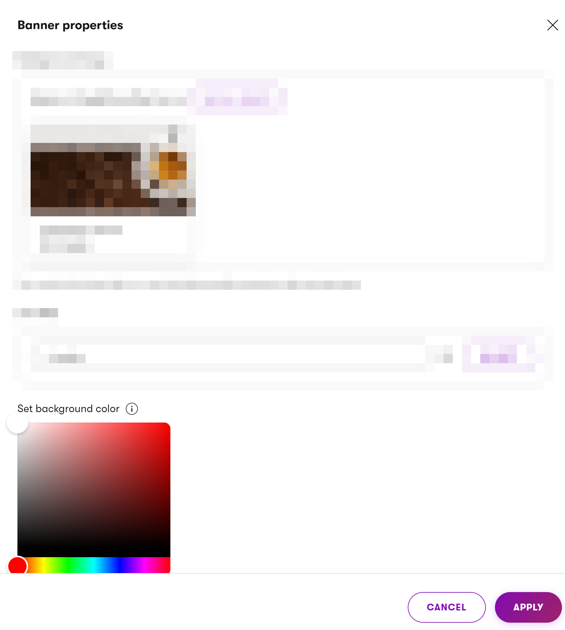
For example, when used in Page Builder widget properties, the component can enable users to set the color of some part or element rendered by the widget. See the following screenshot for an illustration.
If you have not yet done so, prepare your development environment according to Prepare your environment for admin development. UI form components consist of both back-end and front-end code, so you’ll need to prepare a custom JavaScript module as well.
Custom code best practices
We recommend separating admin UI customizations into a dedicated class library project. Using separate assemblies keeps the code intended for the admin UI separate from your site implementation. It also provides a convenient place to embed compiled JS modules with client code and simplifies certain advanced deployment scenarios.
After your environment is set up, implement the component’s back-end definition.
using System.Threading.Tasks;

using Kentico.Xperience.Admin.Base.FormAnnotations;
using Kentico.Xperience.Admin.Base.Forms;

namespace Acme.Web.Admin.UIFormComponents.ColorSelector
{
    [ComponentAttribute(typeof(ColorSelectorComponentAttribute))]
    public class ColorSelectorFormComponent : FormComponent<ColorSelectorFormComponentClientProperties, string>
    {
        // The name of client React component to invoke, without the 'FormComponent' suffix
        public override string ClientComponentName => "@acme/web-admin/ColorSelector";

        protected override Task ConfigureClientProperties(ColorSelectorFormComponentClientProperties clientProperties)
        {
            base.ConfigureClientProperties(clientProperties);

            if (string.IsNullOrEmpty(clientProperties.Value))
            {
                // Initial state handling.
                // Sets the default value of the component (white) if no color was selected on the client.
                clientProperties.Value = "#FFFFFF";
            };

            return Task.CompletedTask;
        }
    }

    // Client properties class
    public class ColorSelectorFormComponentClientProperties : FormComponentClientProperties<string>
    {
    }
}
Next, define the editing component attribute used for annotating other properties.
using Kentico.Xperience.Admin.Base.FormAnnotations;

// The component doesn't define any custom configuration properties.
// The default attribute definition is therefore sufficient.
public class ColorSelectorComponentAttribute : FormComponentAttribute
{
}
Finally, write the React component that renders the user interface. The component makes use of a color picker from the react-colorful library.
"dependencies": {
    "react-colorful": "^5.x.x"
  },
import React, { useState } from 'react';

// Imports a color selector component from react-colorful
import { HexColorPicker } from "react-colorful";

import { FormComponentProps } from '@kentico/xperience-admin-base';
import { FormEditMode, FormItemWrapper } from '@kentico/xperience-admin-components';

export const ColorSelectorFormComponent = (props: FormComponentProps) => {

    const handleOnChange = (value: string) => {
        // If 'onChange' is undefined, do nothing
        if (props.onChange) {
            // Passes the new user input to a parent component where all field
            // values are maintained. 'value' emitted by the color picker's onChange
            // event stores the most up to date input of the component.
            props.onChange(value);
        }
    };

    // Renders the color selector in a state
    // corresponding to the 'editMode' value passed through 'props'.
    const renderColorSelector = () => {
        if (props.editMode === FormEditMode.ReadOnly) {
            return (
                <div>
                    The selected color is
                    <span style={{ color : props.value.toString() }}>{props.value}</span>.
                </div>
            );
        }

        else if (props.editMode === FormEditMode.Disabled) {
            return (
                renderDisabledSelector()
            );
        }

        else {
            // Renders the color selector in an editable state
            // and ensures the propagation of the selected value.
            return <HexColorPicker color={props.value} onChange={handleOnChange}/>;
        }
    };

    // Renders the color selector in a disabled state which prevents editing
    // and interaction with the component.
    const renderDisabledSelector = () => {
        return (
            <div style={{ position: "relative", display: "inline-block" }}>
                <HexColorPicker color={props.value}/>
                <div
                style={{
                    position: "absolute",
                    top: 0,
                    left: 0,
                    width: "100%",
                    height: "100%",
                    backgroundColor: "rgba(255,255,255,0.5)",
                    zIndex: 10,
                    }}
                />
            </div>
        );
    };

    // Renders the color selector and wraps it in 'FormItemWrapper' to ensure
    // the component works correctly inside forms.
    return (
        <FormItemWrapper
            label={props.label}
            explanationText={props.explanationText}
            invalid={props.invalid}
            validationMessage={props.validationMessage}
            markAsRequired={props.required}
            labelIcon={props.tooltip ? 'xp-i-circle' : undefined}
            labelIconTooltip={props.tooltip}
            editMode={props.editMode}
        >
            {renderColorSelector()}
        </FormItemWrapper>
    );
};
To make the component available from the admin UI, it must be exported from the client module’s entry.tsx:
// Export the full path to the component file
export * from './form-components/ColorSelectorFormComponent';
The UI form component is ready for use in builder component dialogs and model-driven UI forms. To enable usage in the field editor, register the component using RegisterFormComponent.
using Kentico.Xperience.Admin.Base.Forms;

[assembly: RegisterFormComponent("Acme.UIFormComponents.ColorSelector",
                                 typeof(ColorSelectorFormComponent),
                                 "Color selector")]