
Module: Commerce content modeling
27 of 38 Pages
Design mixed content widgets
Mixed content widgets are the recommended pattern for most commerce widgets. They reference structured, product default (or core) content from the Content hub and provide editors with the option to override specific fields for campaigns, promotions, and optimization. The original content in the Content hub stays intact – overrides only apply to the specific page where the editor configures them.
Label override properties clearly
Make sure that editors understand that using these override properties is optional and what happens if left blank. You can use a pattern, such as: “Override [FieldName] (optional)” with a description like “If empty, displays the value from the Content hub.”
Widget examples from the pet store scenario
The following widgets are conceptual blueprints, not production-ready code. They illustrate how the three widget patterns apply to common commerce use cases within the pet store scenario introduced at the beginning of this guide - pet adoption services and a product catalog. Each example lists recommended properties grouped by category (content source, overrides, display, behavior) so you can see how the property design principles translate into practical widget designs.
Where relevant, the examples reference the Kbank demo site to show similar patterns in a real Xperience project. If you’d like to explore those implementations, start with the companion guides on modeling reusable Product SKUs and modeling commerce pages, which define the content types these widgets are built to display. Then you can explore the Training guides repository, which contains code samples of different widgets.
We provide multiple examples intentionally. Each widget faces different decisions about where the content comes from, which content editors can override, and how they can adjust content display. Reviewing them together helps you recognize recurring patterns you can adapt to your own project. If you already feel confident applying the three widget patterns to your content types, you can skip ahead to the section components section.
Pet Card widget
Displays a pet available for adoption with optional promotional overrides. You can design the widget to display data from the current page that references the pet item or another website page (that already references the pet item) in any of the channels, from the Content hub pet item, or to dynamically display an item editors added to a smart folder.
Confused about the content selection process? See how we designed the Product widget in the Kbank demo website.
Select pet
- Radio (Radio - Current pet page, Pet page, Content hub, Smart folder)
- Pet (Combined content selector/Smart folder selector - required)
Override properties:
- Override headline (Text - optional, defaults to pet name)
- Override description (Text area or Rich text - optional, defaults to pet description)
- CTA text (Text - optional, defaults to “Meet [PetName]” defined on the widget level)
- Open in new tab (Checkbox - boolean)
- Promotional badge text (Text - e.g., “Adoption Special!”)
- Promotional badge color (Dropdown - Company brand colors)
- Show adoption fee (Checkbox - boolean)
Display properties:
- Card style (Dropdown - Wide, Slim, Detailed, Featured, etc.)
- Image (Dropdown - Image variant names, or Text field - accept image variant name)
- Allow product quick view (Checkbox - Modal product preview that can trigger, e.g., on listing pages, that shows a summarized view with add-to-cart capability)
Use cases: Pet listing pages, homepage featured pets, and adoption campaign pages.
Product Card widget
Displays a product with purchase information and optional promotional overrides. It can use the same content selection mechanism as the Pet Card widget.
Select product
- Radio (Radio - Current product page, Product page, Content hub, Smart folder)
- Product (Combined content selector/Smart folder selector - required)
Override properties:
- Override headline (Text - optional, for optimization)
- Override description (Rich text or Text area - optional, for promotions)
- Override CTA text (Text - optional, defaults to “Add to Cart”)
- Promotional badge text (Text - e.g., “20% Off”)
- Promotional badge color (Dropdown - Company brand colors)
- Override price display (Text - e.g., “Starting at $19.99”)
Display properties:
- Card style (Dropdown - Wide, Slim, Detailed, Featured, etc.)
- Show rating (Checkbox - boolean)
- Show stock status (Checkbox - boolean)
- Show quick view button (Checkbox - boolean)
- Image (Dropdown - Image variant names, or Text field - accept image variant name)
Use cases: Product listing pages, related products, and upsell sections.
Testimonial widget
Displays a customer testimonial with optional excerpt customization.
Select testimonial (from Content hub)
- Testimonial (Combined content selector - required)
Override properties:
- Override quote excerpt (Text area or Rich text - can shorten for context)
- Highlight specific portion (Text - pull quote emphasis)
Display properties:
- Show customer photo (Checkbox - boolean)
- Show company/title (Checkbox - boolean)
- Show rating stars (Checkbox - boolean)
- Quote style (Dropdown - depending on the brand design, e.g., Standard, Blockquote, Card)
- Include verified badge (Checkbox - boolean)
Use cases: Product pages, landing pages, social proof sections.
Hero banner widget
The most flexible widget that can reference different content types or use fully custom content. You can follow the same content selection pattern as in the Pet Card widget. The widget’s display properties will depend on each company’s design manual, so use the following properties as ideas.
Select source content:
- Radio (Radio buttons - for indicating a decision)
- Current page (Radio)
- Pet or Product (Combined content selector - configured to allow selecting reusable Pet or Product content types or creating new content items of these types)
- Website page (Combined content selector - scoped to supported webpage content types)
- Banner (Campaign banner) (Combined content selector - reuse existing Banner from Content hub or create new)
Override/Custom properties:
- Headline (Text - required)
- Subheadline (Text)
- Description (Rich text)
- Background (Combined content selector - scoped to select assets, such as images or videos)
- CTA primary text (Text)
- CTA secondary text (Text - optional) and CTA secondary link (URL or page selector)
- CTA primary link (URL selector and Text field for external links)
Display properties:
- Height (Dropdown - Small, Medium, Large, Full width)
- Content alignment (Dropdown - Left, Center, Right)
- Overlay opacity (Number (or custom Slider component) - 0–100%)
- Text color scheme (Dropdown - Light, Dark, Auto)
- Show/Hide image (Checkbox - boolean)
- Add margin (Dropdown - Small, Medium, Large)
Use cases: Homepage hero, campaign landing pages, product launches.
For a detailed example of how a hero banner widget handles dependent properties and editor flows, see the hero banner editor flow in the widgets guide.
Call-To-Action widget
Prompts visitors to take a specific action. You can enhance CTA properties and give editors the option to select Content hub references for reusable CTAs, downloadable PDFs, and other relevant content. The decision-making pattern can follow a similar approach as the Pet Card widget.
We also recommend providing editors with a text field (or different component) they can use to add tracking IDs to call-to-action widgets. This will help them correctly track events through custom activities across different customer journeys and optimize their content.
Call-To-Action widget properties:
Select content from Content hub (optional):
- CTA content (Combined content selector - scoped to allowed content types or reusable field schemas)
CTA properties:
- Headline (Text)
- Description (Text area or Rich text editor)
- Button label (Text)
- Button link (URL or page selector)
- CTA identifier (Text - Depends on project specifications, e.g., custom_activity_name)
Display properties:
- Style (Dropdown - Depends on the brand design manual, for example, Box, Banner, Inline)
- Button style (Dropdown - Depends on the brand design manual, e.g., Primary, Secondary, Outline)
- Button size (Dropdown - Depends on the brand design manual, e.g., Small, Medium, Large)
- Icon (Combined content selector - optional, scoped to appropriate reusable content type)
- Background color (Dropdown - Depends on the brand design manual, e.g., Primary, Secondary, Highlights)
Use cases: In-content CTAs, sidebar promotions, end-of-article conversions. See also the landing page components guide for detailed CTA design considerations.
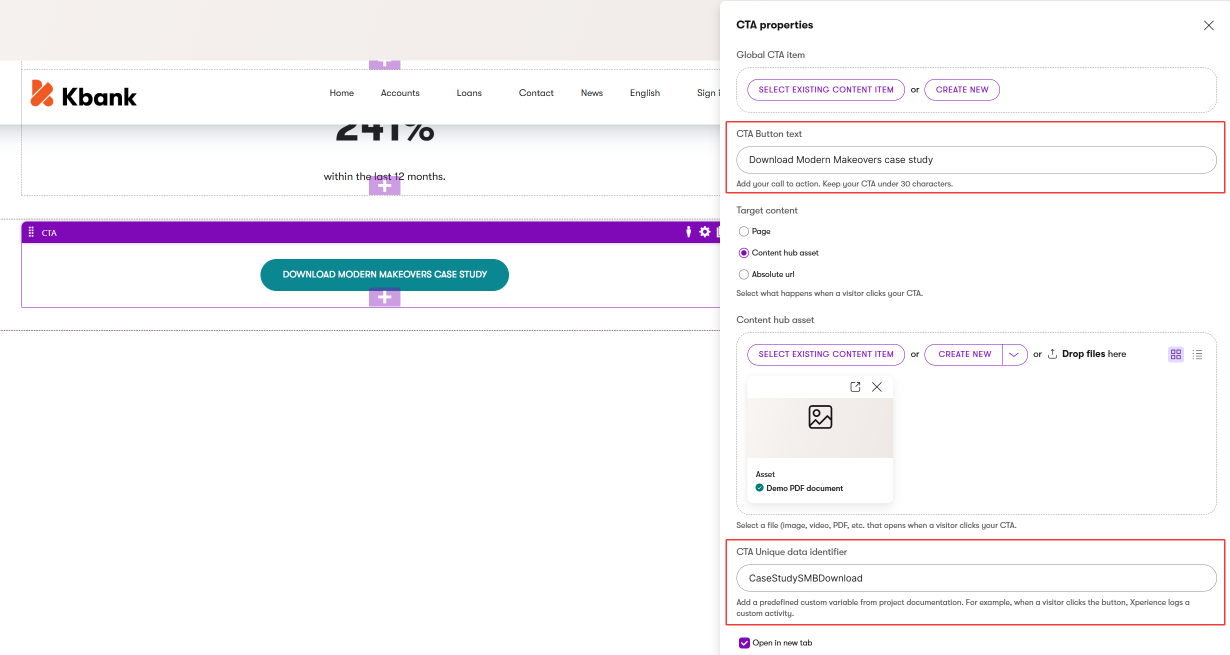
As you can see in the image above, editors can select a global Call to action content item (that represents a specific URL across all channels in the XbyK ecosystem). Or, they can create a call to action in place by adding a label and selecting a page, asset, or a specific URL directly in the widget properties. They can also assign a unique tracking ID to measure button clicks (in this case, file downloads) to visualize performance in a customer journey.
Additional Mixed content widgets to consider
Based on common commerce patterns, you may also want to design:
- BundleOffer widget - References a Product Bundle or Collection content types with overrides for name, savings callout, and CTA text. You can include a limited-time badge and display options to show included products and the savings calculation. Use for product upsells and cart recommendations.
- Promotion widget - Full-width promotional banner, for example, with a countdown timer, that allows editors to share incentive messaging and CTA. Combines Content hub reference with campaign-specific overrides.
- Category Preview widget - Visual category navigation cards that reference a product category, e.g., in Tag selector, and override the display image and teaser text for seasonal campaigns.
- Incentive Badge widget - Allow editors to share trust signals, such as showing shipping guarantees, return policies, and certification badges. You can include these properties in a custom reusable Featured content type with override capability for promotional periods.