
Module: Commerce content modeling
28 of 38 Pages
Design referenced content widgets
Referenced content widgets display content stored in the Content hub. Editors configure how the content looks through display properties, but they cannot change the content itself. This pattern is best for images, videos, and data-driven displays where consistency across channels matters.
Image widget
Displays an image exactly as stored in the Content hub.
Select an image from Content hub:
- Image asset (Combined content selector - required)
Display properties:
- Image size (Dropdown - Image variant names, e.g., Thumbnail, Medium, Large, Full-width),
- Image overlay (Dropdown - Depends on the brand design manual )
- Alignment (Dropdown - Left, Center, Right)
- Link URL (URL or Page selector - optional)
- Open in lightbox (Checkbox - boolean)
- Show caption (Checkbox - boolean from Image content item’s metadata)
- Enable lazy loading (Checkbox - boolean)
Use cases: Content images, product photography, decorative elements.
Video widget
Plays a video from the Content hub with configurable player settings.
Select a video from Content hub:
- Video asset (Combined content selector - required)
Display properties:
- Player controls (Dropdown - Full, Minimal, None)
- Autoplay (Checkbox - boolean)
- Muted by default (Checbox- boolean)
- Loop (Checbox- boolean)
- Aspect ratio (Dropdown - 16:9, 4:3, 1:1)
- Show transcript (Checkbox - boolean from asset metadata)
Use cases: Product demonstrations, tutorials, brand storytelling.
Feature Card widget
Displays a product or service feature from the Content hub.
Select featured content:
- Featured content (Combined content selector - required, scoped to allowed content types or reusable field schemas)
Display properties:
- Card style (Dropdown - icon-top, icon-left, minimal)
- Icon size (Dropdown - small, medium, large)
- Show learn more link (Checkbox - boolean)
Use cases: Product features, service offerings, benefit displays.
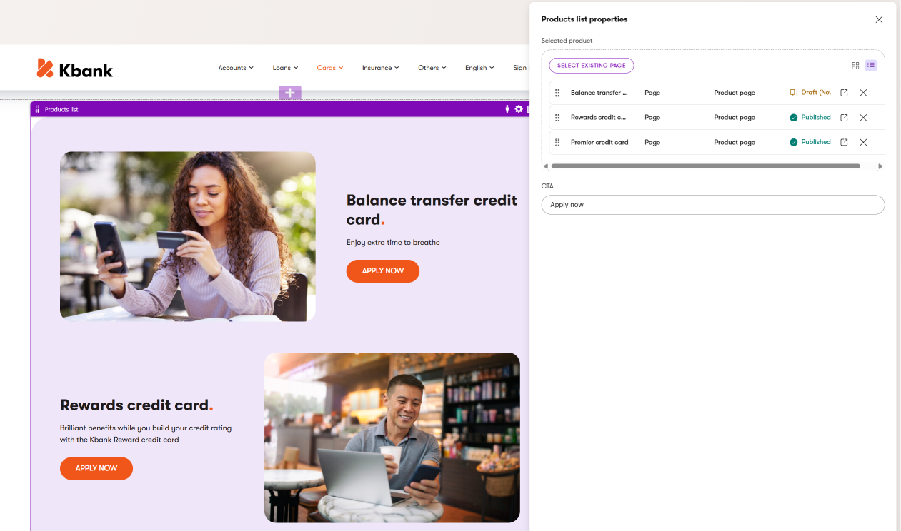
Product List widget
Displays product teasers with product name, short description, and image.
Select products
- Products (Combined content selector - Scoped against allowed content types or reusable field schemas, or from a smart folder)
Display properties
- CTA - (Text - Allow editors to provide a call to action)
- Display style - (Dropdown - Depends on the brand design manual, e.g., Stacked, Side-by-Side, Distributed)
- Number of products (Number - number of displayed products)
- Show/Hide product features (Checkbox - boolean)
See the Product list widget on the Kbank demo site.
Use cases: Product listing pages, related products, and upsell sections.
FAQ List widget
Displays a collection of FAQ items from the Content hub.
Select FAQs from Content hub:
- FAQ collection (Combined content selector - FAQ collection or a Tag selector for a category)
- OR Select multiple FAQ items (Combined content selector - multiple selection allowed, scoped against FAQ content type)
Display properties:
- Display style (Dropdown - Depends on brand design manual, e.g., Accordion, List, Cards)
- Show all expanded (Checkbox - boolean)
- Enable search (Checkbox - boolean)
- Group by category (Checkbox - boolean)
See the FAQ widget on the Kbank demo website.
Use cases: Help pages, product information, support sections. For more on FAQ widget design, see the landing page components guide.
Additional Referenced content widgets to consider
- Product Comparison widget - side-by-side comparison table referencing multiple Products. Display properties control which attributes to compare, highlight differences, and column layout. (For example, see the Product comparator widget in the Kbank demo site.)
- Pricing Table widget - references multiple Pricing Plan content items and displays them in a comparison layout. Properties include a highlighted featured plan, column layout, a show comparison toggle, and an annual/monthly pricing toggle. Use for service pricing pages and subscription offers.
- Location Map widget - references a Location content item and displays it on a map. Properties include zoom level, directions link, contact info display, and pin color. Use for store locator and contact pages.
- StoreNavigation widget - references product categories to build mega-menu or breadcrumb navigation. Display properties control navigation style, depth levels, and featured category highlights.
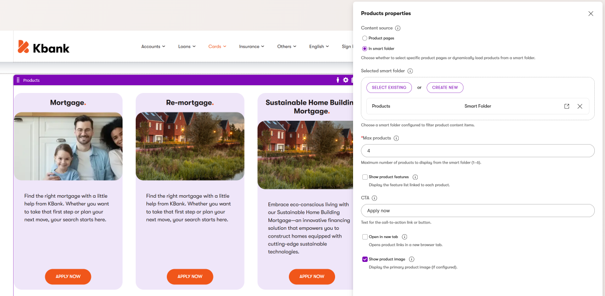
The image above shows the Products widget that you can see on the Kbank demo site. Editors can select data from a specific page or, as in this case, display products from a smart folder. They can adjust the call to action to unify the listing, and then adjust the look and feel of all the selected products section.