
Module: Page Builder
13 of 18 Pages
Set up an advanced widget
Now that we’ve gone over the process of building a simple widget, let’s dive into a more complex example with many configuration options.
The code samples here are for a widget that displays financial services, with many properties to control which service data it shows and how the data are presented.
Combined with the Page templates and Page Builder section from earlier in this series, it works to achieve the page designs specified by these mockups:
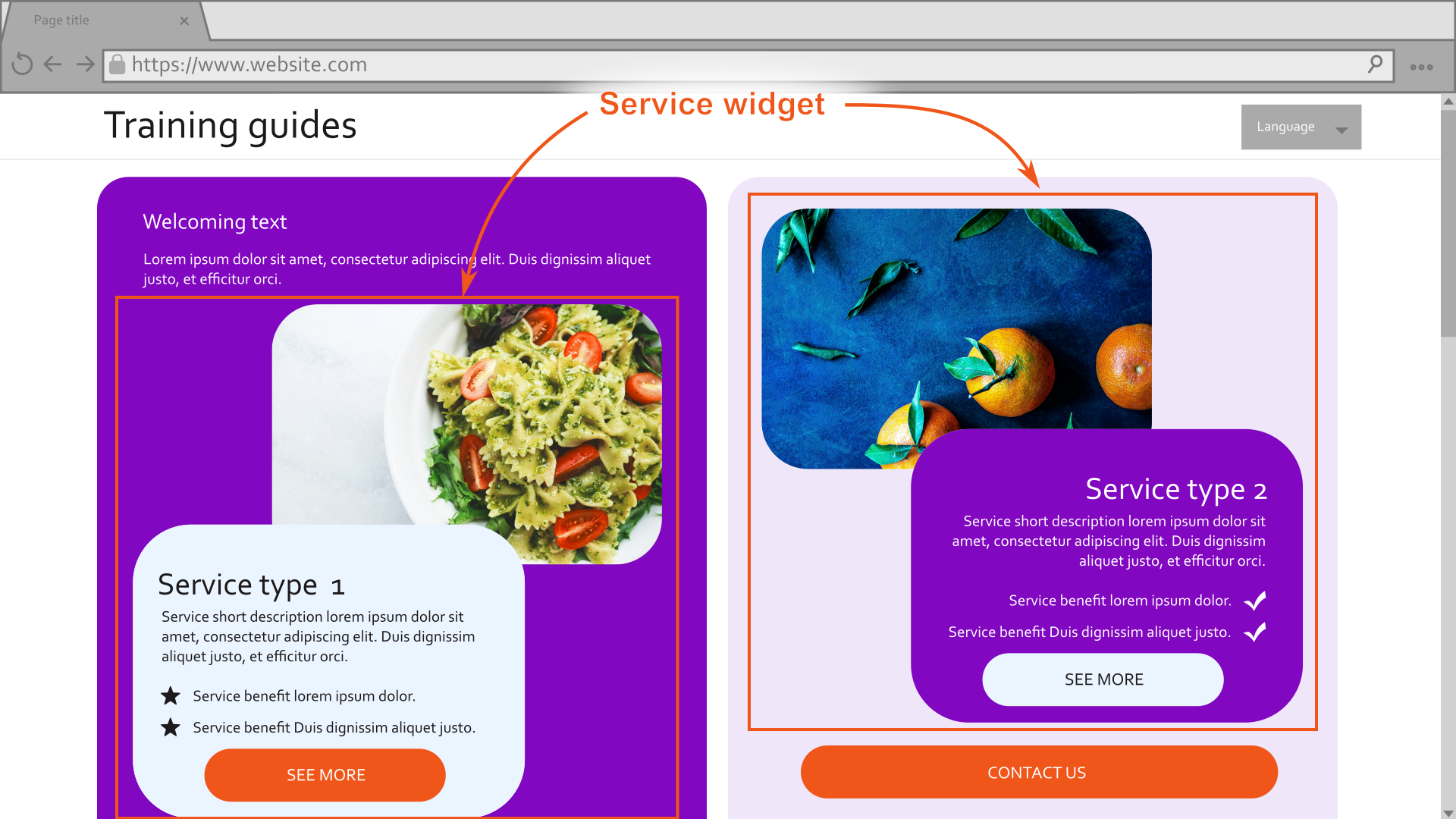
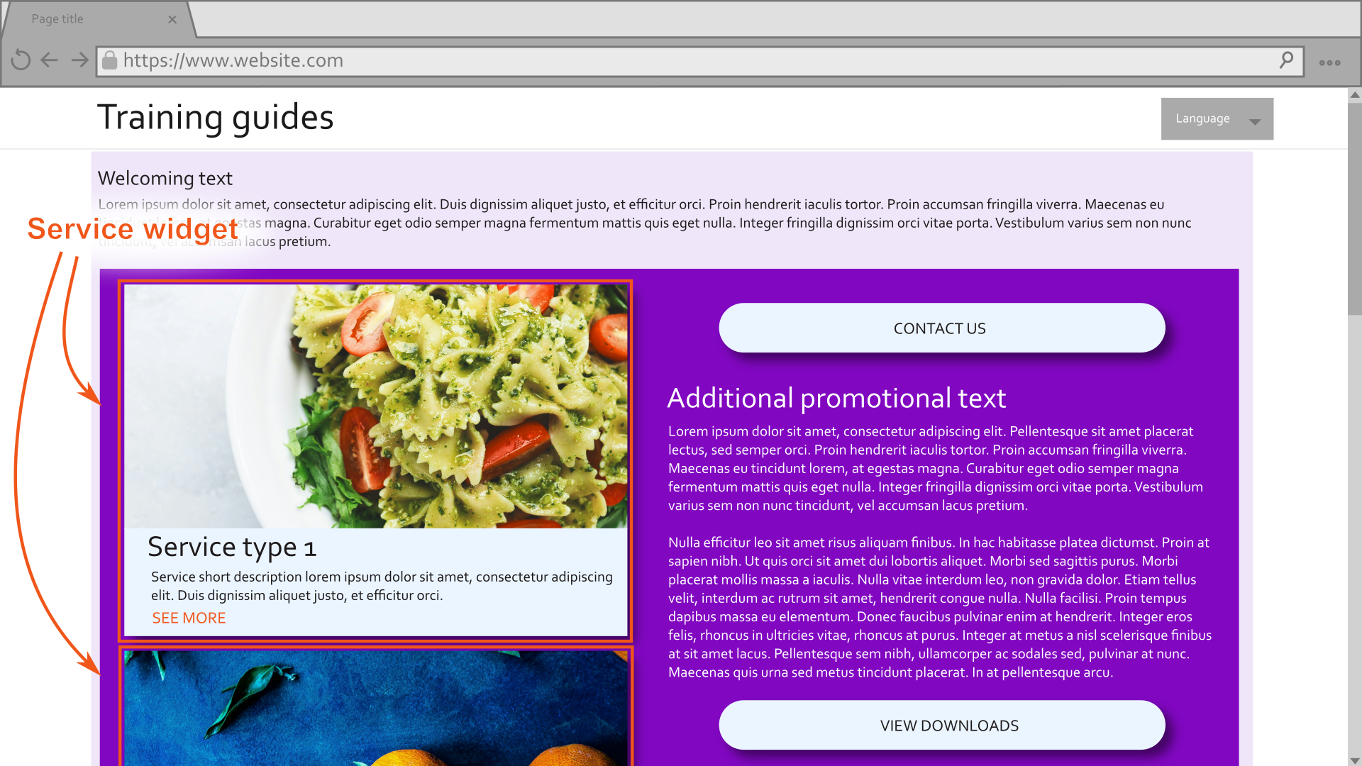
For a more detailed breakdown of how templates, sections, and widgets can be applied to achieve the mockups, check out the start of this series.
Create the widget view model
Begin with the widget view model, so that you have a focus on the final result the widget will render from the beginning.
Focus only on what the view needs at this point. We can gather, transform, and process the data however we like between the widget’s properties and view component.
Think of what your widget will need to display under different circumstances and decide what values will be necessary to achieve that.
Consider whether your view can reuse existing tools from your project and account for the parameters they need. For example, if we have a tag helper that renders a formatted date based on a
DateTimeobject, we can include an unprocessedDateTimevalue in the view model rather than a formatted date string.If your widget needs to show multiple possible layouts or designs, make sure to include properties that control the widget’s appearance.
If your team has an interface or abstract class for widget view models, make sure you’ve implemented all the appropriate members.
If this is your first widget, consider creating such a resource to promote consistency among widget view models where appropriate.
For example, you may include an abstract property to indicate if a widget is configured incorrectly. This invites the developers of future widgets to consider when to display an error message to business users.
Here is an example from the Training guides repository:
C#WidgetViewModel.csnamespace TrainingGuides.Web.Features.Shared.Models; public abstract class WidgetViewModel { public abstract bool IsMisconfigured { get; } }Many of the sample widgets in the finished branch of the Training guides repository inherit from the class above, such as the Hero banner and Article list.
using TrainingGuides.Web.Features.FinancialServices.Models;
using TrainingGuides.Web.Features.Shared.Models;

namespace TrainingGuides.Web.Features.FinancialServices.Widgets.Service;

public class ServiceWidgetViewModel : IWidgetViewModel
{
    public ServicePageViewModel? Service { get; set; }
    public bool ShowServiceFeatures { get; set; }
    public AssetViewModel ServiceImage { get; set; } = new();
    public bool ShowAdvanced { get; set; }
    public string ParentElementCssClasses { get; set; } = string.Empty;
    public string MainContentElementCssClasses { get; set; } = string.Empty;
    public string ImageElementCssClasses { get; set; } = string.Empty;
    public string ColorScheme { get; set; } = string.Empty;
    public string CornerStyle { get; set; } = string.Empty;
    public string CallToActionCssClasses { get; set; } = string.Empty;
    public bool IsImagePositionSide { get; set; } = false;

    public bool IsMisconfigured => Service is null;
}
Display the widget
Display messages to editors but not live site visitors
When editors work with widgets, we should help them by providing messages about how to work with the widget. Some messages make the most sense to display in the widget’s output, so that editors can see them outside of the widget properties dialog. However, we must make sure that these messages are not displayed on the live site, so visitors do not see messages that don’t concern them.
Create a tag helper or view component that displays its content only when the page is in Page Builder or Preview mode. For example:
using Kentico.Content.Web.Mvc;
using Kentico.PageBuilder.Web.Mvc;
using Kentico.Web.Mvc;
using Microsoft.AspNetCore.Razor.TagHelpers;

namespace TrainingGuides.Web.Features.Shared.Helpers.TagHelpers;

/// <summary>
/// Displays the inner content of the Tag Helper only when the page is being viewed
/// in Page Builder or Preview mode
/// </summary>
[HtmlTargetElement("tg-page-builder-content", TagStructure = TagStructure.NormalOrSelfClosing)]
public class PageBuilderContentTagHelper : TagHelper
{
    private readonly IHttpContextAccessor accessor;

    public PageBuilderContentTagHelper(IHttpContextAccessor accessor)
    {
        this.accessor = accessor;
    }

    public override void Process(TagHelperContext context, TagHelperOutput output)
    {
        var httpContext = accessor.HttpContext;

        bool isNotInPageBuilder = httpContext.Kentico().PageBuilder().GetMode() == PageBuilderMode.Off;
        bool isNotInPreview = !httpContext.Kentico().Preview().Enabled;

        if (isNotInPageBuilder && isNotInPreview)
        {
            output.SuppressOutput();
        }

        output.TagName = "";
    }
}
The PageBuilderContentTagHelper sample above can display static messages when the page is in Preview or Page Builder mode, but it can also work with dynamic content.
For example, here’s another tag helper that displays a message when the widget is not configured properly:
using Kentico.Content.Web.Mvc;
using Kentico.PageBuilder.Web.Mvc;
using Kentico.Web.Mvc;
using Microsoft.AspNetCore.Html;
using Microsoft.AspNetCore.Razor.TagHelpers;

namespace TrainingGuides.Web.Features.Shared.Helpers.TagHelpers;

/// <summary>
/// Displays a helpful message that a Widget needs to be configured when the page is viewed
/// in Page Builder or Preview mode.
/// </summary>
[HtmlTargetElement("tg-configure-widget-instructions", TagStructure = TagStructure.WithoutEndTag)]
public class ConfigureWidgetInstructionsTagHelper : TagHelper
{
    private readonly IHttpContextAccessor accessor;
    public string Message { get; set; } = string.Empty;

    private const string P_TAG = "p";
    private const string INSTRUCTIONS_EDIT_MODE = "This widget needs some setup. Click the <strong>Configure widget</strong> gear icon in the top right to configure content and design for this widget.";
    private const string INSTRUCTIONS_READONLY_MODE = "This widget needs some setup. Click <strong>Edit page</strong> and then the <strong>Configure widget</strong> gear icon in the top right to configure content and design for this widget.";
    private const string INSTRUCTIONS_PREVIEW_MODE = "This widget needs some setup. Switch to the <strong>Page Builder</strong> and <strong>Edit page</strong>.<br/>Then click the <strong>Configure widget</strong> gear icon in the top right to configure content and design for this widget.";

    public ConfigureWidgetInstructionsTagHelper(IHttpContextAccessor accessor)
    {
        this.accessor = accessor;
    }

    public override void Process(TagHelperContext context, TagHelperOutput output)
    {
        output.TagName = P_TAG;
        output.TagMode = TagMode.StartTagAndEndTag;

        var httpContext = accessor.HttpContext;
        string messageToShow = string.IsNullOrEmpty(Message)
            ? (httpContext.Kentico().PageBuilder().GetMode() switch
            {
                PageBuilderMode.Edit => INSTRUCTIONS_EDIT_MODE,
                PageBuilderMode.ReadOnly => INSTRUCTIONS_READONLY_MODE,
                PageBuilderMode.Off => INSTRUCTIONS_PREVIEW_MODE,
                _ => INSTRUCTIONS_PREVIEW_MODE
            })
            : Message;

        output.Content.SetHtmlContent(new HtmlString(messageToShow));
    }
}
Implement the widget view
Display helpful messages for editors when the widget is not configured properly.
Use tag helpers and view components to handle shared logic used in other parts of the system.
Use conditional logic to render different data and visual elements based on the values of the view model’s properties
@using System.Globalization
@using TrainingGuides.Web.Features.FinancialServices
@using TrainingGuides.Web.Features.FinancialServices.Widgets.Service
@using TrainingGuides.Web.Features.FinancialServices.Models
@using TrainingGuides.Web.Features.Shared.OptionProviders.Heading
@using TrainingGuides.Web.Features.Shared
@using TrainingGuides.Web.Features.Shared.OptionProviders.ColumnLayout
@using TrainingGuides.Web.Features.Shared.OptionProviders.ColorScheme
@using TrainingGuides.Web.Features.Shared.Services

@inject IHttpRequestService httpRequestService

@model ServiceWidgetViewModel

@{
    var baseUrl = httpRequestService.GetBaseUrl();
}

@if (Model is null || Model.IsMisconfigured)
{
    <tg-page-builder-content>
        <tg-configure-widget-instructions />
    </tg-page-builder-content>

    return;
}

<div class="@Model.ParentElementCssClasses">
    <a href="@Model.Service!.Link.LinkUrl"
        target="@(Model.Service.Link.OpenInNewTab ? "_blank": "")"
        title="@Model.Service.Link.LinkTitleText">

        @* image *@
        @if (Model.ServiceImage != null && !string.IsNullOrEmpty(Model.ServiceImage.FilePath) && !Model.IsImagePositionSide)
        {
            <tg-styled-image
                corner-style="@Model.CornerStyle"
                class="@Model.ImageElementCssClasses"
                src="@Url.Content(Model.ServiceImage.FilePath)"
                alt="@Model.ServiceImage.AltText">
            </tg-styled-image>
        }
        <tg-component-style
            color-scheme="@Model.ColorScheme"
            corner-style="@Model.CornerStyle"
            class="@Model.MainContentElementCssClasses">
            <div class="tg-row">
                <div
                    class="tg-col align-self-center m-3">
                    @* title *@
                    <h3 class="mt-2 mb-1">@Model.Service.NameHtml</h3>

                    @* short description *@
                    <p>@Model.Service.ShortDescriptionHtml</p>

                    @* benefits *@
                    @foreach (var benefit in Model.Service.Benefits)
                    {
                        <div class="tg-product_benefits c-icon-box mt-1 me-7">
                            <div class="c-icon-box_icon">
                                @if (benefit.Icon != null)
                                {
                                    <img
                                        src="@Url.Content(benefit.Icon.FilePath)"
                                        alt="@benefit.Icon.AltText" class="c-icon" />
                                }
                            </div>
                            <div class="c-icon-box_body">
                                @benefit.DescriptionHtml
                            </div>
                        </div>
                    }
                </div>
                @if (Model.ServiceImage != null && !string.IsNullOrEmpty(Model.ServiceImage.FilePath) && Model.IsImagePositionSide)
                {
                    <tg-styled-image
                        corner-style="@Model.CornerStyle"
                        class="@Model.ImageElementCssClasses"
                        src="@Url.Content(Model.ServiceImage.FilePath)"
                        alt="@Model.ServiceImage.AltText">
                    </tg-styled-image>
                }
            </div>
            @* features *@
            @if(Model.ShowServiceFeatures)
            {
                <div class="row">
                    <div class="c-pricelist">
                        <div class="col">
                            <tg-component-style color-scheme="@ColorSchemeOption.Light1" corner-style="@Model.CornerStyle" class="c-table">
                                @foreach (var feature in Model.Service.Features)
                                {
                                    <div class="c-table_row">
                                        <div class="c-table_cell"><div class="c-table_cell">@feature.LabelHtml</div></div>
                                        <div class="c-table_cell text-end">
                                            <tg-service-feature-value feature="@feature"/>
                                        </div>
                                    </div>
                                }
                            </tg-component-style>
                        </div>
                    </div>
                </div>
            }
            @* cta *@
            @if (!string.IsNullOrEmpty(Model.Service.Link.CallToAction))
            {
                <div class="mt-2">
                    <a type="submit"
                        href="@Model.Service.Link.LinkUrl"
                        class="btn text-uppercase @Model.CallToActionCssClasses"
                        target="@(Model.Service.Link.OpenInNewTab ? "_blank" : "")"
                        title="@Model.Service.Link.Name">@Model.Service.Link.CallToAction</a>
                </div>
            }
        </tg-component-style>
    </a>
</div>
Alongside the tag helpers we’ve just implemented, the sample above uses multiple tag helpers from the earlier page templates examples. You can review the details of their implementation here:
Define the widget’s properties
Widget properties are meant to gather only necessary data from editors. They do not need to include everything that the view model needs, because the data can be supplemented and transformed by the view component. Properties only require the input necessary to find everything the view model needs.
Some widgets that operate based on hard-coded values or settings stored elsewhere do not need properties at all. However, widgets meant to empower editors with flexible options rely heavily on properties.
If a flexible data source suits your scenario, create a property to determine where the widget sources its data.
For example, a widget can use data from its page by default, and pull data from a different page depending on the value of a property.If more details are required based on any of the data sources, use visibility conditions to display additional properties only when the corresponding option is selected.
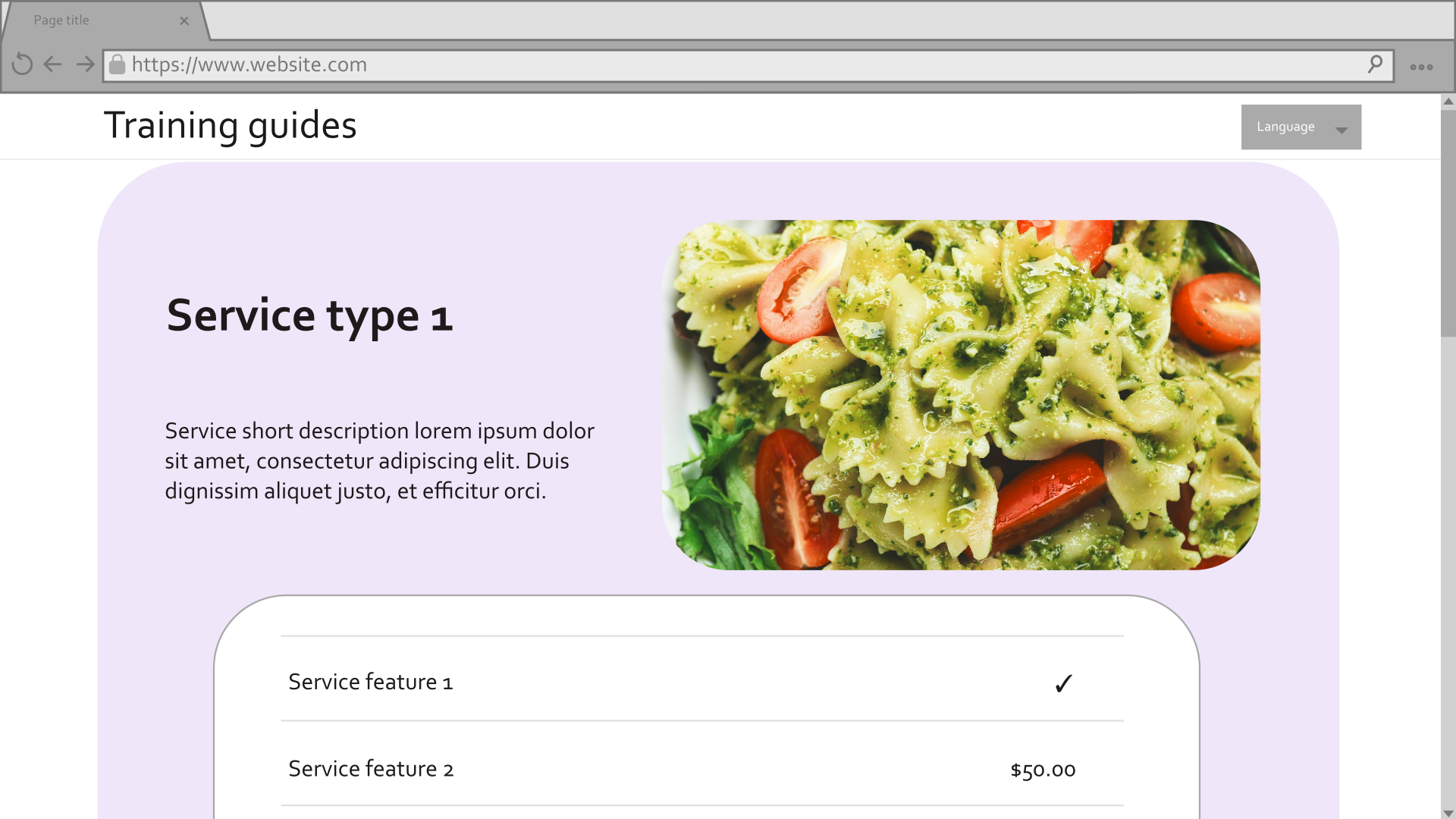
If you are displaying structured data, add properties to determine what should be included or hidden.
For example, your editors may want to be able to choose whether or not a thumbnail image should appear alongside text-based content.Add properties to configure the visual display of the widget.
For example, the widget may need multiple options for layout and color scheme.If there are a lot of visual options, use visibility conditions to hide them by default. Display them only if the editor chooses to configure advanced properties with a checkbox.
Define any standard widget properties that should appear regardless of the other selections.
Consider how the properties should be ordered.
Remember that what seems logical to a developer is not necessarily intuitive for business users. If you typically focus on back-end development, it may be worth consulting a UX expert from your team.Include
ExplanationTextfor properties often, to alleviate confusion and ambiguity for your editors.Define any constants, dropdown providers, and sets of options to make maintenance easier.
C#ServiceWidgetProperties.csusing System.ComponentModel; using CMS.ContentEngine; using Kentico.PageBuilder.Web.Mvc; using Kentico.Xperience.Admin.Base.FormAnnotations; using TrainingGuides.Web.Features.Shared.OptionProviders; using TrainingGuides.Web.Features.Shared.OptionProviders.ColorScheme; using TrainingGuides.Web.Features.Shared.OptionProviders.CornerStyle; namespace TrainingGuides.Web.Features.FinancialServices.Widgets.Service; public class ServiceWidgetProperties : IWidgetProperties { // A property that determines the datasource of the widget [RadioGroupComponent( Label = "Select which Service page to display", Options = $"{ServiceWidgetModel.CURRENT_PAGE};{ServiceWidgetModel.CURRENT_PAGE_DESCRIPTION}" + $"\n{ServiceWidgetModel.SELECT_PAGE};{ServiceWidgetModel.SELECT_PAGE_DESCRIPTION}", Order = 10)] public string Mode { get; set; } = ServiceWidgetModel.CURRENT_PAGE; // A conditional property based on the selected data source [VisibleIfEqualTo(nameof(Mode), ServiceWidgetModel.CURRENT_PAGE, StringComparison.OrdinalIgnoreCase)] [TextInputComponent( Label = "Service page anchor", ExplanationText = "If displaying current page, optionally set what page anchor to navigate to when visitor clicks the widget or its call to action link.", Order = 20)] public string PageAnchor { get; set; } = string.Empty; // A conditional property based on the selected data source [VisibleIfEqualTo(nameof(Mode), ServiceWidgetModel.SELECT_PAGE, StringComparison.OrdinalIgnoreCase)] [ContentItemSelectorComponent( ServicePage.CONTENT_TYPE_NAME, Label = "Select service page", ExplanationText = "Choose the service page to be displayed in the widget.", MaximumItems = 1, Order = 30)] public IEnumerable<ContentItemReference> SelectedServicePage { get; set; } = []; // Properties that determine if specific data should be displayed or hidden [CheckBoxComponent( Label = "Display service image", Order = 40)] public bool ShowServiceImage { get; set; } = true; [CheckBoxComponent( Label = "Display service benefits", Order = 50)] public bool ShowServiceBenefits { get; set; } = true; [CheckBoxComponent( Label = "Display service features", Order = 60)] public bool ShowServiceFeatures { get; set; } = false; // Standard widget properties that do not depend on other selections [TextInputComponent( Label = "Call to action (CTA) text", ExplanationText = "Add a call to action text, e.g., \"Read more\".", Order = 70)] public string CallToAction { get; set; } = string.Empty; [CheckBoxComponent( Label = "Open in new tab", ExplanationText = "Opens Service page in new tab when visitor clicks the widget or CTA", Order = 80)] public bool OpenInNewTab { get; set; } = true; // Property to determine if advanced styling configuration should be shown [CheckBoxComponent( Label = "Show advanced options", Order = 90)] public bool ShowAdvanced { get; set; } = false; // Advanced styling properties, hidden if the ShowAdvanced checkbox is not enabled. [VisibleIfTrue(nameof(ShowAdvanced))] [DropDownComponent( Label = "Color scheme", ExplanationText = "Select widget color scheme.", DataProviderType = typeof(DropdownEnumOptionProvider<ColorSchemeOption>), Order = 100)] public string ColorScheme { get; set; } = nameof(ColorSchemeOption.Dark1); [VisibleIfTrue(nameof(ShowAdvanced))] [DropDownComponent( Label = "Corner style", DataProviderType = typeof(DropdownEnumOptionProvider<CornerStyleOption>), Order = 110)] public string CornerStyle { get; set; } = nameof(CornerStyleOption.Sharp); [VisibleIfTrue(nameof(ShowAdvanced))] [CheckBoxComponent( Label = "Drop shadow", Order = 120)] public bool DropShadow { get; set; } = false; [VisibleIfTrue(nameof(ShowAdvanced))] [VisibleIfTrue(nameof(ShowServiceImage))] [DropDownComponent( Label = "Image position", ExplanationText = "Select the image position with respect to text.", DataProviderType = typeof(DropdownEnumOptionProvider<ImagePositionOption>), Order = 130)] public string ImagePosition { get; set; } = nameof(ImagePositionOption.FullWidth); [VisibleIfTrue(nameof(ShowAdvanced))] [DropDownComponent( Label = "Text alignment", DataProviderType = typeof(DropdownEnumOptionProvider<ContentAlignmentOption>), Order = 140)] public string TextAlignment { get; set; } = nameof(ContentAlignmentOption.Left); [VisibleIfTrue(nameof(ShowAdvanced))] [VisibleIfNotEmpty(nameof(CallToAction))] [DropDownComponent( Label = "CTA button style", DataProviderType = typeof(DropdownEnumOptionProvider<LinkStyleOption>), Order = 150)] public string CallToActionStyle { get; set; } = nameof(LinkStyleOption.Medium); } // Add options for the position of the image in the widget public enum ImagePositionOption { [Description("Full width")] FullWidth, [Description("Left side")] Left, [Description("Right side")] Right, [Description("Ascending shape")] Ascending, [Description("Descending shape")] Descending } // Add options for how the content of the widget is aligned public enum ContentAlignmentOption { Left, Center, Right } // Add constants for names and descriptions public static class ServiceWidgetModel { public const string CURRENT_PAGE = "currentServicePage"; public const string CURRENT_PAGE_DESCRIPTION = "Use the current service page. (If this widget is placed on existing Service page, automatically displays the correspongind Service data.)"; public const string SELECT_PAGE = "servicePage"; public const string SELECT_PAGE_DESCRIPTION = "Select a service page."; }In some cases you may find it beneficial to move option enumerations into their own dedicated files.C#LinkStyleOption.csusing System.ComponentModel; namespace TrainingGuides.Web.Features.Shared.OptionProviders.ColorScheme; // Change description of color scheme enumeration options to apply to links/CTA buttons public enum LinkStyleOption { [Description("Button, dark")] Dark = ColorSchemeOption.Dark1, [Description("Button, medium")] Medium = ColorSchemeOption.Dark2, [Description("Button, light 1")] Light1 = ColorSchemeOption.Light1, [Description("Button, light 2")] Light2 = ColorSchemeOption.Light2, [Description("Button, light 3")] Light3 = ColorSchemeOption.Light3, [Description("Plain link, dark")] TransparentDark = ColorSchemeOption.TransparentDark, [Description("Plain link, medium")] TransparentMedium = ColorSchemeOption.TransparentMedium, [Description("Plain link, light")] TransparentLight = ColorSchemeOption.TransparentLight }For information about creatingIDropdownOptionProviderimplementations such as theDropdownEnumOptionProviderin this sample, see the custom dropdown example from earlier.