
Module: Page Builder
14 of 18 Pages
Build the advanced widget's view component
A widget’s view component is often the core of its functionality.
The view component contains the business logic that supplies all the values for the view model, usually by interacting with the Xperience API, or some external endpoint. It often uses widget properties to parameterize API interactions based on input from the editors.
Use an identifier constant to register the widget.
If you have any properties that are meant to change the data source of the widget, add conditional code that reacts to them accordingly.
If you have properties meant to affect how the widget interacts with APIs, make sure to take them into account.
For example, you may have a property to narrow the results of a query.Appraise your existing tools, such as services and extensions, to share code across your project and avoid redundancy.
If your application does not have any reusable resources that apply, and the widget shares functionality with other parts of your application, consider making new shared code.Pass along display-related properties that are handled in the view, while processing display-related properties that are not handled by the view.
using CMS.Helpers;
using Kentico.PageBuilder.Web.Mvc;
using Microsoft.AspNetCore.Mvc;
using Microsoft.AspNetCore.Mvc.ViewComponents;
using TrainingGuides.Web.Features.FinancialServices.Models;
using TrainingGuides.Web.Features.FinancialServices.Services;
using TrainingGuides.Web.Features.FinancialServices.Widgets.Service;
using TrainingGuides.Web.Features.Shared.Models;
using TrainingGuides.Web.Features.Shared.OptionProviders.CornerStyle;
using TrainingGuides.Web.Features.Shared.Services;

[assembly: RegisterWidget(
    identifier: ServiceWidgetViewComponent.IDENTIFIER,
    viewComponentType: typeof(ServiceWidgetViewComponent),
    name: "Service",
    propertiesType: typeof(ServiceWidgetProperties),
    Description = "Displays selected service.",
    IconClass = "icon-ribbon")]

namespace TrainingGuides.Web.Features.FinancialServices.Widgets.Service;

public class ServiceWidgetViewComponent(IContentItemRetrieverService contentItemRetrieverService,
        IComponentStyleEnumService componentStyleEnumService,
        IServicePageService servicePageService,
        IContentTypeService contentTypeService) : ViewComponent
{
    public const string IDENTIFIER = "TrainingGuides.ServiceWidget";
    private const string BS_DROP_SHADOW_CLASS = "shadow";
    private const string BS_MARGIN_CLASS = "m-3";
    private const string BS_PADDING_CLASS_3 = "p-3";
    private const string BS_PADDING_CLASS_5 = "p-5";

    public async Task<ViewViewComponentResult> InvokeAsync(ServiceWidgetProperties properties)
    {
        var model = await GetServiceWidgetViewModel(properties);

        if (model.Service?.Price is decimal price)
        {
            model.Service?.Features.Add(
                new ServiceFeatureViewModel
                {
                    Key = "price-from-service-content-item",
                    Name = "Price",
                    LabelHtml = new("Price"),
                    Price = price,
                    ValueHtml = new(string.Empty),
                    FeatureIncluded = false,
                    ValueType = ServiceFeatureValueType.Number,
                    ShowInComparator = true,
                });
        }

        return View("~/Features/FinancialServices/Widgets/Service/ServiceWidget.cshtml", model);
    }

    private async Task<ServiceWidgetViewModel> GetServiceWidgetViewModel(ServiceWidgetProperties properties)
    {
        if (properties == null)
            return new ServiceWidgetViewModel();

        var servicePageViewModel = await GetServicePageViewModel(properties);

        return new ServiceWidgetViewModel()
        {
            Service = servicePageViewModel,
            ShowServiceFeatures = properties.ShowServiceFeatures,
            ServiceImage = properties.ShowServiceImage
                ? servicePageViewModel?.Media.FirstOrDefault() ?? new AssetViewModel()
                : new AssetViewModel(),
            ShowAdvanced = properties.ShowAdvanced,
            ColorScheme = properties.ColorScheme,
            CornerStyle = properties.CornerStyle,
            ParentElementCssClasses = GetParentElementCssClasses(properties).Join(" "),
            MainContentElementCssClasses = GetMainContentElementCssClasses(properties).Join(" "),
            ImageElementCssClasses = properties.ShowServiceImage ? GetImageElementCssClasses(properties).Join(" ") : string.Empty,
            IsImagePositionSide = IsImagePositionSide(properties.ImagePosition),
            CallToActionCssClasses = componentStyleEnumService
                .GetColorSchemeClasses(componentStyleEnumService.GetLinkStyle(properties.CallToActionStyle ?? string.Empty))
                .Join(" ")
        };
    }

    private async Task<ServicePage?> GetServicePage(ServiceWidgetProperties properties)
    {
        ServicePage? servicePage;

        if (properties.Mode.Equals(ServiceWidgetModel.CURRENT_PAGE))
        {
            servicePage = await contentItemRetrieverService.RetrieveCurrentPage<ServicePage>(3);
        }
        else
        {
            var guid = properties.SelectedServicePage?.Select(webPage => webPage.Identifier).FirstOrDefault();

            servicePage = guid.HasValue && guid != Guid.Empty
                ? await contentItemRetrieverService.RetrieveWebPageByContentItemGuid<ServicePage>(
                    (Guid)guid,
                    4)
                : null;
        }

        int? serviceContentTypeId = contentTypeService.GetContentTypeId(ServicePage.CONTENT_TYPE_NAME);

        return servicePage?.SystemFields.ContentItemContentTypeID == serviceContentTypeId
            ? servicePage
            : null;
    }

    private async Task<ServicePageViewModel?> GetServicePageViewModel(ServiceWidgetProperties properties)
    {
        var servicePage = await GetServicePage(properties);

        if (!string.IsNullOrWhiteSpace(properties.PageAnchor))
        {
            properties.PageAnchor = properties.PageAnchor!.StartsWith('#')
                ? properties.PageAnchor
                : $"#{properties.PageAnchor}";
        }

        return servicePage != null
            ? await servicePageService.GetServicePageViewModel(
                servicePage: servicePage,
                getMedia: properties.ShowServiceImage,
                getFeatures: properties.ShowServiceFeatures,
                getBenefits: properties.ShowServiceBenefits,
                callToAction: properties.CallToAction,
                callToActionLink: properties.PageAnchor,
                openInNewTab: properties.OpenInNewTab,
                getPrice: properties.ShowServiceFeatures)
            : null;
    }

    private List<string> GetParentElementCssClasses(ServiceWidgetProperties properties)
    {
        const string PARENT_ELEMENT_BASE_CLASS = "tg-product";
        const string LAYOUT_FULL_WIDTH_CLASS = "tg-layout-full-width";
        const string LAYOUT_IMAGE_LEFT_CLASS = "tg-layout-image-left";
        const string LAYOUT_IMAGE_RIGHT_CLASS = "tg-layout-image-right";
        const string LAYOUT_ASCENDING_CLASS = "tg-layout-ascending";
        const string LAYOUT_DESCENDING_CLASS = "tg-layout-descending";

        List<string> cssClasses = [PARENT_ELEMENT_BASE_CLASS];

        if (properties.ShowServiceImage)
        {
            string imagePositionCssClass = properties.ImagePosition switch
            {
                nameof(ImagePositionOption.Left) => LAYOUT_IMAGE_LEFT_CLASS,
                nameof(ImagePositionOption.Right) => LAYOUT_IMAGE_RIGHT_CLASS,
                nameof(ImagePositionOption.Ascending) => LAYOUT_ASCENDING_CLASS,
                nameof(ImagePositionOption.Descending) => LAYOUT_DESCENDING_CLASS,
                nameof(ImagePositionOption.FullWidth) => LAYOUT_FULL_WIDTH_CLASS,
                _ => LAYOUT_FULL_WIDTH_CLASS
            };
            cssClasses.Add(imagePositionCssClass);

            if (IsImagePositionFullSize(properties.ImagePosition))
            {
                cssClasses.Add(BS_MARGIN_CLASS);

                cssClasses.AddRange(
                    componentStyleEnumService.GetCornerStyleClasses(
                        componentStyleEnumService.GetCornerStyle(properties.CornerStyle!)));

                if (properties.DropShadow)
                    cssClasses.Add(BS_DROP_SHADOW_CLASS);
            }
        }

        return cssClasses;
    }

    private List<string> GetMainContentElementCssClasses(ServiceWidgetProperties properties)
    {
        const string MAIN_CONTENT_BASE_CSS_CLASS = "tg-product_main";
        const string ROUND_CORNERS_BOTTOM_ONLY_CLASS = "bottom-only";
        const string TEXT_ALIGN_LEFT_CLASS = "align-left";
        const string TEXT_ALIGN_CENTER_CLASS = "align-center";
        const string TEXT_ALIGN_RIGHT_CLASS = "align-right";

        List<string> cssClasses = [MAIN_CONTENT_BASE_CSS_CLASS];

        cssClasses.AddRange(GetChildElementCssClasses(properties));

        if (properties.ShowServiceImage)
        {
            if (IsImagePositionSide(properties.ImagePosition))
                cssClasses.Add(BS_PADDING_CLASS_5);
            else
                cssClasses.Add(BS_PADDING_CLASS_3);

            if (IsImagePositionFullSize(properties.ImagePosition)
                && HasRoundCorners(properties.CornerStyle))
            {
                cssClasses.Add(ROUND_CORNERS_BOTTOM_ONLY_CLASS);
            }
        }

        string textAlignmentClass = properties.TextAlignment switch
        {
            nameof(ContentAlignmentOption.Left) => TEXT_ALIGN_LEFT_CLASS,
            nameof(ContentAlignmentOption.Center) => TEXT_ALIGN_CENTER_CLASS,
            nameof(ContentAlignmentOption.Right) => TEXT_ALIGN_RIGHT_CLASS,
            _ => TEXT_ALIGN_LEFT_CLASS
        };

        cssClasses.Add(textAlignmentClass);
        return cssClasses;
    }

    private List<string> GetImageElementCssClasses(ServiceWidgetProperties properties)
    {
        const string IMAGE_BASE_CSS_CLASS = "tg-product_img";
        const string ROUND_CORNERS_TOP_ONLY_CLASS = "top-only";
        List<string> imageLeftRightClasses = ["tg-col", "c-product-img", "object-fit-cover"];

        List<string> cssClasses = [IMAGE_BASE_CSS_CLASS];

        cssClasses.AddRange(GetChildElementCssClasses(properties));

        if (IsImagePositionSide(properties.ImagePosition))
        {
            cssClasses.AddRange(imageLeftRightClasses);
        }

        if (IsImagePositionFullSize(properties.ImagePosition)
        && HasRoundCorners(properties.CornerStyle))
        {
            cssClasses.Add(ROUND_CORNERS_TOP_ONLY_CLASS);
        }

        return cssClasses;
    }

    private List<string> GetChildElementCssClasses(ServiceWidgetProperties properties)
    {
        List<string> cssClasses = [];

        if (!IsImagePositionFullSize(properties.ImagePosition))
        {
            if (properties.DropShadow)
                cssClasses.Add(BS_DROP_SHADOW_CLASS);

            cssClasses.Add(BS_MARGIN_CLASS);
        }
        return cssClasses;
    }

    private bool IsImagePositionFullSize(string imagePosition) =>
        Equals(imagePosition, nameof(ImagePositionOption.FullWidth));

    private bool IsImagePositionSide(string imagePosition) =>
        Equals(imagePosition, nameof(ImagePositionOption.Left)) || Equals(imagePosition, nameof(ImagePositionOption.Right));

    private bool HasRoundCorners(string cornerStyle) =>
        Equals(cornerStyle, nameof(CornerStyleOption.Round)) || Equals(cornerStyle, nameof(CornerStyleOption.VeryRound));
}
If your project has a dedicated class for component identifiers, add the identifier for your widget.
    ...
    public static class ComponentIdentifiers
    {
        public static class Sections
        {
            ...
        }

        public static class Widgets
        {
            ...
            //Include the widget in the component identifiers list
            public const string SERVICE = ServiceWidgetViewComponent.IDENTIFIER;
            ...
        }
    }
Document your widget
When you develop a new widget, make sure you train your editors about how to use it, and create documentation for it. Things that seem self-explanatory to development teams may not be so clear to non-technical users, so it’s important to give editors and other business users instructions on how to use what you make for them.
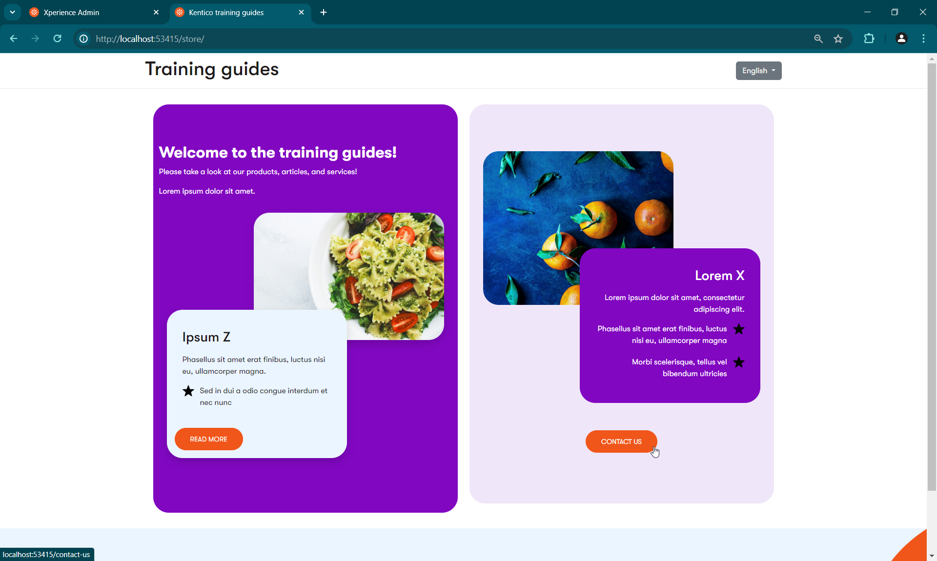
See the results
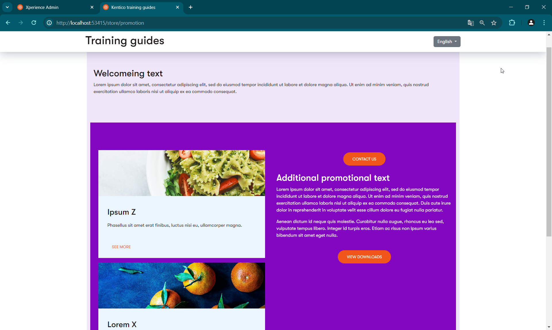
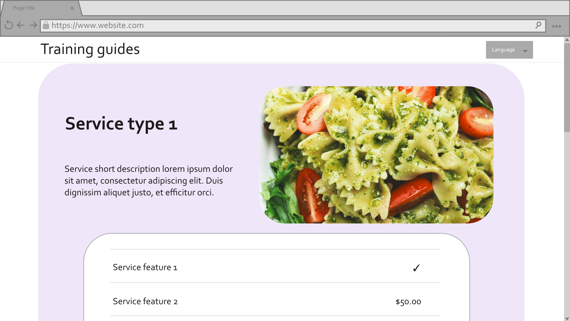
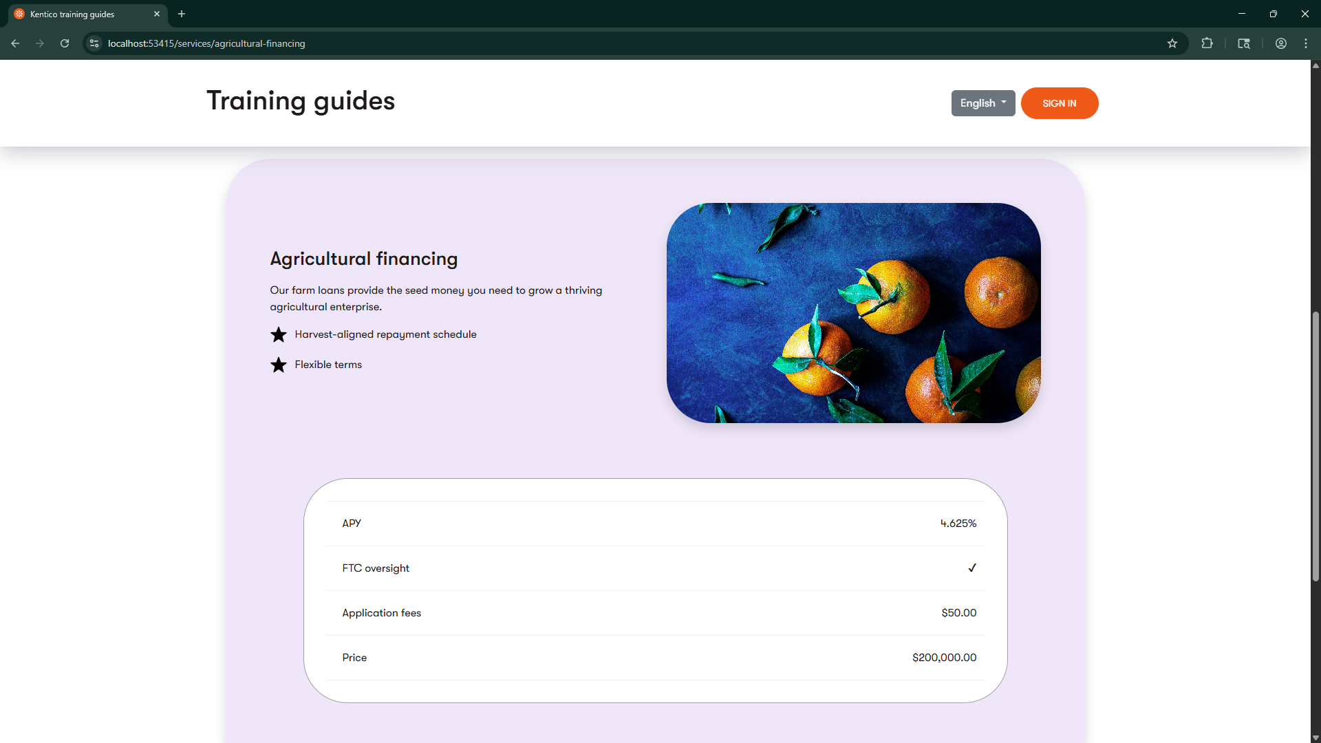
Now your editors can place service details on pages, alongside other content and functionality.
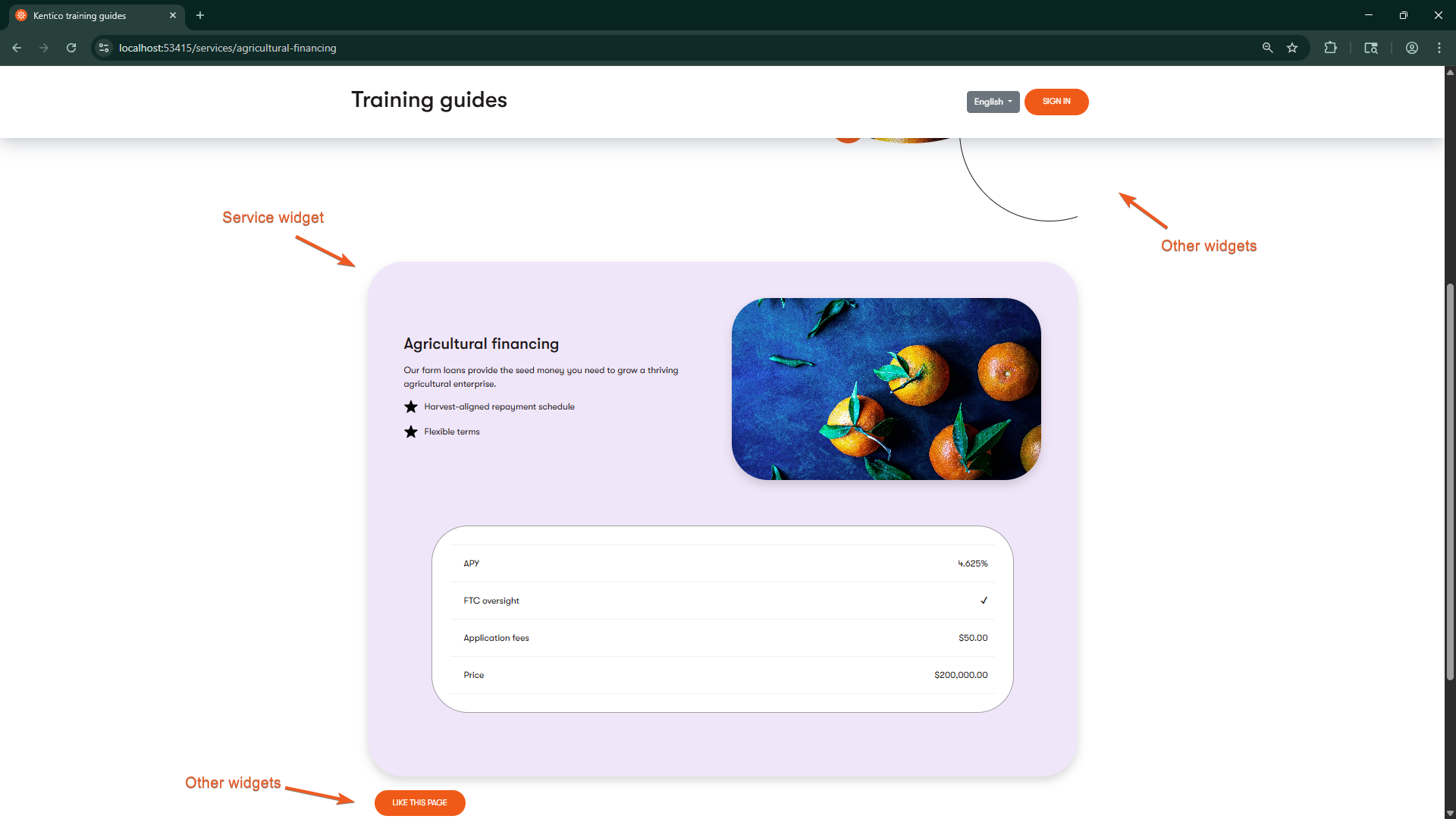
If you’ve followed along with this series about Page Builder, you can now use the General template, General section, Simple CTA widget, and Service widget to recreate the pages depicted in the mockups.
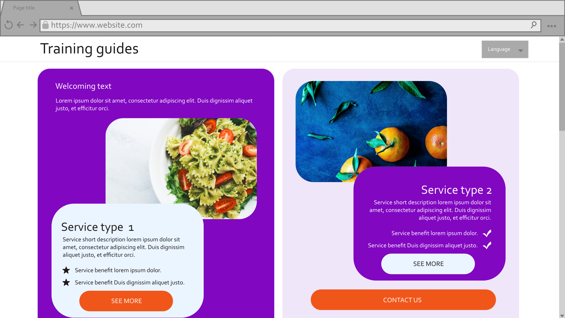
You’re welcome to tweak the styling to get the pages to appear even closer to the mockups. You can also apply your knowledge to add additional configurations to the template, section, and widgets.
Additionally, the finished branch of our Training guides repository has several additional widgets that you can look over and modify for your own purposes.