Module: Page Builder
7 of 18 Pages
Finish the structured data template
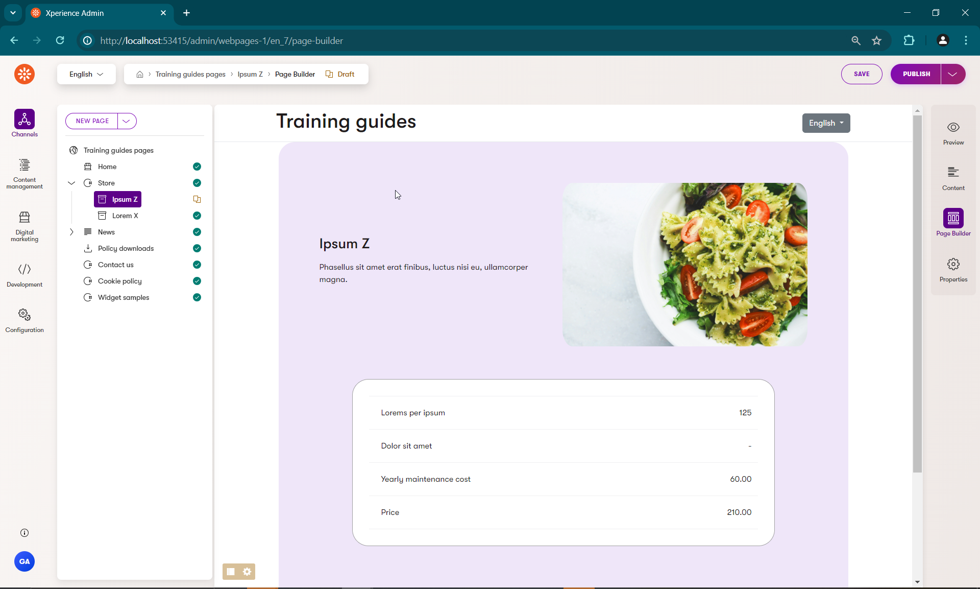
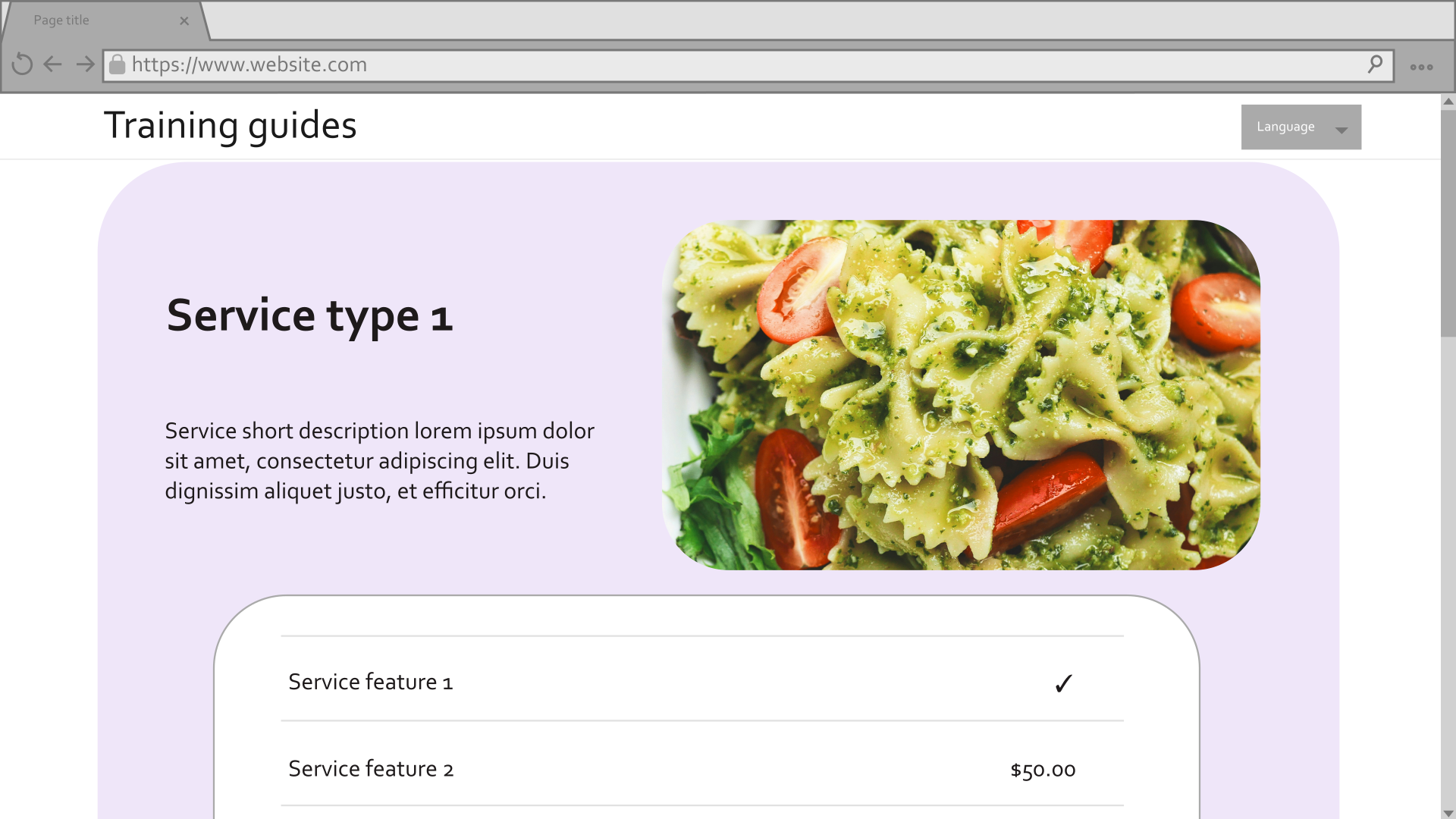
Comparing the current template to the mockup from the start of this series, you’ll notice that the Service features table is missing.
Its data is already in the template model, so it should be fairly straightforward to render to the page.
However, if you inspect the ServiceFeature content type, you may notice that its value can come from multiple different places depending on the selected ServiceFeatureValueType.
Let’s make one last tag helper, so that we don’t need to clutter the view with conditionals.
Add a service feature value tag helper
Since this one is specifically related to Service features, and not general styling, we can put it in the ~/Features/FinancialServices/TagHelpers folder.
- Create a new self-closing tag helper called
ServiceFeatureValueTagHelper, with the tag nametg-service-feature-value. - Add a
ServiceFeatureViewModelproperty and a constant for thespantag. - In the
Processmethod, determine the formated value depending on the providedServiceFeatureValueTypefrom the view model and render it.
using Microsoft.AspNetCore.Html;
using Microsoft.AspNetCore.Razor.TagHelpers;

using TrainingGuides.Web.Features.FinancialServices.Models;

namespace TrainingGuides.Web.Features.FinancialServices.TagHelpers;

/// <summary>
/// Formats Service feature value based on its type.
/// </summary>
//This TagStructure allows the helper to be called with a single self-closing tag in razor views.
[HtmlTargetElement("tg-service-feature-value", TagStructure = TagStructure.WithoutEndTag)]
public class ServiceFeatureValueTagHelper : TagHelper
{
    public ServiceFeatureViewModel? Feature { get; set; }

    private const string SPAN_TAG = "span";

    public override void Process(TagHelperContext context, TagHelperOutput output)
    {
        output.TagName = SPAN_TAG;
        // Make sure to set the output's  TagMode to StartTagAndEndTag.
        // This ensures that even though the tag helper is called with a single tag,
        // the rendered output closes the `span` tag that wraps the value.
        output.TagMode = TagMode.StartTagAndEndTag;

        string? formattedValue = Feature?.ValueType switch
        {
            ServiceFeatureValueType.Text => Feature.ValueHtml.Value,
            ServiceFeatureValueType.Number => "$" + Feature.Price.ToString("n2"),
            ServiceFeatureValueType.Boolean => Feature.FeatureIncluded ? "✔" : "-",
            _ => string.Empty
        };

        output.Content.SetHtmlContent(new HtmlString(formattedValue));
    }
}
Add the service features list to the template view
- In the ~/Features/FinancialServices/ServicePagePageTemplate.cshtml folder, add a
foreachloop to cycle through the service features. - Retrieve each feature’s
LabelHtmldirectly, and use the new tag helper to display its value - Wrap the whole thing in the
tg-component-styletag helper, settingcolor-schemedirectly andcorner-stylebased on the template properties.
...
<tg-component-style color-scheme="@ColorSchemeOption.Light1" corner-style="@Model.Properties.CornerStyle"  class="c-table">
    @foreach (var feature in templateModel.Features)
    {
        <div>
            <div>@feature.LabelHtml</div>
            <div>
                <tg-service-feature-value feature="@feature"/>
            </div>
        </div>
    }
</tg-component-style>
...
Finish styling the template.
Now if you run the site, you’ll see all the data, but it’s still not formatted in a way that matches the mockup.

Add CSS styles and any necessary elements to make the template more visually appealing.
@using TrainingGuides.Web.Features.FinancialServices.Models
@using TrainingGuides.Web.Features.FinancialServices
@using TrainingGuides.Web.Features.Shared.OptionProviders.ColorScheme

@model TemplateViewModel<ServicePagePageTemplateProperties>

@{
    var templateModel = Model.GetTemplateModel<ServicePageViewModel>();
}

<tg-component-style color-scheme="@Model.Properties.ColorScheme" corner-style="@Model.Properties.CornerStyle">
    <div>
        <div>
            <h3>@templateModel.NameHtml</h3>
            <p>@templateModel.ShortDescriptionHtml</p>
        </div>

        @foreach (var asset in templateModel.Media)
        {
            <tg-styled-image src="@asset.FilePath"
                alt="@asset.Description"
                corner-style="@Model.Properties.CornerStyle"
                class="c-product-img object-fit-cover" />
        }

        <tg-component-style color-scheme="@ColorSchemeOption.Light1" corner-style="@Model.Properties.CornerStyle"  class="c-table">
            @foreach (var feature in templateModel.Features)
            {
                <div>
                    <div>@feature.LabelHtml</div>
                    <div>
                        <tg-service-feature-value feature="@feature"/>
                    </div>
                </div>
            }
        </tg-component-style>
    </div>
</tg-component-style>
At the end of it all, you should be able to achieve this by configuring your template.