
Module: Model website presentation components
4 of 11 Pages
Examine page components on KBank
The page templates in Kbank are tied to a specific content type.
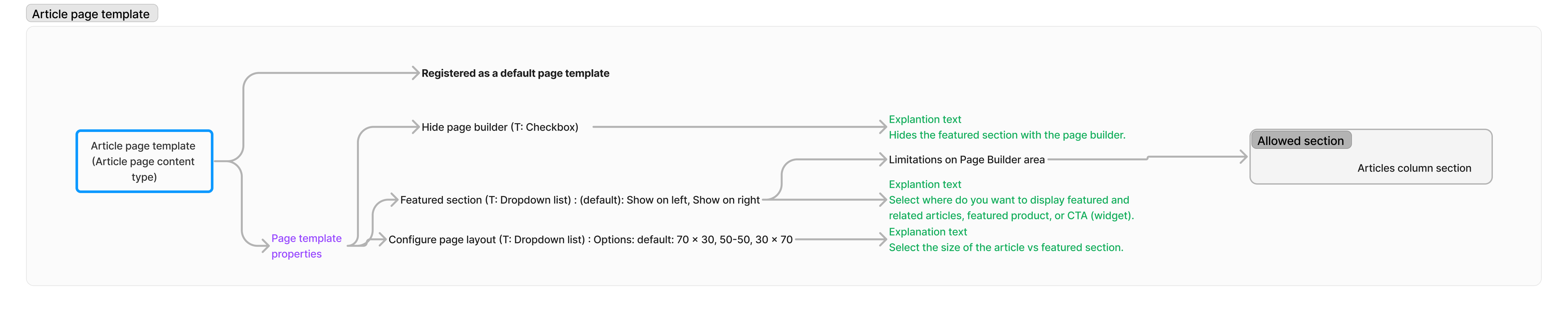
The Article page template displays article data stored as reusable content and contains the Page Builder, where editors can further promote their marketing content. They can use page template properties to hide the promotion area, or show it on the different side of the page.
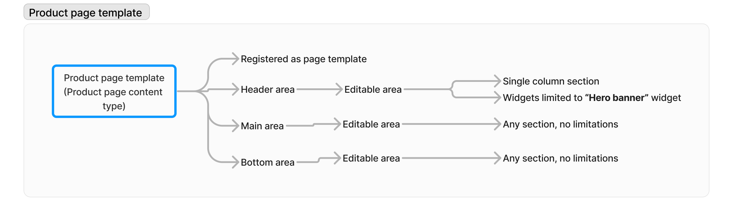
Product page template displays data stored in a reusable Product content type. Editors create the page using the template and add widgets to the page. Product-specific widgets contain a special property, and product display data is displayed directly on the page; editors don’t need to make any selections. Editors can speed up their work and create a custom product page preset with the default widget configuration. Preconfigured widgets automatically display the product’s data when they select a reusable product from the Content hub.
Sections
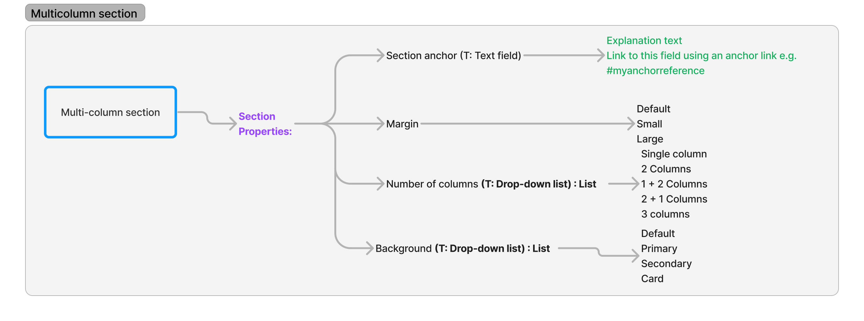
Multicolumn section component provides editors with the most configuration options and is the most commonly used section type across the Kbank ecosystem. Editors can add a section anchor for deeplinking, adjust page’s margin, backround and number of columns.
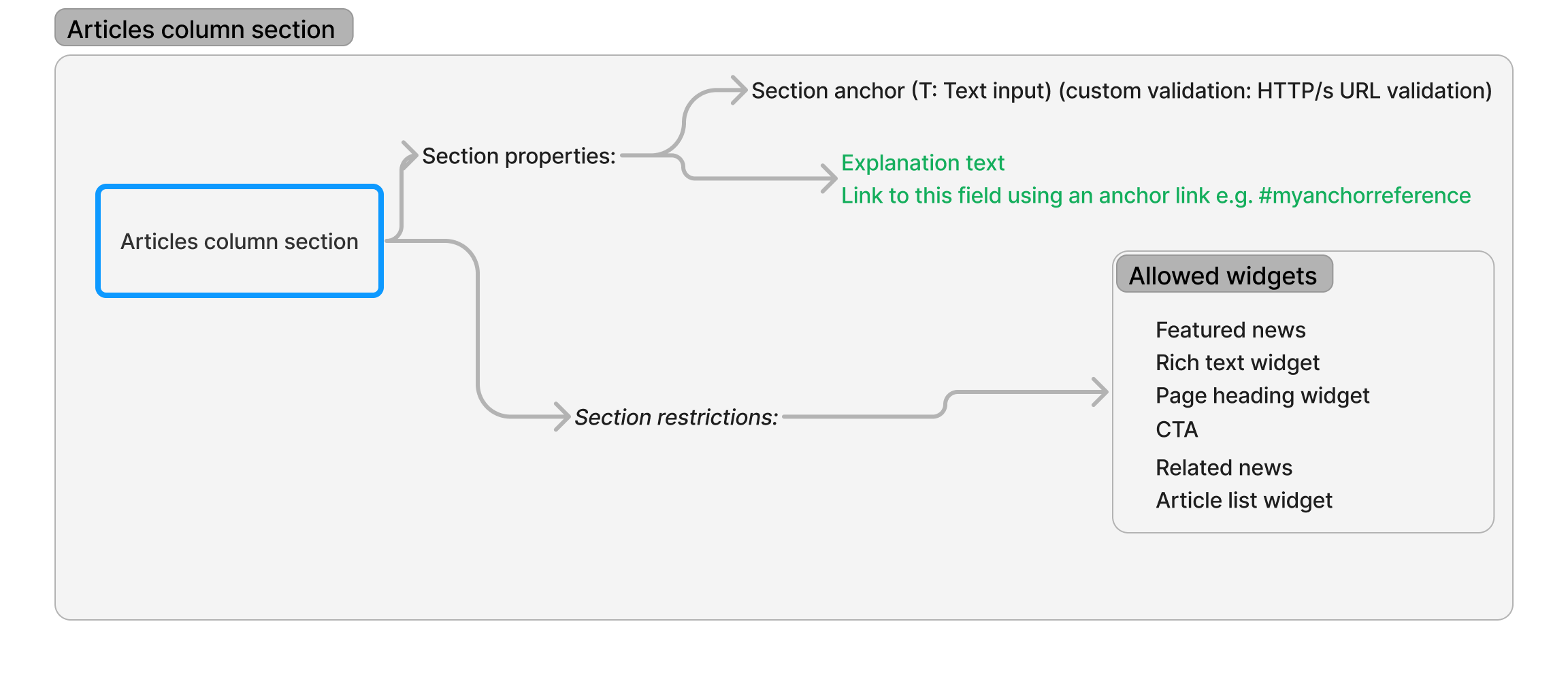
Articles column section is optimized to work properly in the Page Builder area in the Article page template. It contains hand-selected widgets tailored to fit the size of the editable area and helps editors effectively continue marketing conversations with website visitors.
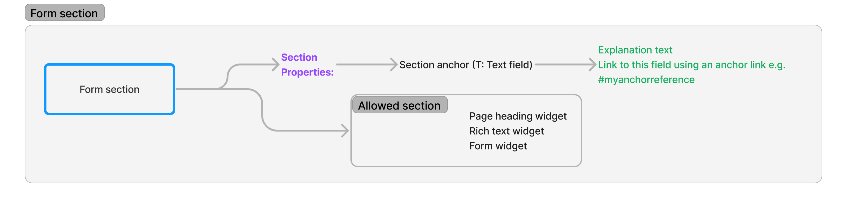
Form section and its configuration options ensure that editors add forms the same way across the whole website, and include content through a Page heading and Rich text widgets.
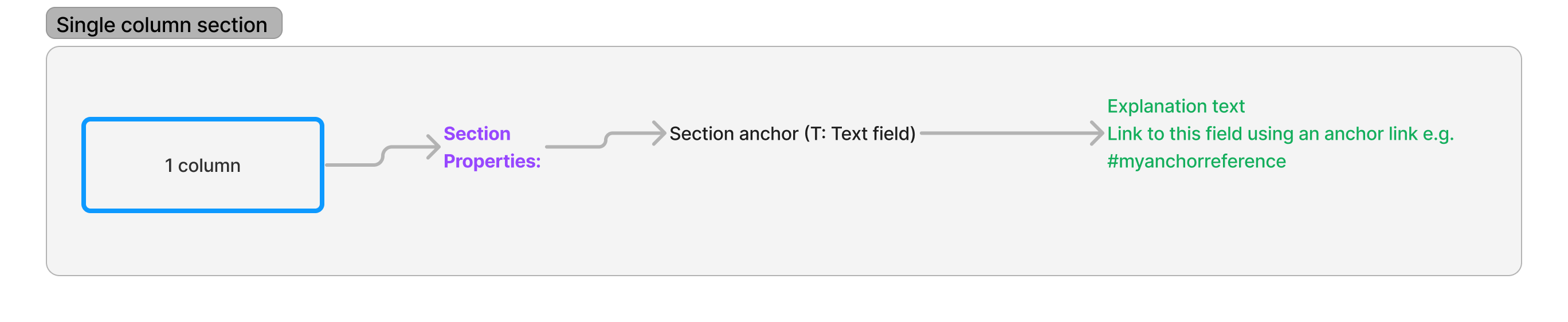
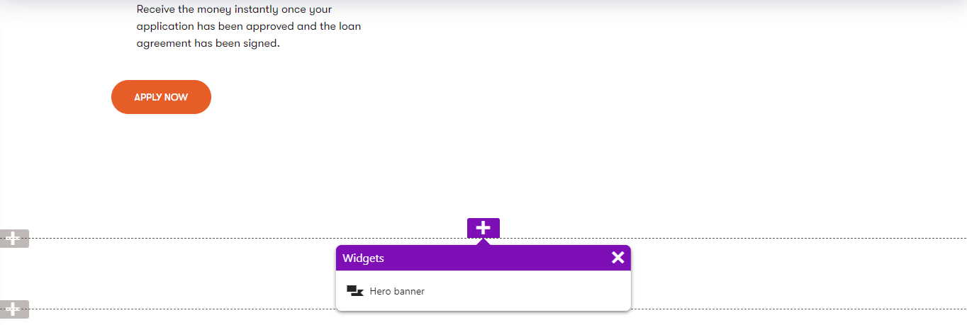
Single (or 1-) column section contains a single property. On the Kbank demo site, you can see that the 1-column section exhibits two behaviors - when placed into the body of the page, editors can pick any widgets. When they place the section at the top of the Product page, restrictions applied to the template (not on the section level) to ensure editors can use only the Banner widget. We’ll discuss recommended practices for sections in a following guide.
The restrictions on the top zone allows editors to add only the Hero banner widget.
Widgets
The following section shows different configuration options for widgets that you can find on the Kbank demo site. Using these widgets, editors can create website pages using both structured content or one-off content. We’ll cover defining widgets and recommended practices in one of the following guides.
Hero banner widget
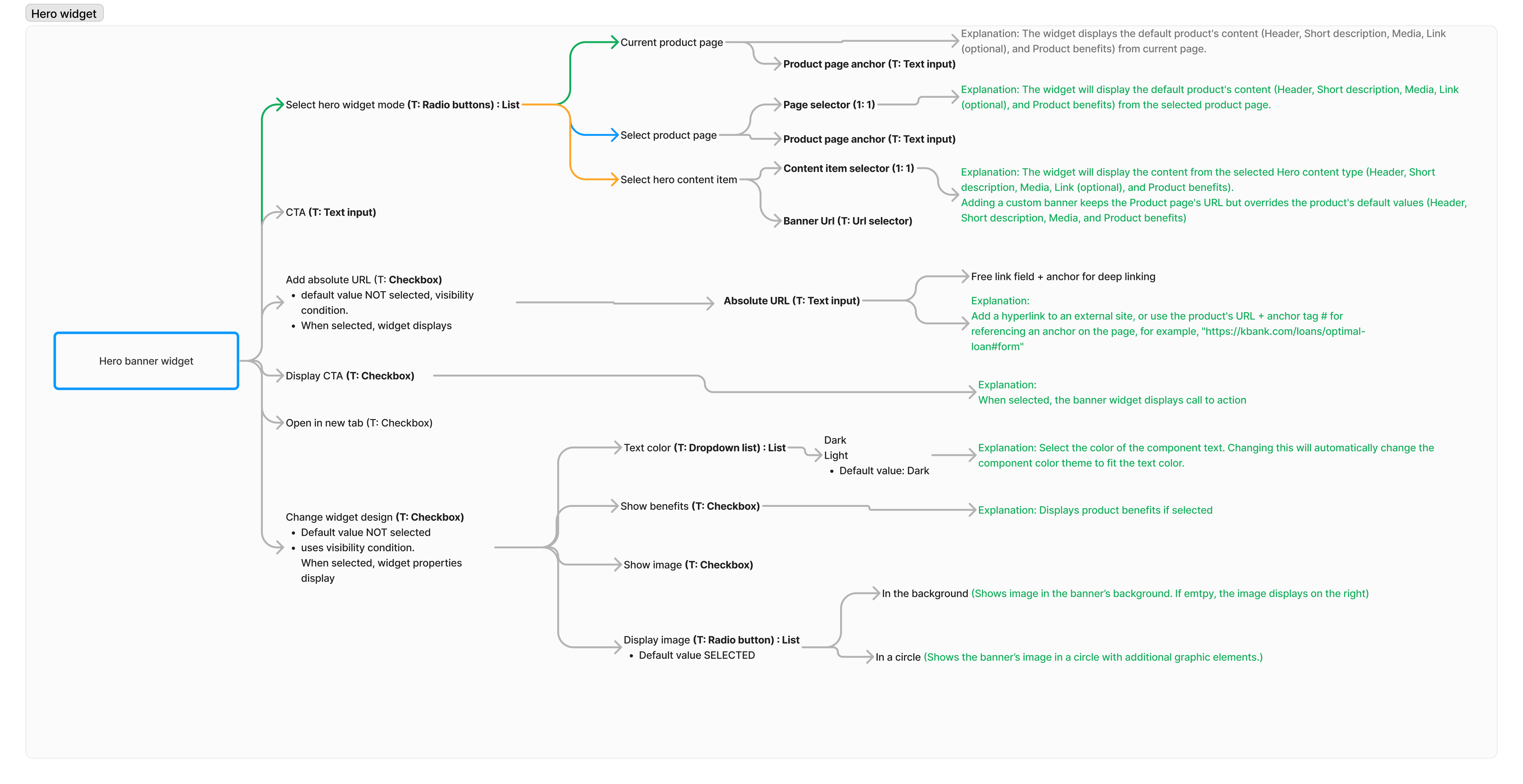
Editors can configure different hero banner properties starting with the source of the content: current page, any other page in the content tree, or a separate, reusable hero banner content item.
They can adjust links and configure the widget’s design, such as hiding or showing the teaser image or including product benefits.
FAQ widget
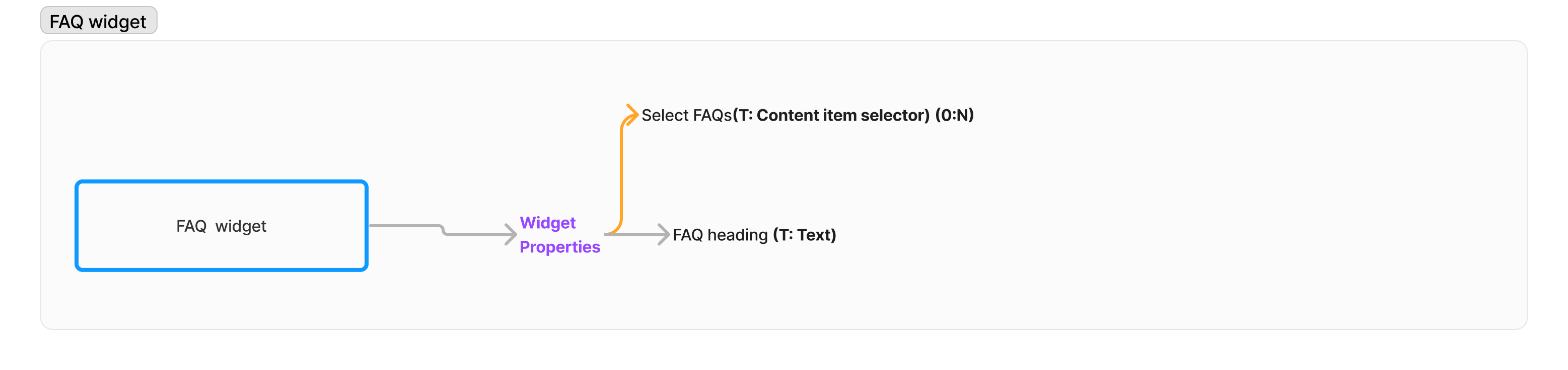
Editors use FAQ widget to add reusable FAQ content items to the page. They can also supply a custom FAQ heading.
Image widget
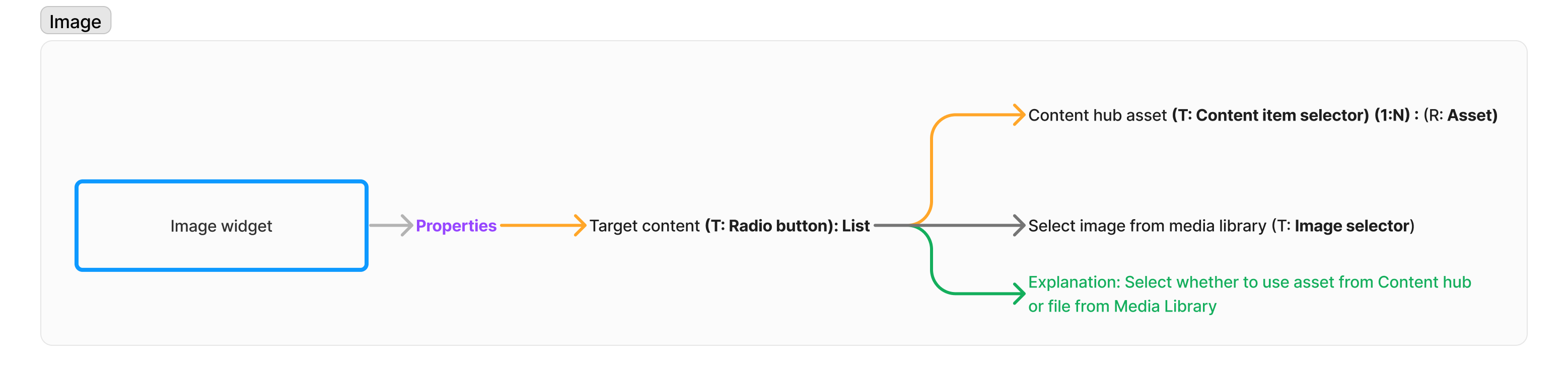
Image widget allows editors to select image from the content hub, or reference a media file from a legacy media library.
Product widget
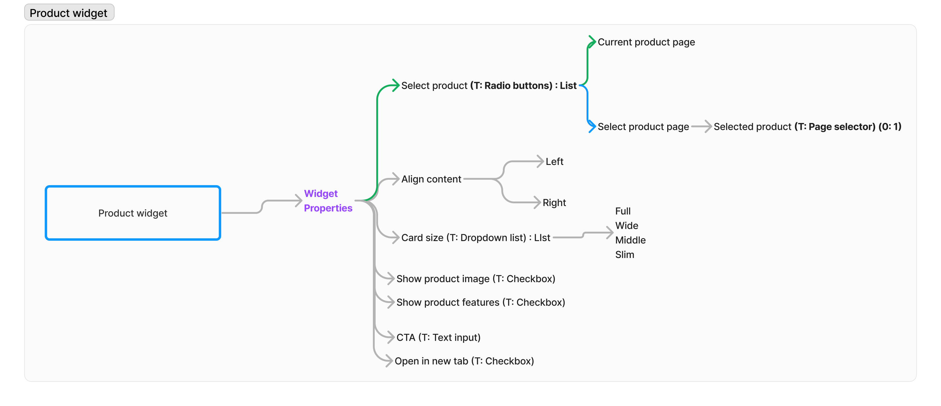
Editors can use the Product widget to select content from the current product page or refer to other pages in the website channels. They can adjust the content layout, including alignment, widget size, and the call to action. They can also decide to hide product image and product benefits.
Page heading widget
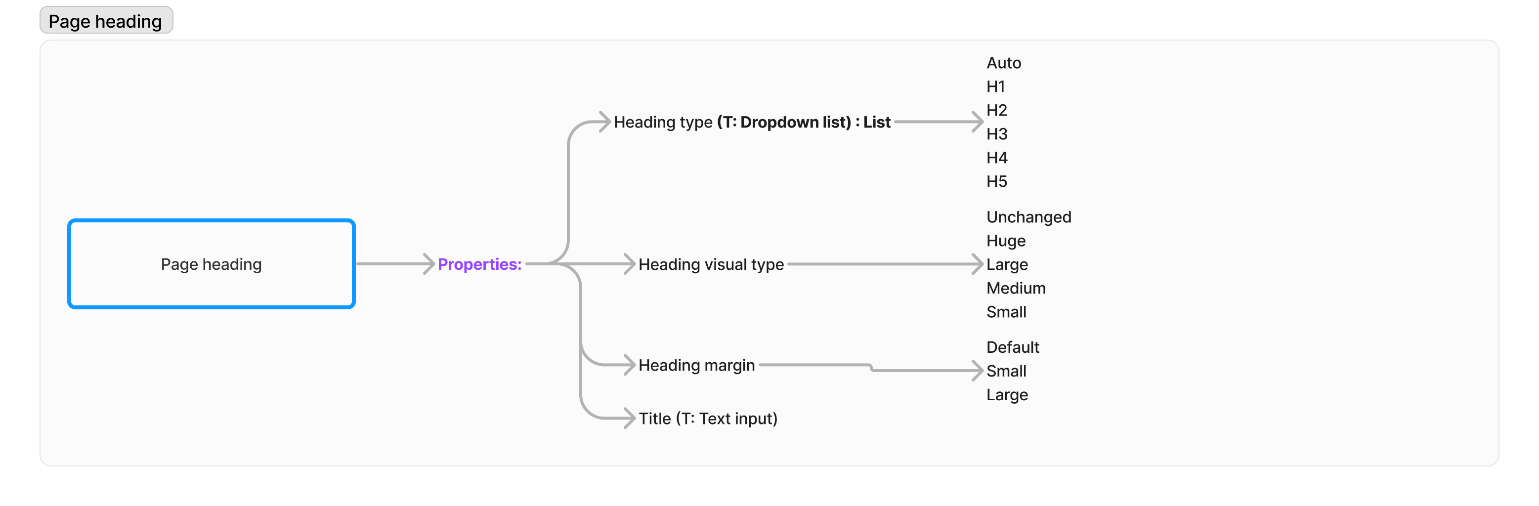
Editors can add a website-specific heading to the page and style it accordingly. They can define the heading type (H1-H4), adjust the heading visual style, and adjust margins.
Unlike the previous widgets that allowed also for reusing content, the Page heading widget creates one-off content as it stores all the data editors input in the page.