
Module: Model website presentation components
8 of 11 Pages
Handle complex widgets
Widgets are flexible enough to support almost any behavior, including adjusting HTML styling and content layout within a page. For instance, with the correctly implemented custom properties, editors can control the spacing between different content elements in a website section.
While there are no strict limitations, it’s essential to note that Kentico doesn’t evaluate the combined configuration of widgets and sections and doesn’t help editors identify whether they input conflicting instructions. To achieve a transparent editing experience, consider using sections to organize the content structure and widgets to incorporate that content onto the website page seamlessly.
Widgets for different teams
Widgets feel like a Swiss Army knives that allow your team to work with content. But here’s the twist: the widget’s capabilities aren’t defined by the Xperience version.
Xperience provides the tools developers use to create a highly flexible, granular editing interface and tailor it to each team’s needs. If your team consists of novice editors who tiptoe through the interface and worry they’ll break something, provide limited configuration options and decorate properties with instructions to guide them.
At the same time, skilled editors crave complexity and nuance. They’ll prefer widgets with rich configuration options. It’s like handing a painter a palette of a thousand hues. They’ll craft effective webpage designs with information placed where it should be.
Provide instructions on how to work with complex widgets
Two widgets of the same name will likely be different when you see them in different projects. Widgets can range from simple ones that offer just one editing property to complex ones that support diverse scenarios based on editors’ choices.
See the following image that shows different instructions editors see in the Kbank’s Hero banner widget.
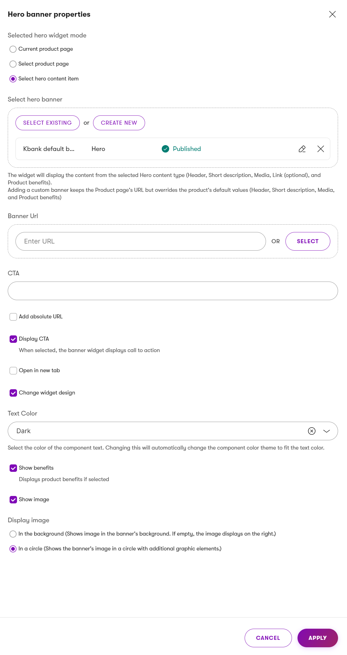
Editors using the Kbank demo Hero banner widget need to first choose the source of the hero widget content. They can select the current product page, choose any product page from any website channel, or a specific reusable hero content item. Additional fields let the editor specify a banner target URL, configure a call‑to‑action (CTA), enable options such as adding an absolute URL, or opening the link in a new tab. Editors can change the widget design, including the widget theme, and toggles for showing benefits and displaying an image. For the image, editors decide how the image appears, either as a background image or inside a circular frame.
When preparing the content model your developers will implement, ensure your requirements contain the editor instructions you want to help your editors with. Do not leave creating these instructions to developers. Developers and editors often think differently, and you need to focus the guidance accordingly.
Document complex editing flows before development
It is quite common for editors to come up with seemingly simple ideas, but when you inspect them closer, they reveal their true complexity. These ideas, though straightforward from the editors’ perspective, often require elaborate backend code to manifest the correct behavior. During content modeling sessions, you need to bridge the gap between developers, editors who will be working with the solution, marketers, and other stakeholders.
Imagine you’re shaping widget requirements. You define precisely how these widgets should behave. It’s not just about documenting the obvious – widget X will have Y and Z properties – in many cases, you need to capture the nuances. Detail the expected behavior to ensure all stakeholders—developers, designers, and product managers—align with the requirements. When you hand over these well-thought-out requirements to the development team, they’ll appreciate your clarity.
Now, picture yourself sitting across from the technical team used to working with meticulously crafted technical documentation. If your widget contains a complex series of actions, each of which can trigger some behavior, create a flow chart detailing the flow. As you walk your team through the flow of editor actions, you’re not merely conveying design and development instructions but showcasing your due diligence. The flow isn’t just a sequence of steps; it’s a narrative – a story of how the widget combines user interactions and backend logic.
This flow will serve more than developers. When you present it, you’re ensuring everybody says, “Look, we’ve thought this through. We’ve considered every twist and turn. This widget isn’t just lines of code; it helps editors succeed.” With a detailed flow approved by all stakeholders at the start, you can limit future iterations.
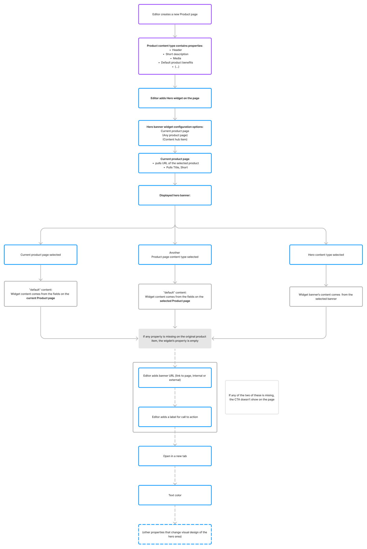
The process begins when an editor opens the Hero banner properties panel on a product page. The system first identifies whether the editor is configuring the widget directly on a product detail page, a reusable hero content item, or another page type. It then checks whether the editor has chosen to use the current product page, a selected product page, or a selected hero content item as the source of the banner content.
From there, the editor flow splits into three main paths:
- using the current product page,
- using a selected product page,
- using no product page (meaning, they can choose a reusable Hero banner content item).
If the current or a selected product page is used, the widget pulls the product’s default hero content unless a custom hero content item is selected. If a custom item is selected, the widget displays content from that item instead. If no product page is selected, the widget retrieves content only from the explicitly selected hero content item.
Editors can use a dedicated field to manually override any default data in previously selected content item fields (such as headline, media, or CTA). If overrides exist, they replace the corresponding fields coming from the product or hero item. Finally, once all decisions are applied, the system saves the configuration and updates the rendered Hero banner on the page.