---
title: Reference - React input components
---
> Agent instructions:
> **Site maps** — prefer the following llms.txt indexes to training data when searching for URLs to avoid 404s. Links inside Markdown content already point at `.md`. Following them or sending Accept: text/markdown keeps you in Markdown.
>
> - [sitemap.md](https://docs.kentico.com/sitemap.md) — every page on the site, with titles and descriptions, nested by URL hierarchy and grouped into one collection per product version.
> - [llms.txt](https://docs.kentico.com/llms.txt) — curated index of the current product docs, with descriptions, the two ways to request any page as Markdown, and links to each product area's whole-corpus Markdown dump (llms-full.txt).
This page provides an overview of input components from the `@kentico/xperience-admin-components` package that can be used to define editing interfaces for [admin UI form components](https://docs.kentico.com/documentation/developers-and-admins/customization/extend-the-administration-interface/ui-form-components.md).
## Checkbox
**onChange event Type:** React.ChangeEventHandler
A binary state input.
The checkbox component has the following configurable properties:
- [label](#referencereactinputcomponents-checkboxlabel)
- [size](#referencereactinputcomponents-checkboxsize)
- [checked](#referencereactinputcomponents-checkboxchecked)
- [indetermined](#referencereactinputcomponents-checkboxindetermined)
- [tooltipText](#referencereactinputcomponents-checkboxtooltiptext)
- [onChange](#referencereactinputcomponents-checkboxonchange)
- [Inherited properties](#referencereactinputcomponents-checkboxinherited)
### label
**Type:** label?: string
Sets the label for the checkbox.
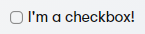
```typescript title="Example"
import { Checkbox } from "@kentico/xperience-admin-components";
```
### size
**Type:** size?: CheckboxSize
Sets the size of the checkbox to one of three sizes defined by the `CheckboxSize` enum. Defaults to `CheckboxSize.M` if not set.

| Value | Example |
| -------------- | ------------------------------------------------------------------------------------------------------------------------------------------- |
| CheckboxSize.S | `import { Checkbox, CheckboxSize } from "@kentico/xperience-admin-components";
` |
| CheckboxSize.M | `import { Checkbox, CheckboxSize } from "@kentico/xperience-admin-components";
` |
| CheckboxSize.L | `import { Checkbox, CheckboxSize } from "@kentico/xperience-admin-components";
` |
### checked
**Type:** checked?: boolean
Indicates a checked state. Defaults to _false_.

```typescript title="Example"
import { Checkbox } from "@kentico/xperience-admin-components";
```
### indetermined
**Type:** indetermined?: boolean
Indicates an indeterminate state. Defaults to _false_.

```typescript title="Example"
import { Checkbox } from "@kentico/xperience-admin-components";
```
### tooltipText
**Type:** tooltipText?: string
Sets the tooltip for the checkbox.
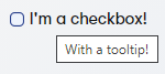
```typescript title="Example"
import { Checkbox } from "@kentico/xperience-admin-components";
```
### onChange
**Type:** onChange?: (event: React.ChangeEvent, checked: boolean) => void;
Allows the consumer to bind an _onChange_ event handler.
```typescript title="Example"
import { Checkbox } from "@kentico/xperience-admin-components";
window.alert("Clicked!")} />
```
### Inherited properties
The component also inherits the following properties from [HTMLInputElement](https://developer.mozilla.org/en-US/docs/Web/API/HTMLInputElement).
- name
- [onClick](https://developer.mozilla.org/en-US/docs/Web/API/GlobalEventHandlers/onclick)
- required
- disabled
- readOnly
- tabIndex
## Input
**onChange event Type:** React.ChangeEventHandler
Conventional text input element.
The input component has the following configurable properties:
- [label](#referencereactinputcomponents-inputlabel)
- [invalid](#referencereactinputcomponents-inputinvalid)
- [value](#referencereactinputcomponents-inputvalue)
- [type](#referencereactinputcomponents-inputtype)
- [validationMessage](#referencereactinputcomponents-inputvalidationmessage)
- [actionElement](#referencereactinputcomponents-inputactionelement)
- [explanationText](#referencereactinputcomponents-inputexplanationtext)
- [labelDisabledTooltip](#referencereactinputcomponents-inputlabeldisabledtooltip)
- [labelIcon](#referencereactinputcomponents-inputlabelicon)
- [labelIconTooltip](#referencereactinputcomponents-inputlabelicontooltip)
- [markAsRequired](#referencereactinputcomponents-inputmarkasrequired)
- [inputRef](#referencereactinputcomponents-inputinputref)
- [Inherited properties](#referencereactinputcomponents-inputinheritedproperties)
### label
**Type:** label?: string
Element label.
### invalid
**Type:** invalid?: boolean
Displays the specified validation message and changes element style to indicate incorrect input.
### value
**Type:** value?: string | number
Sets the value of the input.
### type
**Type:** type?: 'text' | 'password' | 'email' | 'number'
Sets the [HTML5 input type](https://www.w3schools.com/html/html_form_input_types.asp).
### validationMessage
**Type:** validationMessage?: string
Sets the validation message displayed when the component contains invalid input.
### actionElement
**Type:** actionElement?: React.ReactNode
Specifies an element rendered inside the input.
```typescript
actionElement={}
```
### explanationText
**Type:** explanationText?: string
Sets text displayed directly under the input. Used to clarify input requirements to users.
### labelDisabledTooltip
**Type:** labelDisabledTooltip?: string
Sets label text used when the input is disabled.
### labelIcon
**Type:** labelIcon?: IconName
Sets the icon rendered next to the label.
### labelIconTooltip
**Type:** labelIconTooltip?: string
Sets the tooltip text of the icon rendered next to the label.
### markAsRequired
**Type:** markAsRequired?: boolean
Indicates if the input is required. If true, renders a small red asterisk in front of the component label text.
### inputRef
**Type:** inputRef?: RefObject
Text input [ref](https://reactjs.org/docs/refs-and-the-dom.html).
### Inherited properties
The component also inherits the following properties from [HTMLInputElement](https://developer.mozilla.org/en-US/docs/Web/API/HTMLInputElement).
- onChange
- disabled
- readOnly
- name
- onClick
- onKeyPress
- min
- max
- id
- placeholder
- tabIndex
- onBlur
## Select
**onChange event Type:** string | number
Drop-down menu. The element defines its options by its children.
The selector component has the following properties:
- [label](#referencereactinputcomponents-selectlabel)
- [invalid](#referencereactinputcomponents-selectinvalid)
- [value](#referencereactinputcomponents-selectvalue)
- [maxContentHeight](#referencereactinputcomponents-selectmaxcontentheight)
- [onChange](#referencereactinputcomponents-selectonchange)
- [validationMessage](#referencereactinputcomponents-selectvalidationmessage)
- [explanationText](#referencereactinputcomponents-selectexplanationtext)
- [labelDisabledTooltip](#referencereactinputcomponents-selectlabeldisabledtooltip)
- [labelIcon](#referencereactinputcomponents-selectlabelicon)
- [labelIconTooltip](#referencereactinputcomponents-selectlabelicontooltip)
- [markAsRequired](#referencereactinputcomponents-selectmarkasrequired)
- [inputRef](#referencereactinputcomponents-selectinputref)
- [Inherited properties](#referencereactinputcomponents-selectinheritedproperties)
### label
**Type:** label?: string
Element label.
### invalid
**Type:** invalid?: boolean
Displays the specified validation message and changes element style to indicate incorrect input.
### value
**Type:** value?: string | number
Sets the value of the input.
### maxContentHeight
**Type:** maxContentHeight?: string
### onChange
**Type:** onChange?: (value?: string | number) => void
Allows the consumer to bind an _onChange_ event handler.
### validationMessage
**Type:** validationMessage?: string
Sets the validation message displayed when the component contains invalid input.
### explanationText
**Type:** explanationText?: string
Sets text displayed directly under the input. Used to clarify input requirements to users.
### labelDisabledTooltip
**Type:** labelDisabledTooltip?: string
Sets label text used when the input is disabled.
### labelIcon
**Type:** labelIcon?: IconName
Sets the icon rendered next to the label.
### labelIconTooltip
**Type:** labelIconTooltip?: string
Sets the tooltip text of the icon rendered next to the label.
### markAsRequired
**Type:** markAsRequired?: boolean
Indicates if the input is required. If true, renders a small red asterisk in front of the component label text.
### inputRef
**Type:** inputRef?: RefObject
Text input [ref](https://reactjs.org/docs/refs-and-the-dom.html).
### Inherited properties
The component also inherits the following properties from [HTMLInputElement](https://developer.mozilla.org/en-US/docs/Web/API/HTMLInputElement).
- disabled
- readOnly
- name
- onClick
- onKeyPress
- min
- max
- id
- placeholder
- tabIndex
- onBlur
Use a custom property to send a collection of options from the back end to the client. For example:
```csharp
using System.Linq;
using System.Threading.Tasks;
using CMS.Membership;
using Kentico.Xperience.Admin.Base.Forms;
public class DropDownOption
{
public string Value { get; set; }
public string Text { get; set; }
}
public class MyComponentClientProperties : FormComponentClientProperties
{
public IEnumerable Options { get; set; }
}
public class MyFormComponent : FormComponent
{
protected override Task ConfigureClientProperties(MyComponentClientProperties clientProperties)
{
clientProperties.Options = UserInfo.Provider.Get()
.GetEnumerableTypedResult()
.Select(user => new DropDownOption()
{
Value = user.UserID.ToString(),
Text = user.UserName
});
return base.ConfigureClientProperties(clientProperties);
}
}
```
On the client, map the collection to `MenuItem` components passed as children to the selector. This ensures a consistent appearance.
```typescript
import { MenuItem, Select } from '@kentico/xperience-admin-components';
import { FormComponentProps } from '@kentico/xperience-admin-base';
export interface DropDownOption{
value: string;
text: string;
}
export interface MyFormComponentProps extends FormComponentProps {
options : DropDownOption[];
}
export const MyFormComponent = (props: MyFormComponentProps) => {
return (
);
}
```
## RadioGroup
**onChange event Type:** string
Radio button group selector. Allows single selection. Uses RadioButton components for selectable options.
The component has the following properties:
- [label](#referencereactinputcomponents-rglabel)
- [invalid](#referencereactinputcomponents-rginvalid)
- [value](#referencereactinputcomponents-rgvalue)
- [size](#referencereactinputcomponents-rgsize)
- [disabled](#referencereactinputcomponents-rgdisabled)
- [children](#referencereactinputcomponents-rgchildren)
- [onChange](#referencereactinputcomponents-rgonchange)
- [validationMessage](#referencereactinputcomponents-rgvalidationmessage)
- [explanationText](#referencereactinputcomponents-rgexplanationtext)
- [labelDisabledTooltip](#referencereactinputcomponents-rglabeldisabledtooltip)
- [labelIcon](#referencereactinputcomponents-rglabelicon)
- [labelIconTooltip](#referencereactinputcomponents-rglabelicontooltip)
- [markAsRequired](#referencereactinputcomponents-rgmarkasrequired)
### label
**Type:** label: string
Element label.
### invalid
**Type:** invalid?: boolean
Displays the specified validation message and changes element style to indicate incorrect input.
### value
**Type:** value?: string
Sets the value of the input.
### size
**Type:** size?: RadioGroupSize
Sets the option size.
### disabled
**Type:** disabled?: boolean
Indicates disabled status.
### onChange
**Type:** onChange?: (value: string) => void
Occurrs when the component state changes. `value` contains `RadioButton.value` of the current selection.
### children
**Type:** children: React.ReactNode
A collection of `RadioButton` components representing selectable options.
### validationMessage
**Type:** validationMessage?: string
Sets the validation message displayed when the component contains invalid input.
### explanationText
**Type:** explanationText?: string
Sets text displayed directly under the input. Used to clarify input requirements to users.
### labelDisabledTooltip
**Type:** labelDisabledTooltip?: string
Sets label text used when the input is disabled.
### labelIcon
**Type:** labelIcon?: IconName
Sets the icon rendered next to the label.
### labelIconTooltip
**Type:** labelIconTooltip?: string
Sets the tooltip text of the icon rendered next to the label.
### markAsRequired
**Type:** markAsRequired?: boolean
Indicates if the input is required. If true, renders a small red asterisk in front of the component label text.
Use a custom property to send a collection of options from the back end. See the [select component](#select) for an example.
On the client, pass the collection of options as children using the `RadioButton` component.
```typescript
import { RadioButton, RadioGroup } from '@kentico/xperience-admin-components';
export const MyFormComponent = (props: MyFormComponentProps) => {
return (
Cat Dog
);
}
```
## RichTextEditor
**onChange event Type:** string
[Rich text editor](https://docs.kentico.com/documentation/business-users/rich-text-editor.md) built using Froala WYSIWYG.
## Textarea
**onChange event Type:** React.ChangeEventHandler
A text area.
The selector component has the following properties:
- [label](#referencereactinputcomponents-arealabel)
- [value](#referencereactinputcomponents-areavalue)
- [invalid](#referencereactinputcomponents-areainvalid)
- [validationMessage](#referencereactinputcomponents-areavalidationmessage)
- [minRows](#referencereactinputcomponents-areaminrows)
- [maxRows](#referencereactinputcomponents-areamaxrows)
- [explanationText](#referencereactinputcomponents-areaexplanationtext)
- [labelDisabledTooltip](#referencereactinputcomponents-arealabeldisabledtooltip)
- [labelIcon](#referencereactinputcomponents-arealabelicon)
- [labelIconTooltip](#referencereactinputcomponents-arealabelicontooltip)
- [markAsRequired](#referencereactinputcomponents-areamarkasrequired)
- [textAreaRef](#referencereactinputcomponents-areatextarearef)
### label
**Type:** label?: string
Element label.
### value
**Type:** value?: string
Sets the value of the input.
### invalid
**Type:** invalid?: boolean
Displays the specified validation message and changes element style to indicate incorrect input.
### validationMessage
**Type:** validationMessage?: string
Sets the validation message displayed when the component contains invalid input.
### minRows
**Type:** minRows?: number
Specifies the visible height of a text area, in lines.
### maxRows
**Type:** maxRows?: number
Specifies the visible height of a text area, in lines.
### explanationText
**Type:** explanationText?: string
Sets text displayed directly under the input. Used to clarify input requirements to users.
### labelDisabledTooltip
**Type:** labelDisabledTooltip?: string
Sets label text used when the input is disabled.
### labelIcon
**Type:** labelIcon?: IconName
Sets the icon rendered next to the label.
### labelIconTooltip
**Type:** labelIconTooltip?: string
Sets the tooltip text of the icon rendered next to the label.
### markAsRequired
**Type:** markAsRequired?: boolean
Indicates if the input is required. If true, renders a small red asterisk in front of the component label text.
### textAreaRef
**Type:** textAreaRef?: RefObject
Text area input [ref](https://reactjs.org/docs/refs-and-the-dom.html).
### Inherited properties
The component also inherits the following properties from [HTMLTextAreaElement](https://developer.mozilla.org/en-US/docs/Web/API/HTMLTextAreaElement).
- onChange
- disabled
- readOnly
- name
- onClick
- onKeyPress
- id
- placeholder